


If you’re looking for digital marketing reporting software that’s both powerful and free, look no further than Google’s Data Studio.
Google’s free visualization and reporting tool has been around since 2016, and has only gotten better over time, rolling out new feature updates and improvements every month.
While Data Studio makes it easy to connect to data sources and automate reporting, you still need to decide which visualizations and information will be most useful for your audience.
Use the examples in this article for chart inspiration and guidance to beat the “blank page syndrome” on an empty Data Studio canvas.
Create for Your Audience
Your clients and leadership teams probably aren’t as familiar with the nuances of paid marketing as you are.
Insights that seem obvious to you can be completely unclear to someone less experienced.
Take extra steps to:
- Spell out acronyms, use headings, and microcopy.
- Define technical words.
- Enhance pre-attentive attributes like color and shape.
- Look for ways to help your clients understand the meaning of the numbers they’re reviewing.
Basic Google Ads Visualizations for Client Reports
Start with these visualizations to easily provide clear, high-value data and insights.
If you’re brand new to Data Studio, check out this beginner’s guide for how to set up your first report so you can easily follow these instructions and recommendations.
1. KPI Scorecards
Scorecards are a staple of most digital marketing reports and dashboards – and for good reason.
They help your clients quickly see the performance of key metrics and KPIs (key performance indicators).
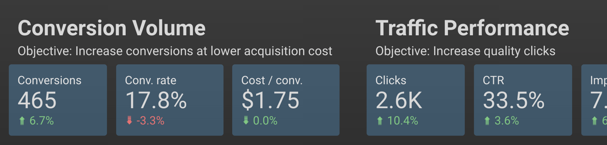
You can create scorecards for almost any metric you want to showcase.
I recommend arranging them in order of importance (KPIs like conversion data toward the beginning, traffic data toward the end).
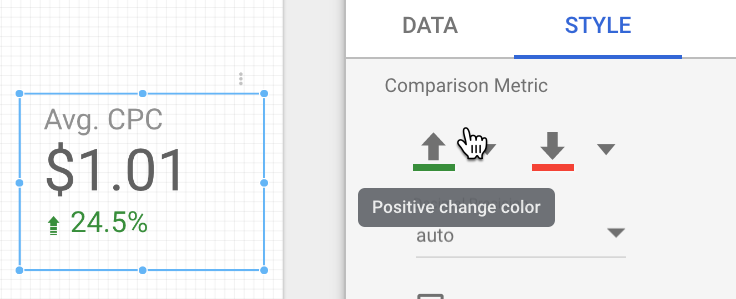
Add comparison metrics, and adjust the color in the Style panel (shown below) so an increase in a metric like CPC doesn’t have a green “up” arrow.
Here’s a quick overview of the metrics and dimensions you need to put this visualization together:
How to Create Scorecards
- Data Range Dimension: Month.
- Metric: Use one key metric per scorecard.
- Comparison Data Range: Choose previous period, previous year, or custom.
2. Attention-Grabbing Tables
The tables you can build in Data Studio aren’t the bare-bones Excel charts you used to send to clients.
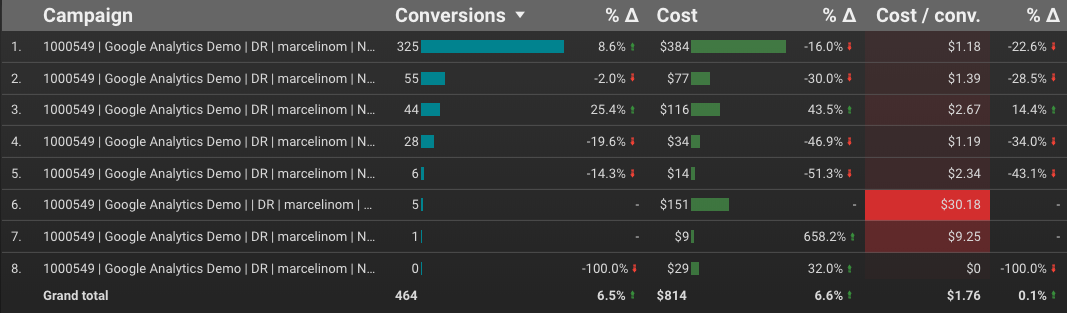
By using built-in features like color, bar charts, heatmaps, time comparisons, and targets, you can quickly draw attention to the most important elements of the table.
You can control each metric’s formatting from the Style panel.
In this example, Column #1 displays both bars and compact numbers, with a target value of 50:
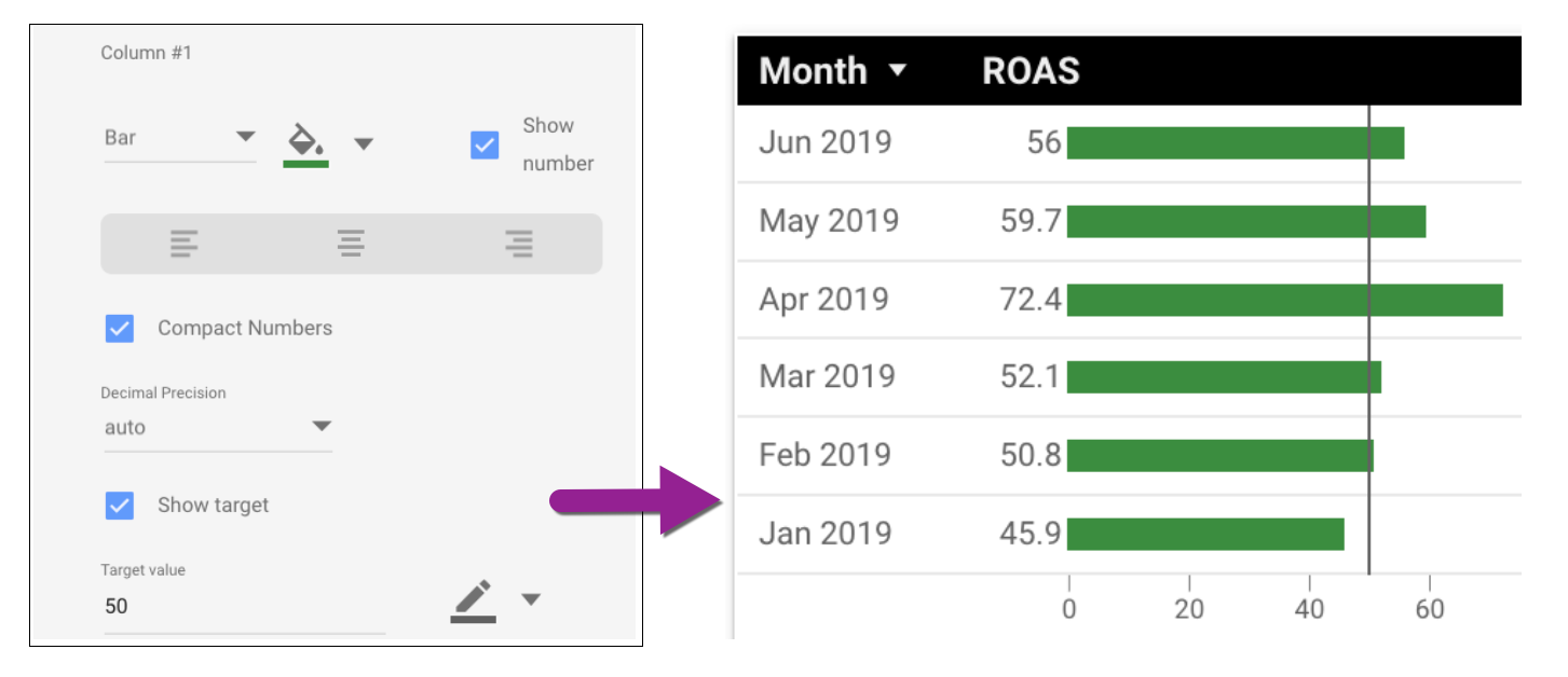 How to Create Tables
- Dimension: Campaigns (shown); Accounts, channels, ad groups or other segments will work
- Metrics: Choose metrics that contribute to the story you’re telling; remove non-essential metrics
3. Charts with Reference Lines
Regular line graphs and area charts are useful on their own, but reference lines go the extra step of showing your audience at a glance whether performance is meeting the goal.
These two charts contain identical performance information, but the use of a reference line helps them tell different stories.
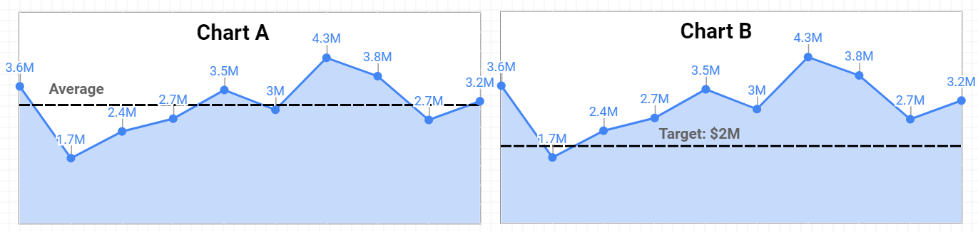
Chart A is using a line based on an average revenue, helping us quickly identify that three of the last four months outperformed the average.
Chart B is using a target reference line with a goal of $2 million.
We immediately see that all but the second month hit the target revenue.
Use reference lines sparingly and strategically to make sure you’re focusing attention where it belongs, rather than distracting your reader with an arbitrarily selected benchmark.
How to Add a Reference Line
- Create chart.
- Go to “Style” panel.
- Choose reference line type (constant value, metric, or parameter).
- Select calculation or value.
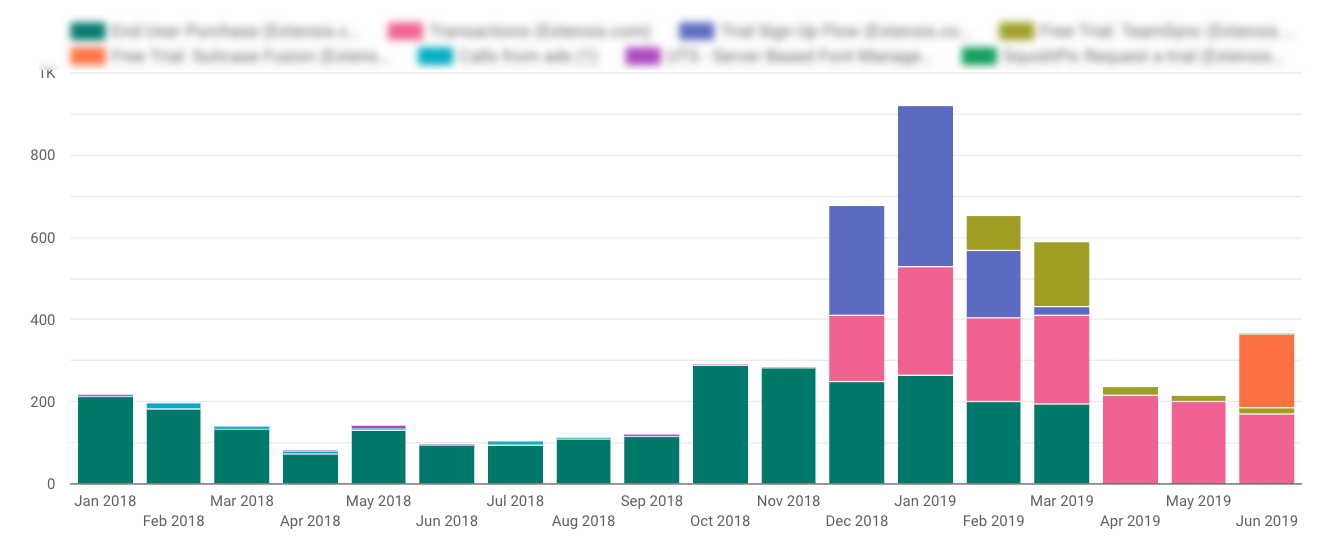
4. Conversion Type Breakout
Some metrics are like Lego blocks – clearly defined, and consistent. A click is a click is a click.
Some metrics are like Play-Doh – defined by the imagination of the user. A conversion is a sale – no wait! Now it’s also a page view.
Don’t let inconsistently defined conversions skew your reports; clearly show which conversion types are contributing to the total.
Here’s a stacked column chart that illustrates the breakout of conversion types over time:
And here’s the same data in a stacked area chart for a different visualization:
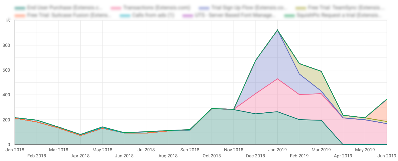 How to Create Conversion Type Charts
- Dimension: Month.
- Breakdown Dimension: Segment Conversion Type Name.
- Metric: Conversions.
- Sort: Month.
5. Local Actions – Click Type Breakout
When you’re running location extensions and local search ads, conversions get even more complicated.
Google rolls metrics like website visits and menu views into All Conversions, which can create reporting headaches for marketers.
Clicks on location extensions still accrue cost even if they don’t contribute to standard conversion targets.
How do you demonstrate the value of local actions without inflating your conversion numbers?
My favorite solution is to create a “value add” visualization that shows the breakout of click types.
Clients can easily see that these non-converting clicks are driving phone calls, chats, and other interactions that are important for their business:
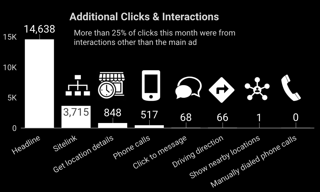
Adding icons is optional, but helps to communicate a variety of activity in what are admittedly confusing names for click types.
How to Create Click Type Breakout Charts
- Dimension: Click Type.
- Metric: Clicks (shown); You can also use All Conv, CPC or Cost metrics.
- Sort: Clicks.
6. Year Over Year Performance – Time Series
With a year like this one, charts comparing past performance are crucial for giving clients and stakeholders the context behind the numbers.
You’ll want to benchmark not just year over year revenue, but other metrics like spend, impression share, ROAS, and more.
In this example report page, the primary YoY revenue chart is aided by including time series charts for spend and ROAS.
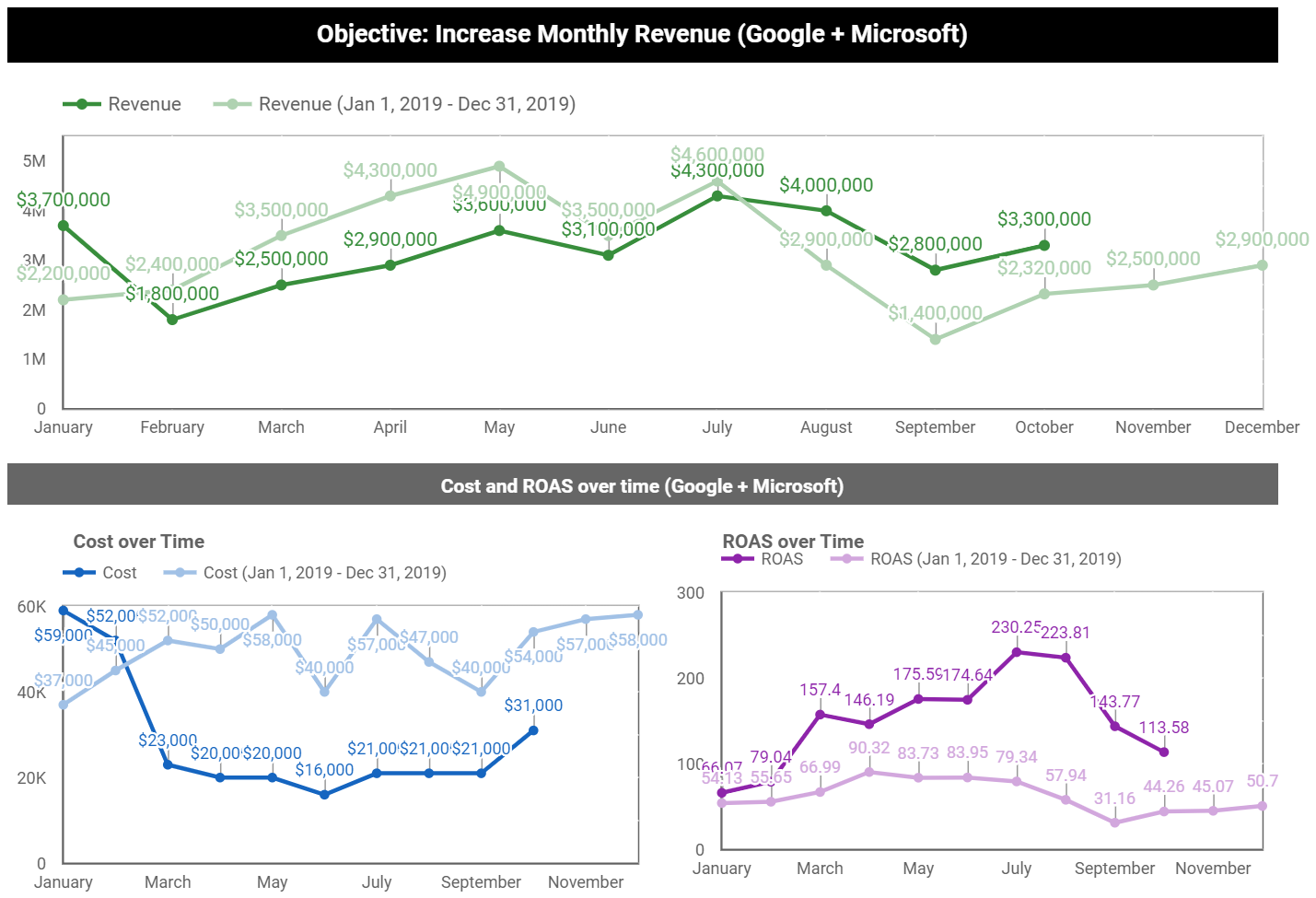 How to Create Year Over Year Performance Charts
- Date range dimension: Date.
- Dimension: Month.
- Metric: Any metric you’d like to compare.
- Set default date range to Advanced (Jan 1 – [today minus one month]).
- Set “compare to” date range to last year (Jan 1 – Dec 31).
Intermediate Google Ads Visualizations for Client Reports
Now that you’ve got the hang of how to prepare these visualizations, let’s look at more advanced examples.
These take a bit more effort to set up, but once you learn the skill you’ll be able to apply it to all your charts and reports.
7. Top Ad Placements
This placement visualization is a client favorite.
Not only does it list the name of the site or channel where the ad appeared; it also allows your clients to click the active URLs so they can review the websites that are serving their ads.
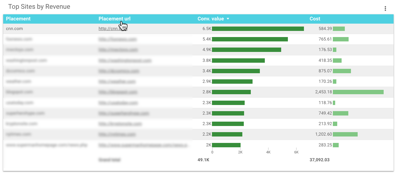
What makes this table complicated?
Data Studio doesn’t have fields for placement data.
To create this chart, you’ll need to export your placement details from Google Ads to Google Sheets, then connect Google Sheets as a new data source in your report.
This tutorial walks you through all the steps, including how to add a data source.
 How to Create a Top Ad Placements Chart
- Dimension: Placement.
- Dimension: Placement URL.
- Metrics: Conv. Value & Cost (shown); Just about any metrics can work well here.
- Sort: Conv. Value.
8. YouTube Ads Performance
Clients love to understand and experience how their ads are performing, so this visualization is another favorite.
Rather than a table listing performance data of video titles or ad names, you can let people watch the ad directly from the report:
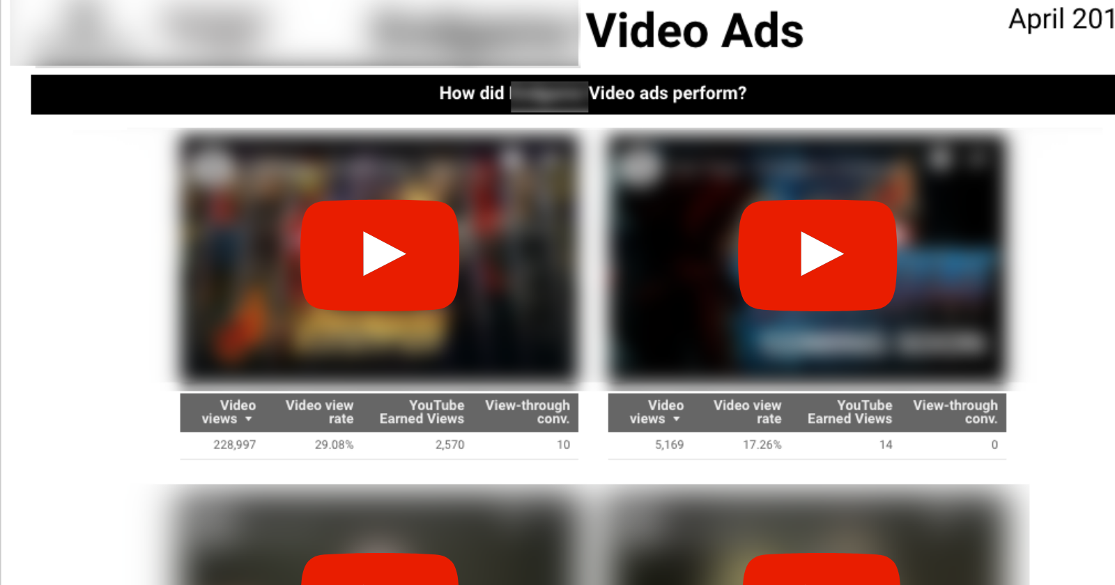
Adding the video is easy; simply embed the YouTube URL.
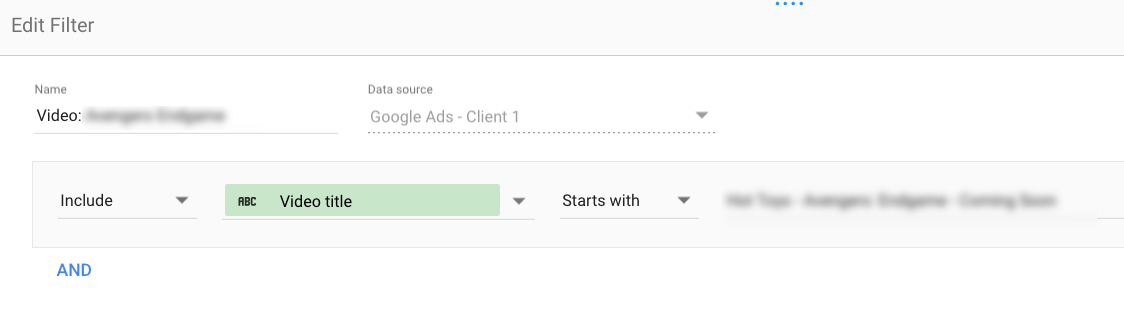
To recreate the tables so they are each unique to the video, you’ll need to create a filter for each table.
 How to Create a YouTube Ads Performance Visualization
- Embed YouTube video.
- Dimension: (none applied; video filter used).
- Metrics: Video views, Video view rate, YouTube earned views, View-thru conversions (shown); Many other.
- YouTube metrics are available, including watch rate.
9. Micro Comparison Bar Charts
Data Studio’s built-in date comparisons are helpful, but limited.
You can compare two periods (such as month over month or year over year), but there’s no way to compare all three.
These micro bar charts solve that problem, making it easy to see the three time periods at a glance:
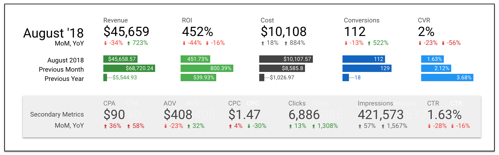
If you’re wondering about the MoM and YoY scorecard comparisons, it’s a little formatting hack explained here.
To create the microbar charts, you essentially need to “stage” the dimensions to only pull select months.
This can be done using Google Sheets as a source, or creating a filter in Data Studio to hard-code months that are displayed.
You can watch the YouTube tutorial on how to create micro bar charts with Google Sheets.
How to Create Micro Bar Charts
- Dimension: Month or Year Month.
- Metrics: Your KPIs, one per chart.
- Sort: Month.
Search Landscape Visualizations for Client Reports
To understand the causes and impact of paid search performance, it helps to examine external factors.
These visualizations provide deeper context by looking at greater trends and activity.
10. Google Trends Data
When this month’s performance is significantly different than last month’s, clients want to know why.
Did something change in the account, or was there a larger trend at play?
Google Trends can help you show the impact of seasonality, news cycles, and other events on your ad performance.
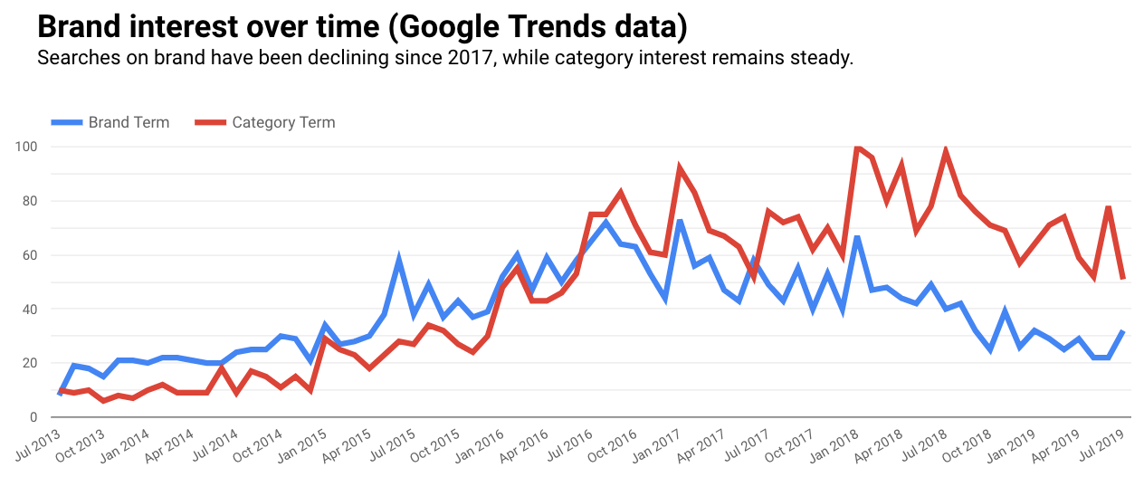
Google Trends doesn’t have a direct connector, but you can download the data to Google Sheets or use workarounds like strategiq.co’s gtrends.app.
How to Create a Google Trends Chart
- Connect your data source.
- Dimension: Year Month.
- Metrics: Brand and Category search terms (shown); Any metrics are fine.
11. Google Analytics Channel Breakout
Even if paid search is your entire focus, it probably isn’t all your client is concerned about.
Including Google Analytics data for reference can be helpful to show the relationship between channels and previous time periods.
This chart shows revenue, revenue per order, and average order value by channel.
It also displays a comparison to the previous month, and makes it easy to see each channel’s contribution to total revenue as a percentage.
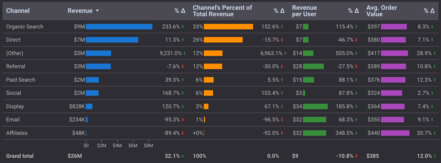
Paid search enjoyed a 40% revenue increase month over month.
But before we congratulate ourselves too much, we can see from this chart that most channels experienced a similar uptick.
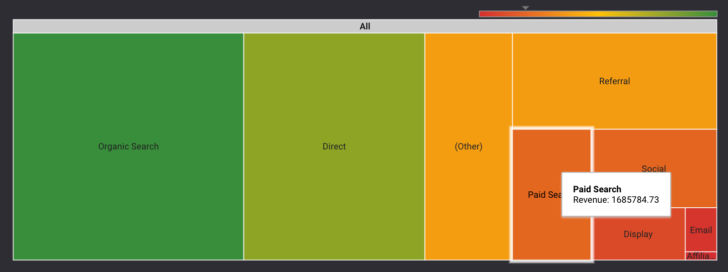
A new addition for comparison visualizations is the treemap.
While it doesn’t (yet) display metric values without hovering, it does better show the relationship between larger and smaller contributors.
 How to Create a Google Analytics Chart (Table or Treemap)
- Use Google Analytics as a data source.
- Dimension: Default Channel Grouping.
- Metrics: Revenue, Revenue as percent of total, Revenue per order, Average Order Value.
- Sort: Revenue.
- Time Comparison (for table): Previous period.
12. Auction Insights Scatter Plot
Of all the visualizations shared in this article, this Auction Insights chart is the most temperamental.
For starters, your company’s domain is represented by a (null) value, and it’s downhill from there.
But if you can get it to work, it’s a nice visual companion to a table that communicates several key competitive metrics at a glance.
We’ve also been able to access detailed competitor data that isn’t available from the interface or downloads.
This chart shows the relationship between impression share, outranking share, and average position of multiple competitors all at once:
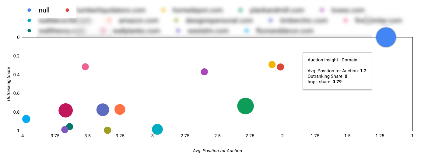 There are other (more stable) ways to create Auction Insights charts, but I find this formatting makes it the easiest to interpret.
How to Create the Auction Insights Chart
- Dimension: Auction Insights Scatter Plot.
- Metric X: Avg. Position for Auction.
- Metric Y: Outranking Share.
- Bubble Size: Impression Share.
- Sort: Avg. Position for Auction (Ascending).
- Note: Chart shown uses Reverse X and Reverse Y Axis, with a minimum X axis value set to 1.
Google Ads Visualizations for Internal Reports
Not all of the Data Studio visualizations you build should be client-facing.
You need your own tools for monitoring and management on a daily basis. And when you’re your own audience, you don’t have to be as fussy about the presentation.
These visualizations are great for internal reporting to help you identify and take action on performance in real-time.
13. Pacing Bullet Charts
The Google Ads interface gives you a lot of useful data, but it doesn’t help you see how you’re pacing against specific targets.
A Data Studio dashboard can show you daily averages, pacing to target, month to date pacing, and more:
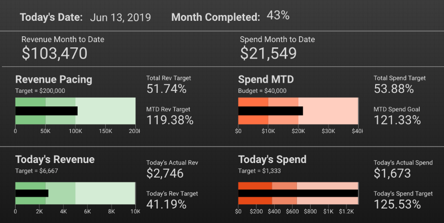
To build this dashboard, you’ll need to create some calculated fields if you’re pulling data directly from Google Ads.
If you’re using Google Sheets for your data source, you can do the calculations there.
Because of current limitations with date ranges, these calculated fields can be complicated.
How to Create This Pacing Dashboard
- Date: Table (Dimension: Day, Date Range: Today).
- Month Completed: Scorecard (Calculated field or Google Sheets).
- Bullet Charts: Based on your goals and targets.
- Additional Scorecards: Calculated fields or Google Sheets.
14. Zoom-In/Zoom-Out Time Series Charts
One of the challenges for paid search marketers is needing to be in the weeds with granular data, without overlooking high-level trends.
If you need to see the big and the small at the same time, you can add multiple snapshots of the same metrics to a dashboard in Data Studio.
This group of time series charts shows cost and conversion value for 30 days, 90 days, and 12 months. The top filter controls the ad group being reviewed:
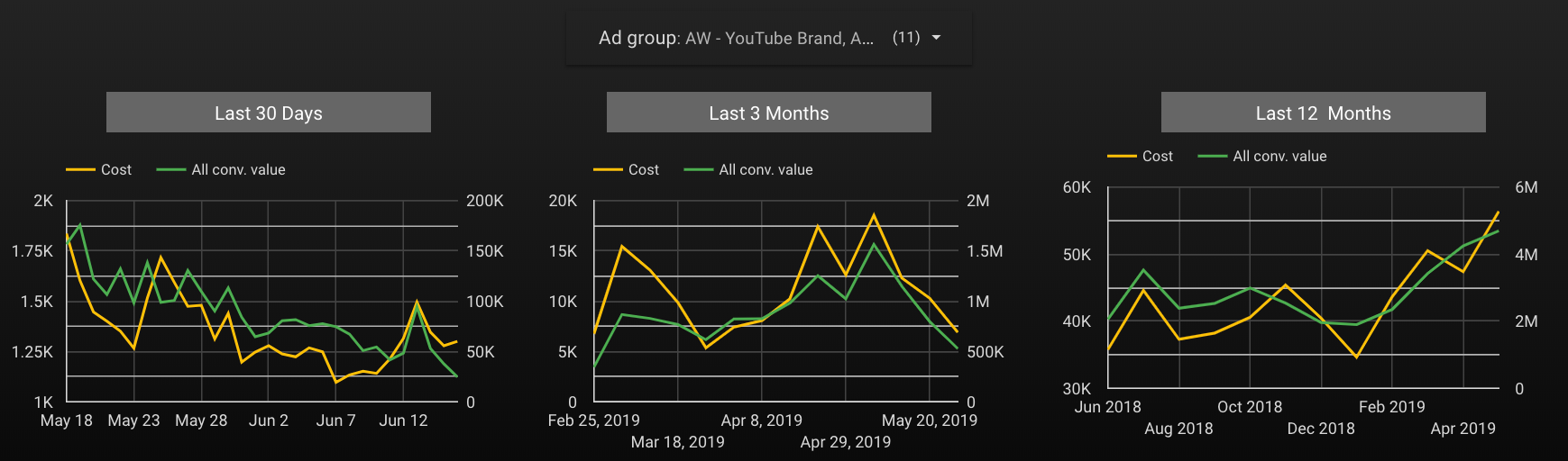
While volume is decreasing in the short term, it’s been steadily increasing over time.
There’s nothing wrong with using a similar layout in a client report, but I suggest offering a curated view to provide a specific answer, rather than including a filter control and putting the burden on your client to dig into the data and discover answers.
How to Create Time Series Ranges
- Dimension: 1=Day, 2=Week, 3=Month.
- Metrics: Cost, All conv value (shown); Any metrics can be used.
Conclusion
Data visualizations help you tell a story your clients can understand and learn from; they aren’t just for decoration or report filler.
The more comfortable you become building meaningful charts and graphs, the better you can interpret data and help others do the same.
More Resources:
- 9 Essentials to Make Perfect PPC Reports for Your Clients
- How to Upgrade Your PPC Reporting Process to Avoid Common Traps
- PPC 101: A Complete Guide to PPC Marketing Basics
Image Credits
Featured Image: Created by author, July 2019
All screenshots taken by author, July 2019 and November 2020
