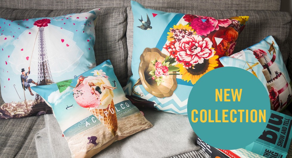
Did you know that the design and layout of an e-commerce can impact sales? Of course you did. But, do you know why the design of a retailer’s website such a big deal? For starters, it’s the first impression that consumers have of your company. This will determine if your site leaves a lasting impression with visitors and if they’ll stick around to make a purchase. An excellent e-commerce shouldn’t just look great, it also needs to be easy to navigate and make very clear what’s for sale.
If you’re looking for inspiration on how to design an outstanding e-commerce site, check out the following 10 sites. Each selection makes a great first impression and are easy for visitors to browse through, which will assist in completing the checkout process.
10. Free People
 Free People
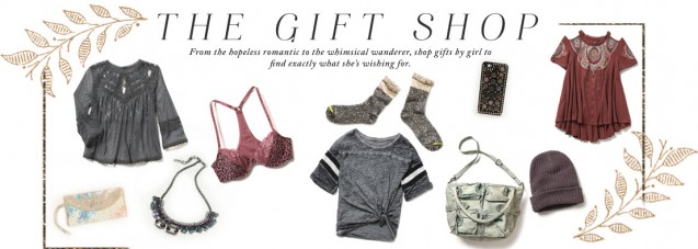
A clean, bright site that showcases models wearing clothing and footwear from the brand. Free People also has an easy to navigate site where visitors can exactly locate what they’re looking for. The addition of recent lookbooks and catalogs are great for visitors who aren’t exactly sure what they’re looking for.
9. Incase
Incase/Facebook
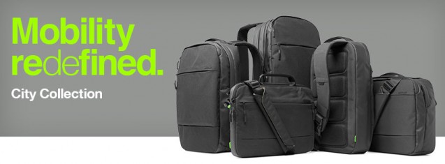
A simple, yet intuitive site that is very organized. However, the best part of the Incase site is the header, since it reveals only the most important parts of the site – shopping cart, the Incase logo, and a drop down for more options.
8. Reebok
 Reebok/Facebook
Reebok does an excellent job of providing plenty of excellent images of their products – either in action of just solo shots. The company also includes featured products and exercise tips to keep your interest . As you scroll down the site, a header where visitors can either shop or search for products follows visitors.
7. Firebox
 Firebox
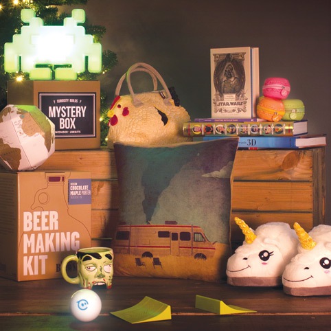
A fun site full of select, boxed images of the “Coolest Things You Can Buy”. The images of the products are large and clear enough to investigate before leaving the homepage. Overall, just a clean and responsive site that provides you with essential info – like pricing – before clicking on a product.
6. Kershaw
 Kershaw
A sleek site that has a flawless and seamless flow as visitors navigate through the site. Once you find a knife that you like, there’s a large, clear image followed by customer reviews. Overall, just a really sharp site.
5. My Own Bike
 My Own Bike
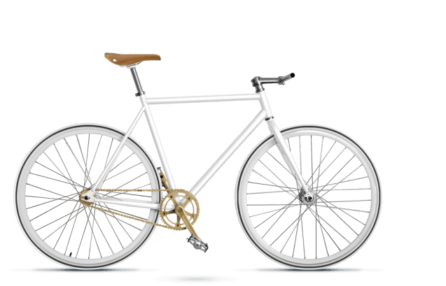
This German company sells custom made bicycles and offers a clean, sharp website with all the information you need right in front of your eyes – including pricing, how to build a bike on the site, and a beautiful gallery of pictures.
4. Wine Store
 Winestore/Facebook
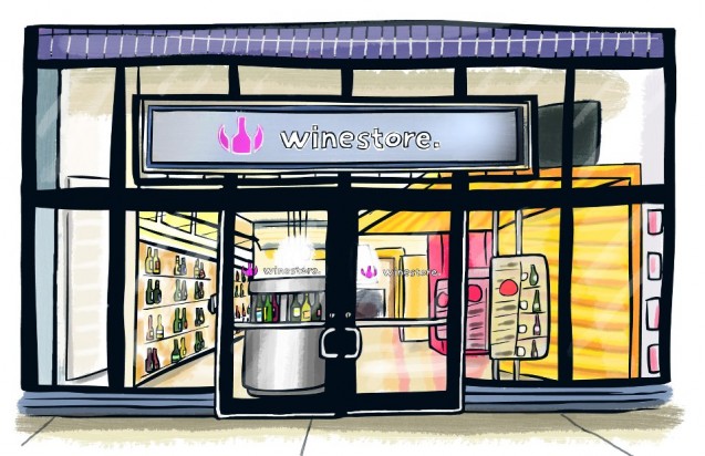
A unique layout that includes a logo and navigation on the right side of the site – a move that directs the eyes to that location. What’s interesting about this site is that “You’re The Expert,” meaning that you don’t have to be a sommelier to enjoy the Wine Store. Just browse selections that feature easy to understand reviews that won’t make you feel lost when searching for a bottle of wine.
3. Storyville
 Storyville
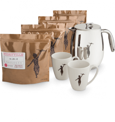
An excellent site with a chocolate-coffee colored photographic homepage that is accompanied by excellent photography. You can just stare at the dazzling images without leaving the homepage while the banner at the top remains in place – so when you’re ready you can get to the shopping.
2. Bonjour Mon Coussin
 Bonjour Mon Coussin
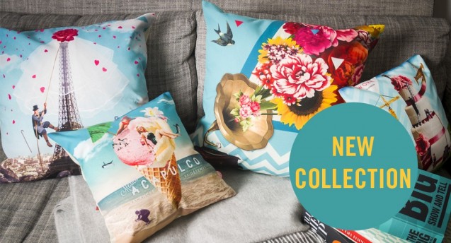
A vibrant and clean site full of beautiful images of the products for sale. Like Storyville, you can sit back and just watch the changing images without leaving the homepage.
1. Luhse Tea
 Luhse Tea/Facebook
There’s a lot going on when you visit Luhse Tea, but in a good way. The full page retro animation is a nice touch and is unlike any other retail site. We really love the search bar that’s located in the blimp, too. This is a really clever and creative site that makes shopping for teas and spices exciting.
Did we include your favorite eCommerce site? If not, let us know which eCommerce site you think is the best and tell us why!


