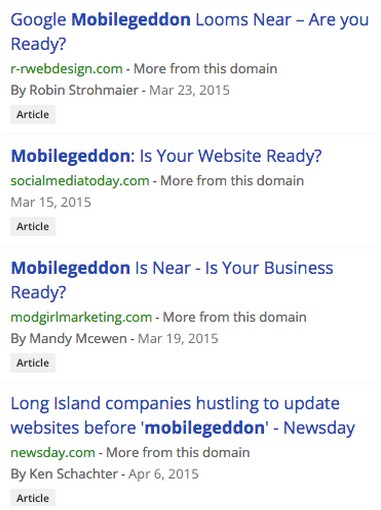
On Thursday, February 26th, 2015 Google announced that it would be changing it’s mobile search algorithm. Barry Schwartz covered the announcement on Search Engine Land and not long after the term “mobilegeddon” had been coined. The term refers to the Armageddon of non-mobile-friendly pages in Google’s mobile search results as of April 21st, 2015.
In just under two months anyone with a website has had to measure their mobility and if necessary, adapt to mobile-friendliness in order to maintain their search presence with mobile users. Forget Panda, forget Penguin, mobile-friendly is arguably one of the biggest updates in all of search history – Google’s announcement affects mobile search results worldwide.
Creating a mobile site, adapting your mobile content strategy and having mobile on your radar is no longer a choice. Complying to this announcement in a few short weeks means assessing your website, your content and your content strategy. With little time left and no concern for whether mobile was part of your Spring marketing priorities or not, anyone working in web is preparing for Google’s update.
Surviving the mobilegeddon apocalypse is going to take more than a few blog tips to address and in fact the discussion is quite complex. Everything from mobile URLs to leveraging video in mobile ads is being discussed under the umbrella of Google’s update. Cindy Krum’s recent Search Engine Land post is the most accurate and in-depth discussion I’ve read on the topic to date. She uses the most recent industry discussions on the topic straight from Google’s recent staff presentations at the SMX West and SMX Munich conferences to provide a summary of the need-to-know surrounding Google’s upcoming mobile update.
Indeed, preparing for mobilegeddon requires a step back before taking action and certainly before shifting your entire content marketing plan, but at the same time doing nothing is not an option.
Mad About Mobile
Lets be honest, if you waited for this Google announcement to execute project-mobile-content-adaptation, you failed. It doesn’t matter what industry you’re in, there is nothing you can do about the fact that an increasing proportion of mobile users will access your website content from a mobile device.
Atul Satija, VP and Managing Director of Global Revenue and Operations at InMobi, says in an interview on the App Annie blog that mobile is already the dominant platform for consumer engagement. Website Magazine discussed a recent ComScore report in their April 1st, 2015 post on mobile ads, stating that in 2014 the average American consumer spent 7 out of 8 minutes of their media consumption on a mobile device. Even in June of 2014, ComScore had already reported that 60% of time spent on digital media, was done so from a mobile device.
Google has always been concerned with the quality of the users search experience and so this major announcement doesn’t come as a surprise to many. This is likely the first of many mobile search updates to come that will redefine the search experience on a cellphone and soon for tablets, watches, gloves and any other smart technology we can wear. Jayson DeMers wrote on Entrepreneur that mobile search results will change and soon be populated not just with display websites, but also with mobile apps and other mobile technologies. The discourse of an increasingly mobile population is what brings us here today, we should be discussing how to get ready for the mobacalypse.
Content Considerations and the Time to Take Action
If there wasn’t a pressing deadline, you would first begin by considering the life cycle of your mobile marketing activities and planning each stage as you would for your larger content strategy, starting with your current website. Here’s some highly practical advice for what you would do if you had all the time in the world:
Undesign Your Current Website
Don’t try to make your mobile site look exactly like the desktop version. Take the time to make a mobile site that prioritizes user-experience. Information can be better explained on mobile platforms with a scaled-back design suited to smaller display screens. Text should be legible and website functions as well as calls-to-action should be functional and clickable by touch. This applies to both responsive design websites and independent mobile sites obviously. Smashing Magazine wrote about a mobile content strategy and advises content marketers to actually write smaller headlines for content that is intended solely for mobile site (this wouldn’t work for responsive sites).
Prepare to Shrink Content
When you know what the layout will be, you can begin to plan what content will make it to mobile. Pascale Guay, CEO of Dialog Insight, said in an interview that “ensuring that your content will effectively perform across platform is the key to a successful multi-channel content strategy.” Dialog Insight writes on their blog that when preparing to mobilize your content you should review each element of the page for its importance. Assigning a grading system from 1 – 3 for each element of the page can help you to decide. Content elements that have a 1 must stay on the page, 2’s are only included if there is room and 3’s are removed entirely from the mobile site, for example.
DISCLAIMER: The author is working with Dialog Insight to revamp their website, but the company didn’t sponsor any mention on this post.
In addition, the use of images on mobile, explaining they should also be adapted by using smaller versions of the same image or by choosing new photos for the mobile site altogether. Any banner images with text need to be adjusted, since the text included on the desktop site will be extremely small on a mobile device. These banner images therefore need to be recreated with larger text if image-text is to be included at all on the mobile site. It’s crucial that each content element of each page is carefully considered before being included on the mobile version of your website.
Test Test Test
If the conversion is too low on mobile after your tweaks, try some browser and device testing and see if you can improve the end users mobile experience. Think like your target audience and go on your site. Get your friends to test, your kids, even this drunk guy who specializes in UX testing.
Mobilizing Your Content
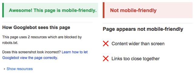
If you want to survive the update, your mobile site should be crawlable by GoogleBot. To make sure your site pages are crawlable by Googlebot you can use Google’s mobile-page friendliness tester.

The mobile page-friendliness tested will generally diagnose the problem on your website, as seen above on the specifics of the failed page test are written including “content wider than screen” and “links too close together.” Similarly Google provides tips and guidelines on how to correct mobile-problems on your site. Getting your mobile design to pass the Google page test likely requires the use of developers and can therefore become a costly prescription, depending how far off your site is.
Unfortunately there is no 5-pt mobile recovery plan to Google’s mobile update, despite the misleading titles of many blogs making headlines right now.

Strive for Just in Time Delivery but React Fast
The good news is that you or your client’s mobile content strategy should never have been a separate endeavor from you or your client’s global content strategy. You’re still on the right track.
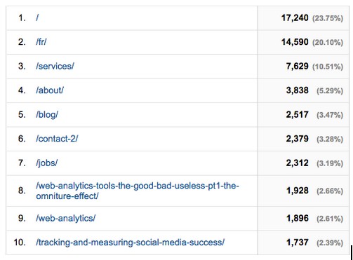
With officially less than two weeks to make your website pages mobile-friendly, how do you know where to start? That was rhetorical and the Home Page should have been an obvious choice (dry sense of humor). Beyond the home page, you can prioritize which pages to adapt in priority sequence by analyzing which pages of your website get the most views from mobile viewers in Google Analytics (you can also check the amount of traffic you get from mobile users while you’re there).

Focusing on only the top 10 pages that drive traffic to your website, apply the 1-3 number system discussed above to each component on the page, while being mindful of the key content relationships and clickable-actions that are essential. Prioritize optimizing these pages first since the update will not have site-wide impacts and rather will be ranked on a page by page basis. During the next few weeks you can sleep at night knowing the main pages that your site traffic finds most interesting will appear in Google’s mobile search results, while buying you some time to address each page properly.
Of course I’m talking exclusively about the content hosted on your website. So what happens if your content marketing strategy includes offsite publishing, such as slideshare presentations, a Reddit AMA and 3 guest posts? The answer is that you’re going to have to be picky and cut out anyone who doesn’t comply to Google. Most community forums and social media sites will have already taken care of making their site content mobile-friendly.
So, when it comes to most major social media sites, like Facebook and Twitter, you can keep whatever mobile plans you had for these channels and execute them “business as usual.” You are going to have to be picky however when it comes to your guest posts or hosting any content on sites that aren’t mobile friendly. Test sites on your phone or in the Google mobile-page tester before approaching the publishers and be weary of hosting your content anywhere that cannot be accessed by mobile viewers.
If you’re really loyal to certain websites/editors/publications who don’t seem to care about this mobile update, talk to them about your concerns and why you are reluctant to put your hard work and wise words on a page that will be excluded to 60% of users trying to access it (send them the link to this post!). This is true for native ads and other forms of content. Prioritize the accessibility of your content, no matter what type it is or where its hosted. As of April 21st that means cutting ties with anyone who is not mobile-friendly or simply missing a huge portion of the market.
Smashing Magazine reminds us in their post about a mobile content strategy that this update is an opportunity to review our current content marketing workflow internally and focus on efficiency. Get through this update by buckling-down with your team and getting organized.
Now, for the rare group of marketers blessed with foresight, buy-in from management and funding, you’re in luck, at least for the interim. Anyone with a souped-up and well-optimized mobile website, mobile app and/or mobile component to their content marketing strategy will come charging out of the gates and likely get a lot of mobile traffic the first few weeks as the rest of the internet scrambles to catch up. I’m sure mobile app developers and stakeholders see this update as their day of redemption rather than armageddon. Beware though, any app developers pedalling interstitials on mobile sites will not make it through the day of judgement.
Conclusion
With impending doom on the horizon for most, the pressure to get our pages ready in time to keep on curating content is on and the solutions aren’t necessarily clear or easy.
Talk to your developers, get a mobile site and then start with the content you can control. Figure out which content is most important to your audience and begin the page diagnostic process with the development and content team. Too much is out of your control offsite, so be selective with who you collaborate with for your external content marketing initiatives. Use the tips and tricks for content and page configuration discussed above to help interest and convert the mobile user.
When it comes to branded search, I’m honestly perplexed at what will happen post-mobilegeddon. If I search for “Green Peace” in my mobile phone and this non-profit that I shamelessly support does not have a single mobile-friendly page on their site, will Google make themselves look bad and pretend this non-profit doesn’t exist? If they did it would ruin the searcher’s experience and the integrity of search to a certain degree. But, since no one is more concerned about that than Google themselves I’m dying to know what will happen when branded searches take place from a mobile device. We’ll see after April 21st!
Image Credits
Featured Image: sdecoret/Shutterstock
All screenshots via Chandal Nolasco da Silva. Taken April 2015.


![AI Overviews: We Reverse-Engineered Them So You Don't Have To [+ What You Need To Do Next]](https://www.searchenginejournal.com/wp-content/uploads/2025/04/sidebar1x-455.png)