One of the biggest breakdowns I see most often in website architecture is sites with poor navigation.
On a pure usability level, navigation has one job: help visitors find the information they need. But in reality, there is a lot more going on under the hood that makes a site navigation succeed (or fail).
Navigation plays a role in usability, findability, search indexing, internal link optimization, and content optimization.
All told, navigation provides a framework for a site’s structure and contributes to both user- and search-friendliness.
Get your navigation wrong, and you’ll find an otherwise stellar-looking website performing poorly on a number of key success metrics.
Get it right, and you have the foundation for building a high-performance website on all levels.
Building an Efficient Navigational Structure
When it comes to navigation, what is “efficient” for one site may not be efficient for another. Each site is unique and will have unique navigational characteristics.
Here are some things to consider:
- Where should your navigation be on the page?
- What information needs to be presented in the global navigation?
- How many categories / sub-categories should you include?
- Should you use drop down (or fly out) menus?
- If space is limited, what navigation items do you include or exclude?
How these questions get answered often starts with understanding the two types of navigation links. Links that are:
- Customer-focused.
- Company-focused.
Every site has both. Sometimes they are grouped together into a single navigation bar and sometimes they are separated visually.
While I have a preference (separate), both are essential because they serve two distinct purposes.
Customer-Focused Navigation
If you care at all about sales and conversions, you need to prioritize your navigation on what your customers want.
Unfortunately, most sites focus on the company navigation items and the customers get the short straw. This is exactly opposite of what your navigation should be.
One of the first questions I ask when performing a website audit is if the visitor saw nothing more than the navigation portion of the website, would they know if the site will satisfy their need?
If your products or services are hidden under a single link item labeled “shop” or “services”, then the answer is likely “no.”
Take a look at the two navigations below. Which one tells you immediately what the company offers?
Example 1:
![]()
Example 2:

Both companies are manufacturers, but only one makes that clear through their navigation. And the visitor doesn’t have to search, read content, or click to know it!
You can make the argument that the visitor should already know if they typed in your URL or clicked the link from Google, but why assume?
Why keep your visitors guessing when you can provide the information (and the links) for what they want without forcing them to hunt for it?
But what about Contact Us and About Us Links? Those are important too, right?
Yes, absolutely. But not as important.
Visitors are only interested in looking at those (or other company-focused pages) once they get further into the buying process. Those pages assist with the sale, but you have to show them that you have what they want first.
Company-Focused Navigation
The second navigational focus is to provide links that point visitors to information about your company.
As I said above, these navigational elements are important but are secondary to the customer navigation items.
As such, they should be segmented visually as well. This can be done my making these less prominent (or hidden behind a hamburger menu), but still easily accessible.
You can see in the KTC example above that they have their company focused navigation above the customer. Now, that’s still too loud for my liking, but the segmentation still works.
Here is another site that puts the customer nav first but offers the company nav in a less obtrusive way:

All the important items are there and easily findable, but secondary to the products that visitors want. This allows visitors to easily find and click those pages when they want them, but they are out of the way until the visitor is ready for them.
While your company-focused links might vary, here are some pretty much universal navigation links that should be visible:
- Logo link – You can add a separate “home” link if you like but always be sure the logo links to the home page.
- About Us – This can be an important page for those deciding who they want to do business with.
- Contact Link – Don’t make visitors hunt for a way to get in touch with you.
- Phone Number – While phone calls are often not preferred by the business, sometimes they are preferred by the customer. Without it, you risk losing them.
- Search Bar – Provide a way to search for your products or information.
- Checkout/Cart – Much like a contact link, you want visitors to be able to get to their cart and check out easily.
There are some exceptions to these options above and those typically fall into the lines of the size of your business.
Certain well-known brands don’t necessarily need About Us links and don’t necessarily want (or need) people to be able to contact them easily.
When you pretty much have more business than you know what to do with, you can afford to move those links to your footer, or even remove them altogether.
But when you’re looking for every new customer you can get, consider carefully before you do.
Ecommerce Navigation Issues
The challenges for ecommerce websites magnify the importance of establishing a clear and proper navigation for your website.
Your navigation is not only for the purposes of helping your visitors get the content they need, but ensuring the search engines can better find and index pages so they can be found in search.
While the top level navigation is important in ecommerce sites, other navigational options can be equally, if not more important overall.
Related Products
One of the best opportunities to get additional products in front of your audience is by adding links to products related to the one a customer is viewing. These can be in the form of:
- “Similar” products.
- Add-ons or accessories.
- Popular items.
- Recently viewed products.
Any (or all) of these options offer a way for you to increase the average visitor order, while also throwing additional link equity toward other pages.
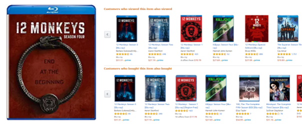
Amazon does a great job of offering additional products. In my search for 12 Monkeys (the single greatest sci-fi show in existence!), Amazon offers additional products that customers viewed and bought:
Add to Cart Functions, Not Links
This is less of a problem today than it was just a few years ago, but there are still some solutions and systems that are using natural links to add products to carts or to checkout.
This creates all sorts of problems with search engines following links and, essentially, adding products to a cart.
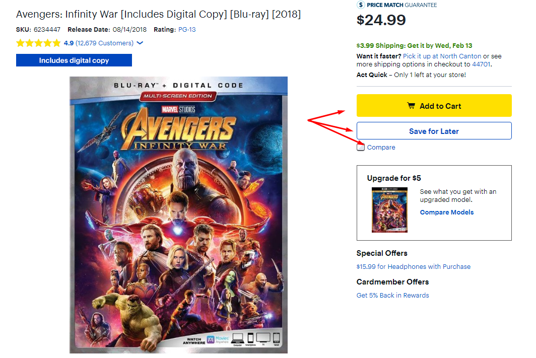
This type of functionality shouldn’t be limited to just cart links. The same applies to links for writing product reviews, adding a product to a wishlist, printable links, product comparisons, add comments or reviews, or any other link that serves as a function rather than leading the visitor to another page of content you would want showing up in search results.
In the image below from Best Buy, none of the three buttons/links indicated are able to be “clicked” by a search engine spider.
Filters Verses Pages
One of the challenges with ecommerce sites is determining when to have links to pages and when a filter will suffice.
Let’s say you have an apartment finder website and you want visitors to be able to navigate their way to results that fit their living criteria. Someone may want a furnished, three-bedroom, pet-friendly apartment with a pool, washer and dryer, gym, has utilities included, and comes with a covered parking space.
Some of those options will work just fine as filters. Heck, maybe all of them can be filters.
But when it comes to good SEO, you also know that some of those can make for great optimized landing pages.
So which is which?
I think it all comes down to keyword research. If a significant number of people are searching for 3 bedroom apartments in Denver, then it probably warrants a page with content and a listing of those apartments.
My gut tells me not as many are searching for a pool, utilities or even a washer or dryer. If that’s the case, go with filters.
But if there is any level of search volume that you want to capture, go with landing pages and use “filters” on the site to drive people to the pages with the content they need.
Other Navigational Needs
Breadcrumbs
Breadcrumbs are the average website’s equivalent of Google’s “I’m Feeling Lucky” button.
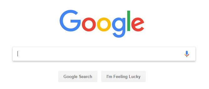
It’s used by about 1% of searchers, but a vast majority don’t want it to go away.
Aside from being a great navigational tool that can help both visitors and search engines easily navigate a website, they are most commonly used as a visual aid.
Breadcrumbs provide the at-a-glance indication that lets your visitors see where they are on your site. And if necessary, they can quickly navigate a couple of steps back.
Despite their lack of actual use, breadcrumbs are a powerful SEO tool. When your breadcrumbs align textually with your main navigation and URLs, Google (and those other search engines) will use that as an enhanced signal for understanding the topic of a page and what it should rank for.
Plus, when Google displays the URL in search results, they are more likely to show the more reader-friendly version:

Rather than a less-than-readable URL:

Finally, breadcrumbs help search engines better understand your site hierarchy.
It’s always best when this is just a reinforcement of how you already have your navigation laid out, but on the chance that the navigation can’t be hierarchically accurate, the breadcrumbs can fill in the blanks.
Keywords in Link Text
Navigation is one of the easiest places to get your keywords into links.
After all, if you’re presenting a link to your Coat Racks page, you’re not going to put “That thing you hang your coats on” in your navigation. But your navigation isn’t the only way to help visitors navigate your site.
Content-based links provide a great opportunity to easily allow visitors to move from one page to the next based on what they are reading and what interests them.
When adding these content-based links, the need to use keywords still applies. Instead of, “Click here to learn more about preparing personal tax returns,” a better way to link would be, “Learn more about preparing personal tax returns.”
If you really want to keep the call to action as part of the link (and there is no reason not to if you can make it work), you would write this: Click here to learn more about preparing personal tax returns.
Not only does this create a clickable call to action using keywords, but this helps prevent over-optimization of your link text by always linking with only your keywords. Search engines are pretty good about sniffing that out.
Related Topics
Similar to linking to related products with your ecommerce site, almost any site can benefit by linking to related topics on their blog.
At the end of your post, provide a few related links that visitors might want to click through to.

HTML Links
Unless you’re deliberately trying to block content from search engines, you want to make sure your links are crawlable.
Search engines have gotten pretty good about following all kinds of non-HTML links, but they are not perfect.
So yeah, you can get away with using those kinds of links, but it’s never ideal and opens up the possibility that Google either won’t follow it or won’t weight the link properly.
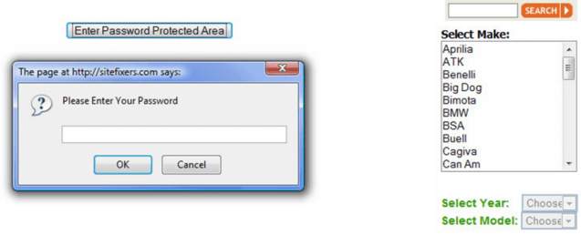
Another common way to link that isn’t so great is to use selection forms or force the visitor to enter a password to view the content.
For the most part, any content hidden behind these walls will have a harder time getting indexed. Which may be the intent, but just make sure it is.
There is no way to overemphasize the importance of your website’s navigation to your overall optimization efforts. If your navigation is broke, your SEO is broke.
Of course, fixing your navigation won’t fix all of your optimization issues, but for most sites, this is the best place to start moving toward a search engine friendly website that, at the very least, has the potential to perform in search.
Image Credits
Featured Image: Paulo Bobita
All screenshots taken by author



![[SEO, PPC & Attribution] Unlocking The Power Of Offline Marketing In A Digital World](https://www.searchenginejournal.com/wp-content/uploads/2025/03/sidebar1x-534.png)