What follows is a list of resources that can be applied specifically to landing page optimization, originally repurposed from ConversionXL and other great websites around the web.
We’ve organized everything to best simulate a visitor’s experience on a landing page from first click to final conversion.
To get the most out of this guide, please use each resource to focus on one area of your landing page experience at a time. Trust me, this will help you later on when you’re wondering what to test next.
I recommend you bookmark this page so you can come back to it when it’s time to create that next landing page.
Step Zero – Really Understand Your Target Market
 Image credit: PixelPerfectDigital.com, used under CC license
Do This: Really get to know your market. Conduct surveys and interviews to understand your customer’s pain points. If you want extra credit, make a list of websites they’re exposed to, and build a picture of what their “typical” online experience is.
Questions like:
- Who are you – your age, job, position in your company, etc.
- What are you using our product for?
- How is your life better thanks to it?
- Do you consider any alternatives? Why?
(note: If you’re a start-up, you’ll want to use customer development questions for your page to resonate with future traffic)
These questions help you uncover trends within your market and tell you things analytics alone can not. All of this is to inform a landing page design that follows your target market expectations which plays a huge role in reducing the amount of friction it takes for them to convert.
The biggest problem I see in landing page design and optimization is the page has no understanding of who the visitor is or their level of online exposure.
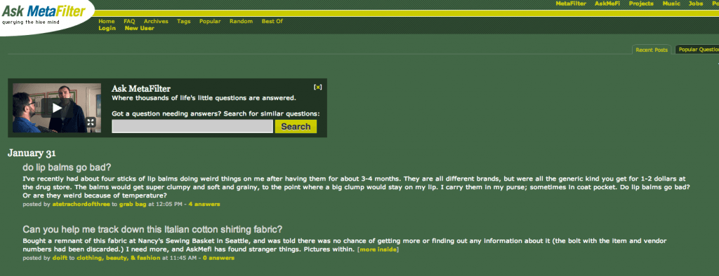 Screenshot taken 01/30/2014 of ask.metafilter.com
Surely, what’s “appeals” to a 54-year-old mother of 5 who goes online to check Facebook and Metafilter will be vastly different from a Google Glass wearing, 27-year-old power-user of social networks you haven’t even heard of yet.
Landing page design isn’t a game where you flex your own aesthetic prowess.
It’s about connecting with the viewer and communicating value as quickly as possible. The more you accept that connection is on their terms, not yours, the better your pages will be.
Step One – Set Up Actionable Analytics
Do This: Set up your conversion goals in Google Analytics.
Ask Peep Laja from ConversionXL about analytics, and he’ll tell you,
“Metrics are there to provide actionable insight. You need to look at a metric, ask “so what?” – and have an answer.” “Conversion rates for our top Adwords are way up. So what? We should increase our Adwords budget.”
Seems simple enough, and yet “Conversion” Analytics looks so intimidating that many of us skip this step so we can get straight to making money.
Stop it.
If you don’t have actionable analytics you’ll never get the full story on your landing page activity. You’ll end up throwing away money and guessing what to do next. Take the time. Learn to interpret your analytics data and make the most of it. Your marketing budget will thank you, I promise.
Recommended Reading:
- 50 Resources For Getting The Most Out Of Google Analytics (older, but relevant)
- 10 Optimization Experts Share Their Favorite Analytics Reports
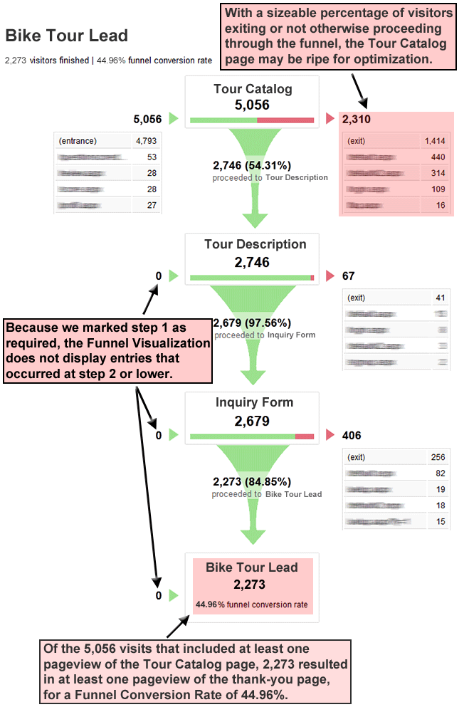
- Building Your Marketing Funnel With Google Analytics
- The Conversion Funnel Survival Guide
Step Two – Make Sure Your Ad’s Message Matches The Landing Page
Do This: Check the bounce rates on the landing pages where you’d like to generate more business. If they’re too high and conversions are too low, you may have a message match problem.
To know for sure, look at the ads pointing to the page that receive the highest click-through rates.
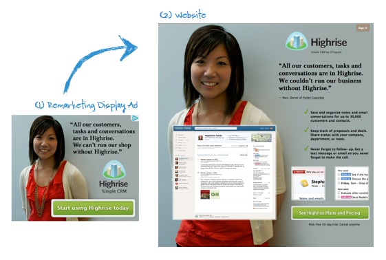
Does your page use similar language to what’s in the ad? Do the images in display ads re-appear on the landing page?
If you miss the mark on this, your landing pages are destined to fail.
Why?
Nine times out of 10, messages in the ad don’t correspond directly to what’s on the page.
Ad images and headlines that don’t correspond to landing page headlines and the page, generally speaking, are not what the user expected when they clicked the ad.
[vimeo 77432926 w=720 h=405]
They land on the page and feel ungrounded. Where’s the headline that grabbed their attention? At the very least, have you inserted the keyword they were searching for in a prominent place on the page?
No?
Lack of conversion is the result of lazy conversion optimization.
Instead of creating one page and throwing multiple, loosely targeted ads at it, create a handful of highly targeted landing pages that focus on tight-knit group of keywords. If your budget allows, experiment with a dynamic keyword insertion platform.
Recommended Reading:
- Give Your ROI A Serious Boost By Maintaining Scent
- The Science Of Landing Pages & How To Build One Backwards
- Gmail Ad Fail – How Poor Message Match Can Kill Your Conversion Rate
- [Message Match] Project Management Software
Step Three – Evaluate Your Landing Page’s First Impression
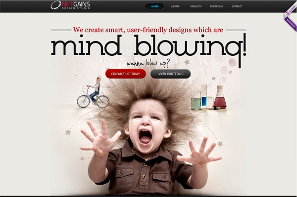 Screenshot taken 01/30/2014 of NetGains.org
Do This: Search for your landing page’s primary keyword and click on the pages your primary competitors are creating.
The idea isn’t to copy what competitors are doing (many times, they don’t know what they are doing, either), but to get an idea of the first impression they’re trying to make.
See, it only takes 0.013 seconds for your brain to identify an image and 0.05 seconds for visitors to form an opinion about your landing page.
The opinion they’ve subconsciously formed in between 1/13th to 1/50th of a second will influence every decision they make on your page.
These strong first impressions are why it’s vital that your message match is strong. It’s also why you should be designing your pages with some degree of familiarity.
Is your page laid out in a way that’s intuitive to your user? Do your product shots meet the standards your target market has from their web browsing experience?
Because the brain registers information faster than your user can perceive, if these elements are even slightly “off”, it becomes an uphill battle all the way to conversion.
Recommended Reading:
- 13 Milliseconds – The Time It Takes For Your Brain To Identify An Image
- How Loading Time Affects Your Bottom Line
- Why “Simple” Websites are Scientifically Better
Notable Examples Of Good First Impressions:
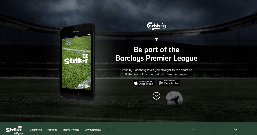 Screenshot taken 01/30/2014 of GetStrikr.com
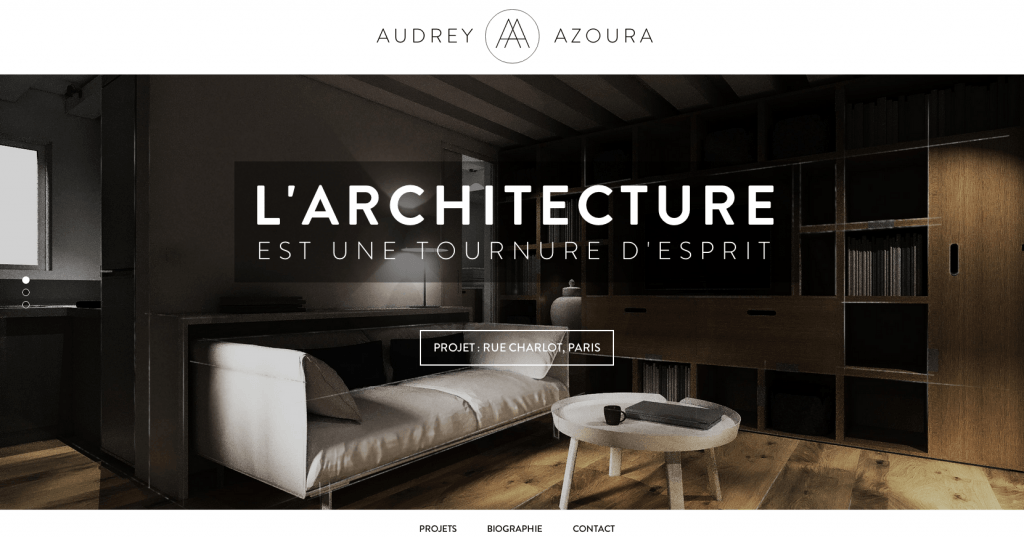 Screenshot taken 01/30/2014 of AudreyAzoura.fr
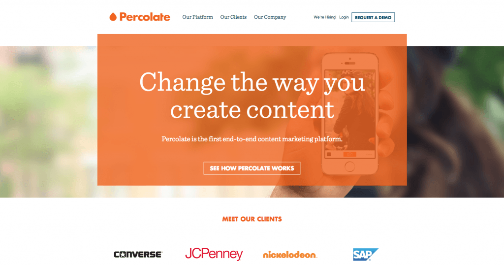 Screenshot taken 01/30/2014 of Percolate.com
Step Four – Does Your Page Have Emotional Resonance?
[ted id=480]
Do This: Use customer development techniques found in this post to build a profile of your ideal buyer personas.
Specifically, we’re looking for clues to let us know which emotional triggers will resonate the most for visitors to the page.
This goes hand in hand with first impressions, but it’s important we make a clear distinction between the two.
If first impressions start by ensuring everything is in a familiar location, emotional resonance is about enhancing these elements to create a mood, hook the visitor, and draw them deeper into the page.
Emotions like joy, pleasure, shock, horror, expectation, exclusivity, and surprise are just a smattering of what you could be designing for.
Only after you’ve picked the mood of the page should you look at things like colors, fonts, photography, and video.
Determine how to balance these elements to support the mood of the landing page – don’t just arbitrarily pick colors and fonts for the sake of eliciting a certain emotion. Blue doesn’t automatically equal trust, red isn’t always angry.
How each element plays with and supports each other is what really determines the overall mood of the page.
Recommended Reading:
- Building Emotion Into Your Websites
- Emotional Design: Why We Love (or Hate) Everyday Things
- The Psychology Of Color In Marketing & Branding
- How Fonts & Typography Affect Conversion
Notable Examples:
 Screenshot taken 01/30/2014 of WandaPrint.com
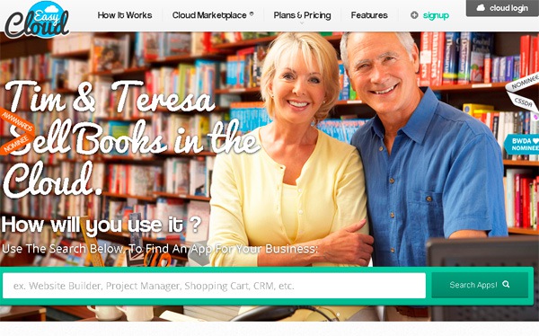 Screenshot taken 01/30/2014 of EasyCloud
Step Five – Craft A Clear & Compelling Value Proposition
Do This: Ask if your value proposition –
1. Directly addresses who your customer is, (Stripe = Payments for developers) 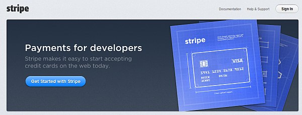
Screenshot taken 01/30/2014 of Stripe.com
2. States what your product does (Markitekt = We make websites sell) :
Screenshot taken 01/30/2014 of Markitekt.com
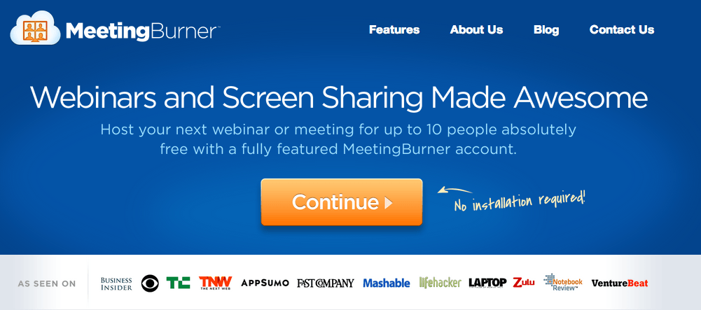
3. Tells why you’re unique (Meetingburner = Webinars and Screen Sharing Made Awesome – No Installation required):
Screenshot taken 01/30/2014 of MeetingBurner.com
4. Show’s the end benefit of using it (Airbnb = Find a place to stay):
Screenshot taken 01/30/2014 of Airbnb.com
Now that your page is loaded and a first impression has been made, your visitor subconsciously decides if the page is worth reading.
If they haven’t clicked the back button, eye-tracking research shows the first thing they’ll be looking for – by default – is a dominate headline (your value proposition) At this point, your visitor’s only decision is “Does this site have what I need? “ or “Should I look somewhere else?” Because judgement was already passed a fraction of a second ago, all you’re doing now is reinforcing whether that initial judgement was right.
When your value proposition answers all of the questions above to help your visitor quickly decide if this page is really what they’re looking for – you stand a much better chance at keeping their interest throughout the rest of the page.
If your value proposition doesn’t answer those questions, you make the path to conversion far more difficult than it needs to be.
Recommended Reading:
- The Art Of Creating A Magnetic Value Proposition
- Use These 3 Points To Create An Awesome Value Proposition
Sidetrack: What Are The Elements of a Viral Pre-Launch Page?
Step Six – How Will Images Reinforce The Message?
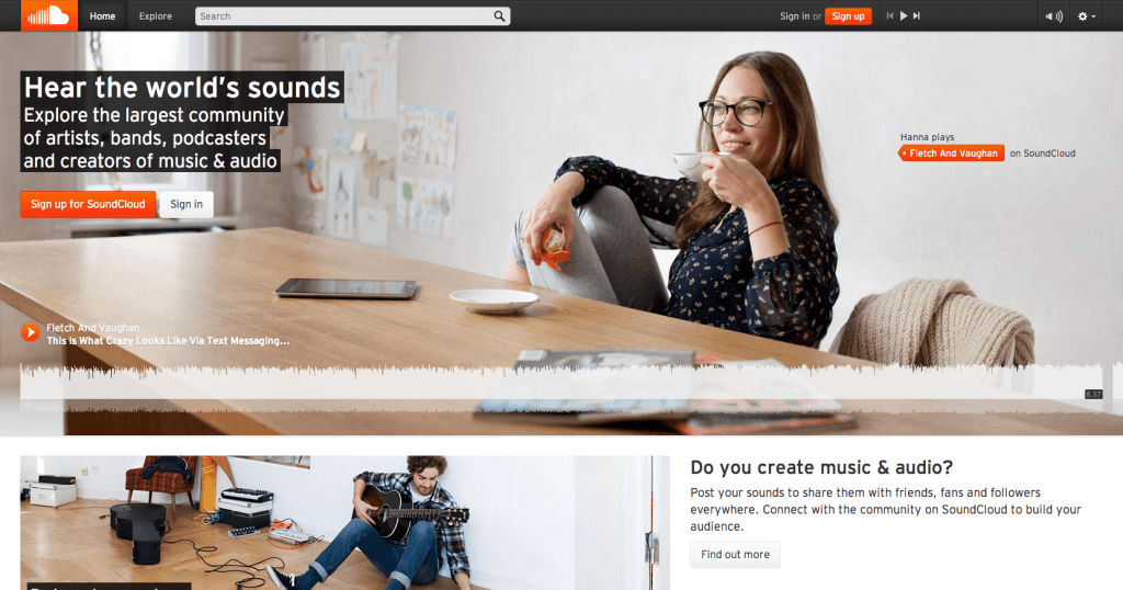 Screenshot taken 01/30/2014 of SoundCloud.com
Do this: Select, Design, or Capture images that reinforce the mood of the page, and speak directly to your target market.
Looking at the Soundcloud page above, you get a very distinct sense that the site is for late teen/early 20’s, hipsterish, music, and soundphiles.
The Alexa data supports this. SoundCloud’s primary audience is:
- Male
- Some college education
- Accessing the site mostly from school
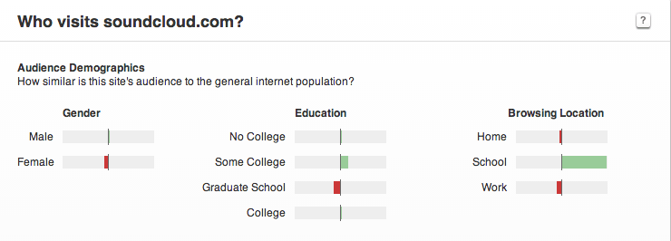 Screenshot taken 01/30/2014 of Alexa.com
The top referring sites and linking sites also provide further evidence that SoundCloud’s core audience is hip and trendy.
Ideally, the images on your landing page should be representative of your target market. But beyond that, sell the emotional value of the product or service your visitor will get after “conversion”.
Images can also be used to “hack” our natural viewing patterns, and direct our eyes where to look next by following some simple compositional rules.
Remember in the last section I said a viewer’s natural instinct is to look for a dominate headline when a page loads? That instinct is superseded the moment you introduce real people or “humanoids” into the mix.
![]() Image credit: The Conversation.com
Image credit: The Conversation.com
I always strongly recommending working with a professional to create any visual elements, and stay away from stock photos if you’ve got the budget.
But, if you must create your own photographs or use stock images, follow this tutorial by Practical E-Commerce and use the list of stock photographs on this page.
Recommended Reading:
- 7 Tips to Boost Your Conversion Rates Using Images
- 3 Ways to Boost Your Conversion Rate with Images
- Public Service Announcement: Image Sliders Kill Conversions
Notable Examples Of Images Effect On Web Viewing 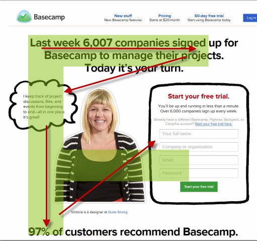 Image credit: CrazyEgg.com
 Screenshot taken 29/05/2014 of Chemistry.com
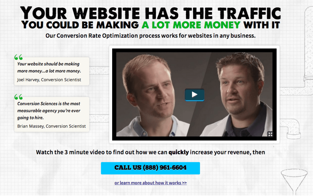 Screenshot taken 01/30/2014 of ConversionSciences.com
Step Seven – Should We Create an Explainer Video?
https://www.youtube.com/watch?v=CvYX_P_c__8&w=760&h=428
Do This: Ask if there is something unique about your service (or brand) that can’t easily be communicated with static text and images.
For Spotify – a streaming music service – it certainly makes sense to incorporate audio/visual elements to flesh out their value proposition.
For Brookdale – a community for senior citizens – sticking with video would have cost them $108,000 in monthly revenue.
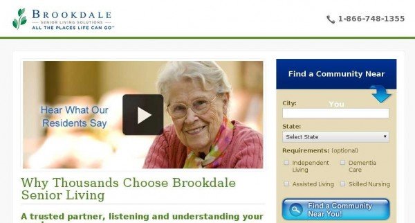 Image credit: VisualWebsiteOptimizer.com
While the statistics suggest visitors will be anywhere between 64-85% more likely to buy because of video, you have a few things to consider:
Can my target market watch video?
Your prospect’s immediate circumstances may dictate that video isn’t the optimal communication method.
For instance, if they work in a quiet office or are around noisy children videos may be forbidden or difficult to watch.
Age, poor internet connection, or outdated computer hardware may also impede your prospect’s ability to click play.
Explainer Videos Are Not Pitch Festivals.
Repeat after me: online videos are not television commercials.
TV commercials were designed to stop you and grab your attention between you switching from station to station.
With explainer videos, visitor’s chose to be on your channel. They click play because they want to see more. Be cool. Don’t pitch them to death.
How Will Video Enhance The Experience?
This goes back to my question from earlier, “What can video do that text and images can’t?” If you can’t answer this, wait to make your video.
For a company like Dollar Shave Club, the video showcases the brand’s humor to endear the visitor to what might be an otherwise dull premise – razors shipped to your door starting at a dollar a month.
[vimeo 66694260 w=760 h=428]
Unbounce, on the other hand, features Nemo – Director Of Growth from KissMetrics in a hybrid of explainer and video testimonial.
Nemo’s enthusiasm for Unbounce radiates as he walks you through the product’s core features. He also implies that Unbounce is partially responsible for the two to three times growth his team achieved – perfect for prospects who share Nemo’s “Growth” title and have to justify the monthly expense for their company.
If what you sell is difficult to understand, requires demonstration, or needs a little extra push so your target market “gets it”, video is an avenue worth exploring.
Also, always work with a professional when it comes to video. One great place to find great explainer video producers is Startup-Videos.com.
Recommended Reading:
- Everything You Need To Know About Creating Killer Explainer Videos
- 5 Dimensions of Rockstar B2B explainer videos
Examples of Awesome Explainer Videos:
[vimeo 78124534 w=760 h=428]
Step Eight – The Importance of Social Proof, Authority & Testimonials
 Image credit: Je Kemp, Used under license.
Do This: Create a social media listening dashboard to track mentions of your brand across the social web.
Next, use Open Site Explorer to find any of the high authority websites linking to your site. 
Screenshot taken on 01/30/2014 of OpenSiteExplorer.com
From here, reach out to the customers who most closely resemble your target market and the websites people within your market view as high authority.
This part is critical. There’s a psychological phenomenon known as implicit egoism, that basically says people gravitate to people, places, and things that reflect a favorable self-association.
The more your visitor sees “themselves” in the reviews and authority sites, the more receptive they will be to your page.
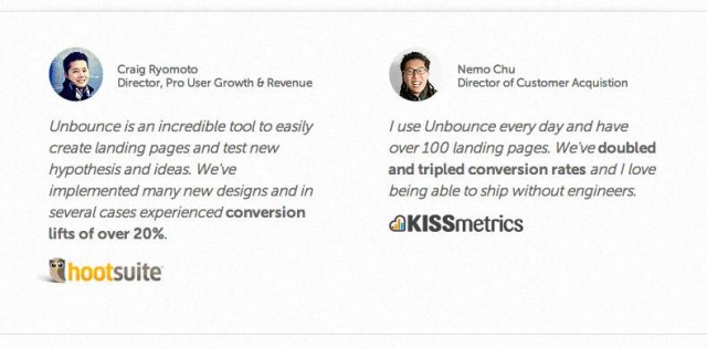 Screenshot taken on 01/30/2014 of UnBounce.com
Send emails asking permission to feature any images or logos along with their testimonial on your landing page.
Why go through all the trouble?
Research shows that businesses who increase their brand advocacy by 12% see an average of two times revenue growth.
It’s also been documented that 63% of consumers indicate being more likely to purchase from a site if it has product ratings and reviews.
Seems like a pretty big payout in exchange for setting up a few filters and sending a few emails, no? Recommended Reading:
- Cialdini’s 6 Principles of Persuasion
- 7 Things You Must Understand When Leveraging Social Proof In Your Marketing Efforts
Notable Examples of Social Proof: 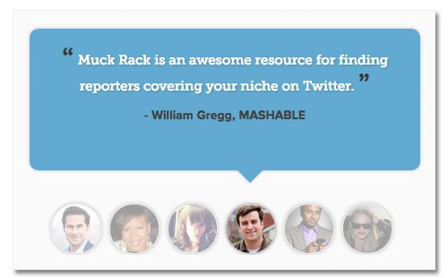 Screenshot taken on 01/30/2014 of Muckrack.com
 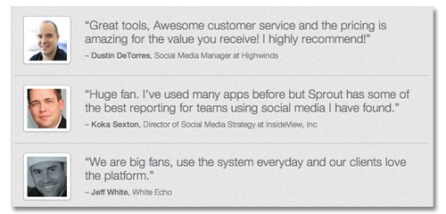 Screenshot taken on 01/30/2014 of SproutSocial.com
Step Nine – Does The Copywriting Make You Want To Read More?
Do This: Get four to six peers together to conduct a peer review for the headlines and leads on the landing page.
Ask the question, “Does this make me want to read more?” and rate gut level responses on a scale of one (low) to four(high). If the average score is below 3.2, get specific suggestions on what to change.
Now that your visitor’s been on your landing page for half a second, they’ve had all the time they need to process the visuals and decide if you’re trustworthy.
At this point, the conscious mind kicks in and users really start consuming the copy on the landing page.
Clearly you want the copy to communicate benefits, but if you want your visitor to sink their teeth in, reinforce the tone established by the visual elements on the landing page. It will resonate with your visitor in a way they can taste.
Why? Because science shows using language that teases the senses fires up the sense centers in the brain.
Want to sell a running shoe?
Make the sweat sting their eyes. Get their heart thumping so loud it’s all they hear besides their feet hitting the ground and the quiet voice whispering “You’re almost there”.
Recommended Reading:
- 5 Landing Page Headline Formulas You Can Test Today
- 10 Companies That Totally Nail Copywriting
- The 7 Point Checklist For Powerful Landing Page Copy
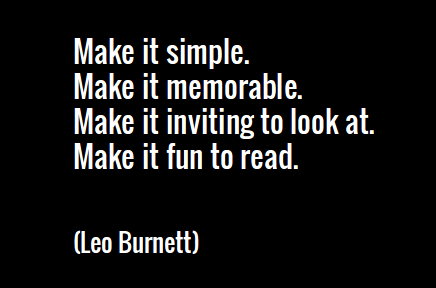 Image credit: Ott Niggulis, Used under license
Step Ten – Does Your Call To Action Communicate Clearly?
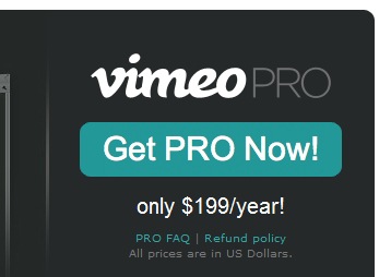 Screenshot taken on 01/30/2014 of Vimeo.com
Do This: Ask if your CTA (and surrounding area) clearly says what it does, triggers a response, and is designed in a way that contrasts with the rest of the site.
The way I see it, the entire landing page experience is just one big interactive story. Your visitor has a problem, searches, clicks, reads, and decides.
If you’ve been focusing on all the details of the story, your call to action is just a gate to the next chapter where whatever pain they were having doesn’t exist any more.
Recommended Reading:
- The Psychology of Color and Online Conversion
- How do Colors Affect Purchases?
- 5 Conversion Studies
Notable Examples: 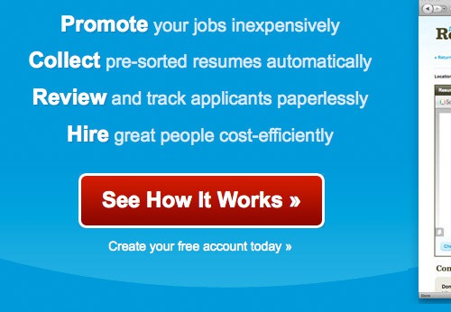 Screenshot taken on 01/30/2014 of TheResumator.com
  Screenshot taken on 01/30/2014 of Opera.com
Step 11 – Start A/B Testing
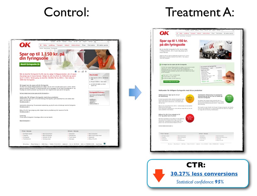
Image credit: ContentVerve.com
Do This: Create a document all of the alternative ideas you’ve had for copy, design, images etc. and form hypothesis as to why these may also work.
If this is your first time creating a landing page, you have two options:
- Build one page to test challenge the existing, low converting page, run it, collect data, and form a hypothesis on how to improve the desired metric after the test is complete.
- Build two equally strong pages targeting the same keyword, run them both, see which performs better, optimize the winning landing page accordingly.
In either scenario, all you’re really trying to do is collect enough data to validate your assumptions about your target market so you can formulate objectives, goals, and performance indicators for future tests.
For Example:
Objective: “Get more people to buy software”
Create a Goal: Insert (X) more descriptive copy to increase (Y) “Buy Now” clicks and (Z) reduce cart abandonment.
The reason you want to document your ideas is so you have a record of what you’ve tried that works and what has increased. Even though many of your ideas will wind up being wrong and get thrown out, it’s much better than forgetting good ideas that could have earned you more.
Recommended Reading:
- How Long Should I Run My Landing Page Test For?
- The Complete Guide To A/B Testing
- How We Improved Landing Page Conversion
Image credit: ConversionXL.com
Conclusion
So much of a visitor’s landing page experience happens in less than a second, so making the most of that time is crucial.
Think of your landing page as a way to tell the story of how your prospect’s life gets better, and use what you know about how the brain processes text and images to create a “hook” that gets them wanting more.
Landing page optimization is just a way to make the story better every time it’s told.
Featured Image Credit: Craig Garner, used under CC license





![AI Overviews: We Reverse-Engineered Them So You Don't Have To [+ What You Need To Do Next]](https://www.searchenginejournal.com/wp-content/uploads/2025/04/sidebar1x-455.png)