Yahoo Visual Timeline 1996-2006
Philipp Lessen has put together an interesting visual timeline of Google’s homepage and the expansion of its services at Google Blogoscoped with screen captures of archived Google.com pages in the Internet Archive’s Wayback Machine.
Building upon Philipp’s idea, which is as simple as it is unique, I thought that since Google was dominating so much search engine oriented news recently that it’s time to give a bit of attention to Yahoo.
Here is the visual screen capture timeline of Yahoo.com, from 1996 to 2006, via the Wayback Machine.
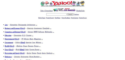
In 1996 Yahoo was built around a simple directory, news headlines, Add Your URL, Cool Sites, and Directory Search. Yahoo was also breaking into its Local direction with Yahoo Los Angeles launching. Notice that Yahoo’s core offerings; Local Business & Maps, News, Stocks, Search (in a directory capacity) and Sports have been around since the beginning.

1997 : Yahoo streamlines their directory, adds a more advanced search offering, stays cool, gets Yahoo Shopping started with Classifieds, and introduces My Yahoo! (very bottom of the page).
1998 is a bit more advanced with the showcased offerings of Yahoo Mail, Shopping, Personals, Chat, Yahoo Games and Yahoo Travel.
Partying like it’s 1999, Yahoo gets futuristic with the Yahoo Pager (beep beep) which works with Yahoo Chat – Yahoo Pager laid the grounds for Yahoo Messenger. Personalized My Yahoo! is more out in the open and front page advertising begins taking shape with the Marketplace. Selected news stories are also (and still) included on the right side info bar.
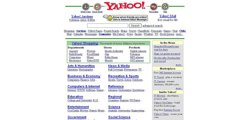
Yahoo grows up a bit in 2000 with the upgrade of Pager to Yahoo Messenger and a full featured Yahoo Shopping showcase outranking the directory.
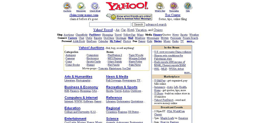
2001is not that different that 2002, with Yahoo Broadcast featured in the sidebar and Auctions showcased after the eBay boom.

2002 brings a facelift to Yahoo with a cleaner tab oriented site with enhanced personalization, Yahoo Launch featured, further enhanced search, Finance & Shopping added to the top buttons, Yahoo Mobile and Yahoo Stores.
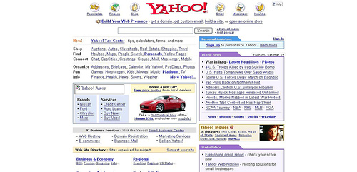
In 2003 Yahoo brings Yahoo Autos to the front and center along with Yahoo movies and Yahoo Business Services including hosting, domains and marketing.
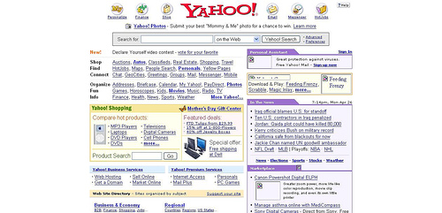
Yahoo 2004 shows a bit more detail with its listings and the addition of more product and advertiser images to its homepage. The search box is enhanced with a drop down menu of niche Yahoo Search offerings. Yahoo Games is getting more real estate on the homepage and Yahoo’s new version of Yahoo Photos gets users interested in storing their digital pics with Yahoo.com – who’d a thunk it?
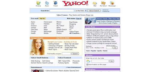
Yahoo 2005 shows a redux in clutter with a fallback similar to their 2002 design. Search is more front and center with a blue outline around the search box and more niche content is featured on the homepage in the Yahoo Health channel. Yahoo starts looking lke more of an informational source again than a roadside strip-mall.
Google’s influence on Yahoo is more evident in 2006 with the tabbed search box taking preference over the old drop down tool. Yahoo also begins marketing their Yahoo Answers user driven social media channel as an alternative to traditional web search. Other Yahoo channels are further simplified in the main site box, without much product features or advertising – a hint that users are finding what they are looking for via search and personalized services such as My Yahoo!
Yahoo’s New Homepage Design

And yes, in what is a total coincidence, Yahoo relaunched their homepage yesterday. Rand Fishkin, who alerted me to this instead of Yahoo (wink Yahoo Fleishman PR, wink!), spills the beans on SEOMoz (thanks Rand!):
My personal opinion – it looks good and functions pretty well. My eye is still accustomed to looking on the right hand side for news, so the ads there are certainly getting my attention (I’m sure eye-tracking studies came in handy for them). The piece that’s really off-putting for me is the “sign-in” to access services above the pink RAZR ad. The combination of those two is particularly unprofessional in its appearance.
The navigation bar on the left and the tabs inside the primary “news” section is quite good. It’s considerably more readable and scannable than MSN’s alternative. Nice work Yahoo! folks – I only hope the media starts paying as much attention to you as they do your competitor. It must be tough to be an “also-ran”.

