You don’t have to be in the biz to realize how important mobile usage has become. Almost everyone – 91% of adults to be exact – have a smartphone. And, a majority of these smartphone users are browsing the internet to “check-in” on a social media network, exchange emails, and just browse the internet. What does any of that have to do with retail? There’s a sale on eBay via a smartphone every 2 seconds. And, over the last couple of years, search queries and sales have been steadily increasing with mobile users. In 2011, for example, the retail industry had 10% search queries from mobile usage, it went up to 16% in 2012. In short, if you have a website, it better be compatible on a mobile device.
Mobile usage has become such a booming industry that earlier this year, Google began penalizing misconfigured mobile sites. That seems harsh, but Google realizes that if a mobile site isn’t properly functioning, a business can begin a countdown until they close up shop. If you want to thrive online, you need to have a stellar mobile presence. You don’t have to be a web designer to see how the following 10 websites’ terrible mobile design makes it hard to use from a consumer perspective.
10. YouTube
Perhaps Google should begin fixing YouTube before passing judgement on other sites. YouTube has a mobile app that works fine (sometimes). Did you ever notice that if you’re searching for a video on your smartphone, it’s not there? There’s some legal stuff, or something like that, behind that riddle. But, if a video is available on your desktop or laptop, shouldn’t be available on a mobile device?
9. Major League Baseball
One of the biggest problems with the Major League Baseball site is that the theme for each team is exactly the same. Sure. The site changes the logo and teams colors, but there’s nothing else to differentiate between teams. And, that’s not even getting into the bland and dull vibe of the mobile site.
8. Twitter
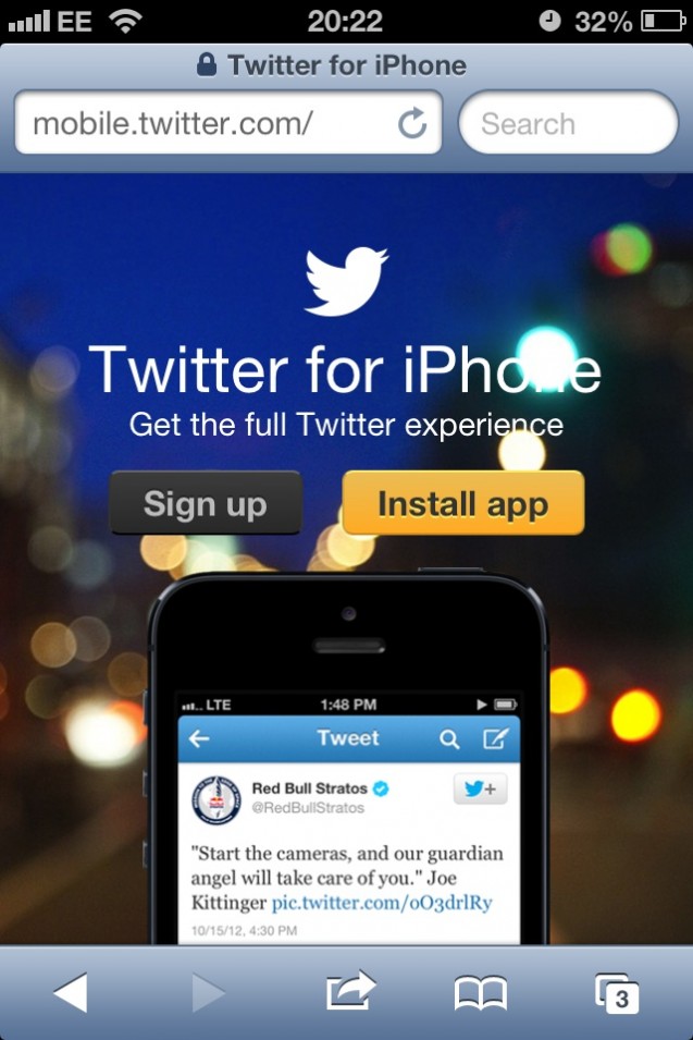
Why can’t you just sign in without downloading the app? Seriously.
7. Mile High Comics
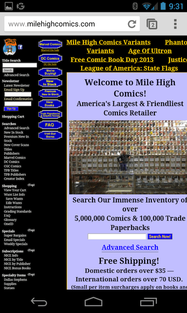
The horizontal layout looks utterly terrible on mobile devices. This is a big no-no – designers beware.
6. Brown Paper Tickets

Brown Paper Tickets is an excellent site if you’re looking for some local entertainment. The only problem is that mobile users have difficulties being able to purchase tickets on the mobile site. That kind of defeats the purpose of having an e-commerce site.
5. Kong Dog Toy Company
Another example of horrible horizontal scrolling. This time it’s when selecting which country you reside in. Not a very pleasant shopping experience if you’re mobile browsing.
4. Johns Hopkins
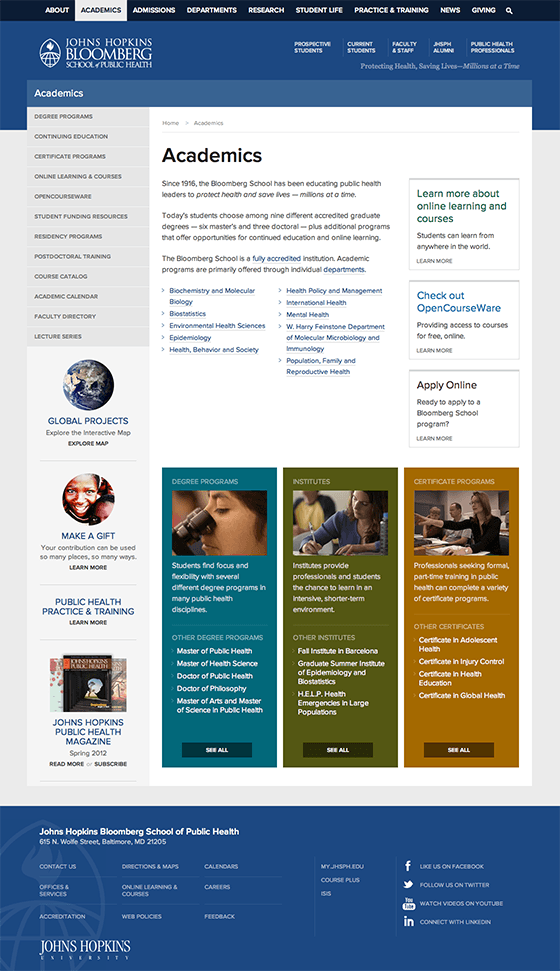 Fastspot LLC
You would have thought that with all the intelligent people at Johns Hopkins they could have hired a superior web designer. Instead, the mobile site is slow and unresponsive because there’s way too much data that a mobile device is trying to handle.
3. Arngren.net
Not only is this a terrible mobile site with an excessive amount of pictures, it’s probably one of the worst websites online.
2. Leoneck Hotel

Reisewebseiten Webkatalog
This hotel in Zurich, Switzerland looks amazing, but try to book a room on the mobile site. It’s almost impossible, probably because you can’t even zoom in on on the homepage. That makes it kinda difficult to navigate.
1. The Afterlife
We have no idea what the purpose of this site is supposed to be. But, we are certain that it’s one of the worst websites ever designed. When browsing the mobile site, you can’t even view all of the insane, drug-induced imagery. If you’re going to visit this terrible site, at least be able to get the full experience.
Which site do you think has the worst mobile site? If it’s not listed, please drop us a comment and share your thoughts.
Featured Image Credit: Wikipedia







![[SEO, PPC & Attribution] Unlocking The Power Of Offline Marketing In A Digital World](https://www.searchenginejournal.com/wp-content/uploads/2025/03/sidebar1x-534.png)