An idea for an A/B test can come from anywhere, but there’s nothing like a stack of case studies to inspire you to attack your own landing pages to see what you can accomplish.
Are you really happy with the conversions you’re getting from your pay-per-click campaigns, or can you squeeze out a little more lift?
Here are 11 landing page optimization case studies to get your neurons firing.
1. Dewalt (Black and Decker) Increases Conversion with Button Text Change
DeWalt is a well-known, trusted brand under the Black and Decker umbrella. The brand has a very distinct sales funnel with call-to-action buttons placed throughout the site that are integral to the purchase path of consumers.
DeWalt wanted to test various calls-to-action with the goal of driving more visitors to vendor landing pages and increasing the purchase of power tools.
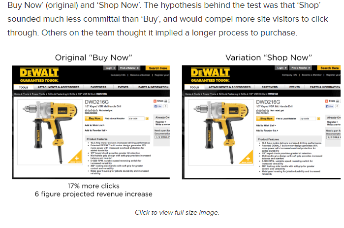
Through testing, DeWalt was able to prove that the original CTA “Buy Now” was the winning choice, as it drove 17% more people to click through to the vendor pages. When the company calculated the 12-month projection based on this percentage, it was a six-figure difference in revenue. (Full case study here)
The Takeaway
No matter the situation, small words count. Even a single word on a button (changing “shop” to “buy”) can have a significant impact on your success metrics.
2. SmartWool Sells More Socks with Old-Hat Techniques
SmartWool wanted to see what it could do to increase conversions on its product line, but the eCommerce pros at Blue Acorn were taken aback by the fact that the existing design was already beautiful and was already employing many eCommerce best practices in layout and product presentation, such as using larger images to emphasize certain products.
They agreed that going with a more uniform approach with consistent products might be the better route to increase average revenue per visitor.
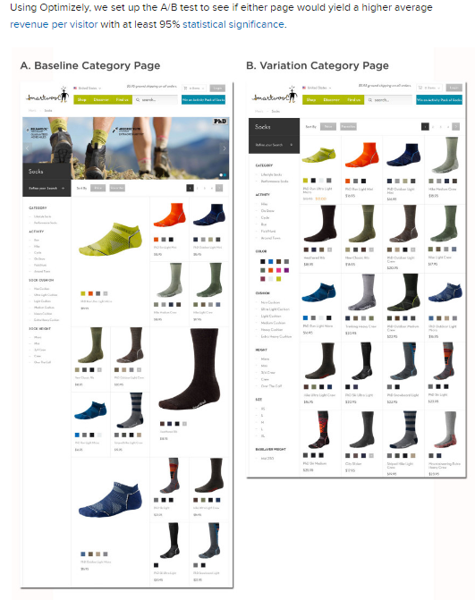
As a result, the variation yielded a 17.1% increase in average revenue per visitor over the course of 25,000 visits. (Full case study here)
The Takeaway
Larger product images might lead to more clicks on that specific product, but it never guarantees a complete checkout. More than likely, you’ll end up with people clicking on products that don’t necessarily match what they’re looking for.
3. Lifeproof Shows Why a CTA is a CTA
Lifeproof builds electronics cases designed to protect smartphones and tablets from extreme conditions – like when you pick up your iPhone, and instead of swiping to access it, you throw it 20 feet (we’ve all done this).
The first test variation the company performed on its site had a significant impact. The global navigation button at the top of the site simply read “Shop.” To test it, Lifeproof created two variations that read “Shop now” and “Store.”
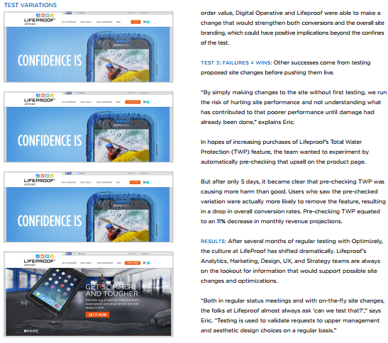
It was a small change, as many optimization adjustments often are, but, as a result, Lifeproof found that 12.8% people were likely to click on “Shop now,” which resulted in a 16% lift in monthly revenue projections. (Full case study here)
The Takeaway
A call-to-action is just what it implies – you’re telling a customer to take action. While you can use buttons with noun text and still see conversions, the best results come from a clear and concise direction that you want your customers to take.
4. VeggieTales Improves Customer Focus to Increase Site-Wide Revenue
VeggieTales is a widely-popular animated series for preschoolers in the U.S. VeggieTales’ desire was to systematically optimize the design of its online storefront to drive up the revenue per visitor and improve overall conversion rates throughout the site.
While changes were made throughout the website to various pages, one of the most notable improvements was with the checkout page. The original checkout page contained the same headers and footers as the rest of the site.
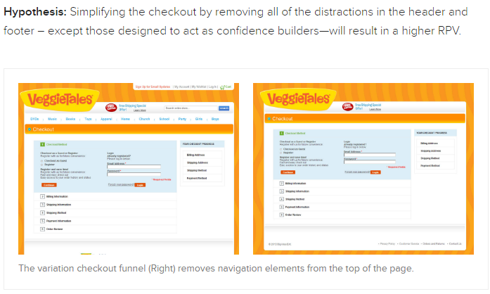
The navigation was removed, as well as search and contact functionality at the top of the checkout. This streamlined variation produced a 14.3% increase in revenue per visitor and a 42% increase in conversions. (Full case study here)
The Takeaway
When you’re dealing with a conversion point and you want your customers to take a specific action, remove as many distractions as you can and eliminate their ability to click away from the page.
5. Brookdale Living Discovers How to Better Engage Its Audience
Brookdale Senior Living offers community living situations for senior citizens. It was struggling with its original site design which featured a bare bones design (no graphics or testimonials to enhance trust with visitors).
The company created two landing page variations to test against its original home page – one featuring a photo of an elderly woman, and a second variation which housed a brief video in place of the image. Other than the change from image to video, all other elements remained the same.
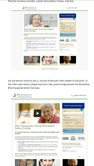
As a result, Brookdale found that the landing page with the image increased conversions by 3.92% (a $106,000 increase in revenue), while the video only increased conversions by .85% over the original. (Full case study here)
The Takeaway
When you have an established brand that your audience is familiar with, a long engagement tool like a video can serve as a distraction. You also need to take into account the target audience – older adults and the elderly may not want to wait for videos to load, or may have a slower internet connection that can be frustrating if they feel they have to wait for a video to get all the information.
Know your audience, and understand how they see and interact with your brand.
6. DMV.org Wants to Lessen Vehicle Owner Frustration
The DMV website is designed to provide useful information to simplify the DMV experience. More than 200 million visitors each year use it as an educational resource. The DMV earns on-site revenue when visitors purchase products like insurance through its partners.
Since the site only makes money when there’s a transaction, the DMV wanted to improve revenue per visitor.
In one test, DMV.org did A/B testing on opt-ins for insurance quotes:
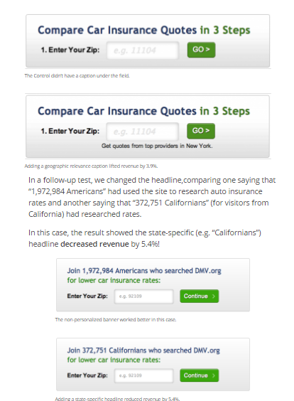
The result was a 14% lift in revenue across all content pages featuring that banner. (Full case study here)
The Takeaway
The first banner focused on convenience, counting the steps to get a rate quote. The improved version focused on what mattered more to car owners – getting the lowest rate. Knowing the pain points of your audience and the things that are on their mind can help you better position solutions to get them to convert.
7. BusinesSuites Goes Big with Changes
BusinesSuites is a provider of virtual offices. The company was faced with the challenge of not seeing the level of conversion from its landing pages that it had originally expected. This was troublesome because that’s where the majority of its traffic came from.
Rather than test small incremental changes over time, BusinesSuites opted to go for a massive redesign with its landing page. This included:
- Limited, more concise copy
- Fewer form fields
- Removing location-specific address listings
The results paid off. After a drastic redesign, BusinesSuites saw an 88% increase in conversions over the previous pages. (Full case study here)
The Takeaway
Sometimes you need to test something big and make a significant change. For smaller businesses, it’s sometimes the better route to go when you need a dramatic improvement in conversions.
8. AvidXchange Gains Insight on Sales Funnel Position
AvidXchange provides a solution for invoice and payment automation, and it has traditionally done well with internal marketing. However, its struggle was with gaining leads from PPC campaigns. AvidXchange took a multi-layered approach to optimizing and testing its landing page to change a number of elements.
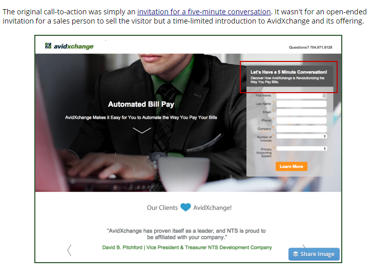
The surprising result was the customers who were funneling into the landing page were not end-stage customers, but rather early adopters interested in the service. This knowledge helped the company better position its campaigns and marketing materials, which resulted in a 79% decrease in cost per lead. (Full case study here)
The Takeaway
Sometimes what you’re serving to your customers and your expectations of conversion don’t match up with where they’re at in the sales funnel. Make sure you’re positioning your content appropriately, so you’re not expecting something customers aren’t ready to give.
9. 1-800-Dentist Improves Conversion with Single-Step Optimization
1-800-Dentist faced a challenge where its long-form process was broken into multiple stages with a high drop off in Step One. The problem was that Step One was all vital information, and nothing could be stripped away to reduce it.
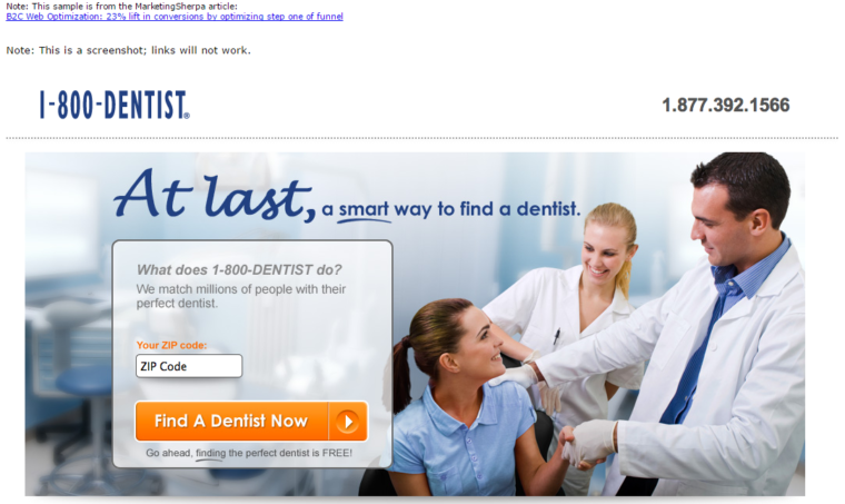
To reduce friction in Step One, the company kept only the single most significant field to match prospects with a dentist (zip code) and moved other vital forms into the next steps of the funnel. The result was a 23% boost in conversions in less than a week. (Full case study here)
The Takeaway
Make the entry point as simple as possible. By trimming the form fields for entry without eliminating them (moving them down the funnel), you can reduce friction that costs you conversions.
10. Ancestry.com Improves Conversion with Reduced Choices
Ancestry.com was using a single opt-in page for all of its target audience, no matter how they entered or from where. The company sought to optimize the existing page and create a template from which it could create more custom experiences for the user. This led Ancestry.com to test various button sizes, placement of the CTA versus placement of pricing, placement of imagery, and the reduction of package options down to one choice.
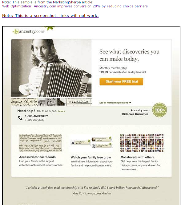
As a result, Ancestry.com was able to lift conversions by 20%. (Full case study here)
The Takeaway
This is another case where you’re reducing friction with your audience. When you give multiple package options, the prospect has to decide, research, and take pause. With just one package option, there’s just no choice – buy, or not. It works.
11. MarketingSherpa Improves Conversion During Live A/B Test
At Optimization Summit 2013 in Boston, MarketingSherpa teamed up with Hoover’s to run a live split test for an audience. The team chose a product page and created a variety of change recommendations including headlines, call to action, and changes to the product column.
Overall, the changes were designed to simplify the layout and improve messaging.
The audience then voted in teams on the changes before they were implemented. About 24 hours after launching, the treatment outperformed the control with an 8.1% increase in conversions. (Full case study here)
The Takeaway
Stripping away distractions and putting an emphasis on value messaging (the benefit statements) helps the audience understand how they can benefit – personally – from what you’re selling. It’s the only way they can experience the product if they can’t hold it in their hands.
Which conversion optimization case study caught your attention? Share your thoughts in the comments below.
Image Credits
Featured Image: Jens Kreuter/Unsplash.com
All screenshots by Andrew Raso. Taken May 2016.



![AI Overviews: We Reverse-Engineered Them So You Don't Have To [+ What You Need To Do Next]](https://www.searchenginejournal.com/wp-content/uploads/2025/04/sidebar1x-455.png)