You’ve spent a fortune on your new e-commerce website, but only a few of your visitors even find the right product, let alone buy something. Mistakes that look like minor issues can have a cumulative effect and lead to poor conversion rates and major profit loss. In this article, I’ll go through some common problems so that you can get the most sales out of your B2C e-commerce website’s traffic.
1. Not Using Filters or Not Using Them Correctly
If you are looking to buy a new dog collar, you probably already have a few criteria, like price, size, color, material, etc. Not all collars are the same, though – you might want to buy a small one for a Chihuahua or a big one for a Great Dane. You might have a budget, and you might want a color that matches your favorite bag.
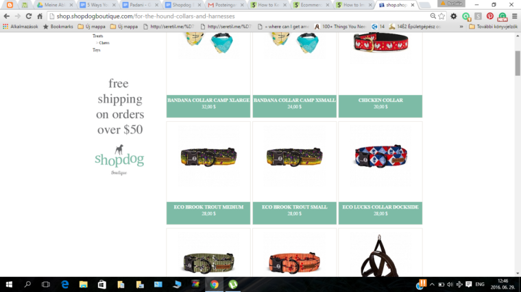
If you were shopping on ShopDogBoutique.com, you wouldn’t be able to narrow down your options in the Collars & Harnesses category. They just give you an unsorted, unfiltered (see the difference between sorting and filtering ) list of different collars and harnesses. (Bigger sites may also benefit from SEJ’s tips for success with e-commerce search.)
You need to go through all the pages in this category to find the cheapest option, or to discover that they don’t sell leather collars. You can’t filter by size, and most of the time you can’t even find information about the size on the product description page either. So you should just hope that your new harness will fit your Great Dane. As you can imagine, most customers don’t take the risk of buying the wrong product.
Without filters, the customers have difficulty finding the right product and instead of going through all the pages in a category, they might just go somewhere else. Conversely, you can see how navigation that helps narrow down choices helps both with conversion and SEO, as seen in this conversion video review for Skechers.
2. Adding Unnecessary Steps to the Process
The more steps customers need to take in order to buy a product, the less likely they will eventually buy it. (That’s what explains the popularity of this extension for Magento.)
Visitors don’t want to register, don’t want to give their credit card number, don’t want to take a million little steps before and after adding the product to cart – they just want to buy it. Hurdles belong on the path of track-and-field runners, not on your small (or big!) e-commerce store.
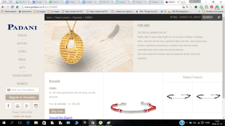
An extreme example we found is the website for Padani’s Jewelry. You just can’t buy the items directly – you can only request a quote, and they will contact you.
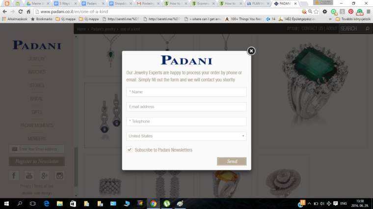 Padani’s site follows the general approach of most e-commerce shops. But then the purchase process requires you to contact them. Not very self-serve…
Many customers don’t want to be bothered by a sales rep or deal with a pushy pitch. They will just go to another store, where they can buy directly.
GoCardless had the same issues. Their customers had to request a personal phone call to get information about their product. When Shout Agency changed the approach to offering a recorded demo, they increased GoCardless’ conversion by 139%.
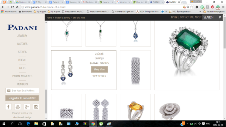
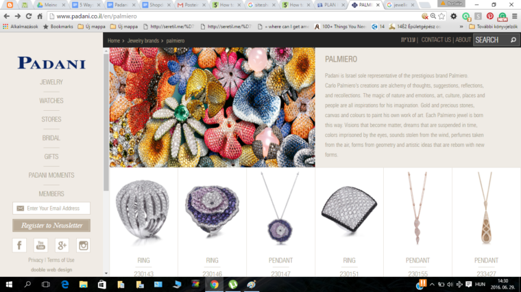
On the other hand, we can find positive elements in Padani’s buying process. You can request a quote directly from the category page, not just from the product description page. If you move your cursor over the picture of the desired product, it reveals the ‘“Buy item” button. In situations where you know that you want an item, this indeed speeds up the buying process.
Another thing Padani does well: you don’t have to register before requesting a quote, unlike many e-commerce stores.
3. Displaying Products That are Not for Sale
It seems obvious, but it’s surprisingly not: only display products you actually sell. I don’t mean out-of-stock products (we covered inventory-driven pogo sticking problems for e-commerce here). I mean that you shouldn’t display items that are not available now and have never been (i.e. it’s not just a temporary out-of-stock issue).
For example, on Padani’s website, you can see pictures of items that don’t even have a product category page. You can not find these colorful flower-shaped jewelry pieces anywhere on the website!
Padani probably just figured they were making a pretty page, but didn’t realize that people would click the product pics in the header. This is why I always encourage e-commerce stores to regularly run usability tests. That’s the sort of thing you can find out through usability testing, even very cheap, crowdsourced usability testing.
4. Unclear Category Labels
Suppose you’re trying to buy a leash for your dog. Your eyes quickly scan through the category list of Shopdog Boutique, but you don’t see any leash there. You click on “Collars & Harnesses” as this sounds like the closest category to what you are looking for. You still don’t find a leash, nor even a link to the category that has leashes.
So where are the leashes? The leashes are actually on the category page called “On-The-Go.” Unless you built the site, though, it’s not obvious at all. Once you’ve figured it out, you can see where the idea came from: the category has harnesses, LED spotlights, and other types of products for when you’re on the go – not just leashes.
Nevertheless, this labeling makes finding your desired product harder. The problem is that the rest of the categories are organized around product types, not use case scenarios. So it’s not expected there near other labels like “Collars and Harnesses.”
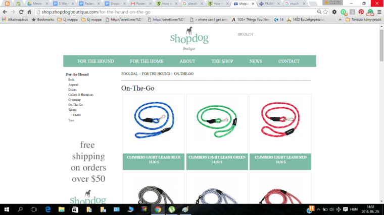 The On The Go category is where you’d need to go to find leashes. Not quite intuitive given the rest of the information architecture is based on product types rather than use scenarios.
(Use case scenarios can also be a valid way to organize your navigation. And they can be very helpful for upselling and increasing average order size through bundling. Besides “On The Go,” imagine various doggy bath products for a “bathtime” category, or books, teddies, and crib accessories in a “bedtime” category on a baby products site.)
Padani makes the same mistake of not creating clear categories.
Their “Gifts – For Her” category offers us gifts for “the special moments in life”, like birthdays, weddings, army recruitment, etc. However, except for a few items, it’s unclear what specific occasions they are meant for, making you question whether you’re on the right page. “Is this really gifts for her/ her special occasions?” If this is ‘gifts for special occasions,’ shouldn’t it be clearer what gift is for what occasion?
To make matters worse, items that do fit into these categories are not listed. For example, many of their rings are not included in the engagement nor in the wedding sections, even though they are suitable for these occasions.
Summary
An e-commerce website can miss out on conversions by making it too challenging for visitors to find the right product, or just to buy it. This can be due to difficulty in narrowing choices or navigating choices, and of course due to excess friction as well. By putting yourself in the customer’s shoes, and seeing what questions they need to ask to find the right product, you can achieve higher add-to-cart conversion rates.
Image Credits
Featured Image: maxxyustas/DepositPhotos.com
Screenshots by Gab Goldenberg. Taken July 2016.




![AI Overviews: We Reverse-Engineered Them So You Don't Have To [+ What You Need To Do Next]](https://www.searchenginejournal.com/wp-content/uploads/2025/04/sidebar1x-455.png)