The checkout stage is crucial when it comes to driving conversions.
Your shoppers have come all that way in the conversion funnel, and you need to make sure you close the sale.
But getting customers to the checkout page doesn’t necessarily assure conversions.
In fact, many of your potential customers may end up abandoning their carts after viewing the checkout page, or going through a few stages of checkout.
The Baymard Institute even found that, on average, online retailers experience a cart abandonment rate of almost 70 percent. This drastic cart abandonment may be because customers simply changed their minds. Or it could be all of the mistakes retailers are making at checkout that are driving away valuable customers.

The same Baymard Institute study decided to take a further look into what these mistakes could be.
What are retailers doing wrong at checkout that’s compelling their shoppers to abandon their carts?
Let’s take a look at some of the top checkout disasters that can destroy your conversion rates, and how to avoid them.
1. Only Displaying Extra Costs at Checkout
According to the previously-cited study, the top reason why people abandon their shopping carts is because the extra costs displayed at checkout are too high. In the study, 61 percent of respondents said they abandon a purchase because of the extra costs being too high.
These extra costs could be shipping charges, taxes, or other fees that the shopper wasn’t aware of previously. Retailers could have easily prevented this by being more transparent about the extra charges customers might have to pay before they even get to the checkout page.
This means instead of displaying the extra costs only when shoppers get to the checkout page, you need to start giving shoppers an option to calculate shipping charges and other fees beforehand.
Innisfree, for example, gives shoppers an option to calculate the shipping cost while they’re still on the product page.
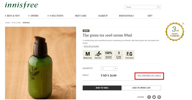
Because the website ships worldwide, Innisfree has added an option to view a shipping fee table. So shoppers can view the estimated shipping cost based on which country the order will be shipped to.
Innisfree is transparent about the possible shipping charges based on the shipping method chosen and the weight of the package as well:

By maintaining transparency about extra charges before customers add an item to their shopping bag, you can prevent many of them from changing their minds. Once they click on the “Buy Now” button, they will be doing so after they’ve made a decision to pay for those extra charges.
When you only display these extra charges at checkout, there’s a good chance many of your shoppers will change their minds. And it won’t just be because they think the charges are too high but because they find the maneuver deceptive. The lack of transparency is likely to cause them to avoid buying products that they really like or need.
Ideally, you should provide your customers with free shipping but that’s not always viable especially when you ship worldwide. But you could set a free shipping threshold in which the order amount has to be of a certain price before it can qualify for free shipping. If neither of these options is viable for you, you can always use the transparency technique as mentioned above.
2. Compulsory Account Creation
The second most common reason why people abandon their shopping carts is because the site required them to create an account to complete their purchase. In the Baymard Institute study, 35 percent of respondents chose compulsory account creation as the reason why they abandon their carts.
Making it mandatory for shoppers to create an account could be a hassle for them. And it could distract them from the main goal, which is to get them to convert.
Some websites even require shoppers to verify their email addresses after creating an account. This just adds too many unnecessary steps to the checkout process and could result in cart abandonment.
If you wish to drive higher conversion rates you need to introduce a guest checkout option. This makes it easier for new customers to complete their purchases without necessarily creating an account.
Macy’s provides a guest checkout option to their shoppers:

But for some businesses, guest checkout may not be a good option. For instance, guest checkout may not be the best idea if it’s a hassle for your business to initiate returns, exchanges, and refunds without an account.
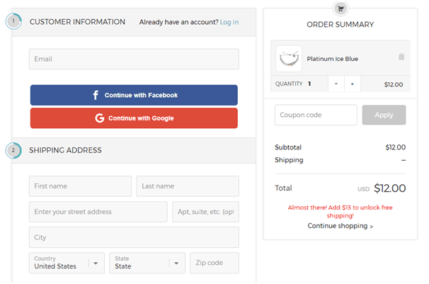
So even if it’s absolutely necessary for you to make account creation compulsory, at least give shoppers the option to sign up using their social media accounts. This way they can easily create a new account at the click of a button.
Pura Vida Bracelets provides shoppers such a social media sign-up option:
3. Complicated/Lengthy Checkout Process
Just like shoppers dislike having to create a new account to complete their purchases, they also dislike going through a complicated or lengthy checkout process. According to the Baymard Institute, 27 percent of respondents in their survey admitted to abandoning their cart due to this reason.
Compulsory account creation would also fall under the scope of a lengthy checkout process. But since it’s one of the major mistakes, it needed to be more elaborate.
There are several other aspects of the checkout that could make it too long or complicated for shoppers.
For example, they may have to go through multiple pages after clicking on the “Buy Now” button. After adding the item to cart, they’re taken to their cart to view the items in the cart. And then they have to click on “Checkout” to go to the actual checkout page, where they’re greeted with a signup form with multiple form fields.
It’s exhausting to even think about it.
So you can just imagine how frustrated your customers might be when they want to buy something quickly and they have to go through all those steps before they can even start entering their payment information.
Your goal is to ensure that customers have a pleasant experience transacting with your site. So reduce the steps required during checkout.
Bershka does a great job of reducing these steps by giving shoppers the option to either see their shopping cart or checkout directly once they add an item to the cart. If they select “Process Your Order Now,” they get taken directly to the checkout page, where they either sign up, sign in, or checkout as guest:

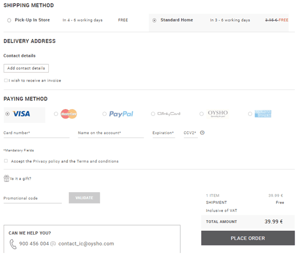
Ideally, you should have a one-page checkout where customers can enter all their details on a single page. Then they won’t have to go through multiple pages to complete their purchase.
Oysho enables shoppers to enter all their information through one checkout page:
But even if this isn’t possible, make sure you have a progress indicator that will show them exactly how many steps they have to go through to complete the purchase. If you make it clear to them that they only need to complete a few critical steps then they might not get too frustrated with all the steps involved.
Pullandbear has a clear progress indicator, where they display the stage the shopper is in during checkout. As you can see in the screenshot below, the customer only has to complete the stages of reviewing their cart, entering the shipping information, and then making their payment.

And, of course, make sure you reduce the number of form fields to only collect the information that you absolutely need – shipping and payment info. You can also reduce the number of form fields by consolidating the customer’s name fields into one instead of having separate fields for first name and last name.
Some websites, like Ulta, have even gone so far as to offer a PayPal checkout option:

This makes the checkout process faster and smoother, allowing shoppers to quickly pay for their orders and minimize the number of steps required.
4. Lack of Trust Seals
Trust is an important factor when making online purchases. You’ll hardly find consumers buying products from a brand or business they don’t trust.
But even if shoppers trust your business, they might still be hesitant about entering their banking and personal details on your website. In fact, 18 percent of respondents in the Baymard Institute study abandoned their shopping carts because they didn’t trust the website with their payment information.
Even if your site already has an SSL certificate and the information customers share with you is secure, they may not be too assured unless they can see some seals or symbols they trust. To reduce customer anxiety and assure them that their payment information will be safe with you, you need to add some trust symbols and/or guarantee statements on your checkout page.
This will increase their perceived security even if they don’t have a full understanding of how these trust seals ensure better security on e-commerce site. In some cases, adding trust seals have resulted in a 14 percent increase in conversion rate.
According to another Baymard Institute study, some of the most trusted security seals are, in order:
- Norton
- McAfee
- TRUSTe
- BBB
- Thawte
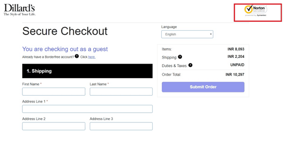
Dillard’s displays a Norton security seal in the checkout page, giving assurance to shoppers that whatever information they enter is secure.
Pura Vida Bracelets displays a TRUSTe security seal toward the bottom of the checkout page as you can see in the screenshot below.

5. Lack of Multiple Payment Methods
You could lose a lot of shoppers at the checkout page if you don’t provide them with multiple payment options. This is especially crucial if you ship to different countries as you have to ensure that every customer can make a payment with what’s the most convenient for them.
The Baymard Institute study found that 8 percent of respondents abandoned their shopping carts because there weren’t enough payment methods.
Even if credit card is commonly used in the U.S., shoppers in other countries may not even have a credit card or may prefer other payment methods.
Chinese shoppers, for instance, highly prefer eWallets and online bank transfers while Russian shoppers use debit cards almost as much as they do credit cards. And 60 percent of millennials in Germany prefer to use PayPal for their online purchases.
Worldpay even predicts that, due to the fast growth of eWallets, they will overtake credit cards as the most used online payment method by 2019. So you can’t just rely on credit card payments if you wish to drive more conversions to your site.
Provide your customers with multiple options of payment methods so they can easily select which is the most convenient for them. Give them the option to use debit cards, PayPal, Apple Pay, Google Wallet, etc. to cater to the varying needs of your customers.
Let’s take another example from innisfreeworld.com, which provides a wide range of payment methods for their customers. Not only can shoppers use credit cards and PayPal, they can also use eWallets like Tenpay and WeChat Wallet, which are popular in China and several other Asian countries.

Hanacure.com/ combines this tactic with the easy checkout tactic and gives customers an option to checkout directly using PayPal or Amazon Pay instead of following the usual checkout process.

Conclusion
These are five of the drastic checkout mistakes that can destroy your conversion rate. And you have a clear idea how to tackle each of these issues.
The main idea behind all of these tactics is to ensure shoppers have a pleasant experience shopping on your site and smoothly complete their checkout. Your focus should be on the wants and needs of your customers, striving to provide them with increased convenience when they shop with you.
More E-Commerce Marketing Resources Here:
- 15 Must-Have Features for E-commerce Sites
- 9 Technologies E-Commerce Marketers Must Use in 2017 and Beyond
- 10 Point Checklist: Is Your E-Commerce Business Ready for Cyber Monday?
Image Credits
Screenshots by Shane Barker. Taken on September 2017

