Why is it, with an abundance of data, digital marketers are still throwing spaghetti on the wall to see what sticks?
SEO and marketing professionals tend to focus so much on making the magic happen in that last mile.
Yet when it comes to the foundational stages, many of them are still looking at sessions, time on page, and total conversions.
To better inform your marketing strategy, you need to understand your customer.
To better understand your customer, you need to optimize your use of Google Analytics.
There were a few rules I held myself to when writing an article that would center data in digital marketing strategies:
- Valuable insights only – it has to save on spend and increase conversions.
- Simplified steps – no advanced knowledge of analytics needed.
- No additional code required – all reports are accessible within Google Analytics, right now.
Here are six ways to use Google Analytics that you haven’t thought of, but should start doing today.
1. Multi-Channel Conversion Paths
One of the pitfalls with reporting on conversions is that Google Analytics uses last click attribution.
Conversion data alone is not helpful considering the path a user takes to get there is often multiple touchpoints over a period of time.
For example, a customer “Jane,” finds your site through an organic search and she returns one week later by clicking over from a social network.
The next day, Jane comes back a third time via an email campaign, and a few hours later returns directly to complete a contact form or make a purchase.
Given Google Analytics’ last-click model, Jane is recorded as a conversion for the direct/none traffic source.
Attributing Jane’s conversion to the direct traffic source is not an accurate portrayal, as it was a series of touchpoints that worked together over a period of time that led to the conversion.
You can see this path to conversion using the Multi-Channel Funnels Top Conversion Paths report.
The MCF report allows you to see how the marketing channels support each other along a user’s path to conversion.
Visualizing this data allows us to see how SEO, PPC, and other efforts play into the larger digital marketing mix in order to understand (and convey) their full value.
5 Steps to Setting Up the MCF Report
- Sign in to Google Analytics.
- Navigate to Conversions icon (
 ).
). - Click Multi-Channel Funnels.
- Select Top Conversion Paths.
- Set up advanced segmentation.
Where to Find the Top Conversion Paths Report
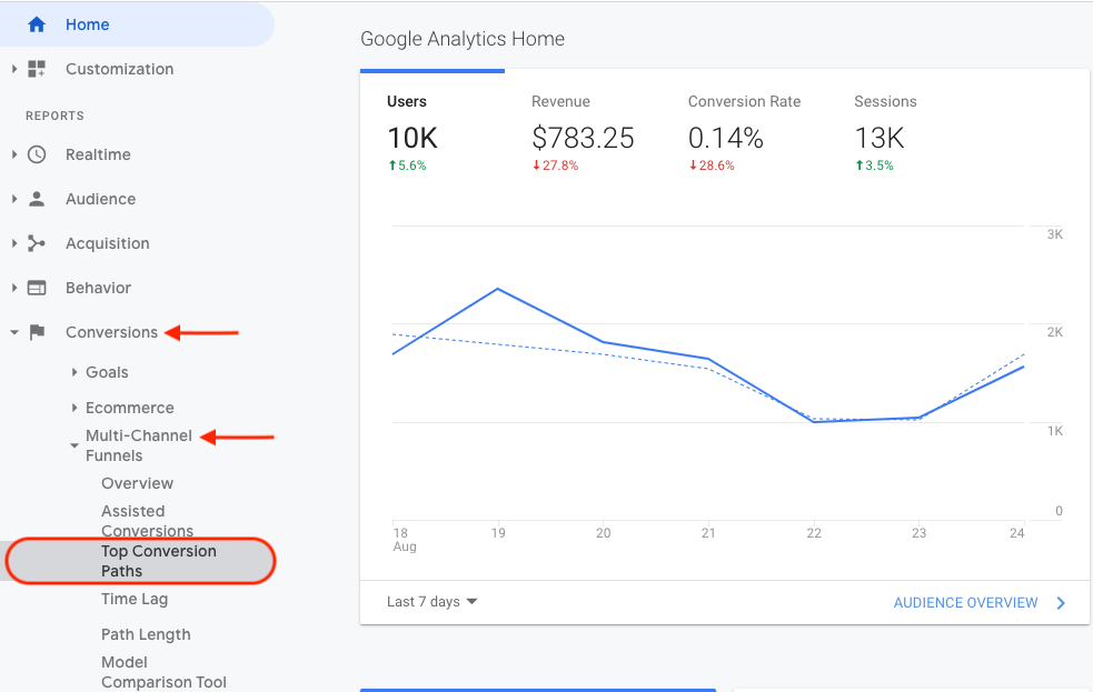
Looking through the report you will begin to notice patterns.
These patterns help in understanding where to allocate funds to improve conversions.
Note: The MCF report is set by default to channel grouping.
I encourage you to tailor this view to each company by selecting the desired conversion, filtering to a specific medium, editing the primary dimension, and adding a secondary dimension, like landing page URL.
2. Comparing Traffic Sources & Conversions by Market
After analyzing the MCF reports you will have a fairly solid understanding of how the different marketing channels work together towards a conversion.
Now, what if you are playing in multiple markets?
International audiences, for example, behave differently per market so you can not have the same blanket marketing plan across all countries.
You will need to compare traffic sources and conversions per country (or city – if you’re national) to help make decisions regarding where to best allocate resources by traffic source and market.
This is possible with advanced segmentation in the Goal Flow report available in Google Analytics.
6 Steps to Set up Advanced Segmentation in the Goal Flow Report
- Sign in to Google Analytics.
- Navigate to the Conversions icon (
 ).
). - Click Goals.
- Click Goal Flow.
- Set the report segment to the country (region or city) you are analyzing.
- Set the report filter to source/medium (or channel grouping).
Where to Find the Goal Flow Report
a
How to Read the Goal Flow Report
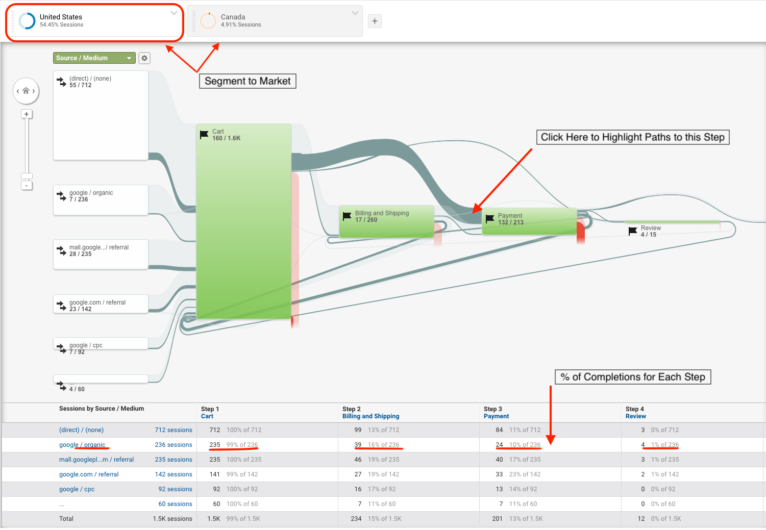
Now you can see the percent of completions for each step along the path to conversion, relative to the traffic source per market.
3. Retention & Acquisition
So far insights have focused primarily on users that lead to a conversion.
What if you could examine the point at which users tend to disengage?
Yes, I am talking about the ability to examine the point at which a group of new users begins to initiate fewer sessions, viewing less pages, or generating less revenue.
Learn when to re-engage users for retention, right now, in the Cohort Analysis report.
5 Steps to Viewing the Cohort Analysis Report
- Sign in to Google Analytics.
- Navigate to the Audience icon (
 ).
). - Select Cohort Analysis.
- Set Dimensions.
- Set Metrics.
Where to Find the Cohort Analysis Report
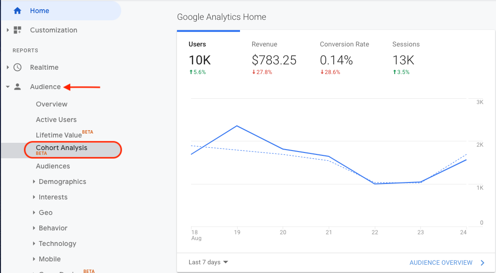
Cohort Analysis Report Set Up
This is where it gets really fun.
Configuring the report is how you build your cohort, or group of users, to analyze.
Dimensions available to select:
- Cohort Type: Acquisition Date is the only currently available option.
- Cohort Size: Time frame that determines the size of each cohort (day, week, month).
There are multiple metrics available to filter how you view and use the data.
For example, your third quarter data is showing an increase in transactions, this is great news.
What would happen if you were to examine the weekly cohorts per market during this period?
How to Read the Cohort Analysis Report
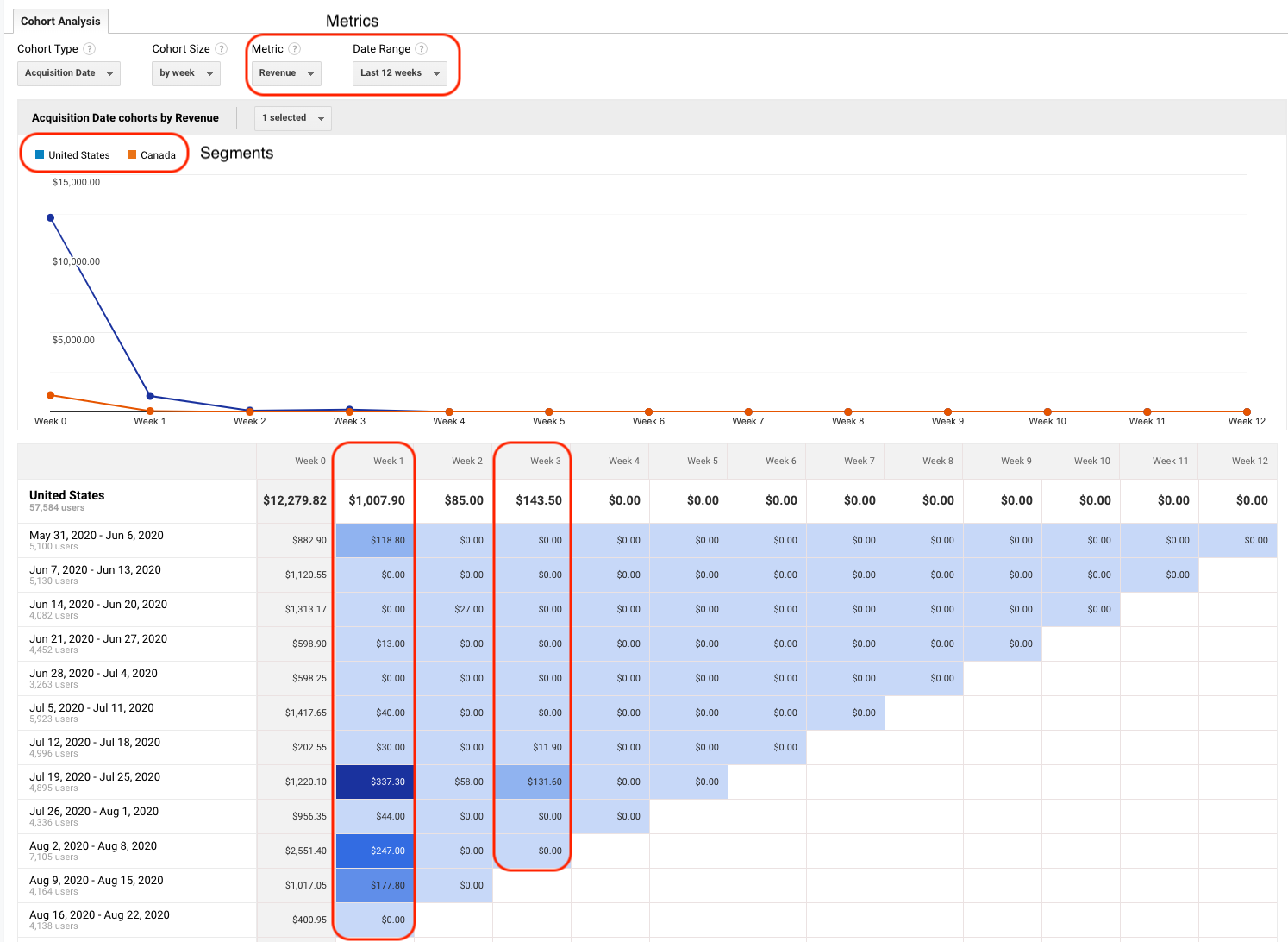
In the cohort analysis report, you may see that while transactions increased overall, revenue declines in Week 1 after acquisition and drops off dramatically in Week 3.
Now you know exactly when to re-engage users (Week 1) in order to improve the performance.
To retain those customers you may set up an email campaign that offers a discount in Week 1 or advertise new products that have been added since their last session in Week 3.
If you are unable to recapture the lost customers, you will know that in order to maintain the level of growth you want, the company needs to acquire new users every 3 weeks.
Note for national and international accounts, don’t forget to segment by market.
4. Measure Flash Sale Success
With the holiday season approaching, you can use the same cohort analysis report to understand the buying behavior of new customers per holiday sale campaign.
When analyzing short-term marketing efforts, like holiday sales, you will be comparing metrics like “Revenue per User” and “Transactions per User.”
By isolating this cohort you can learn how revenue per new user compares across the dates each holiday campaign ran.
To configure the Cohort Analysis report for short-term marketing analysis, dimensions and metrics should be as follows:
- Segment: Market
- Cohort Type: Acquisition Date.
- Cohort Size: By Day.
- Metric: Revenue per User or Transaction per User.
- Date Range: Select Date Range of flash sales.
Cohort Analysis Report for Short-Term Marketing Efforts
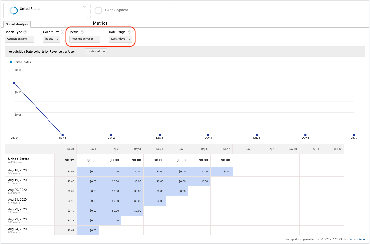
Example
Julie’s company is running a holiday flash sale and shares one sale code via an Instagram advertisement on November 15, 2020.
The following week Julie’s affiliates share a special discount to their audiences.
While UTM tracking will tell us the total revenue generated per holiday sale – cohort analysis will tell us the value of the new users generated from the flash sales.
November 15, 2020 a sale of 30% off was advertised on Instagram.
You might find that revenue per new user was $100.
November 15, 2020 a sale of 15% off was advertised through Instagram influencers.
You might see that revenue per new user was $250.00
This provides important insight into how to best allocate resources for upcoming flash sales.
5. Conversion Probability
One of the most exciting parts of Google Analytics is the ability to use machine learning to see what affects customers’ likelihood to convert.
Gathering insights from historic audience interactions enables marketers to make advertisements and website content more relevant.
Using the same data modeling that is used in Smart Lists and Smart Goals, Google Analytics is able to calculate a user’s likelihood to convert over the next 30 days.
Users are assigned a probability score ranging from a low probability of 1 to a high probability of 100.
To calculate conversion probability, Google Analytics needs a few pieces in place:
- Ecommerce tracking must be implemented.
- Ecom must generate 1,000+ transactions per month.
- Once past the 1k/month mark Analytics will need 30 days of data to model.
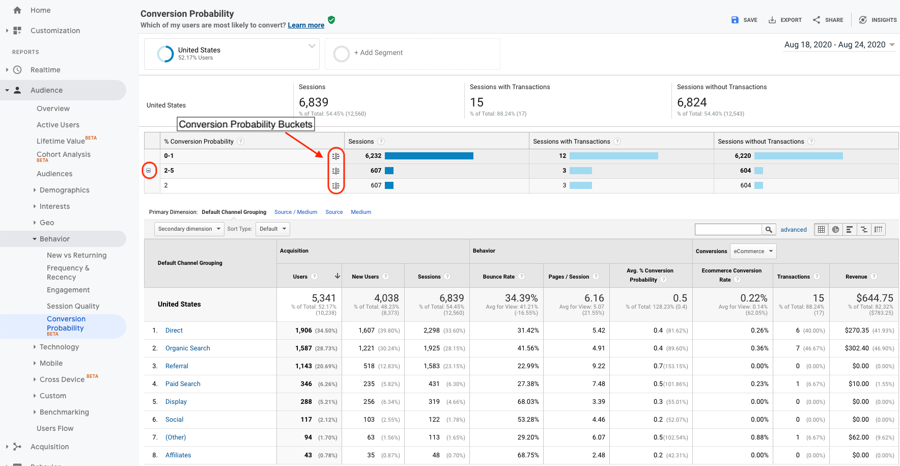
The Conversion Probability report enables you to create traffic segments built from the conversion-probability buckets and apply those segments to your reports.
Applying conversion probability segments to Analytics reports allows you to answer questions such as:
- Which channels deliver the most likely converters?
- Which conversion path is the most effective?
- Does it make sense to reduce budget for the campaigns (or keywords) that are the least likely to convert?
10 Steps to Harnessing the Power of Conversion Probability:
- Open Google Analytics.
- Select Audience (
 ).
). - Select Behavior.
- Select Conversion Probability.
- Open Conversion Probability Report.
- Click the icon to the far right within the % conversion probability bucket.
- Name the conversion probability segments.
- Enable the view that needs the segment available.
- Click “Create Segment”.
- Apply to your reports.
Where to Find the Conversion Probability Report
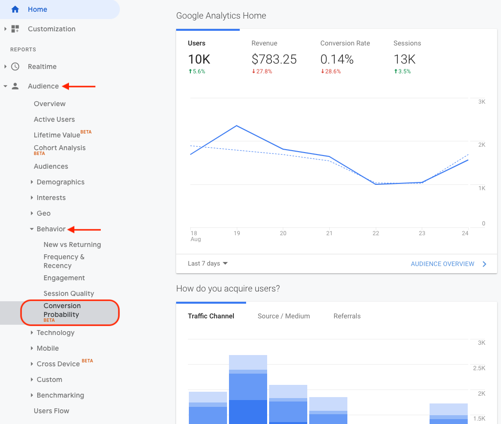
How to Set Probability Bucket Segments
6. Custom Google Analytics Dashboard
At this point, you can see that the customer journey is written in data and every touchpoint adds even more volume to the pool of information.
There are two hurdles when handling this amount of data:
- It is difficult to make sense of it all and costly to organize.
- Marketing companies are siloed and not enough people have access.
When innovative developers want to explore new website structures, they need data to make the case to upper management.
Or, when marketers want to create case studies to showcase capabilities, they need data to share and define success.
One way to break through these barriers is to enable access to data and provide the necessary training on how to use it.
Google Analytics comes with a standard default dashboard that provides basic insights as to how many web visits, how many pages visited, and how many accumulative conversions.
While the default Dashboard is a solid starting point, the true value of Google Analytics lies within the ability to visualize the answers to your company’s most important questions.
Finding and extracting this data is extremely time-consuming and often an overwhelming task.
How many hours each month does your team spend creating monthly reports and preparing for meetings?
There is a more cost-effective answer to this drain on company resources.
Invest in a customized Analytics (or Data Studio but that’s another article) dashboard, that displays only the metrics you need.
Everything you want to see and nothing you don’t, all in one place, saving hours (and copious amounts of sanity) month-over-month.
You can even share the dashboard with others within your organization to replicate, making reporting even easier.
5 Steps to an Actionable Google Analytics Dashboard
- Sign in to Google Analytics.
- Navigate to the Customization icon (
 ).
). - Click Dashboards.
- Click Create.
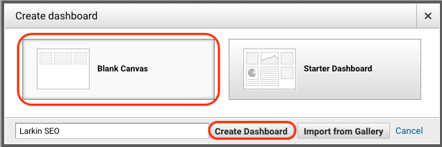
- In the Create Dashboard, select:
- Blank Canvas – no widgets.
- Starter Dashboard – default set of widgets.
- Import a prebuilt Dashboard from the Solutions Gallery.
Where to Find Custom Dashboards
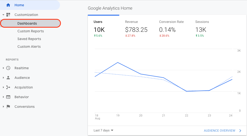
Screenshot of Dashboard Options
The Analytics Advantage
Making data a top priority is about better understanding your customer to better inform your marketing strategy.
Dig past the surface level metrics in Google Analytics and get to the data that improves understanding of user behavior.
Use this understanding to connect with customers in ways that nurture the relationship and increase revenue.
This list is only six of the many ways to optimize your use of Google Analytics.
Remember, centering data in your marketing strategy is not about gaining a competitive advantage, you are throwing spaghetti on the wall if you do not.
More Resources:
- Why Google Search Console & Google Analytics Data Never Matches
- How to Use Google Analytics: A Complete Guide
- 10 Great Google Analytics Alternatives
Image Credits
All screenshots taken by author, August 2020

