In the world of digital marketing, landing pages are one of your most powerful tools for converting customers.
A thoughtfully constructed and well-designed landing page can mean the difference between a website visitor just checking out your company and becoming a loyal customer.
And that importance cannot be overstated.
In this article, we’ll touch on what landing pages are and how to optimize them before looking at 30 examples of well-crafted landing pages from various brands.
What Is A Landing Page?
A landing page is more than just any old webpage – it’s a page that’s designed to lead visitors to take a specific action.
This could be anything from making a purchase to signing up for a membership, downloading a guide, or getting a quote from your business.
Landing pages seek to provide the right information succinctly and remove any unwanted distractions so that the likelihood of website visitors taking the desired action is increased.
Optimizing Your Landing Page
So, what goes into creating an effective landing page?
If you’re thinking about building a landing page, the good news is that you can use many different tactics to optimize your landing page.
Generally speaking, you want to create a simple, mobile-friendly page that speaks directly to the target you want to reach. But when it comes to the content, here are just a few effective strategies to leverage:
- Strong headline and body copy: Your headline is often the first thing a user sees when they arrive at your landing page. You should make sure it resonates with your target audience, and that any surrounding copy provides the right context, highlights your unique value proposition, and sells through the message.
- Engaging, cohesive visuals: When it comes to landing pages, visuals really matter. They can help further emphasize your value prop, as well as help communicate your brand voice to website visitors. Be strategic about what visuals you use and where. Videos and images should be high quality and engaging, and think about how you can use animated and illustrated assets to show, not tell. Also, be thoughtful about your use of color and how the page’s color palette can elicit the response you want from visitors.
- Compelling call to action (CTA): Every landing page has a CTA, and this is the action you want your visitor to take. Yours should be positioned prominently on the page, and leverage action-oriented language to convince your visitors to make a move.
- Social proof: Building trust can be crucial in converting customers, but sometimes you only have a small window in which to do so. Including trust indicators such as customer or partner logos, customer reviews, and even testimonials can effectively establish trust quickly.
As I said, these are just a few of the many tactics and strategies that go into building an effective landing page. There’s far more where that came from.
And there are also a ton of SEO-specific tricks that go into making sure your page ranks. We cover them in this article: How To Make The Right Landing Page Rank: A Complete SEO Checklist.
30 Examples Of Great Landing Pages In 2023
1. Netflix
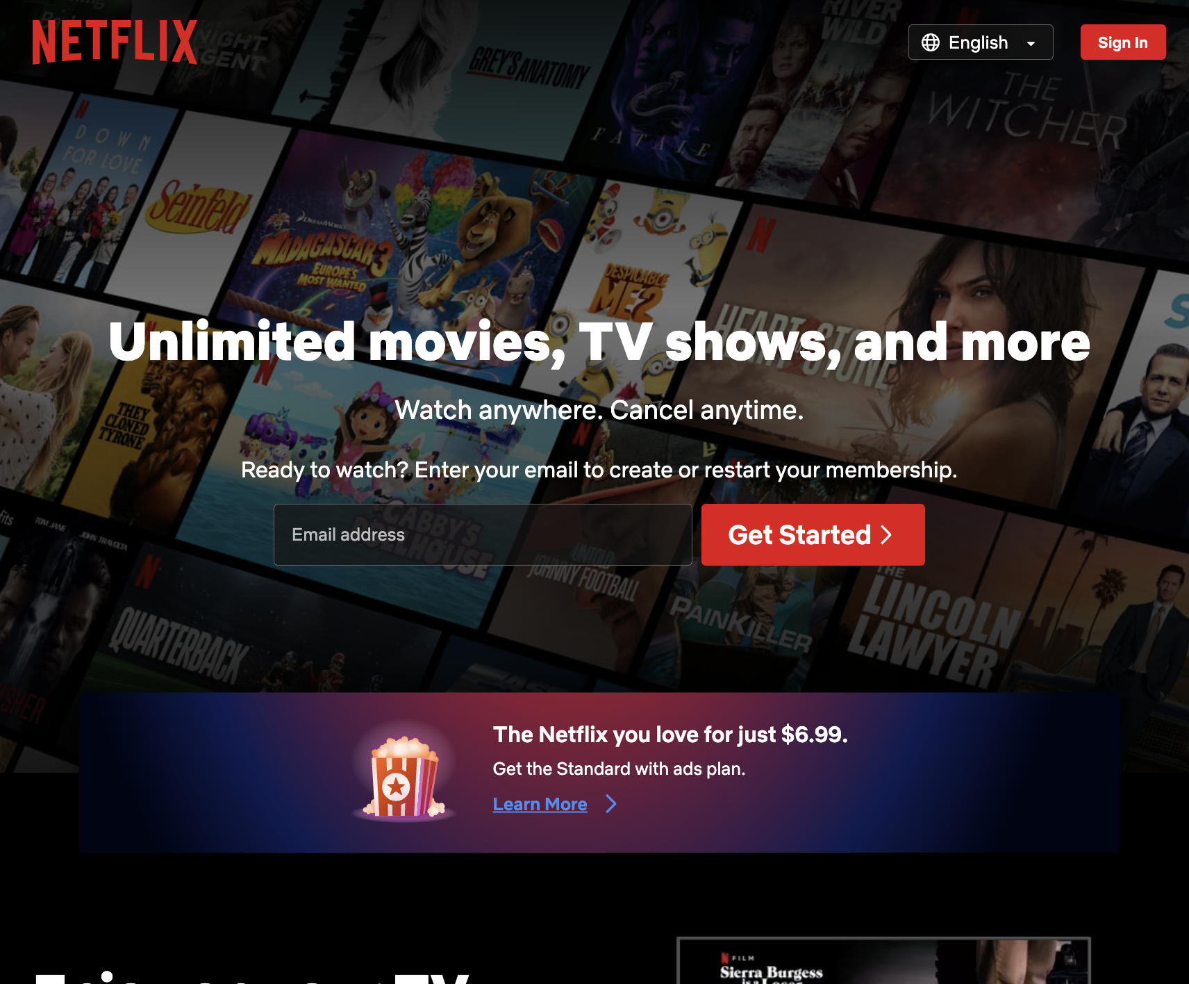 Screenshot from Netflix, August 2023
Let’s start with a remarkable homepage from a household name: Netflix.
The streaming giant’s landing page is short, sweet, and straightforward, including only the necessary details.
It makes it extremely easy for users to complete the goal of the page: entering their email address to get started with a Netflix membership.
Why It Works:
- A single field form above the page fold makes getting started with Netflix seem like a breeze.
- The copy is succinct, states the brand’s value proposition, and makes it clear you can cancel anytime.
- It includes details on basic pricing upfront so users don’t have to go down a rabbit hole to find it.
2. GitHub
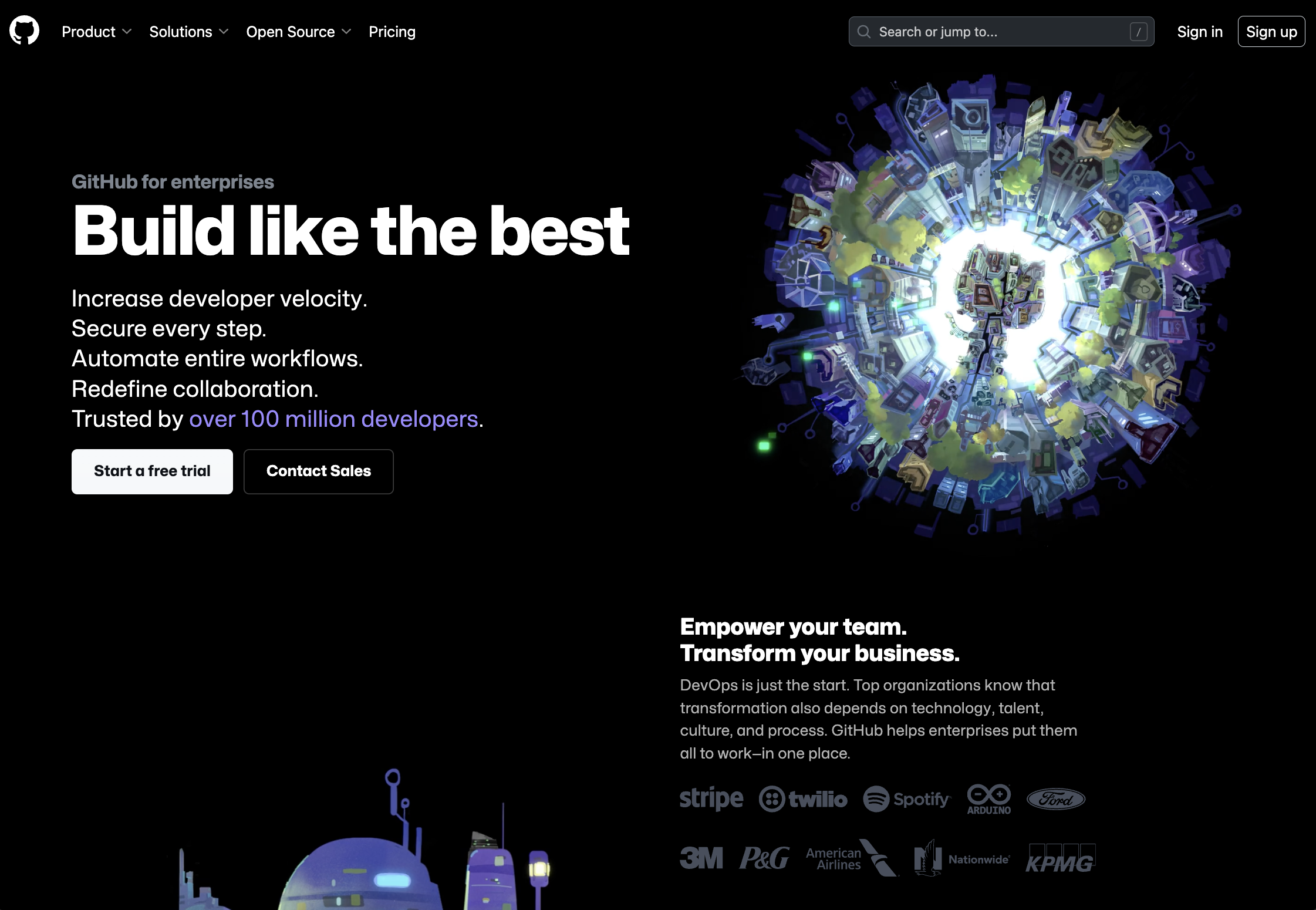 Screenshot from GitHub, August 2023
GitHub is a web-based platform that allows developers to “build, scale, and deliver secure software,” – so it’s no surprise that the company knows a thing or two about building a great website.
Its “GitHub for enterprises” landing page is a great example of a landing page that’s visually stunning but also effective, providing as much information as possible to help the user convert.
Why It Works:
- Stark visuals with a dark background and big, white text that stands out.
- Copy above the fold is brief and designed to highlight the features users will care about most.
- Proof points are included throughout, with customer logos and quotes.
- Two CTAs cater to different types of visitors – those who want to start a free trial and those who want to contact Sales to learn more.
3. Blue Apron
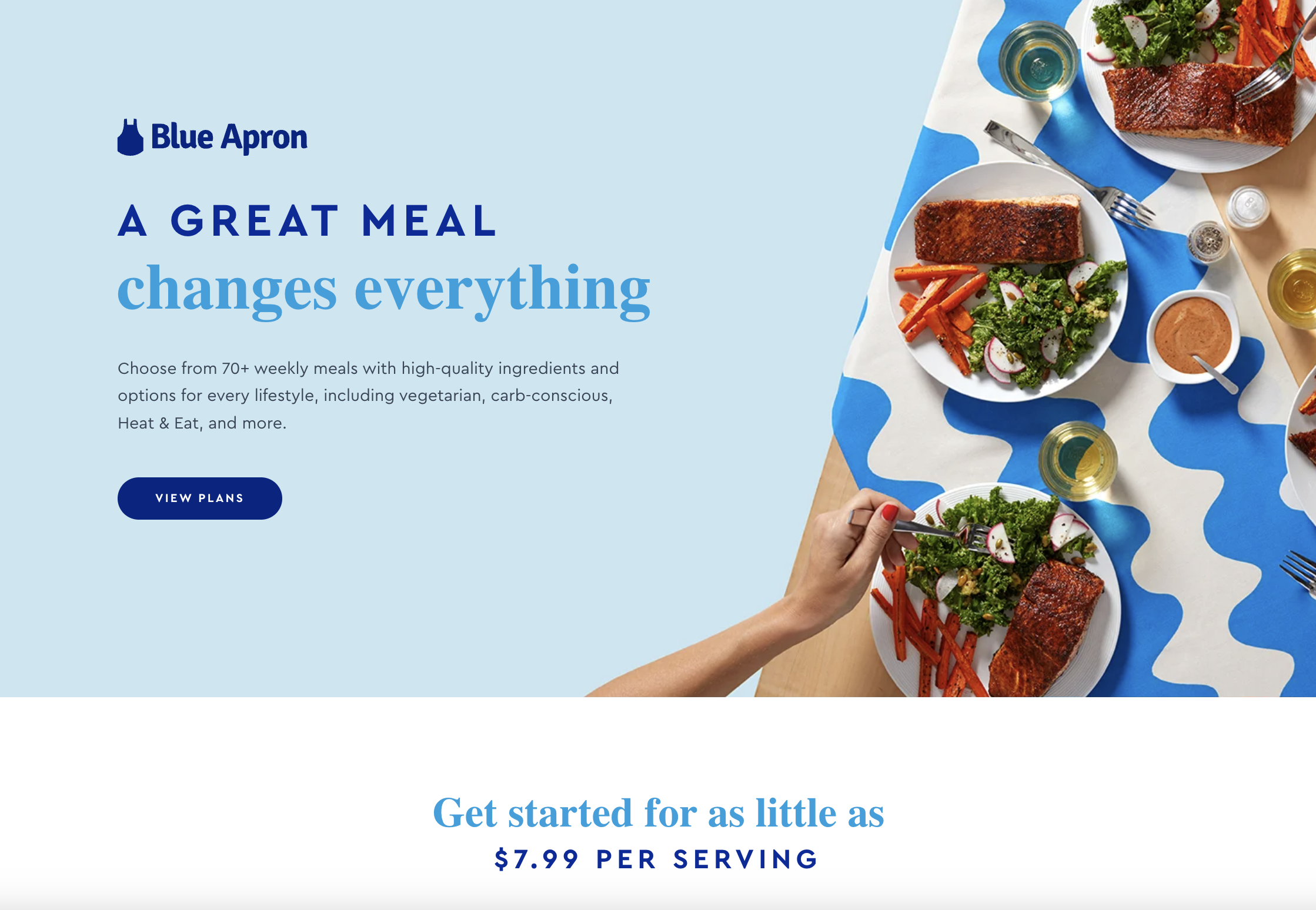 Screenshot from Blue Apron, August 2023
Blue Apron is a home meal planning and delivery company that offers various different subscription plans to its customers.
The goal of this landing page is to encourage visitors to view the plans to find out which best fits their needs – and it does this very effectively.
Why It Works:
- It is visually bright and clean, and uses quality photography to showcase its product.
- Copy effectively communicates the brand’s wide range of meal options and the fact that it caters to many different lifestyle and consumer preferences. It reiterates the core value props of value and convenience.
- The same CTA is repeated throughout the page, giving visitors an incentive to click through.
- Does a good job of highlighting key brand and product attributes without being overly long.
4. Mailchimp
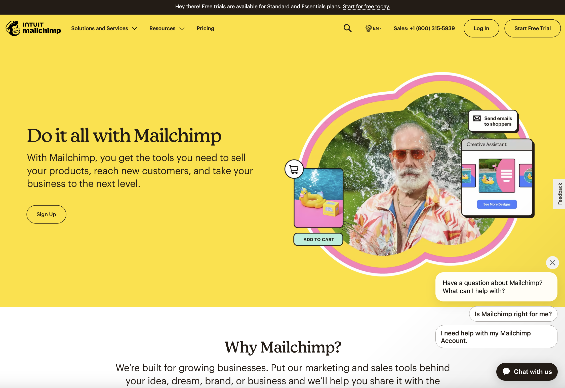 Screenshot from Mailchimp, August 2023
Email and marketing automation platform Mailchimp has developed a reputation for strong B2B marketing – and its “Grow with Mailchimp” landing page is just another example of the company’s savvy.
The page, which is designed to encourage visitors to Sign Up for a Mailchimp account, instantly catches your eye with its bright colors and poppy visuals.
It instantly tells you what you can do with Mailchimp, and then explains how its products can help growing businesses.
Why It Works:
- Simple, clear CTA above the fold.
- Bright colors and fun visuals capture the user’s attention, showcase the product’s capabilities, and create a positive brand association. The use of visuals here really gives a sense of what Mailchimp is like as a brand.
- Strong value prop that makes it clear who the target is for, why you should use it, and how many other brands are already on board.
5. Muzzle
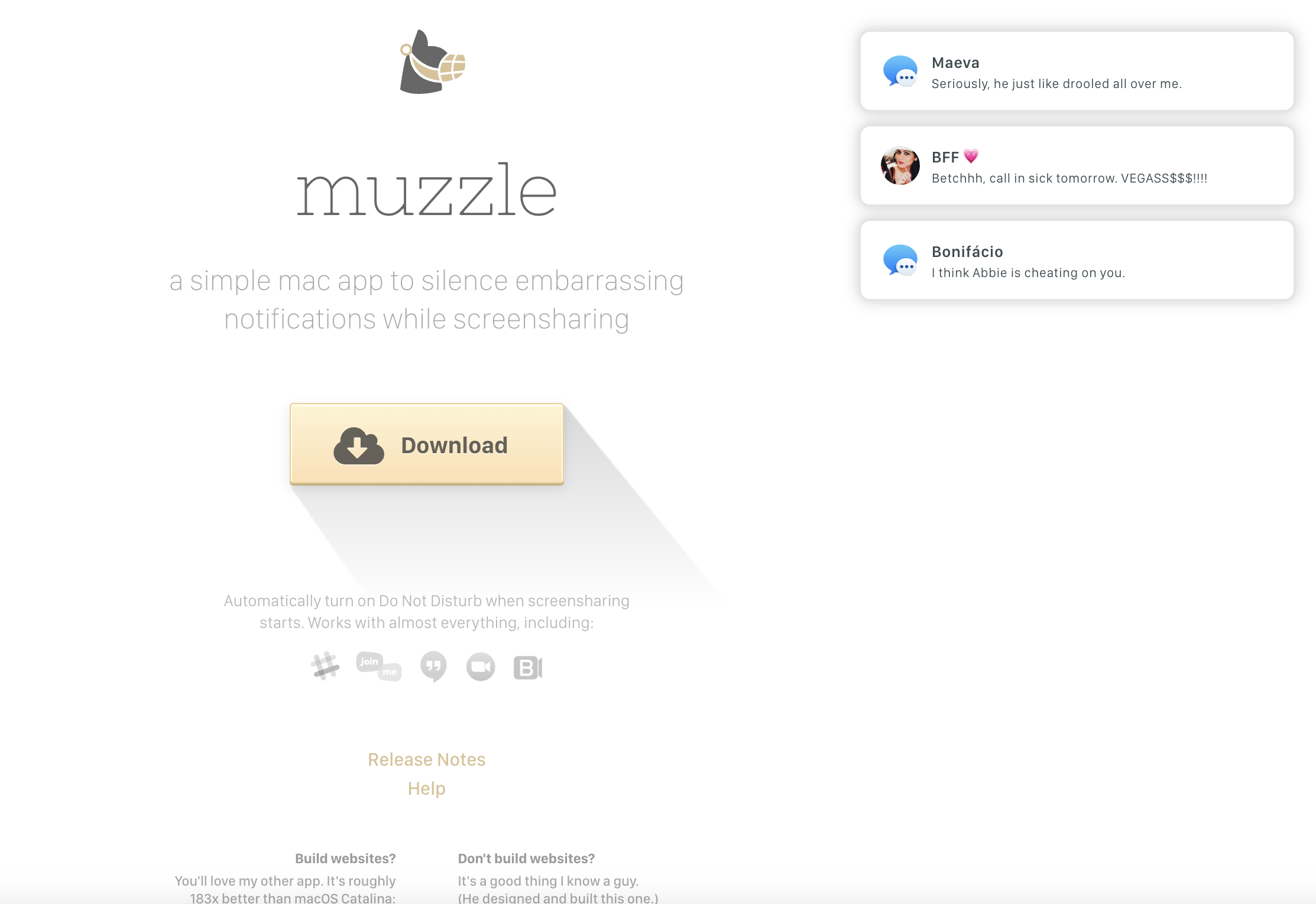 Screenshot from Muzzle, August 2023
Muzzle describes itself as “a simple Mac app to silence embarrassing notifications while screensharing.” And even if you didn’t take that copy in, its landing page does an incredible job of convincing you to download the product.
When you land on muzzleapp.com, you see the brand’s logo, the brief product description, and a big clickable Download CTA.
But your attention is quickly drawn to the animated notifications that start stacking up on your screen, showing embarrassing messages – the kind you would definitely not want popping up in a work call.
Why It Works:
- The page uses humor in a clever and useful way to illustrate the product’s use case.
- From a visual standpoint, the page is understated, with muted greys, which keep it from becoming overwhelming and help draw attention to the animated notifications.
- The CTA button is big, centered, and clear, standing out with a pop of color.
6. Monday.com
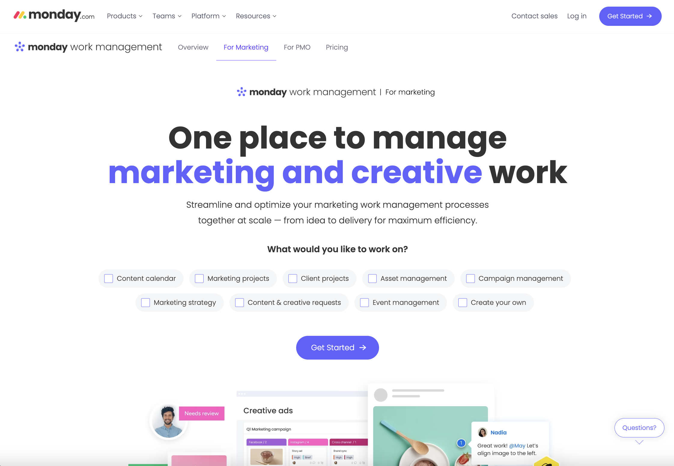 Screenshot from monday.com, August 2023
If you’re a marketer looking to improve your team’s project management capabilities, you might find yourself on the monday work management for marketing landing page.
Designed to highlight how the monday work management product can benefit marketing teams specifically, we like this landing page for a couple of reasons, which we’ll highlight below.
Why It Works:
- It’s interactive. The page doesn’t just speak to the user, but also asks them to select what they would like to work on, providing a number of different boxes that they can check before clicking the “Get started” CTA button.
- It’s minimalist, with clean branding and a white background – so the big, bold, black copy stands out. This page is for marketing and creative teams, so the words “marketing and creative” are delineated in purple, which helps users know they’re in the right place.
- It tells you what the product does and addresses the various specific pain points of its audience.
7. STEEZY
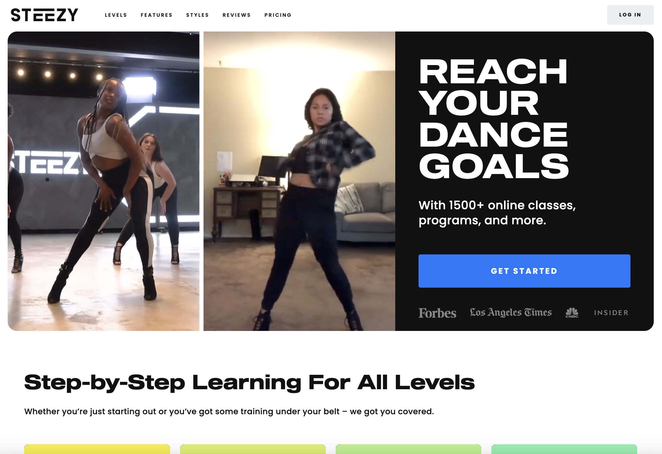
Screenshot from STEEZY, August 2023Looking for a new hobby? Why not learn to dance? STEEZY Studio is an online learning platform that allows customers to take dance classes from home. Its classes provide step-by-step instructions for people at all levels so that they can learn the moves at their own pace.
And if you’re not convinced yet, the STEEZY homepage might do it for you.
Why It Works:
- Visitors to the page are immediately met with looping video examples of the product itself: clips from online dance classes. They look fun and exciting, and show side-by-side clips of the classes themselves alongside people dancing along at home, showing users what they could achieve with the product.
- You’re also instantly met with a product promise in big capital letters: “REACH YOUR DANCE GOALS.” And next to the video examples, you start believing that you could do just that!
- CTA is clear, and the copy highlights the fact that STEEZY has over 1500+ online classes and programs to choose from.
- Social proof is also included above the fold with logos from well-known publications where the company has been featured.
8. Dropbox
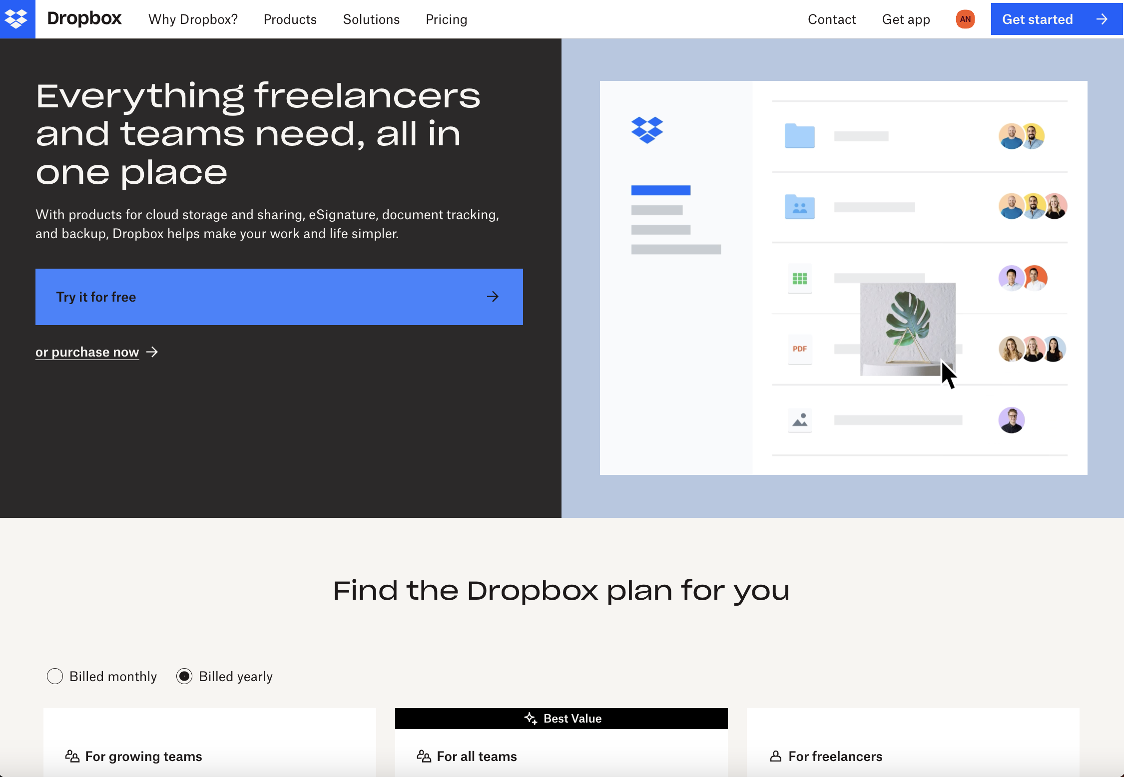 Screenshot from Dropbox, August 2023
There are many different reasons people would need a file hosting service like Dropbox, and this landing page focuses on how it helps freelancers and teams work together online.
That’s clear from the hero copy that drives home how Dropbox gives you everything you need, all in one place.
The sub-copy speaks to the different products and features Dropbox offers and how they’ll “make your work and life simpler.”
Meanwhile, visitors can see a fun animation that shows how the product works in simple terms – and the page even includes detailed pricing information.
Why It Works:
- Fun, animated visuals that showcase the general flow of the product.
- Big, clear CTA that makes it clear users can try the product for free.
- Interactive pricing section that allows visitors to compare different product tiers and find the right option for them.
9. Apple Arcade
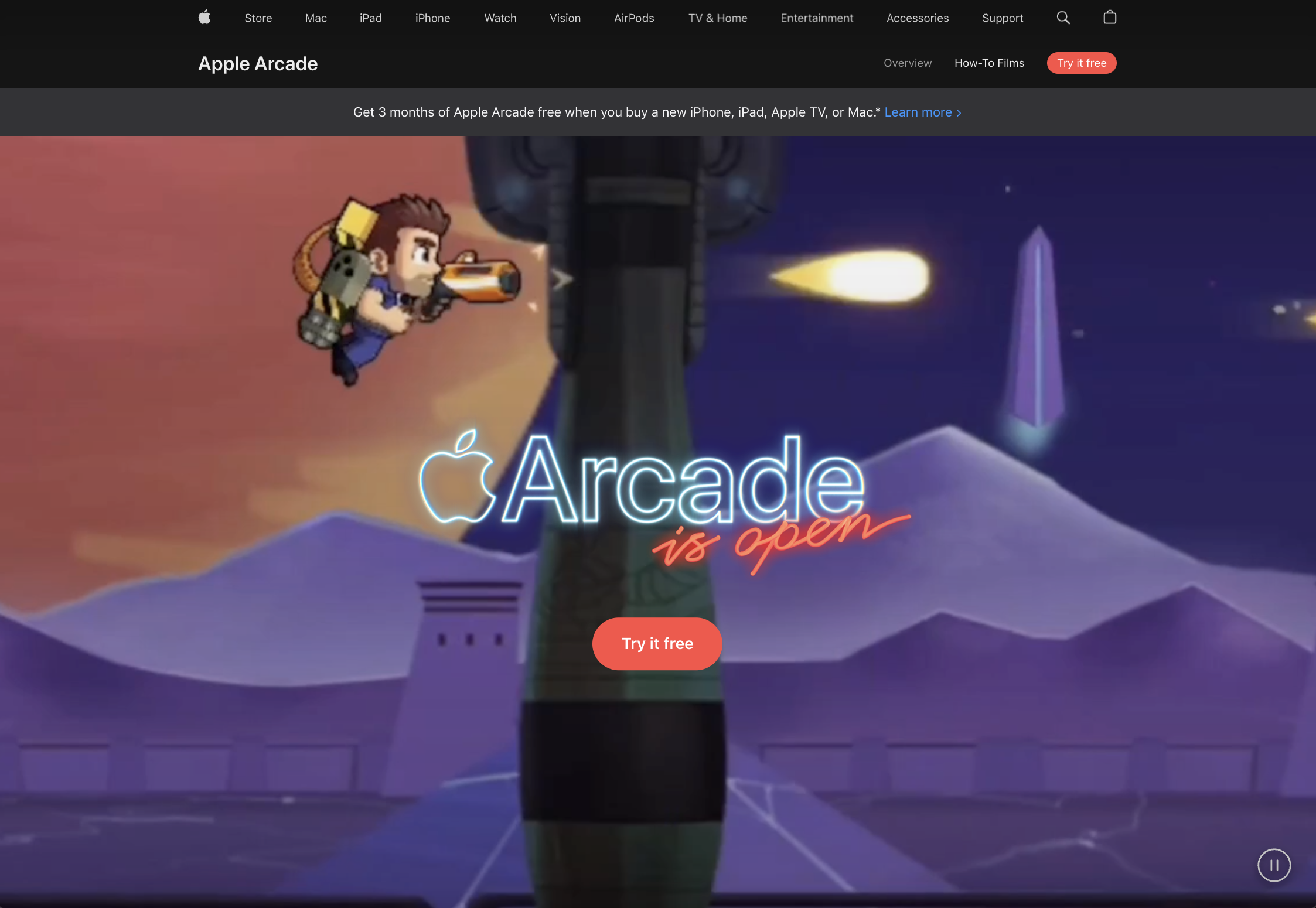 Screenshot from Apple, August 2023
Apple Arcade, Apple’s new video game subscription offering, has arrived – and it has a landing page that we love.
Here are a few reasons why.
Why It Works:
- Almost the entire browser above the fold is focused on showing animated visuals from Apple Arcade’s category of games. The visuals are so big that the visitor feels immersed, and it gives a great preview of what they can expect from the product.
- Copy is sparse for the most part, as Apple is letting visuals show rather than tell. For curious minds, you can scroll down to find the big selling points in bold, red text: unlimited access, no ads, and play online and offline.
- The page includes several options for various deals, including a one-month free trial, or three months free if you buy an Apple device.
10. Oxygen
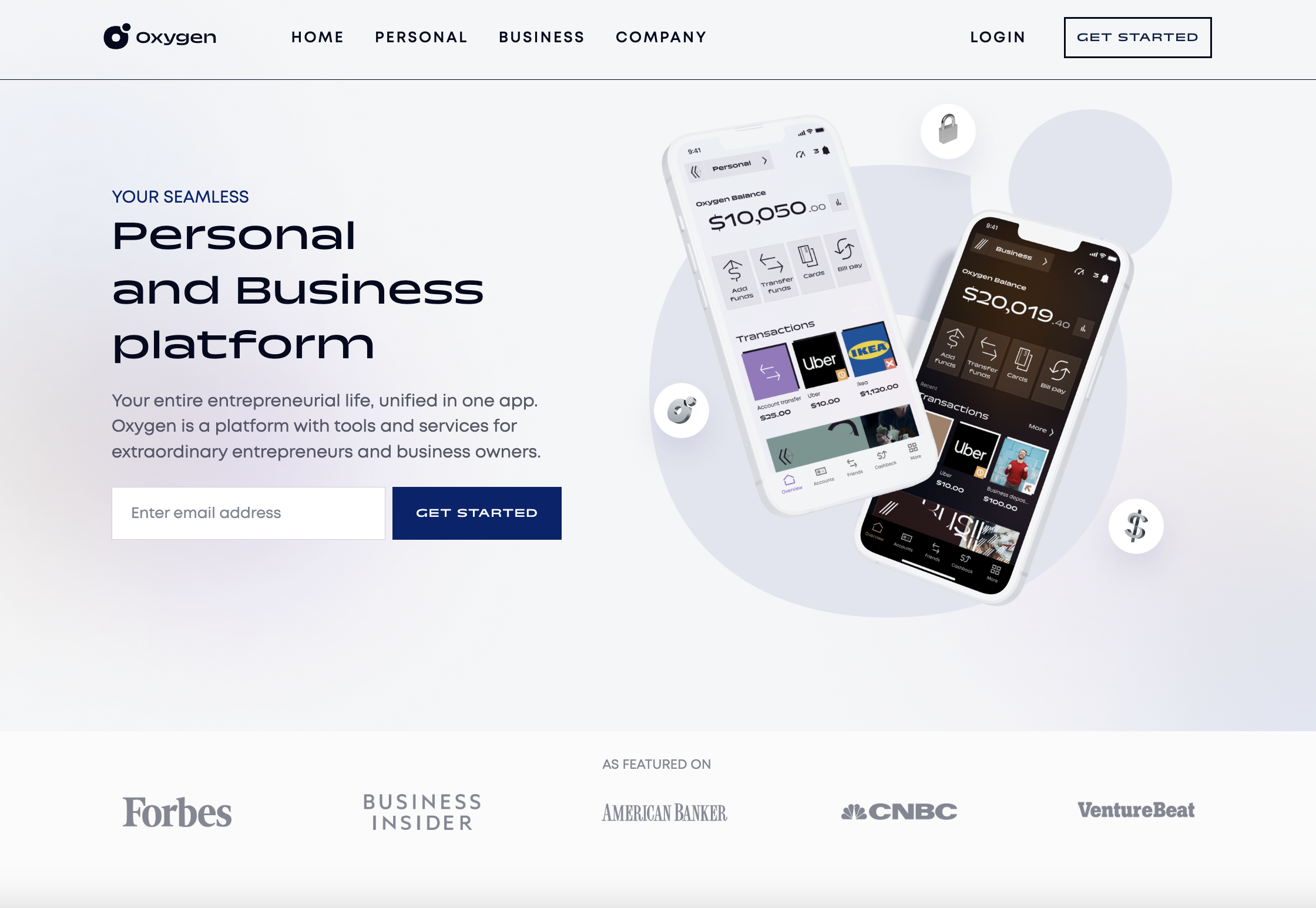 Screenshot from Oxygen, August 2023
Oxygen is a financial services platform with both personal and business banking offerings, targeting entrepreneurs and business owners. This is clear from its landing page, which specifies who the product is for, and showcases screenshots of its sleek app interface.
Why It Works:
- One simple field form to enter your email and get started.
- The copy focuses on who the product serves – that is, it tells visitors who should be interested in it.
- The branding is sleek and minimal, with few distractions. Images and quick animations of the Oxygen product are included throughout the page to generate interest.
11. Wealthsimple
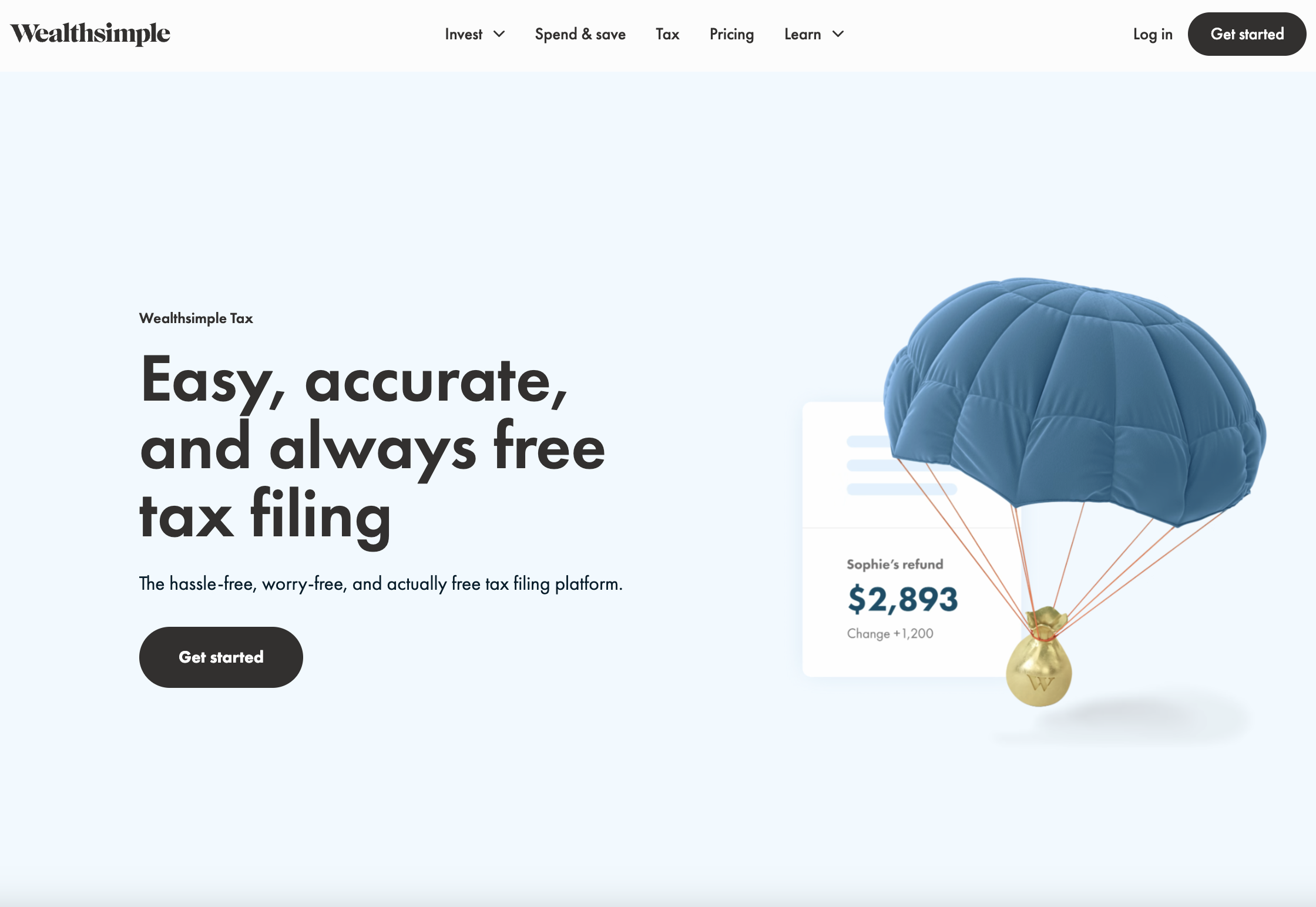 Screenshot from Wealthsimple, August 2023
Wealthsimple is an online investment management service that offers investing tools and financial advice for Canadian users. It also offers a tax filing service, Wealthsimple Tax, with a simple yet effective landing page.
Why It Works:
- Big, prominent value prop that includes the use of the word “free” – always a draw for customers.
- The copy is very succinct and focused on providing a solution to customer pain points. It also serves to reiterate that the product is free.
- Great use of color and aesthetically pleasing animations and visuals throughout that provide a payoff to the visitor.
- Customer testimonials and company logos provide social proof.
12. Scale
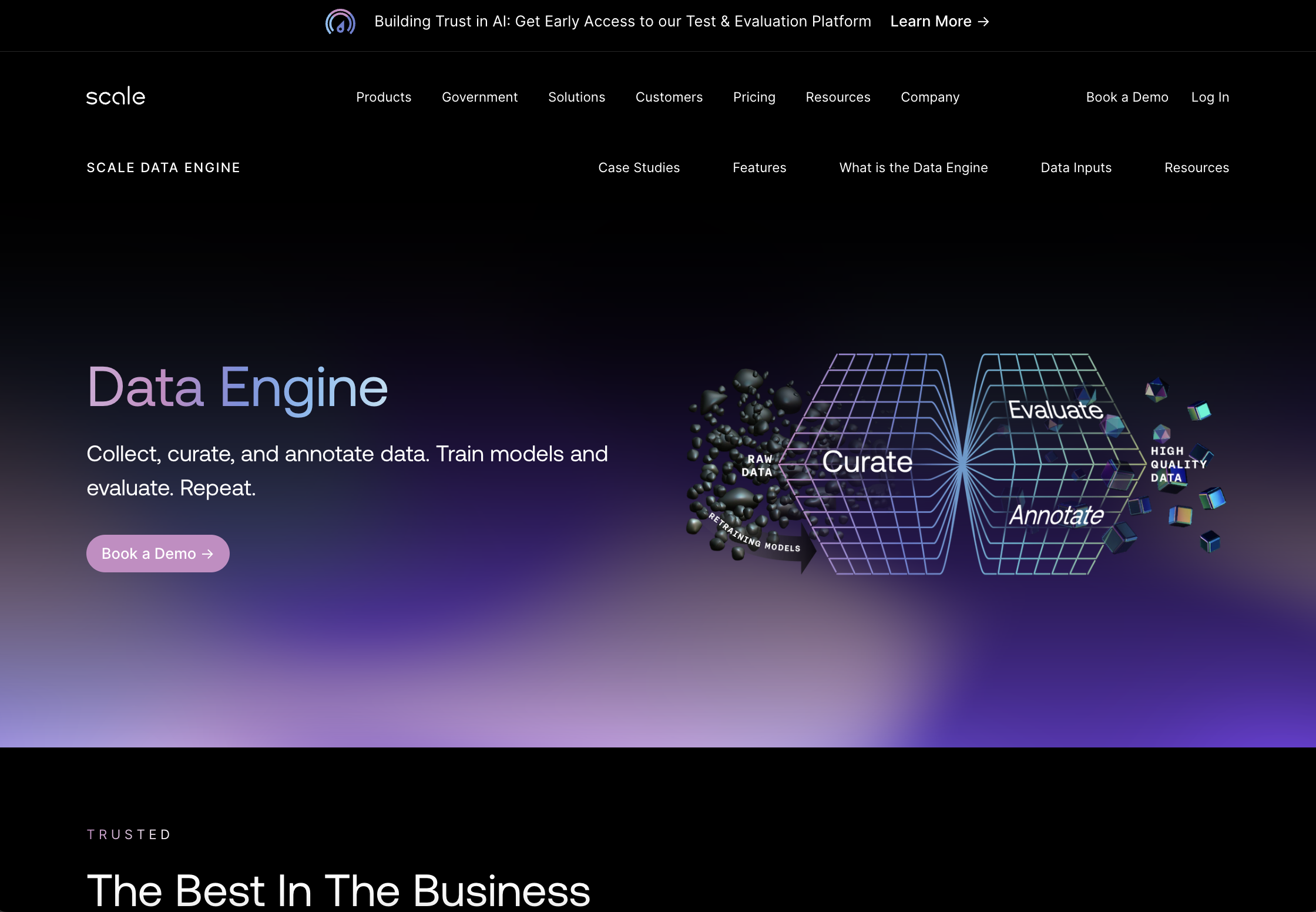 Screenshot from Scale, August 2023
Scale is a company on a mission to speed up the development of AI applications.
Its landing page for Scale Data Engine – a product that helps users collect, curate, annotate, and evaluate data – is an effective one.
Let’s look at a few reasons why it works.
Why It Works:
- Above the fold is simple and elegant, with visuals focusing on the product’s primary use cases. A simple CTA to Book a Demo keeps the focus streamlined.
- The page leans into social proof to show that it’s trusted by some of the world’s biggest companies and most advanced AI teams, from OpenAI to Meta, Microsoft, and more. Not only does the page showcase customer logos, but it also links out to more details case studies with some of these household names.
- The page is visually cohesive and focused on highlighting important features and use cases while providing enough detail to convince visitors to learn more.
13. DoorDash
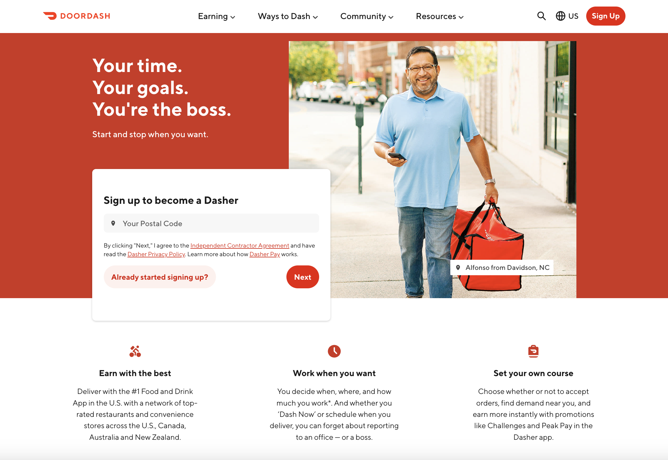 Screenshot from DoorDash, August 2023
DoorDash is an online food ordering and delivery platform that operates across the US. Customers can use the app to order delivery from their favorite local restaurants, which is then delivered by the company’s employees, known as “Dashers.”
This particular landing page is targeting prospective Dashers with the goal of encouraging them to sign up.
Why It Works:
- The hero copy on the page is focused on speaking to the visitor and convincing them why they should sign up: You can be your own boss and set your own working hours. It digs into their pain points and desires to make the sell.
- All you have to do to get started is enter your zip code and press Next – a straightforward and simple task.
- For those who want more information first, the page covers the most important questions, such as how much they can earn, what kind of gear and equipment they’ll need, and what the requirements are to sign up, as well as an FAQ section.
14. Overpass
 Screenshot from Overpass, August 2023
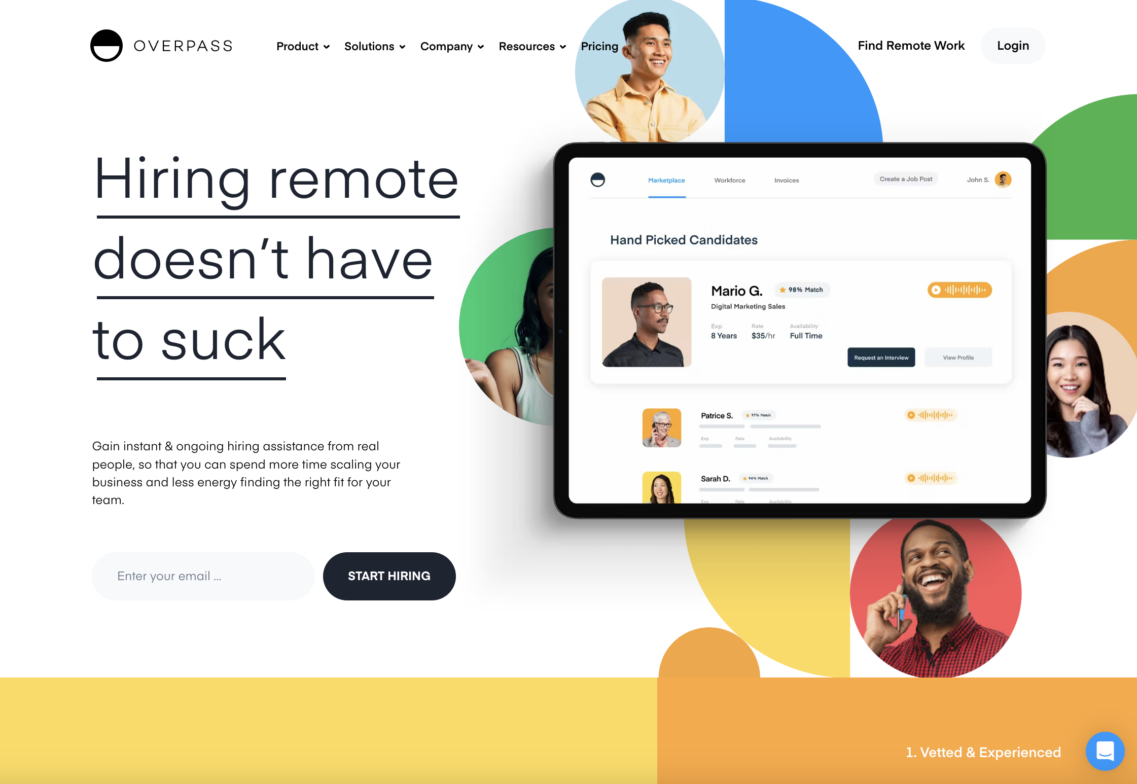
Overpass is an online talent marketplace and payment platform focused on helping companies hire and manage sales and support contractors.
Its landing page promotes its Assisted Hiring product, which provides hands-on, ongoing assistance from real people to make the hiring process easier and save customers time.
Why It Works:
- Uses an engaging tone of voice; the page opens with a punchy, effective line: “Hiring remote doesn’t have to suck.” This speaks to the painful process of hiring remotely, and how Overpass can make everything easier for customers. This conversational, friendly tone is consistent throughout the whole page.
- Fun, bright visuals and animations draw your attention and create positive brand feelings.
- Single form field and CTA to Start hiring make it feel like users can achieve their goals with the click of a button.
- Includes an FAQ drop-down menu to address some of the common questions visitors might have.
15. Miro
 Screenshot from Miro, August 2023
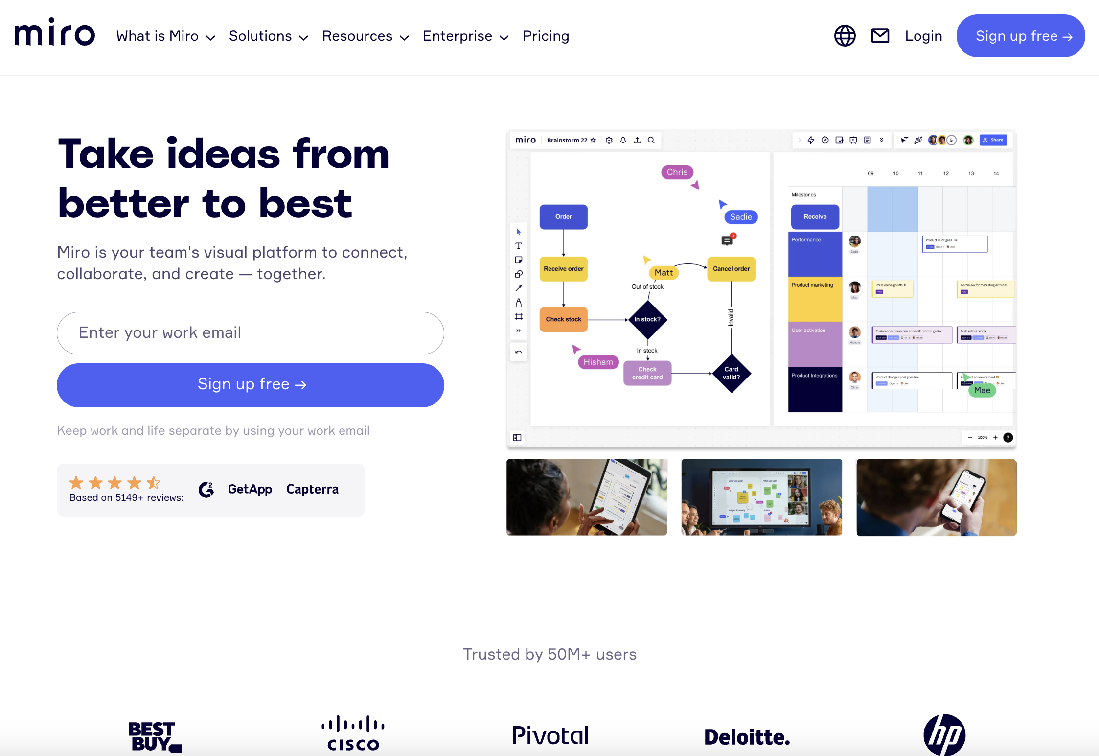
Miro is a visual collaboration platform that allows distributed teams to work together remotely. Imagine a whiteboard but on your computer. You get the gist.
Anyway, Miro’s homepage is a wonderful example of an A+ landing page that provides the right information in the right place.
Why It Works:
- Miro instantly speaks to its target audience about what it can do for them: “Take ideas from better to best.” The copy throughout the page is short, snappy, and conveys exactly what it needs to about why you want this product, and who and what it’s built for.
- A single field form above the fold prompts visitors to enter their work email, specifying that using their work email rather than their personal email will allow them to “keep work and life separate.” It’s a small touch, but a nice nod to the fact that Miro knows its customers are humans, and respects their personal lives.
- The page includes numbers to showcase social proof effectively. For example, “Trusted by 50M+ users,” “Based on 5149+ reviews,” and “99% of the Fortune 100 are customers.”
16. Squarespace
 Screenshot from Squarespace, August 2023
If you’ve ever built your own website, you’ve likely heard of Squarespace. It’s a website-building and hosting platform that makes it easy for individuals and businesses to create and manage their own sites.
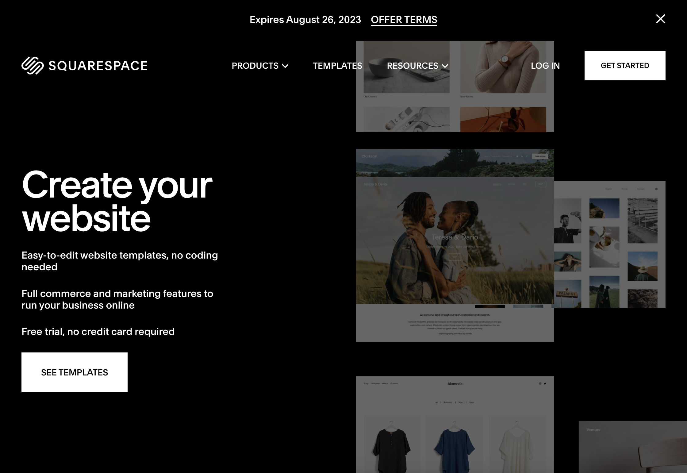
So, it’s great to see that Squarespace knows how to craft a compelling landing page of its own! This one aims to encourage people to start with Squarespace by using one of its templates to start building a site.
Why It Works:
- Simple, short, no fuss. There’s no scrolling forever on this page – everything you need to know is right there, on the page, above the fold.
- It’s visually effective. The background is dark, the text is big, bold, and white, and in the background, you can see scrolling visuals of different website layouts – all of them beautiful.
- There’s not a ton of copy, but what is there emphasizes the ease of use and lack of commitment for users: “Easy-to-edit,” “no coding needed,” “free trial, no credit card required.” Even the CTA button itself feels non-committal as it reads “See templates” rather than requesting the user to sign up or enter personal details.
17. Prose
 Screenshot from Prose, August 2023
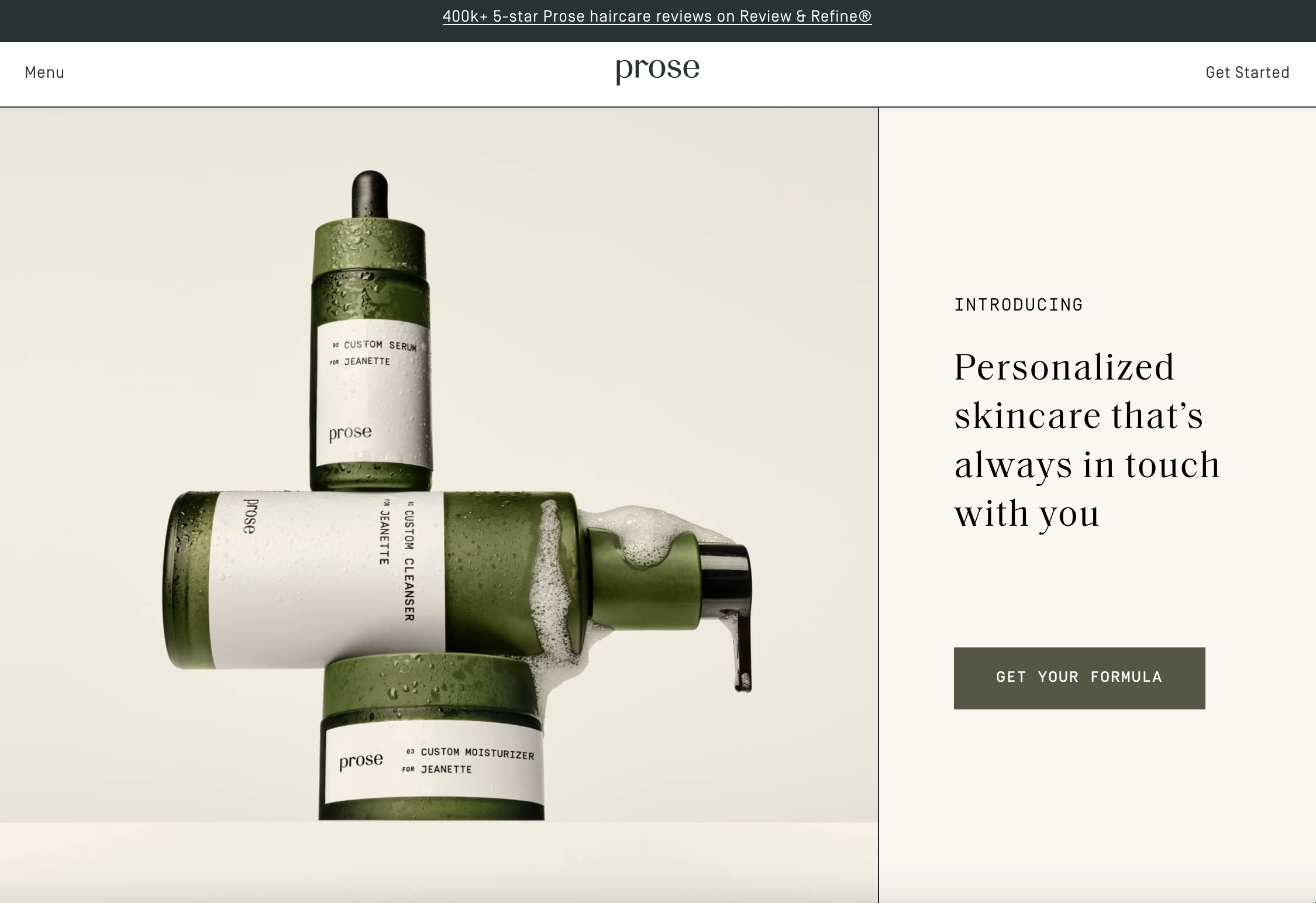
Prose is a beauty brand that offers customers custom, made-to-order hair and skin formulas.
The company’s ethos is built around delivering personalized care, and its formulas are developed by having customers take an interactive quiz about their lifestyle, preferences, etc.
This landing page is specifically designed around Prose’s skincare offering and encourages visitors to take the quiz and get their custom formula.
Why It Works:
- Provides a cohesive visual experience with colors that carry over from the high-quality product photography to the onscreen copy and design elements.
- The copy really drives home the main brand differentiator and value props: This is personalized skincare that’s based on your needs, and made to order. The words “custom” and “customized” are repeated throughout the page.
- It emphasizes social proof both through customer feedback statistics and builds trust through before/after photos and photos of in-house dermatologists.
18. Khan Academy
 Screenshot from Khan Academy, August 2023
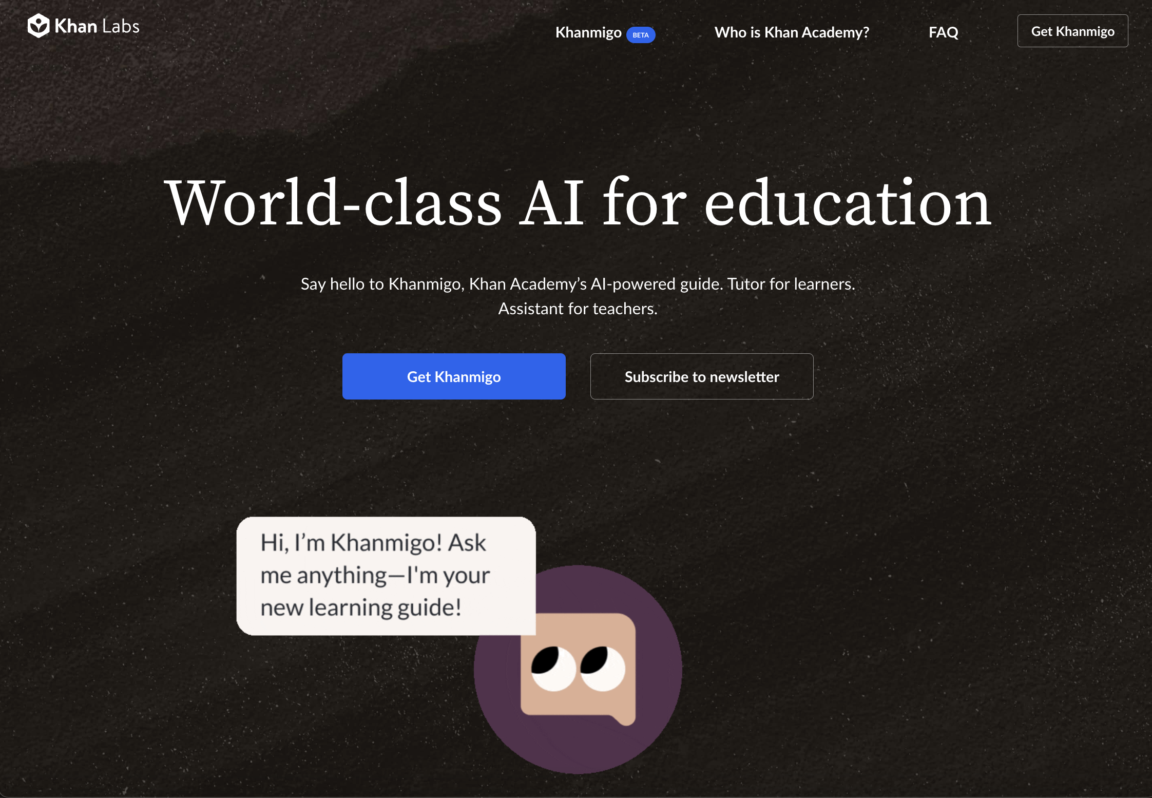
Khan Academy is an educational nonprofit with a mission of providing free education for students around the world. It provides exercises, instructional videos, and learning offerings for students to learn at a pace that suits them.
This landing page is designed to pique interest in Khanmigo, Khan Academy’s AI-powered assistant.
Why It Works:
- The page offers two distinct CTAs – one to sign up and Get Khanmigo, and another to Subscribe to the company’s newsletter. While the former stands out with a blue button, users have the choice based on what they’re looking for – and either way, the company benefits.
- The layout is simple and centered, with each section providing just enough information without going overboard with links and an overwhelming amount of detail
- The use of visuals is varied and thoughtful. At the top, users see an animated example of what Khanmigo looks like and how it works, and below that, a video explainer from Sal Khan himself dives into the product. Below that, you can see screenshot examples of the key product features and how they work in action.
19. Storyworth
 Screenshot from Storyworth, August 2023
Looking for a unique gift idea for a family member? You might consider Storyworth.
Here’s how it works: You gift someone a membership, and they are emailed a question of your choosing each week. They respond to the email with their answer, which is shared with you and whoever else you choose. At the end of the year, all their stories are compiled into a book for you to keep.
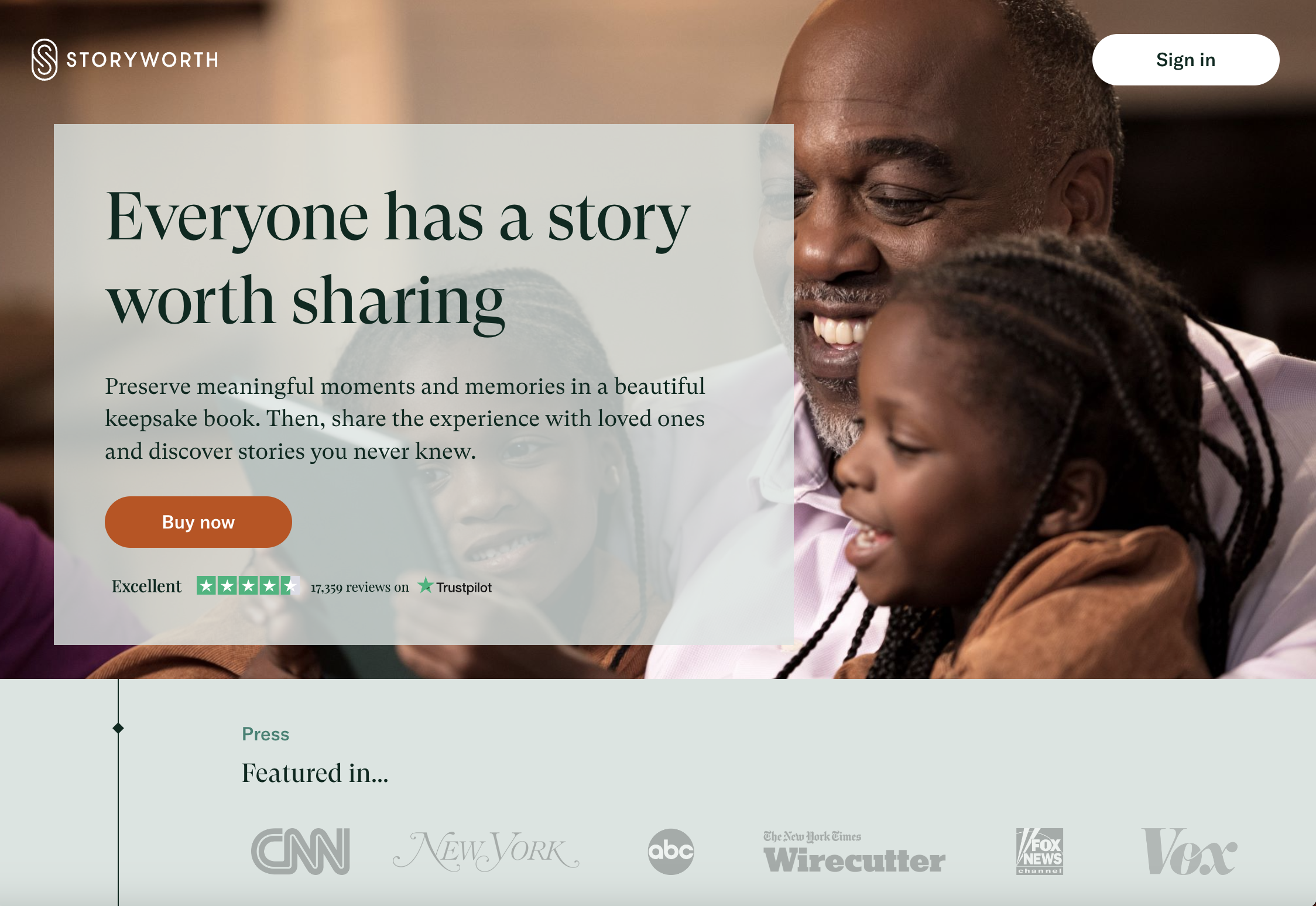
This landing page is crafted to welcome newcomers to Storyworth and encourage them to buy the product.
Why It Works:
- The copy appeals to our emotions by emphasizing the importance of sharing our individual stories and the fact that Storyworth enables you to preserve meaningful memories and moments. Throughout the page, the emotional tone is consistent, leaning into connection with your loved ones.
- CTA buttons are strategically placed in sections where they make sense, and visitors might be most compelled to buy.
- Social proof via press mentions and Trustpilot reviews are featured prominently on the page.
- The “How it works” section breaks down the product so newcomers don’t need to navigate elsewhere to understand better.
20. Going
 Screenshot from Going, August 2023
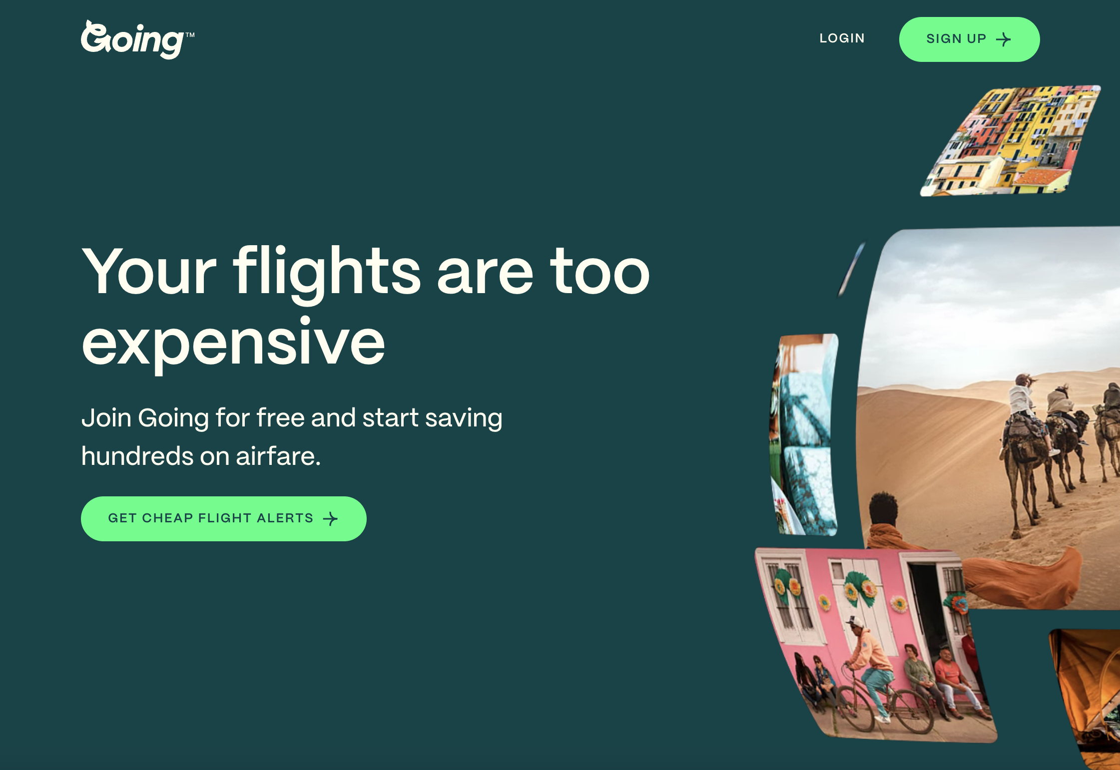
Formerly known as Scott’s Cheap Flights, Going is a platform that helps you find exclusive flight deals from your favorite airports.
We love Going’s homepage, a fantastic example of a landing page built to convert.
Why It Works:
- The copy is expertly targeted to speak to a very specific pain point: Your flights are too expensive. We can all relate to that, right? It then positions Going as the solution to this problem, letting you know you could be saving “hundreds” on airfare. The brand keeps it succinct and to the point in each section of the page, zeroing in on the value prop of price/money saved.
- It’s a fun visual journey without being overwhelming! The Going team mixes it up with animated visuals and cute little illustrations that inspire a sense of whimsy and wanderlust.
- The CTA copy is centered around getting cheap flight alerts – something we’d all love to do. There are also several mentions of “free” in the CTA buttons on the page.
21. Notion
 Screenshot from Notion, August 2023
Notion is an online workspace and productivity application that helps you consolidate tools and work in one place.
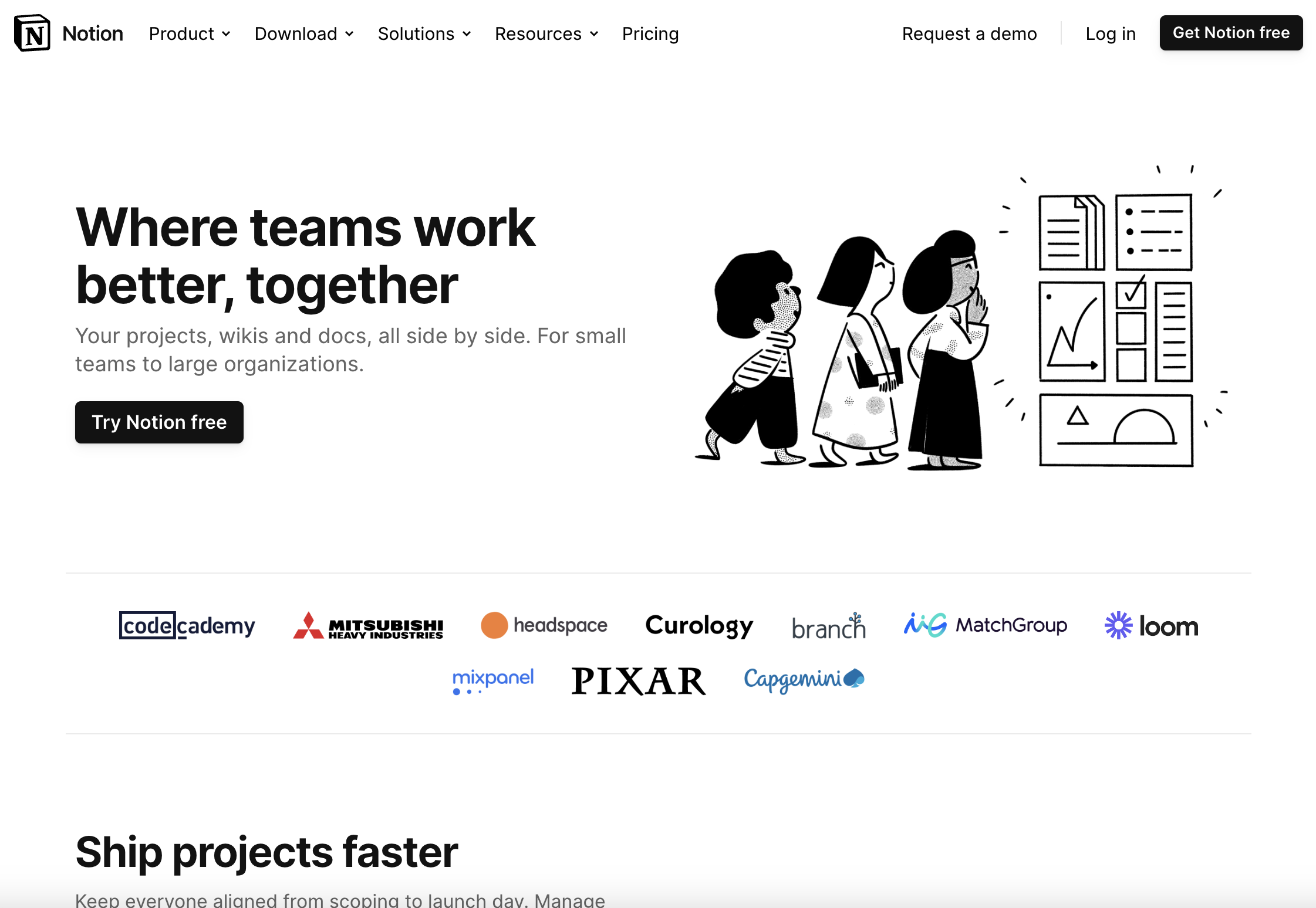
This landing page focuses on the value that Notion provides to teams – and we really like it. Here’s why.
Why It Works:
- Like most of Notion’s marketing, the page is simple – a white background with mostly black visual elements and copy, and pops of color here and there. It’s also infused with Notion’s signature illustrations, which help build out a personality and unique voice for the brand.
- The copy is compelling. It specifies the product’s audience (small teams all the way to large organizations), and touches on some of the tools that Notion can bring together for you. Then, the page dives into some specific capabilities that users might be interested in – each bolstered with a quote from a customer.
- Again, here, we see the repeated reminder that Notion is a freemium product, and all you need to do is click the button to start for free. This is always going to be a motivator for customers, FYI!
22. Spotify
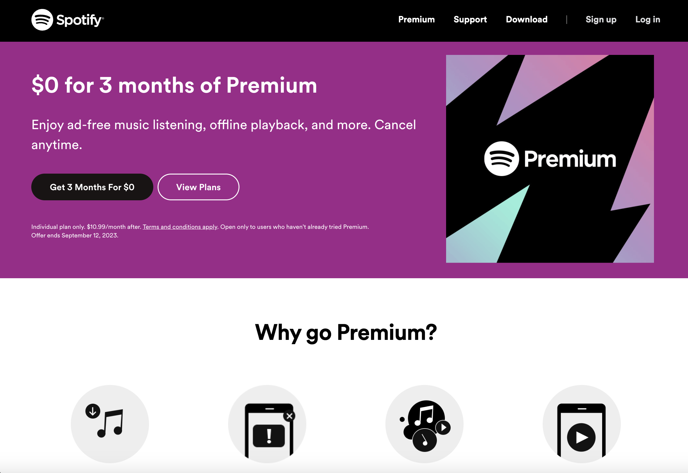 Screenshot from Spotify, August 2023
As one of the (if not the) most popular music and podcast streaming platforms in the world, you’re probably familiar with Spotify.
You might even be a paying customer who’s thinking about upgrading to Spotify’s Premium membership tier – in which case, you may land on this page.
Why It Works:
- This page is streamlined with a very specific, clear goal in mind: Convince people to try a Premium membership. It’s very light on copy, and sticks to the basics: what you get from the membership, why you should sign up, and how you can customize it to your preferences. This makes it easy for visitors to understand.
- The purple header offers a nice pop of color that draws your attention! The page is then segmented into different sections with different colors, which helps with easy navigation.
- The value prop here is clear: Pay $0 and get three months of Premium. Cancel anytime. It’s hard to say no to that.
23. Teamway
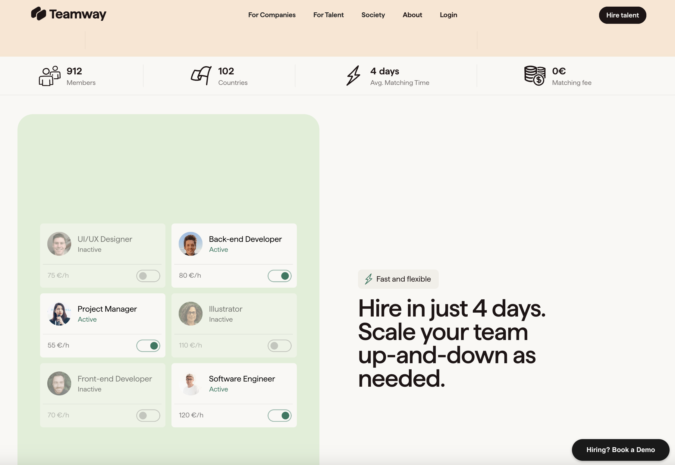 Screenshot from Teamway, August 2023
Teamway describes itself as a “member-owned society where world-class tech professionals team up with progressive companies to build meaningful products and services.” Pretty cool, right?
So is this landing page, which is designed to inspire you to get started with Teamway.
Why It Works:
- You’ll notice that Teamway lets big headline copy do most of the talking on this page; there’s not a ton of small sub-copy. The opening line, “Assemble your dream team,” is a tantalizing promise, and it continues to pique your interest by throwing out simple yet effective numbers in its copy. “Hire in just 4 days” and “Make your budget go 4x further” – we can all easily understand these benefits.
- Speaking of letting things do the talking, Teamway really relies on visuals to help tell the story here. The scrolling headshot feed at the top of the page is a really unique tactic to stand apart from other companies and make you feel like you’re dealing with real people.
- The page includes a comparison against its competitors, as well as an FAQ section and a quick overview of how the product works – all helpful information to convince someone to convert.
24. Pitch
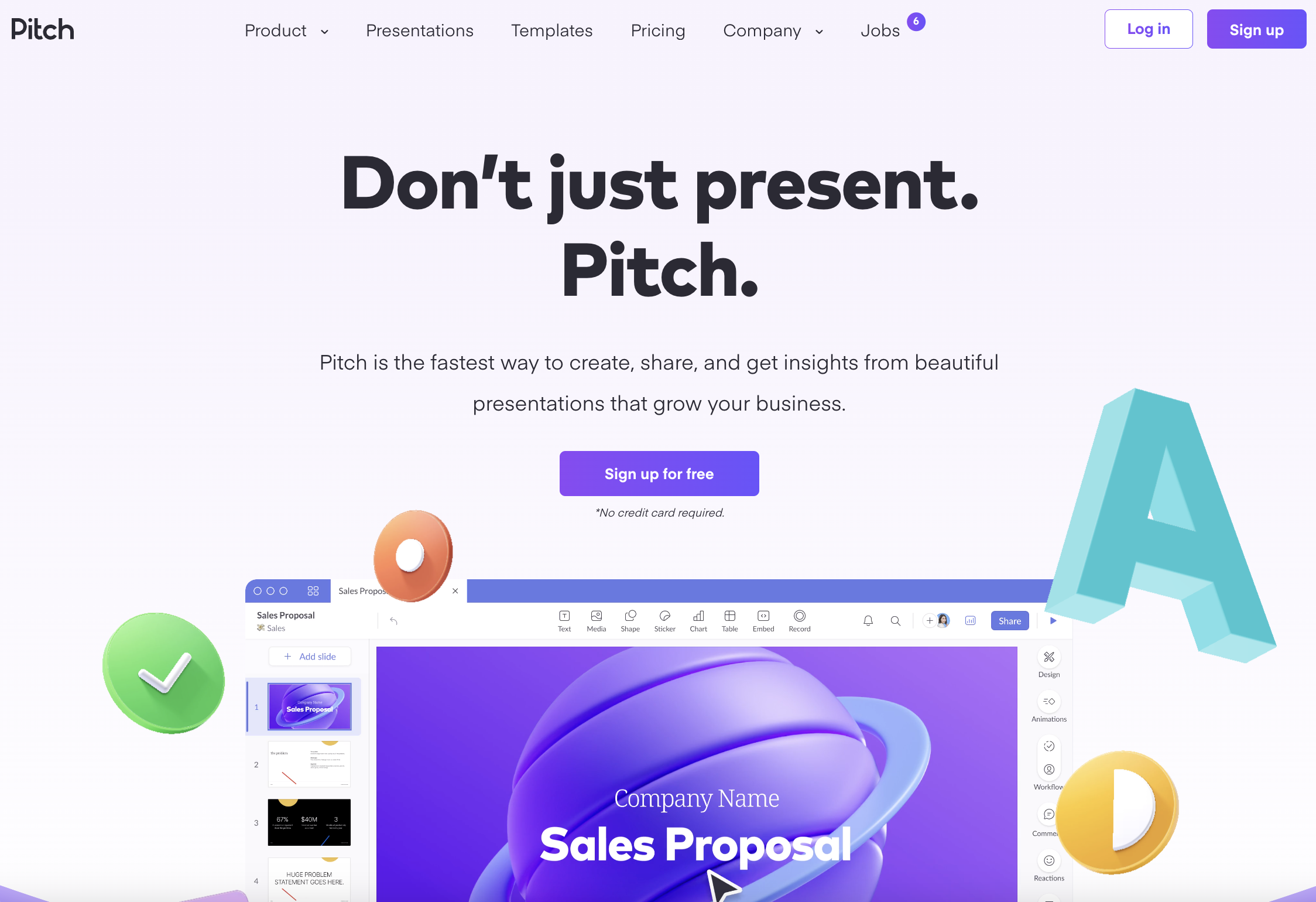 Screenshot from Pitch, August 2023
Pitch is presentation software that enables you to easily create beautiful decks in collaboration with your team.
We love this homepage, which is a gorgeous example of a well-designed and thoughtful landing page.
Why It Works:
- It’s full of colorful, stimulating visuals that move across the screen in different ways as you scroll through – really giving you the sense that you, too, could produce sleek creative with this product.
- The copy and visuals do a great job of explaining exactly what the product does, how it works, and what it looks like in action – as well as the integrations you might be interested in.
- There’s even an interactive section that lets you look at value propositions based on who you are, and what you do. Just select “I’m a designer,” or “I run a business,” and you can see what features might interest you most.
25. Zenefits
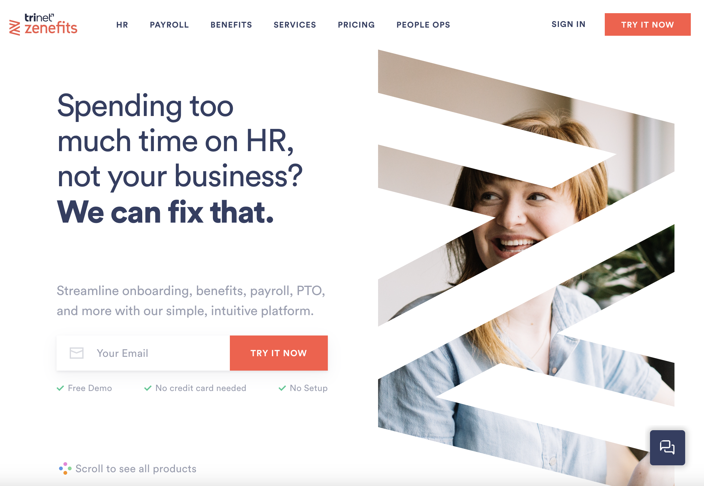 Screenshot from Zenefits, August 2023
Zenefits is a people operations platform that helps companies manage their employee services – from HR to benefits, payroll, time off, etc.
And the company doesn’t just know how to provide great human resources software – it knows how to build a powerful landing page.
We love Zeneftis’ homepage as an example of how you can make landing pages work for you.
Why It Works:
- Once you land on the homepage, you’re met with copy calling out a common pain point: “Spending too much time on HR, not your business?” Here, Zenefits is speaking to its target consumers, telling them, “We can fix that.”
- There’s a bright, big CTA to enter your email and Try It Now, as well as an additional copy that lets you know it’s a free demo with no setup and no credit card needed. A no-brainer!
- In case you need more information before making the jump, you can scroll down the page to read about some of the key product features (and see them in action through quick video clips).
- Got questions? Zenefits includes a handy chatbot in the bottom corner of the landing page to get your FAQs answered live.
26. Remmy
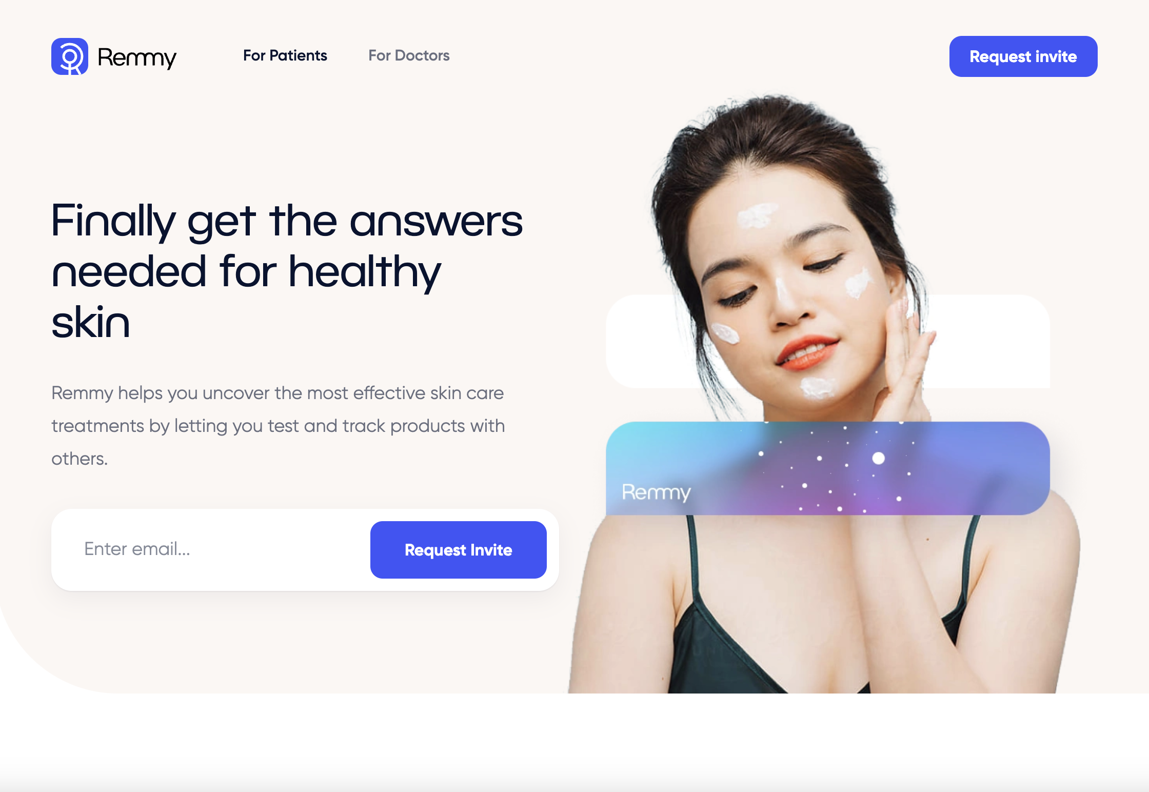 Screenshot from Remmy, August 2023
Remmy is another technology-based skincare company that’s more focused on tracking the progression of a particular skin condition over time and discovering new treatment options through what it calls “social biohacking.”
This landing page targets converting visitors into new patients and is worth checking out.
Why It Works:
- The page opens with a compelling promise that the product will help you finally get the answers you need for healthy skin. In case you’re wondering how that works, the page breaks it down in detail for you, even listing out many of the conditions that it can help with.
- There’s a single field form to enter your email. Where it differs from many other examples is that the accompanying CTA is to “Request Invite” rather than sign up or try for free. This is interesting because it implies exclusivity, which could motivate people to give it a try.
- The brand uses visuals thoughtfully throughout the page to illustrate what the product looks like and its different features.
27. Grammarly
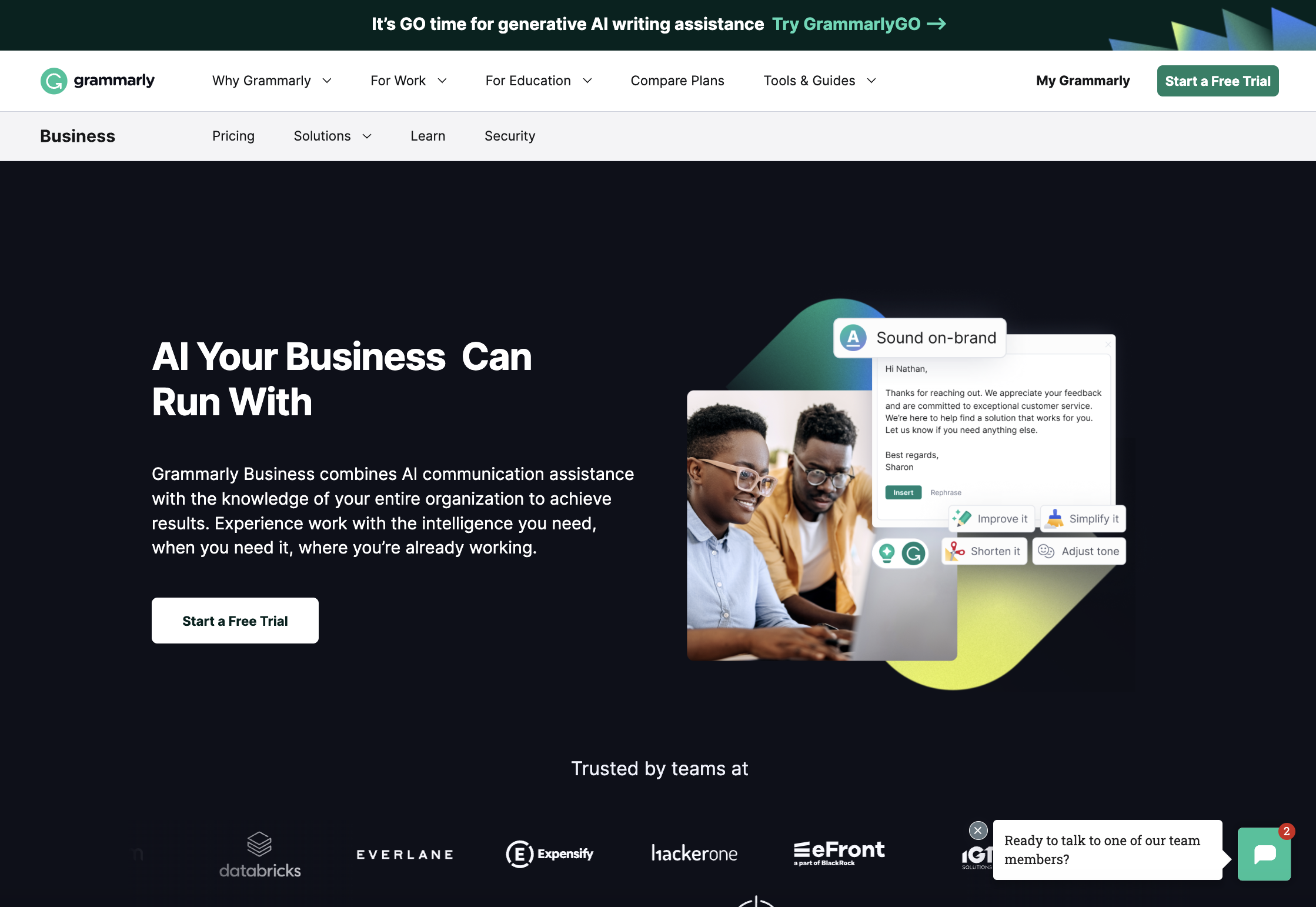 Screenshot from Grammarly, August 2023
Grammarly’s tools are designed to help people communicate more effectively and with more confidence.
Many of us have used its AI-enabled communication assistance features to help us spot typos, fix our grammar, or just word something more eloquently.
This landing page is focused on the company’s enterprise offering, Grammarly Business, with the goal of motivating trial sign-ups.
Why It Works:
- Visual cohesiveness. The page is separated into clear, color-coded sections, each serving a different purpose, so users can navigate to what matters most.
- The copy speaks primarily to how easily businesses can leverage Grammarly’s AI to achieve results, which is a timely topic and a common pain point right now.
- It includes not just logos of customers that it serves, but quotes from specific people, accompanied by their photo, which makes it easier to trust the social proof.
28. Later
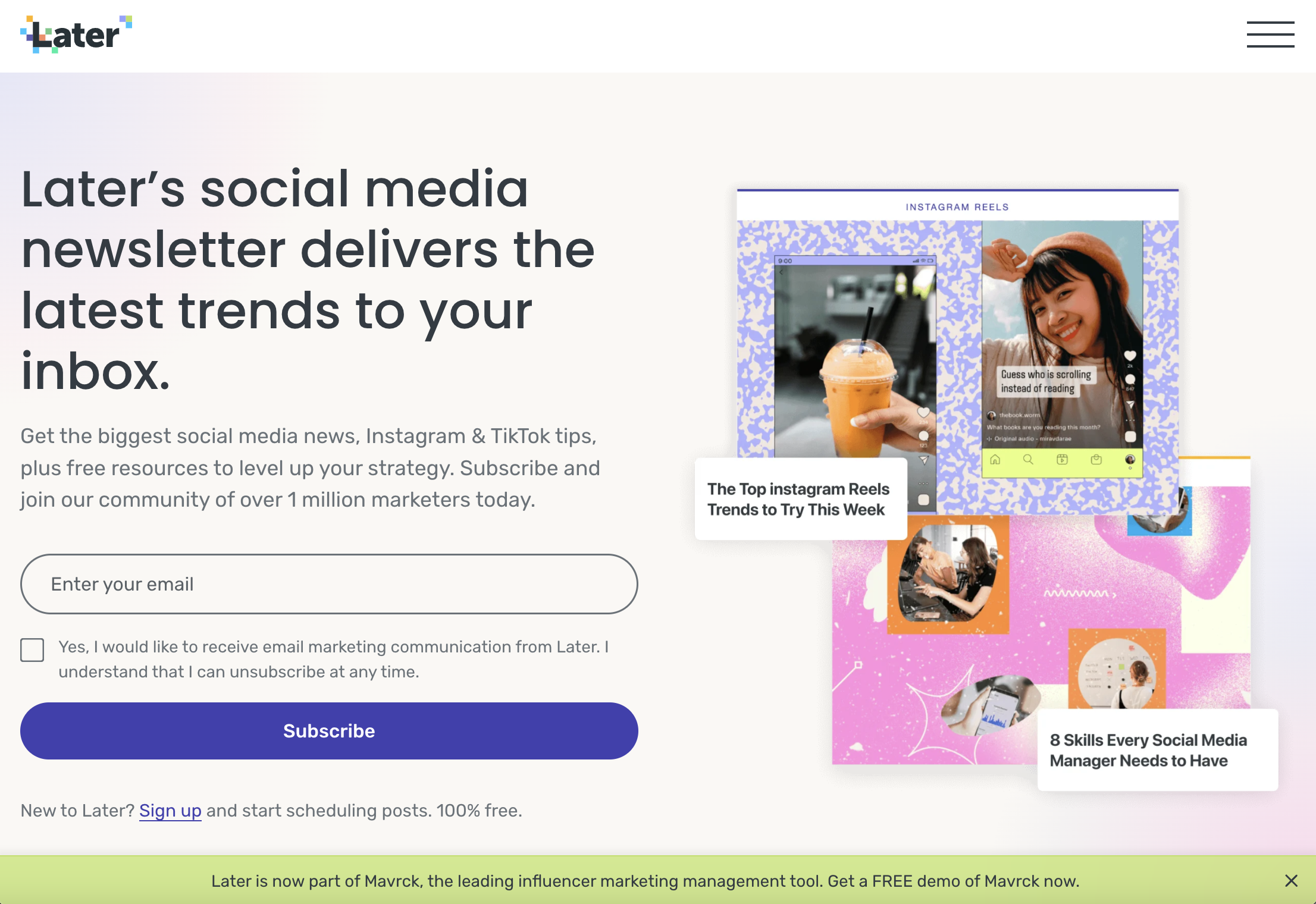 Screenshot from Later, August 2023
One of the first Instagram scheduling tools to hit the market, Later is now a social media marketing platform that serves many different social platforms.
As proof of its authority in this field, Later also produces a social media newsletter to help customers and fans keep up-to-date with the latest social media news and trends – and this effective landing page is where people are sent to subscribe.
Why It Works:
- It’s a short page without a bunch of distractions, housing a single field email sign-up CTA. That’s a sure way to get people to convert.
- The copy immediately tells you what you’re signing up for.
- There’s a great balance of white space and visuals, which speak to the content of the newsletter and what you can expect to see in your inbox.
29. Alto
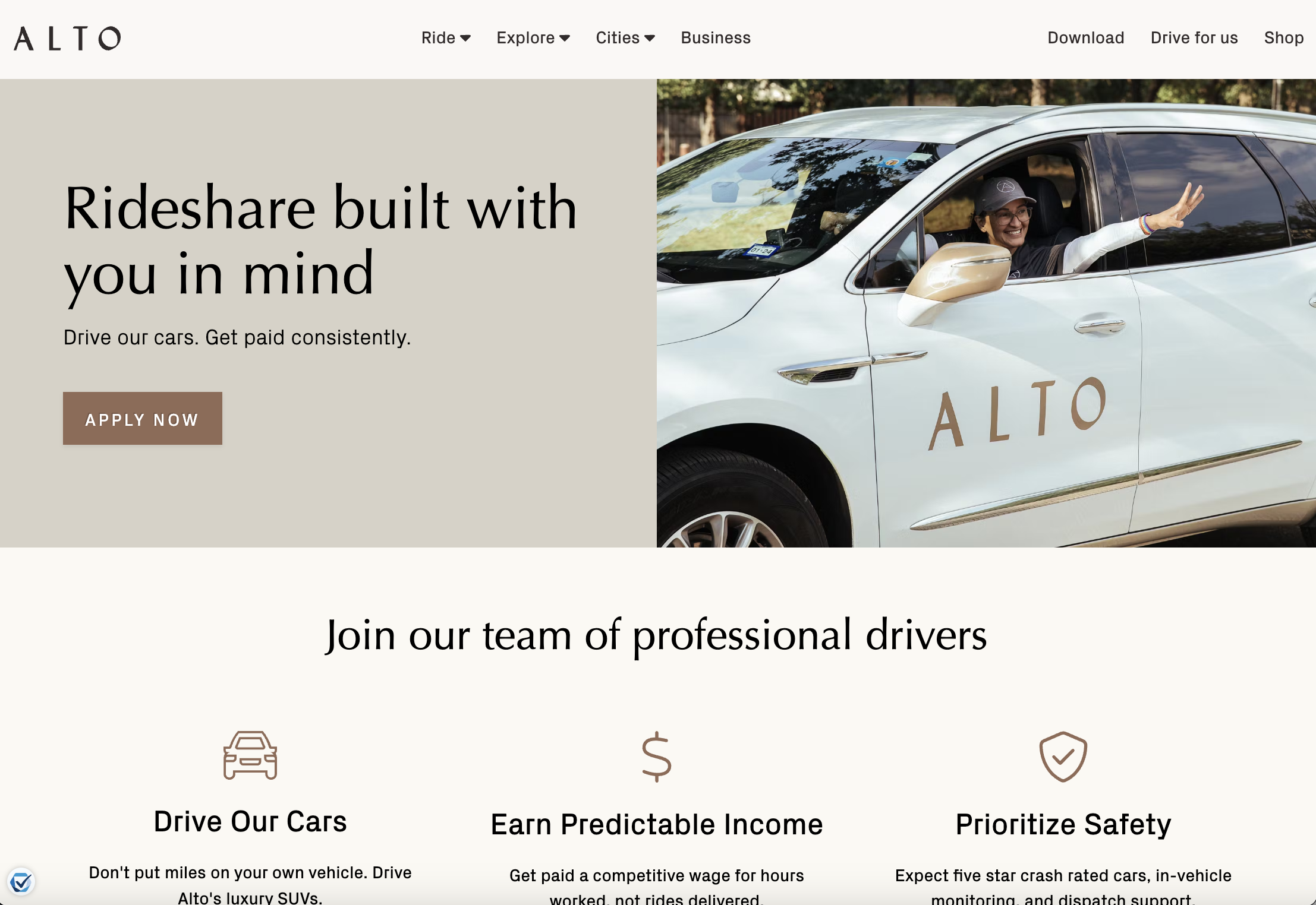 Screenshot from Alto, August 2023
Alto is a luxury ridesharing company with a mission to provide customers with a car service that is safe, clean, and consistent. Its customers – who must have a membership subscription – enjoy an elevated experience with access to luxury vehicles, and other perks and benefits.
One way Alto differentiates itself from competitors like Uber and Lyft is that its drivers are employees, not contractors. This landing page was designed to recruit new drivers to the company, and we think it’s doing a good job.
Why It Works:
- The first thing you see when you land on the page is the headline, “Rideshare built with you in mind.” This really emphasizes the company’s differentiating promise and leans into what prospective drivers might feel competitors are missing: a focus on them. Beneath that, the copy highlights that you get to drive the company’s cars and that you’ll be paid consistently. Pretty convincing, if you ask us.
- If you click the CTA button to “Apply now,” it doesn’t take you to another page but to a multi-field form on the same page where you can enter simple details to submit an application. Attached to this form is a high-quality, first-person drive testimonial video, which touches on more benefits and pros of working for Alto.
- The rest of the page is simple but effective. It outlines the main benefits of working for Alto, such as bonus opportunities, health benefits, and more.
30. Lawn Doctor
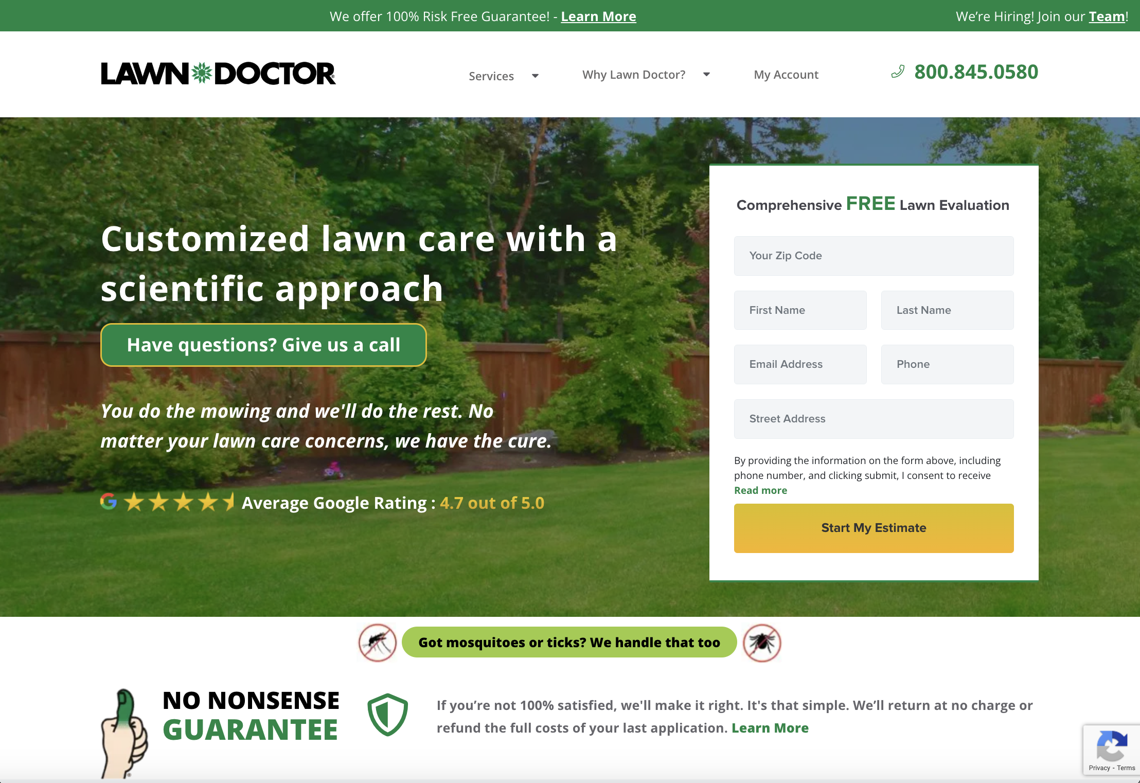 Screenshot from Lawn Doctor, August 2023
Lawn Doctor is a full-service lawn maintenance business offering everything from lawn aeration to tree care and pest control.
It’s a nationwide brand that is made up of locally operated businesses – so it’s a good example of how you can tailor a landing page to a local audience.
For this example, we’re looking at Lawn Doctor’s homepage, which is artfully designed to generate interest from visitors and convert new customers.
Why It Works:
- As soon as you land on the page, you notice the rich green color palette, which perfectly aligns with the company’s products and offerings. The header image is a beautifully landscaped, vibrant green lawn – and it sends the message that with Lawn Doctor, you could have that too! On top of that, you have the company’s average Google rating (4.7 stars) overlaid on the image to offer the social proof you might be looking for.
- The estimate form is easily accessible above the fold and comes with the bolded reminder that your comprehensive lawn evaluation is free.
- The header copy communicates that Lawn Doctor is a step above the competition, as it offers “customized” lawn care with a “scientific approach.” Sounds like the kind of lawn care you want, right?
- In case you’re concerned about making the wrong choice, Lawn Doctor’s landing page includes multiple reminders that they offer a 100% risk-free guarantee – if you don’t like the service, you’ll get your money back.
In Conclusion
Crafting a remarkable landing page requires both strategic thinking and creative design, as well as compelling copywriting.
By taking inspiration from examples like those above and leveraging effective design principles and data on your target audience, you can build a formidable customer conversion tool that helps you drive success in your digital marketing campaigns.
More Resources:
- The 7 Best Landing Page Builders For 2023
- Local Landing Pages: A Strategy For Ranking Local Search Terms
- 25 Awesome About Us Page Examples
Featured Image: XR/Shutterstock



![[SEO, PPC & Attribution] Unlocking The Power Of Offline Marketing In A Digital World](https://www.searchenginejournal.com/wp-content/uploads/2025/03/sidebar1x-534.png)