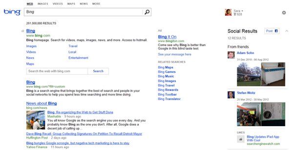
 Yesterday Microsoft’s Bing released an all new design for their social sidebar, a version less cluttered and better linked to friends and trends.
Designed to present Bing users with relevant results of friend networks via Foursquare, Twitter, Facebook, and Klout, the social side of search is still located on the right side of a user’s desktop, but with more minimalist style and ease of use too.
Besides a cleaner and edgy look, Bing users no longer have to hover over people to catch on to added and deeper content. A little + icon lets users drill down to get more info, which is a nice touch. The Official Bing Blog tells more of these improvement, and while not exactly what anyone would call “sweeping innovation”, the incremental change is nice. You can see from the Bing supplied screen below, justification and different organization can have a pretty dramatic effect on user experience.

Regardless of what anyone thinks of Bing, the practicality of social sharing and suggestion come through with some of these refinements. As Bing’s dogma suggests, traveling abroad or installing a lawn sprinkler system, expert and/or friendly help is what the so-called “social movement” is all about in the first place. Sharing is, after all, about more than funny videos. One can think of Bing’s new tool as a bit like the fence in between Tim the Tool Man Taylor’s backyard, and that of his neighbor Wilson. Bing users can just lean across the fence and ask questions too. We leave you with Tim and Wilson and an early version of the Bing sidebar, the backyard fence.


![AI Overviews: We Reverse-Engineered Them So You Don't Have To [+ What You Need To Do Next]](https://www.searchenginejournal.com/wp-content/uploads/2025/04/sidebar1x-455.png)