Podcast: Download
Subscribe: Apple Podcast Google Podcasts Spotify
Visit our Marketing Nerds archive to listen to other Marketing Nerds podcasts!
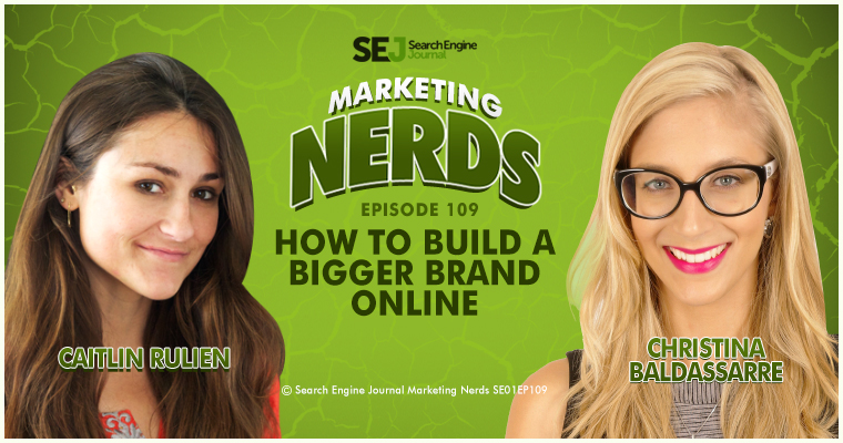
In this episode of Marketing Nerds, Christina Baldassarre, Managing Director of Zebra Advertisement, joined me to talk about how to build a bigger brand online. Christina gives us a look into—first and foremost—why branding matters, as well as tips we can apply when working on our own website and personal branding.
Here are a few transcribed excerpts from our discussion, but make sure to listen to the podcast to hear everything.
Why Does Branding Matter?
I think it’s becoming more a powerhouse now because personal branding has been around since forever, but I think now, especially with social media, even employees who otherwise maybe would not have had such a strong personal brand now get the chance to really present themselves online. I think it just matters because you get the chance to do it. Then second of all, branding matters because it impacts sales, so regardless of whether you’re trying to build a better personal brand or sell a service or product, just branding makes an impact on the bottom line.
Branding is usually associated with images and how something is visually presented, but of course, it goes far beyond just photos. Just to give an example of how powerful the right photo is, the kind of photo you choose can impact your conversion rate up to 70%. We did internal research at Zebra Advertisement for over 2 years and we actually tested over 20,000 ads just to see what makes people convert, what makes people click.
Basically, we started out just by testing how different headlines and descriptions and display URLs and images were affecting the click-through rate and of course the conversion rate. In other words, we just wanted to figure out if any of these elements, if at all, any of these elements have an impact on sales, and what makes people click or buy. It turns out that obviously, the image makes the biggest difference, which is not super surprising because it’s the biggest part of the ad, and also, it’s widely known that images generally have a big impact than text, but what is surprising is how much bigger that difference was. While the image actually affects the conversion rate up to 70%, all the rest was only 10%, 5%, 0.5%, and it went down from there. The image really is the most important thing.
It really seemed like the image was the only thing people care about, so of course, we wanted to put that to a test and see if that was true at all. What we did was we ran Facebook ads and we targeted people who had never traveled much, only speak English, so only speak one language, live in the middle of nowhere, and then we basically chose all the texts in Korean, Russian, Japanese, whatever we felt like had maybe different alphabet that for sure they would not understand. Sure enough, if there was an image that that kind of target group was attracted by could identify with, they clicked. Really, they just overlooked the text. They don’t even care what it says. They don’t even notice if it’s their language. They just look at the image.
What Should Marketers Look for When Choosing an Image?
I think that the image makes a big difference because 30% of the visual cortex in our brain is actually used for image processing versus only 8% and 6% for hearing and sensing, for instance. The brain spends nearly a third of its resources in the visual cortex on imagery, and we can’t really help it. We can’t really control how many resources we spend on looking at images and how much time we spend on processing it. There’s really no way we can control this, so images impact us whether we want it or not.
Even if you have a brand online where you say, “You know, it’s not holding me back. It’s maybe not doing me justice, but it’s okay to look at,” it’s probably holding you back just a little bit because people are judging as soon as they look at you, at your photo, at your font, at your colors. Brand design is not just the way it looks. Brand design is the way you phrase it. Everything gets processed. I believe that especially now with websites, with the trend where everything has a colored background, the text on those pages might actually be processed more in the visual cortex as image processing than text. Even what you’re saying now is probably processed differently by the brain, so it gets more importance.
I just think maybe it’s just because branding is what I do, but I’m just obsessed with it, and I think if it’s so important and you can’t do anything about it, you must control how it’s perceived. If you want concrete suggestions … Say, “You know, I have a photo of myself on my About page. What should I do? It’s me. I won’t look any different. It’s just, what should I do about the photo? It’s just there and I cannot constantly take new head shots.” Well, there is something you should think about. For starters, the styling, the clothes, the colors, the lighting, and all of that should obviously be attractive to your target group, but if you can’t change your photo and you think, “You know, it’s good to go,” experiment with image filters.
If you don’t know how to use any of the free tools online like PicMonkey, you could always go on Instagram, take a new account, don’t follow anyone, make it private, and upload a photo. Apply the filter, and automatically, it’s saved on your smartphone. That’s a new head shot that has a filter that you can then upload to your website. Why do filters matter? Well, some filters are more warm colors, some filters are more cold colors, some filters have an increased contrast, and all of that makes a different impression. The graininess makes a different impression. Maybe you want to experiment with the same head shot, make it really sharp on LinkedIn, and make it really grainy on Snapchat, and make it cartoonish on Instagram. There are just so many things you can do just with little tricks like filters and graininess and experimenting with that.
What are Some Tips for Working on Personal Websites and Branding?
I think one of the most important points when editing your website or when doing a brand makeover is just that instead of making it look nice, design it to sell. You can design brands to sell. Choose specific fonts, specific colors, specific layouts, specific visuals, all with the goal to attract your target audience and to make them buy. Instead of just being likable online, be sellable. In order to increase sales and conversions, or even just conversion maybe being someone filling out your contact page or following you online, you first must know what designs appeal to your target group.
The typical approach to that would be creating an audience persona profile or, ideally, several of those, maybe 3 to 4, which means you define 4 actual people that exist in real life with the following characteristics such as age, gender, lifestyle, what kind of job they have, what kind of job title they have, the household composition, what kind of car they drive. They’re just a bunch of different characteristics that then impact what kind of font appeals to them, what kind of color appeals to them. Do they like bold, thick lines? Do they like really thin, fine lines? Based on the audience persona profiles that you’re creating, you can then design your brand with the goal to sell.
To listen to this Marketing Nerds Podcast with Caitlin Rulien and Christina Baldassarre:
- Listen to the full episode at the top of this post
- Subscribe via iTunes
- Sign up on IFTTT to receive an email whenever the Marketing Nerds podcast RSS feed has a new episode
- Listen on Stitcher, Overcast, or Pocket Casts
Think you have what it takes to be a Marketing Nerd? If so, message Kelsey Jones on Twitter, or email her at kelsey [at] searchenginejournal.com.
Visit our Marketing Nerds archive to listen to other Marketing Nerds podcasts!
Image Credits
Featured Image: Image by Paulo Bobita


![AI Overviews: We Reverse-Engineered Them So You Don't Have To [+ What You Need To Do Next]](https://www.searchenginejournal.com/wp-content/uploads/2025/04/sidebar1x-455.png)