The most effective call-to-action techniques use basic psychology. You can use some of these psychology methods in your calls to action to turn visitors into repeat customers.
For example, let’s say you just read about an online tool that can make your business run faster and increase productivity. Who doesn’t want that?
So you go to the website and snoop around. Ten minutes later you’re clicking the PayPal button and checking your email for confirmation.
Do you know what persuaded you to go to that website and buy the product? It was an effective set of call-to-action methods that pushed you through the buying process.
Call these methods sneaky, but when done right, an effective call to action will guide your visitors through the buying process, thus getting you more clicks, more buys, and more sign ups.
How Compelling Is Your Call to Action?
Your website is competing with more than a billion other websites. Every one of those sites asks the user to do something, whether it be to buy, read more, or hand over their email address. You won’t compel anyone to hand over their money or personal information unless you give them a good reason.
Luckily, creating a click-worthy call to action isn’t hard. In fact, you don’t need to look any further than the nearest psychology book.
Here are seven ways you can use psychology to create a more compelling call to action.
1. Use Repetition
The human brain automatically scans material for themes and patterns that can help it process and understand information faster. Take advantage of the brain’s inclination to seek out repetition and use a recurring phrase to prime your user for the call to action.
For example, if you want more people to sign up to your newsletter, incorporate the phrase “save money” throughout the page. Use that phrase in the header, body, and final call-to-action button. By the time the user reaches the call-to-action button, his brain has already correlated the action of “clicking to subscribe” with saving money.
If you’re not sure which recurring phrase will be effective, use your targeted SEO keyword. This provides a seamless start-to-finish search experience for the user: He types the keyword into the search engine, then recognizes it in your ad copy or meta description, then sees it again once he clicks through to your page. By the time he reaches the call to action containing the same keyword, his brain has begun associating your page with the phrase he initially searched, and he won’t hesitate to click the button.
2. Create a Sense of Urgency
Ever notice that retailers make sales sound like an emergency? Or have you come across a deal with a time limit?

There’s a reason for this. Certain words and phrases, and the feeling of missing out prompt us to act faster.
This is why ads that tout “amazing limited-time offers” or bargains that only last “until supplies run out” are common. We’re more likely to buy now if we’re afraid that we can’t buy tomorrow.
You can improve conversions by creating the same sense of urgency. Also known as scarcity marketing, this technique uses phrases like “last chance,” “offer expires,” or “going fast.”
This method highlights the scarcity of your product, thereby prompting the user to click your call to action before the deal is gone. This is why so many calls to action include the word “now.”
Exclusivity is another powerful motivator. Nothing feels more exclusive than being one of the first to have the insider scoop, especially if you can give the user bragging rights.
So don’t just ask your user to just plain old “subscribe here,” prompt them to “become an insider” or “ask for an invitation” to your mailing list. Other motivators include “be the first to hear about it” or “get it before everyone else.” They’ll be more inclined to join your list if they think they’re gaining access to something that can elevate their status.
3. Focus on a Benefit
Think back to the last time you were on a website evaluating a service. What were you looking for?
While looking through the features of a service or product, I bet you were asking “what’s in it for me” the whole time.
Newbie marketers often make the mistake of talking up features rather than the benefits those features can provide. Higher conversions happen when you can clearly answer the question, “What’s in it for me?”
Psychologically, users aren’t interested in bells and whistles. They’re interested in how those bells and whistles help them solve problems. Think about how your product saves time, money, or hassle for the user, then incorporate that value into your call to action.
A call-to-action button that says “never be late again” is more impactful than one that says “get our time management app.” The same goes for a button that says “shave 10 hours off your work week” rather than “read our time-saving tips.”
Phrase your call to action to focus on results, and you’ll instantly see more clicks.
4. Minimize the Risk
Everyone loves high value and low risk. So why not do like smart marketers do and use money-back and no-obligation tactics to seal the deal? Minimizing risk alleviates your user’s fears and hesitations during the buying process and encourages them to buy or sign up.
Do your sales pages and calls to action make it clear that your free trial is “no-obligation”? Or, does your service include a “money-back guarantee”? Make sure you’re clearly stating them in your call to action or in the copy leading up to it.
While you’re at it, don’t overlook the power of the word “free.” It can be one of the most powerful and persuasive words in the English language, and it’ll help you get more clicks.
Remember, the less risk involved, the more likely your user is to click a call to action — and telling them something is free eliminates any financial risk in their mind.
5. Choose the Right Color
With the absence of physical space — meaning your product or service is fully online — the only senses you communicate through is visual (and audio if you use video). This is why using the right color is so important.
Colors automatically invoke emotion in humans and transmit information on a subconscious level. For example, black has long been associated with sleek sophistication while pink has been associated with femininity — and we all know that green means “go.”

Since you can only communicate through visuals (and sound), use a color that will get your users to “click.”
If you want to energize, choose a vibrant yellow or orange (think Kayak.com). If you want to come across as trustworthy, choose blue as the color of most financial institutions. Or opt for a rich purple if you want to convey a sense of opulence and luxury (think Jet.com).
You can place even more emphasis on your call to action by choosing a color that pops, a color different from the rest of your website. This is easily done by confining your landing page to a monochromatic color scheme and incorporating a contrasting color for your calls to action, whether it be keywords or action buttons.
Conversely, avoid the temptation to make the color design too simple. If your user can’t easily spot your call to action, they won’t be clicking on it. Avoid gray calls to action altogether — gray is the default color when a button or field is inactive; users will skip right over it.
6. Ask at the Right Time
So far we’ve talked about how to ask your visitor to bite at your call to action, but it’s just as important as when you ask them to do it.
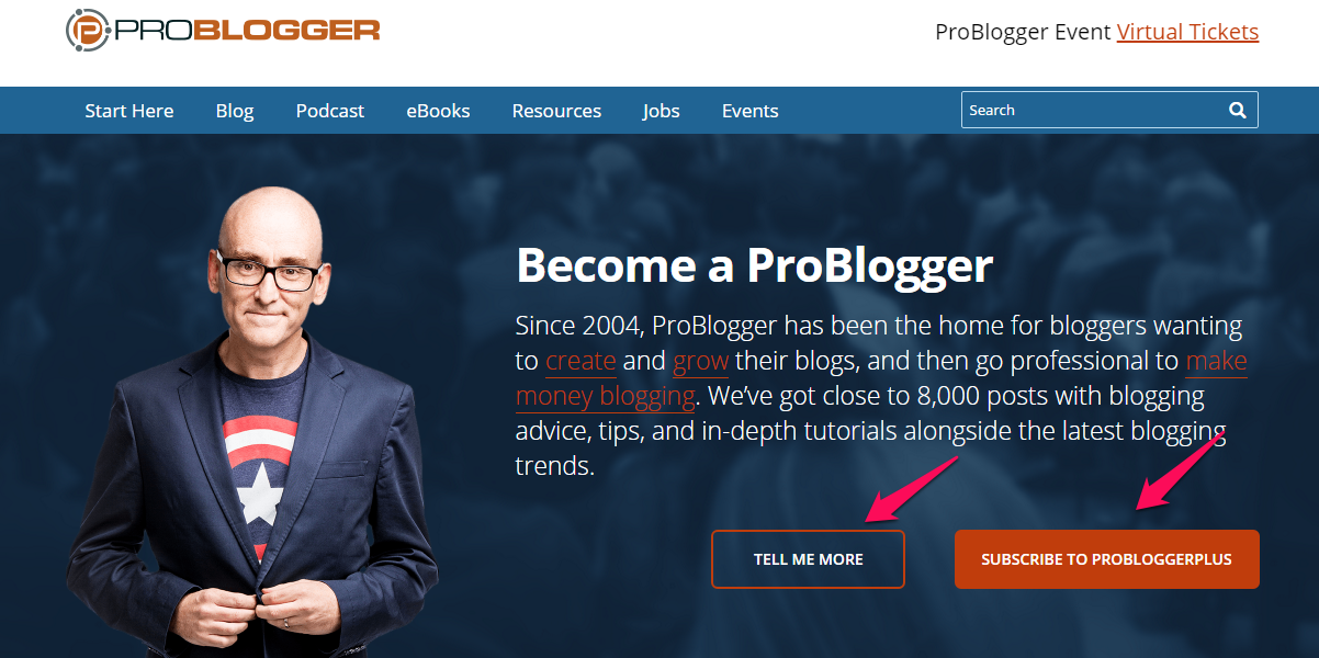
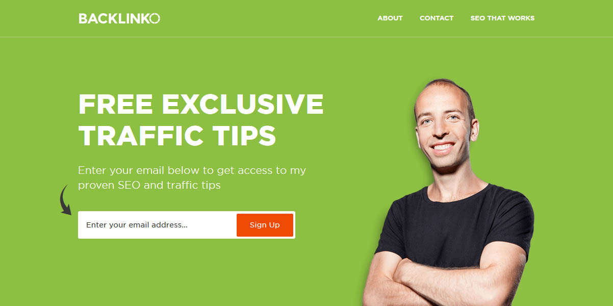
If you’re seeking opt-ins for your course or email list, implement a welcome mat or design your opt-in above-the-fold like marketing leaders Darren Rowse and Brian Dean.

Welcome mats are full-page call to actions and above the fold is the first area you see when you visit a website.

Welcome mats and above-the-fold call to actions provide a less invasive user experience than traditional pop-up boxes. These eliminate the risk of a user leaving your site before seeing your call to action.
However, if your primary goal is to get your users to buy something, it’s best to follow steps 3 and 4 (focus on a benefit and minimize buyer risk) before asking them to sign up via a welcome mat. Users will rarely agree to buy without having some idea of what they’re getting for their money.
7. Keep It Simple
It’s good practice to follow up your primary call to action with a secondary one, such as following your company on social media after purchasing a product. However, it isn’t good practice when your primary call to action is followed by several more calls to action.
The more options you give the user, the less likely they are to choose one — and the more likely they are to bounce. This phenomenon is called decision paralysis, and preventing your visitors from it can help you get higher conversions.
Make sure your primary call to action is immediately visible and understandable, then see if other elements on the page could distract visitors from that call to action. If you’re giving the visitor several other calls to action to click on, it’s probably too much.
Streamline your visitor’s experience and increase success rate by making sure you have a primary call to action and one secondary call to action. Any more than that and it will distract and deter people from staying on your website.
Final Thoughts
Attract more visitors and increase conversion rates by helping your visitors through the buying process using effective call-to-action techniques that have roots in basic psychology.
Implementing these steps today will make your content more appealing and will turn visitors into clients, and customers into repeat visitors.
Image Credits
Featured Image: DepositPhotos
In-post Photo: StockSnap
Screenshots by Dev Sharma. Taken March 2017.


