Web design is fundamentally about visual communication. The most effective designers can keep their viewers’ attention long enough to communicate a message.
Companies have been making a big change lately as to how they communicate their messages online. Gone are the sites with walls of black text on a white background… and nothing else. And that’s a good thing. We’ve determined that most people aren’t inherently good at processing plain data, which is why 82 percent of people won’t bother to read a massive block of text word-for-word.
However, almost all humans are designed to think visually – 90 percent of information transmitted to the brain is visual, and visuals are processed 60,000 times faster than text. That’s why you need to incorporate visual best practices to ensure that your viewers get the most visual experience possible on your site.
According to Web Design Ledger, the biggest visual concept of all is contrast.
Contrast Establishes Visual Relationships
 Created for SEJ by author
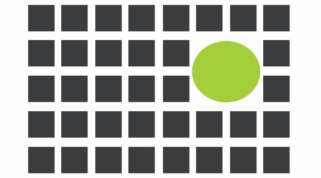
People have a natural desire to categorize objects by looking for their differences and assigning relationships among them. For example, things that appear larger suggest they are closer to us, and color variation might mean that one object is unique from the rest.
The funny thing about “uniqueness” is that objects are only unique because they contrast from the objects around them. Dramatic differences between objects suggest uniqueness, and therefore significance.
This is a great concept for visually optimizing your website. Remember that contrast makes elements stand out based on how they look in relation to their surroundings. An image that is larger than the rest draws attention to itself, as does a red paragraph amongst black ones. People can’t help it – their eyes naturally go right to the elements that are different.
Graphic designers can use this subconscious respect for visual contrast to convey a lot of information in just a single web space. By incorporating different relationships among your elements, you can organize your content and direct your user’s attention to your most important information.
7 Design Principles for Contrast
So what kinds of visual relationships can you establish online?
There are surprisingly more than you might think, and we like to call them design principles. You can create contrast in your content based on:
1. Size
 Created for SEJ by author
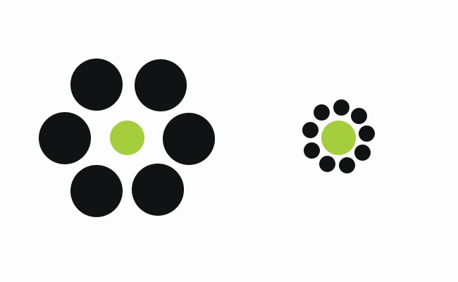
What do you see when you look at this image? On the left, you see a small green circle surrounded by bigger black circles, and on the right is a larger freen circle surrounded by black gray circles. Right?
Wrong. Believe it or not, both of those orange circles are the same size.
Why does the one on the right seem bigger? It’s all about relativity. An object that is larger than other surrounding objects visually takes up more space and therefore demands more attention. Consequently, smaller objects are deemed less important and hold less visual power.
You can use this to your advantage by associating size with significance in your design. Make sure your largest page elements contain the most important information for your viewers. That way, you can guide your viewer’s eye to particular sections of your page in order of biggest to smallest visuals (and most to least significant content).
Try this technique with your text as well. Use big, emphasized type fonts to add order to the page, and use smaller size text with headings and subheadings.
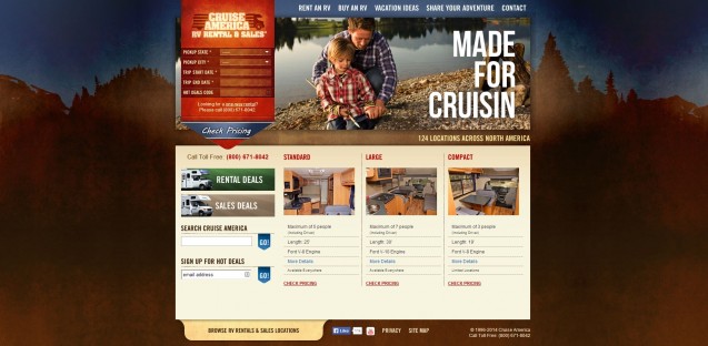
Cruise America has a great example of using size to indicate importance. You look at their homepage, and the first thing your eye goes to is the “Made for Cruisin” heading in the top right. Why? Because it’s significantly bigger than any other textual element on the page, so your eye views it as the most important. Next, your eye probably goes to the picture of the father and daughter, because again – it’s larger than any of the other images.
 Screenshot Taken 3/14/2014 from cruiseamerica.com
The biggest elements on the page are the ones that demonstrate the most important concepts – that the company is “made for cruising,” and that it can provide you a great family experience.
2. Color
You can use color to both organize your page and give it some personality. You can organize your colors to demand attention to specific sections, i.e. using bold, contrasting colors to emphasize buttons or color-coding content by category. You can also use web color psychology to add an emotional appeal to everything from your logo to your CTAs.
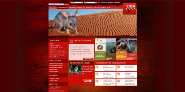
Here are some of the ways you can use different colors to cause an emotional response in your viewers, and some examples of companies that use these colors on their homepages.
Red: Evokes intense feelings of excitement, anger, love, and sexuality.
 Screenshot taken 3/14/2014 from http://www.zoossa.com.au/conservation-ark
Orange: Makes you feel excited, enthusiastic, and warm. Used to draw attention.
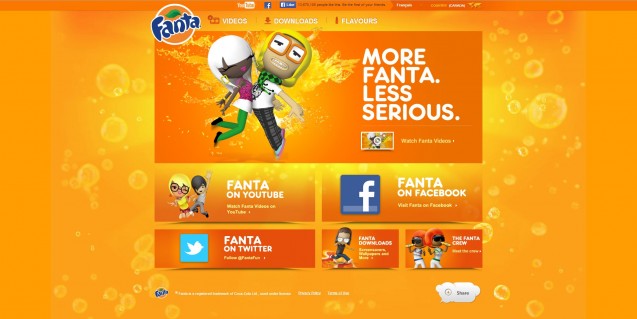 Screenshot Taken 3/14/2014 from http://fanta.com/
Yellow: Both cheerful and frustrating. Most fatiguing to the eye, yet most attention-getting color.
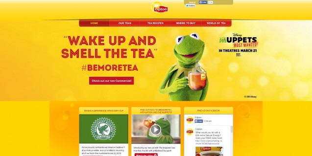 Screenshot taken 3/14/2014 from http://www.liptontea.com/
Green: Symbolizes nature. Associated with peace, luck, health, and greed. Calms and relieves stress.
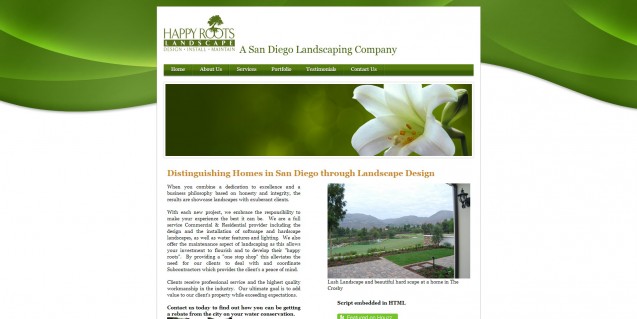 Screenshot taken 3/14/2014 from http://happyrootslandscape.com/
Blue: Most preferred by men. Evokes feelings of calmness and security.
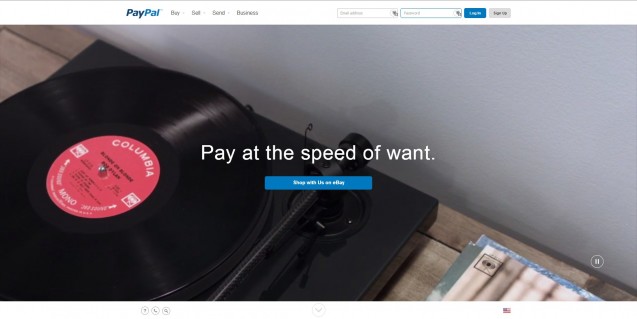 Screenshot taken 3/14/2014 from paypal.com
Purple: Associated with royalty, wealth, and wisdom.
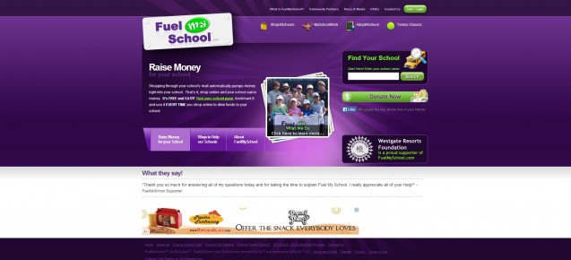 Screenshot taken 3/14/2014 from http://fuelmyschool.com/
3. Alignment
Alignment creates structure among your elements. The location of an element in relation to the location of other elements can dictate its value. For example, items that are middle aligned are up front and center, so they seem more valuable than other elements that are aligned left or right.
Alignment also plays a part in the order that people navigate your page. People have both innate and developed expectations for alignment. Visitors will subconsciously consume all online content left to right in a Z pattern – not just text. Take a look at how the average user might scan the homepage for Wix.com. Your eye naturally starts at the top left, moves across to the right, scans back left further down, etc.
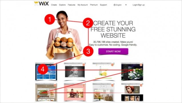 Image credit from onextrapixel.com
Therefore, it’s a good idea to place your most attractive and interesting content at the first 3 points to get your viewer’s attention. For Wix, that involved their most important offer – to help you create a great website for free. Once you grab your viewers’ attention, you can provide smaller and more detailed information further down to keep them engaged.
We also know that users have developed additional expectations for consuming information specifically on web pages – i.e. general information belongs in the top right and contact information should be at the bottom.
Dean and Draper Insurance Agency does a great job of putting the most sought-after information in the top right, where visitors will first look for it. This area includes links to manage your account, request a quote and contact them. It also prominently features their phone number, an important piece of information that any company will want to showcase on their homepage.
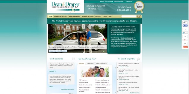 Screenshot taken 3/14/2014 from http://www.deandraper.com/
Considering this information, it makes a lot of sense to put your general information in the areas where viewers expect to find them. Then, organize the rest of your content so that the most important pieces are at the top of the Z pattern.
4. Repetition
Repetition assigns identity to the different parts of your page. If all of your paragraphs are gray, for example, then when users see gray text, they can assume it’s another general paragraph. Also, when users come across a blue hyperlink or a black title, they understand that it is different from the paragraph text.
You call attention to items by breaking apart from your set repetition. Let’s say that you had a statistic that you really wanted to call attention to among several paragraphs of text. If you stuck with your gray paragraphs and incorporated a red one with the statistic, viewers’ eyes would go right to the red paragraph since it would defy the “paragraphs are gray” repetition rule.
The homepage for Resume Baking uses contrast of repetition to call attention to its most important element – its CTA. Users land on this page with the cool blue and white color scheme and are visually shocked to see the bright red button in the center. The button says “Create Resume: It’s quick and easy” to showcases what Resume Baking has to offer. It’s a great way to ensure the first thing the viewer sees are the company’s benefits.
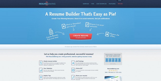 Screenshot taken 3/14/2014 from http://www.resumebaking.com/
5. Proximity
Consider proximity when separating your elements from each other. You might have multiple sections within one page that are separated by space, and you would want to establish a new hierarchy within each section. People are also programmed to associate similar content with proximity – items that are close together have something in common.
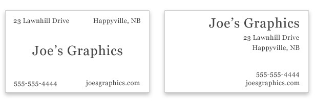 Image credit – webdesignerdepot.com
In Web Designer Depot’s example, we see two versions of a business card for Joe’s Graphics. The one on the left shows the name of the business in the center, with contact information in each of the four corners. However, this business card looks really scattered, and the eye breaks it up into five separate sections. The card on the left features the name of the business in the top right, with the address below it and the phone number and e-mail address in the bottom right. Now, your eye sees two sections where it once saw five. This looks a lot cleaner, is easier to digest and uses the next design principle – whitespace.
6. Whitespace
Cramming a lot of information into a small space makes it feel heavy and dense. Alternatively, if you space your elements out too much, they lose their relationships to one another. You need to strike just the right balance so the eye can easily recognize which elements are related and which aren’t.
Smashing Magazine says you can’t emphasize the importance of white space enough. The first thing visitors do when they approach a webpage is scan the page and divide it into digestible sections of information. Therefore, if you have the choice of separating two segments with white space, you should almost always do so. This makes it easier to break up your content. Without white space, your page looks like one big overwhelming block of information that might discourage viewers from sticking around.
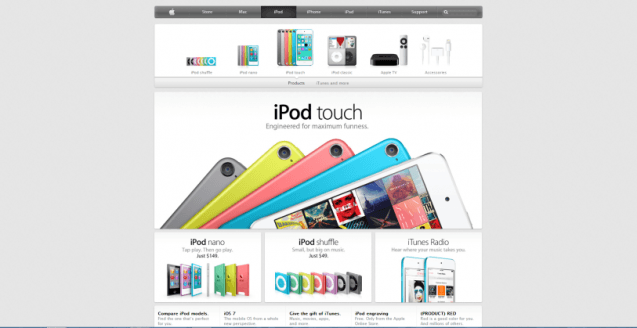
Apple is pretty notorious for using a lot of white space on their website. Their iPod page, for example, incorporates a lot of white space combined with colorful images. The empty space ensures that users aren’t visually distracted by providing great contrast to the content, so the eye goes right to the bright pictures and bold text.
 Screenshot taken 3/14/2014 from apple.com
7. Style/Texture
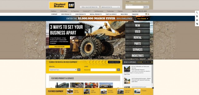
Incorporating styles and textures is also a great way to establish a visual hierarchy on the web. Style is probably the broadest tool you have to execute visual contrast. For example, a brown background “feels” different than a dirt textured one. A textured background adds an additional layer of sensual stimulation – you’re more likely to react to dirt, which you’ve smelled and touched before, than you are to the stagnant color brown.
The Cleveland Brothers CAT dealer, for instance, incorporates a dirt texture as a backdrop to its animated header. Since CAT sells construction equipment, and construction almost always involves dirt, the use of the texture really lends itself to the look and feel of the site.
 Screenshot taken 3/14/2014 from http://www.clevelandbrothers.com/
Why Visual Contrast is Especially Important Online
Contrast is an important concept for any visual medium; however, it’s especially important for web design. As of March 13, 2014, there are at least 2.09 billion webpages on the Internet. That’s a lot for a user to sift through, so you need to do whatever you can to make your page stand apart. By incorporating contrast, you can appeal to human psychology and create visual interest that will make your page rise above.
There are tons of ways to use these principles to incorporate contrast on your page. Here’s a basic checklist of things to do if you want to experiment with contrast on your site:
- Make your most important messages and images pop out by making them the largest elements on the site.
- Use dashes of powerful colors with your links and buttons, and make sure your colors match the emotions you want people to associate with your brand.
- Align your information so that the most interesting and significant elements appear at the top of the Z pattern.
- Break your repetition design rules to bring attention to your CTAs.
- Keep related content close together, but use adequate white space to separate sections.
- Finally, play around with textures to add an additional sensory component to your homepage.
By using all of the tools in your contrast toolbox, you can transform your website into a graphic experience that will appeal to our subconscious desire for visuals. Contrast will help get and keep the attention of your visitors, giving them an ideal web experience and (hopefully) sealing the deal on a conversion.
Featured Image Credit: Andrey_Kuzmin via Shutterstock




![AI Overviews: We Reverse-Engineered Them So You Don't Have To [+ What You Need To Do Next]](https://www.searchenginejournal.com/wp-content/uploads/2025/04/sidebar1x-455.png)