Popovers are an effective tool in the digital marketer’s toolbox. When used properly (and tactfully), popovers can have a significant positive impact on your conversion rate, increase subscribers, and help fill your sales funnel with warm leads.
Marketers often struggle with designing and implementing effective popovers. There are a lot of different tools and methods out there, and when a popover disrupts the user’s browsing, they can do more harm than good.
Today, I’m going to provide an overview of the different types of popovers you can use, give you some important design tips, and review some of my favorite tools for creating effective popovers.
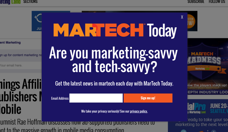
The Different Types of Popovers
Before we dig into the different types of popovers, let’s define what a popover is.
What Is A Popover?
If you use the internet, you’ve encountered a popover. Remember the last time you visited an e-commerce site and a pesky little box literally “popped up” asking you to enter your email address for a 10% coupon code?
That was an entrance popover.
Remember when you were about to leave a blog article and just as your mouse went to click the “x” button a box opened up asking you to subscribe to the blog’s monthly newsletter?
That was an exit-intent popover.
Any prompt that disrupts a user’s normal browsing behavior, uninitiated by the user’s direct action, that promotes a conversion action (newsletter signups, sales, whitepaper downloads, etc.), is considered a popover.
The Entrance Popover
Out of all the different popovers you can use, the entrance popover is the most disruptive to a visitors normal browsing activity, and should be used as sparingly as possible. The entrance popover is exactly what it sounds like – visitors are presented with a popover immediately after landing on your site. Most first-time visitors aren’t familiar enough with your brand to take the action you want them to take with your popover. Without a strong brand awareness, it’s going to be difficult to convince someone to sign up for your monthly newsletter or to exchange a coupon code for a visitors email address. Your visitor doesn’t know who you are yet, how valuable your content is, or whether or not they even want a coupon code.
Most entrance popovers will be a source of frustration to your visitors, and it will decrease their “reservoir of goodwill” toward your brand. That being said, entrance popovers could be effective in many instances.
E-commerce giant Joss & Main takes the entrance popover to the extreme by requiring visitors to actually register before they’re able to browse the site.
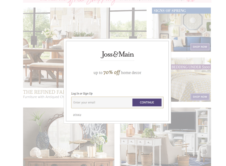 Joss & Main is a big company with an expert marketing team so rest assured they know what they’re doing. They know that while they may turn away a percentage of their potential customers, a number of emails they collect with their entrance popover makes it worthwhile.
On of our clients, Auto Parts Way, uses an entrance popover to increase customer acquisition by offering an instant coupon delivered by email.
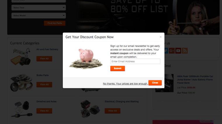 This strategy can backfire for a lot of brands, but if you know your customers, -it could work. Auto Parts Way customers typically know the exact product they’re looking for, and there’s generally very little comparison shopping involved in a sale. Auto Parts Way also has a short conversion funnel, which means an immediate coupon code could be very appealing, even for first-time buyers with little brand awareness.
Generally speaking, think twice before implementing an entrance popover. Make sure the offer is something appealing enough to your visitors that the upside outweighs the natural frustration the popover will cause. Moreover, make sure you’re tracking your visitors, their behavior onsite, and the effects of implementing an entrance popover. Remember, no aspect of your web design will create a fully optimized experience for all your website visitors. In fact, there is no “average” user. Web usability is inherently idiosyncratic, and the only way to really know if a something like an entrance popover is a good idea is to measure its bottom-line results.
The popover tools I review later all come bundled with tracking and analytics of some sort; make sure to use them to track the relative effectiveness of your popovers.
The Timed Popover
The timed popover is similar to the entrance popover in that it’s not triggered by any specific user action, but instead of initiating on page load, the timed popover triggers once a user is on your site for a certain, predetermined amount of time.
Another version of the timed popover is a popover that triggers after a predetermined number of pages are viewed. The basic idea behind both the page number specific and the timed popover are the same: wait until the visitor shows a certain level of engagement with your content before disrupting them with a popover.
It’s a powerful concept, and when the content of the popover is appropriate, it can yield very positive results. Instead of users being greeted with a popover the moment they land on the page, they have some time to make their own judgments as to the quality of your site and the usefulness of your content. Studies have repeatedly shown that web users form an initial impression within just a couple of seconds of landing on your website. By giving your visitors enough time to make a favorable judgment about your brand and to get acclimated to your cyber environment, you increase their favorability toward an offer in a popover.
Popular social media blog socialmediaexaminer.com uses timed popovers to increase their email subscribers.
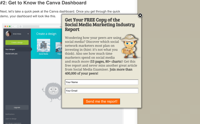 This particular popover triggers after a visitor visits three different pages on their site.
Affiliate Marketing News uses the timed popover to drive subscribers to their newsletter.
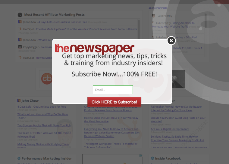 The newsletter signup makes sense for a blog site, because the offer is directly related to the type of browsing the user was engaged with on the site.
The Exit Intent Popover
The exit intent popover is by far the most popular form of popover. Not only is it the least disruptive to a visitor’s browsing behavior, but they also tend to have the highest conversion rates. Exit intent popovers use exit intent technology that triggers the popover when the user’s mouse leaves the browser plane, presumably with the intent to exit your site (hence the name). Exit intent popovers are primarily used to either collect an email address in exchange for a free download or offer or to keep the visitor on the site by redirecting them to a more useful page or by offering them an instant discount.
If you’re new to popovers, I highly recommend starting with exit intent popovers. Even if you have a high traffic website, you can’t do any real harm with an exit intent popover. It’s a safe way to A/B test your popover until you know what works best for your visitors.
Optimonk (one of the companies I am going to review in a bit) uses an excellent exit popover to help turn abandoning visitors into leads.
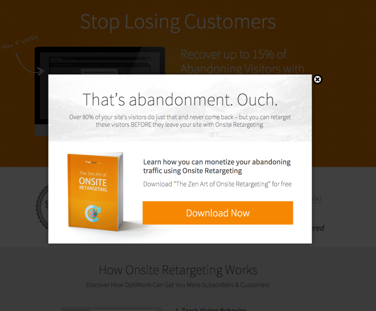 Exit intent popovers are becoming more and more popular as companies like Optimonk are making it easier for nontech savvy entrepreneurs to design, implement, and test them.
6 Key Principles of Popover Design
Popovers already have a tenuous relationship with your website visitors, so it’s important to design them well. In other words, popovers are an inherently unnatural stage in your visitor flow, and it’s your job to make them feel as natural as possible.
The following are the most important elements of popover design. Design your popovers with these principles and you’ll increase their effectiveness.
1. Be As Unobtrusive As Possible
Popovers, as we already said, are disruptive by nature. Everything we do in web design focuses on not disrupting our website visitors. Remember that entrance popovers are the most disruptive type of popover. Use them with extreme caution. Use them only when you know that the return on investment of the popover conversions outweighs the impact of the lost visitors that the entrance popover will inevitably turn away.
Timed popovers are also quite disruptive, but they tend to be less annoying to a visitor than an entrance popover. Use timed popovers to capture subscribers on blog sites or to give away an instant coupon on an e-commerce site.
Exit intent popovers are the least obtrusive of the bunch. Use exit intent popovers first, and then move up from there once they’re generating positive results.
2. Have A Clear Call To Action Linked To An Appealing Offer
You have a fraction of a second to capture the good will of a website visitor with a popover. Popovers are not a place for descriptive copy or a large form. Your popover should have a clear call to action linked to an appealing offer.
In this popover from Bounce Exchange, the visitor is presented with a clear and concise call to action.
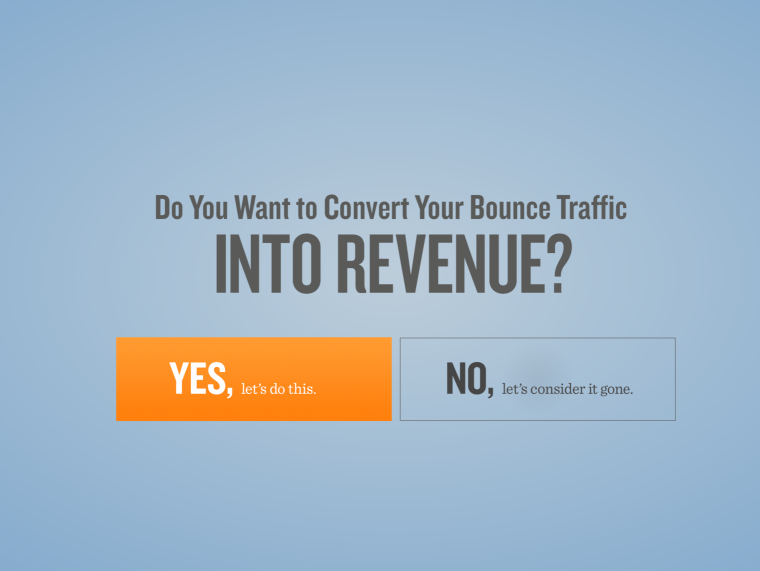 Interestingly, this popover asks the visitor to answer a question instead of download a free guide in exchange for their email. Asking the visitors to answer a question can be a powerful way to hold their interest. Psychologically, it would be difficult for a visitor to answer “no” to the question they’re asked.
Here’s what happens if you click “yes”:
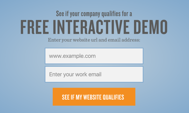 Now you’re presented with your clear offer (free interactive demo) and the call to action (email and website URL). Now that I’ve been conditioned to answer “yes”, I am more likely to submit my information and complete the conversion action the popover wants me to take. Whether you use a one stage popover or a multi-stage popover like the example above, make sure you keep your call to action clear and concise, and highlight your offer in as bold a way as possible.
Here are some popular offers to consider using in your popovers:
- E-books
- Case studies
- White papers
- Industry reports
- Coupon codes
- Free trials
- Newsletter subscriptions
- Contest entries
- Social media follows
The best offer for your popover will depend on the type of popover (entrance versus exit), your audience and the type of browsing behavior and level of engagement with your site.
3. Ask For As Little Information As Possible
This is an easy one.
You know how difficult it is to get your visitors to fill out a form on your site. And that’s when they’re actually motivated to fill out a form on their own. In a popover, personal information is guarded with even more paranoid passion. If you can get away with just asking for an email address, just ask for an email address. Fill in the rest of the blanks as you continue to market to your visitors in follow-up email campaigns and remarketing campaigns.
4. Be Honest
Follow up with your offer in exactly the way you said you would in your popover. Popovers are almost like sketchy strangers hawking their wares in a dark alleyway. If what they’re selling is so appealing that you take out your wallet, the seller better make sure he doesn’t misstep and lose the small amount of trust he earned.
If you say you’re going to give your visitors an instant coupon code, then make sure you apply (or provide) an instant coupon code. Don’t send the coupon via email (unless that’s what your popover promised). If you’re offering a free e-book and you say it’s 23 pages long and packed with actionable insights, make sure your e-book is 23 pages long and packed with valuable resources.
Just be real. If there’s one place to leave your marketese at the door, it’s in your popovers.
5. Be Relevant
The offer in your popover should be relevant to your visitors browsing behavior. The offer or message should feel like a natural extension of the page your visitor is on (or the page your visitor is leaving). For example, if you’re an attorney, your popover should include an offer specific to the type of legal service the visitor was showing interest in. Always ask yourself, “would this offer appeal to this user if this offer was on the bottom of the page instead of in a popover?”
If you’re confident that the offer in your popover is something that the average visitor would find useful and relevant, you have a good shot of making a great popover.
Neil Patel uses a great popover on the Quick Sprout homepage (some may argue that it’s not a popover but the homepage itself, but the concept is the same).
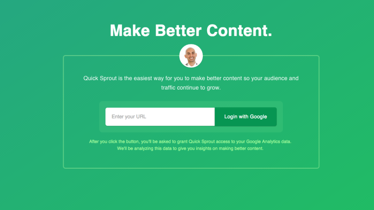 Neil’s popover is slick, simple, and most importantly, relevant. People come to Quick Sprout to learn how they can increase online traffic to their blogs. This popover feels like a clear extension to a visitors normal onsite behavior. The conversion goal in the popover is precisely the action Quick Sprout visitors want to take.
OptinMonster (another tool I’ll review below) does a great job at keeping it relevant to the user with their exit intent popover.
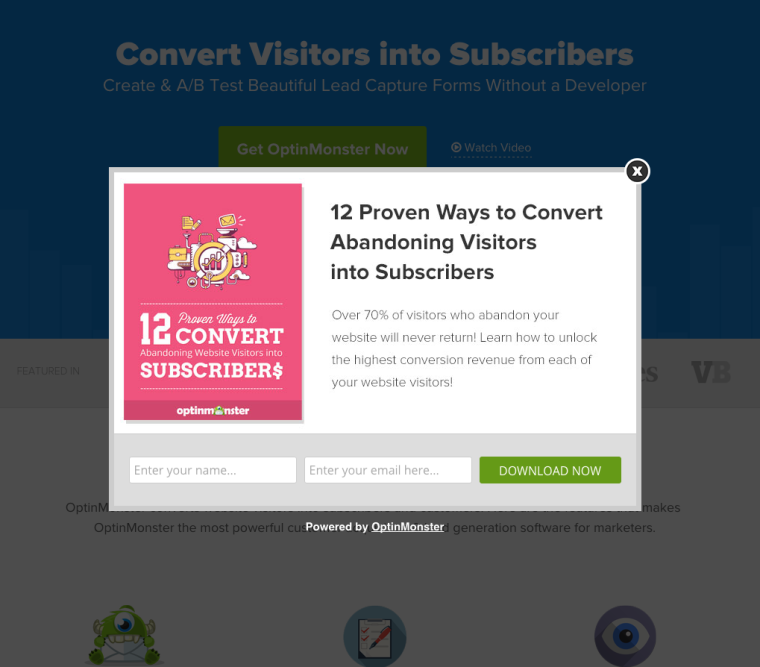 OptinMonster offers an e-book with a clear value proposition that’s relevant to the visitors browsing activity. Simply put, they offer an e-book that their visitors will very likely want to read.
Once again, the content of the offer is relevant, they don’t ask for a lot of information, and they make it very clear what I’ll be getting.
6. Use An Image
Most of the popover examples we’ve seen use a professional looking image or graphic that relates the offer in the popover. A well designed graphical element can help engage the visitor and make them feel better about the offer in the popover. Remember that popovers can be a very powerful marketing tool when used correctly. Popovers can help convert abandoning visitors and increase goodwill.
On the flip side, poorly designed popovers can also disrupt visitors, frustrate their experience, and decrease conversion rates among visitors that would have otherwise converted.
My Favorite Popover Tools
Disclaimer: I have no affiliation whatsoever with any of these tools.
1. Optimonk
Optimonk is used by businesses like Office Depot and Digital Marketer to convert abandoning visitors into leads and customers. Optimonk provides one of the most user-friendly self-serve dashboards on the market. They integrate with your existing site using a tracking code while all the designing and tracking is done through their dashboard.
Optimonk offers a library of pre-built popover templates, intuitive A/B testing, adjustable popover timing and real-time analytics. Optimonk integrates with all major website and e-commerce platforms like WordPress, Drupal and Shopify (including many others), and they also connect directly with your email and marketing software.
Optimonk offers exit intent technology for exit intent popovers, timed popovers, scroll triggering popovers, and on-click popover triggering as well. Optimonk also comes built with more than 20 fun display effects to spice up the visual appeal of your popovers.
2. OptinMonster
OptinMonster is similar to Optimonk in many ways. They offer an intuitive backend design system; they integrate with all your major marketing software and email software right out of the box. OptinMonster also offers advanced user segmentation that allows you to target users based on specific behavior. They also allow you to add scroll boxes and floating bars to engage visitors in a less disruptive way.
You can’t go wrong with OptinMonster or Optimonk – they are both very powerful self-serve solutions that are affordable and easy to use right out of the box.
3. Bounce Exchange
Bounce Exchange positions themselves as an enterprise solution for brands that want to take their popovers to the next level. Bounce Exchange offers industry leading white glove marketing automation, a dedicated design team and patented conversion technology that helps read your visitors’ behavioral footprint to target them with hyper-specific offers.
Some of the world’s leading brands use bounce exchange, but they’re not cheap. Expect to pay thousands of dollars a month to partner with them, as opposed to a relatively paltry twenty bucks or so to use optimonk or optinmonster.
Bounce Exchange has an incredibly useful resource library that you can check out here.
Conclusion
Modern web technology has turned popovers into both an art and science. With powerful behavioral segmentation, real-time analytics and A/B testing, the opportunities for creating powerful popovers are huge. But at the end of the day, popovers are seen by real people – your highly valuable website visitors. People with their own unique emotional makeup, personality, needs, and frustrations.
Popovers will only work when they conform to the most basic principles of human psychology. As long as you keep the principles above in mind when designing your popover campaigns, you’ll be well positioned to see positive, immediate returns.
But most importantly, have fun with them. Popovers are easy to design and implement. Make them fun for you and fun for your visitors … and if you come across any awesome popovers, don’t forget to share them with us here in the comments!
Image credits
Featured Image: Bench Accounting via unsplash.com
All in-post screenshots by Isaac Rudansky. Taken March 2016



![AI Overviews: We Reverse-Engineered Them So You Don't Have To [+ What You Need To Do Next]](https://www.searchenginejournal.com/wp-content/uploads/2025/04/sidebar1x-455.png)