“Every paid search campaign needs a dedicated landing page.”
Digital marketers hear this advice so often that it feels like an undisputed fact.
Unfortunately, a specific format – a “dedicated” standalone landing page – isn’t all that’s needed to guarantee a successful paid search campaign.
Dedicated landing pages can actually result in lower conversion rates than an advertiser’s busier primary website. You may have even experienced this yourself, and you’re about to see why.
So what causes dedicated landing pages to fail?
Pages that ignore the needs and desires of their visitors won’t inspire them to take action.
Here are three case studies I’ve seen first hand where focusing on page elements rather than people can cause your campaigns to end in disaster.
Mistake 1: You Launched a ‘Radical Redesign’ Rather Than Listening to Your Audience
You’re changing your offer. Targeting a brand new audience. Introducing new features and options.
You’re in full renovation mode in your business, and you want your landing page to perfectly reflect all the excitement and possibility that these changes will bring.
You hire a copywriter, find a designer, review, tweak, review, and tweak some more. You finally hit “publish” on your new and improved landing page and await fanfare and conversions.
Except – the fanfare and conversions don’t happen.
In fact, nothing happens.
It’s a devastating outcome you never saw coming.
‘New and Improved’ Isn’t Guaranteed to Win
When you’re in neck-deep in a redesign, it’s hard to imagine that all the work being done might not improve conversions.
Thanks to survivorship bias, we usually hear stories of successful landing page launches – often in the form of case studies that reinforce the positive results of the work.
You won’t find many before-and-after photos of people who gained weight after starting a new diet, and you won’t find too many stories of companies that invested thousands of dollars in landing pages that don’t beat the control. But these untold stories happen far more often than you’d think.
The problem with radical redesigns, where multiple elements are changed all at once, is that they don’t allow for genuine testing. Ideas that seem good (or “good enough”) are all published at the same time. Marketers can only guess the cause of the results.
Radical redesigns are useful when there’s clear evidence the changes are important to prospects. When changes reflect the preference and desires of the advertiser and not the audience, it’s rare for a landing page to overcome that problem by virtue of its design.
Since all changes are wrapped up in a single page variation, new pages are more likely to get scrapped entirely than modified. It’s disappointing and frustrating for everyone involved, because there was usually a high cost to the redesigned page, and a vested interest in it driving better results.
Real-World Trouble with Radical Redesigns
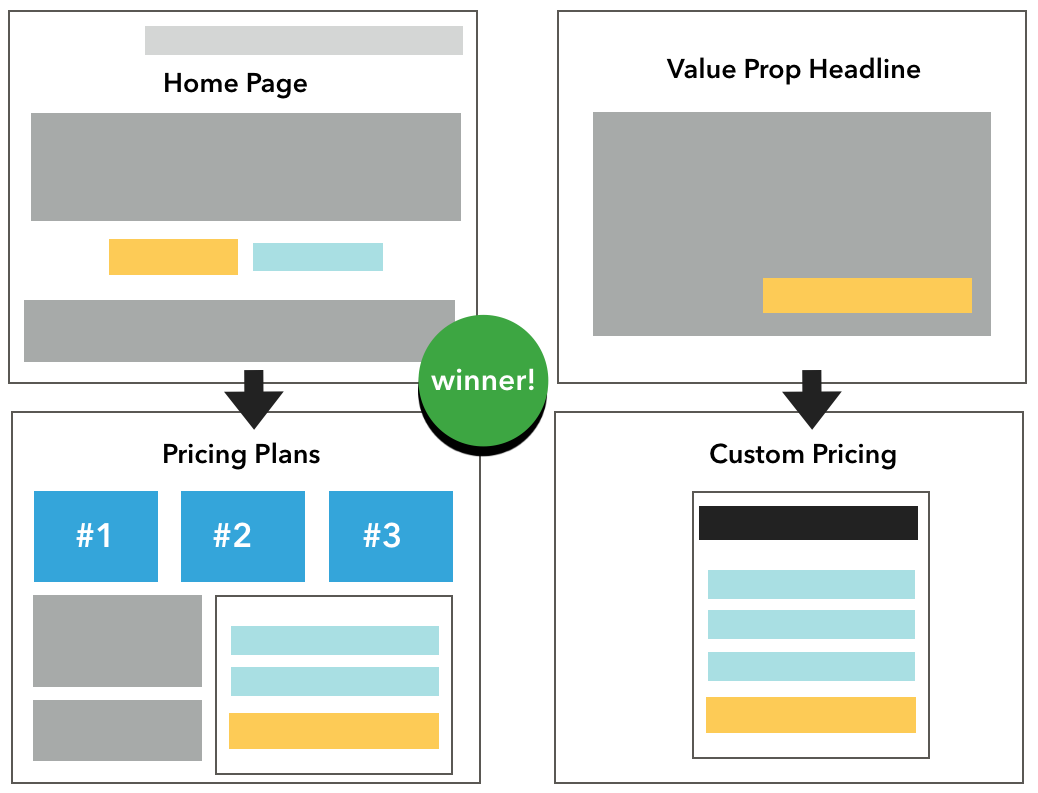
One of our clients was making some changes to their business model. Along with targeting a new audience, they introduced new pricing and created a new sign-up method. They launched paid search ads to drive traffic to the new pages.
We weren’t seeing the traction we wanted to see with the paid campaigns, so we started split-testing the traffic between the new landing pages and the original offer on the home page.
The original home page had a conversion rate 71 percent higher than the new pages.
When we looked closely at the data, the new landing pages had a higher CTA click-through rate than the original site.
But visitors were less likely to convert on the second step: the updated pricing page.

The update reflected a change that was important to the business but less desirable to their prospects.
Improved Conversion Rates Come from Improved Audience Learnings, Not Just New Pages
When radical redesign landing pages are launched, it’s often with expectations of improved performance.
But the best path to improvement is through testing, and the best tests are designed to help the advertiser learn about the audience.
Flint McGlaughlin of MECLABS Institute explains:
“The goal of testing is not simply to get a lift, but to get a learning … Because with that learning, you can map the mind of your prospective customer and create a model that predicts behavior.”
For improved conversion rates, don’t rely on design or expert copy alone.
Start your projects with hypotheses about your audience, and create pages that can be used to validate and inform assumptions.
Incremental changes and valid tests can drive better offers and better conversion rates over time.
Mistake 2: You’ve Confused Clarity with Brevity
The success of paid search campaigns depends on clarity. But clarifying means eliminating confusion, not eliminating all context and information that isn’t a call-to-action.
There’s a common marketing myth about how users search. It goes something like this:
- Your prospect goes to Google, and picks your ad to click.
- She visits your page.
- If there are distractions, she’ll get confused and leave.
- If there are no distractions, she’ll have no option but to complete the form.
The truth is, most people who are in research mode don’t follow this process. Instead:
- Your prospect goes to Google and opens many ads and listings in new tabs.
- She starts exploring her options.
- If she doesn’t see the choices and information she needs, she’ll close your tab.
- If she has enough context, she’ll continue on your page.
And yet, thanks to the myth, we build our pages as if we could “capture” our visitor simply by removing options.
Most “best practices” about clarity in landing pages tend to be limiting and reductive, like:
- One idea per page.
- No navigation.
- No links.
- Short copy.
- No distractions.
- One single call to action.
While these suggestions can help transform cluttered, dense pages into focused landing pages, they can lower conversion rates if taken too far.
Cleaner Landing Page = 35% Conversion Rate Drop
Let’s look at what happened to one of my colleagues.
His client “refreshed” their website with a beautiful redesign.
The site is stunning. Cluttered, text-heavy pages are gone. There’s a simplified, streamlined look throughout the site and for all PPC landing pages.
The result?
A 35 percent drop in conversion rate.
The “old” landing page would not impress a web designer, but it had important information that helped visitors want to take action.
The new page has more white space and fewer “distractions,” but it doesn’t give visitors the information they need to want to fill out the form.

The cluttered page didn’t win because it was cluttered. It won because it clarified the benefits of taking action. In the simplified version, visitors didn’t clearly understand the benefit of completing the form.
Optimize for Clarity, Not Minimalism
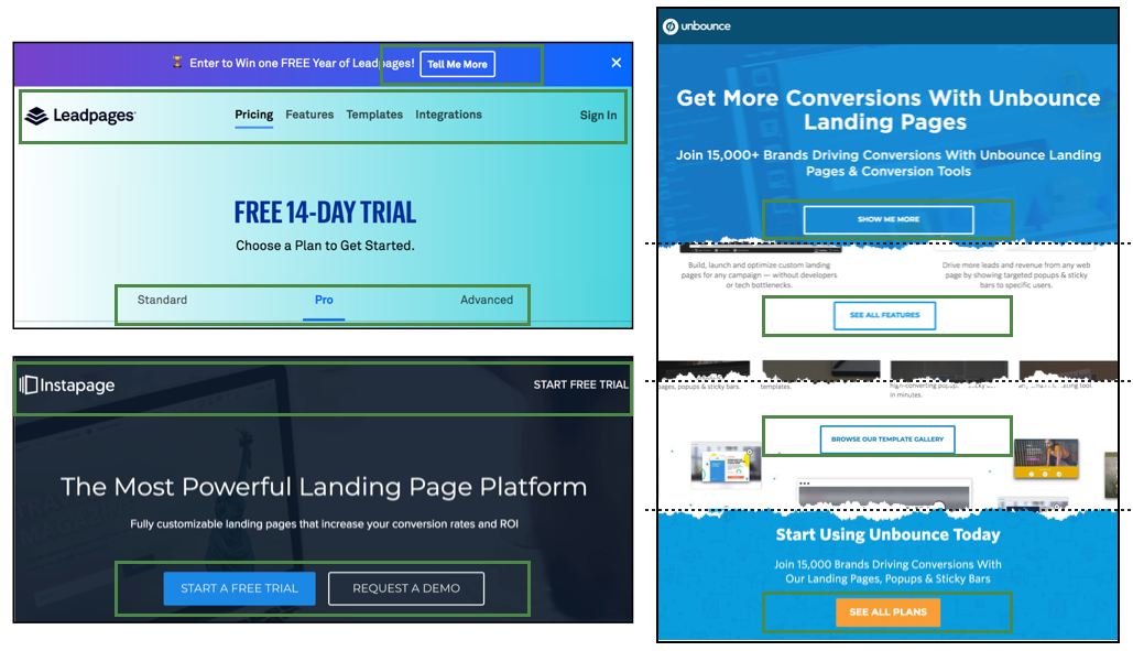
Even the big landing page software companies – like Unbounce, Leadpages, and Instapage – don’t expect an empty page to drive conversions.
All of these companies orient their visitors by using global navigation or multiple CTAs on the landing pages they’re using for their paid search.

Dropping your visitors on a ghost town of a page with no options or context is a bad user experience, and is unlikely to maximize conversions.
Give your visitors clear reasons to take action, and you’ll have a better conversion rate than if you simply strip away options.
No matter how much you limit choice on your page, you can’t limit the choice provided by your competitors, or the choice of simply closing the browser window.
Mistake 3: You Optimized for Attribute Checklists Instead of Your Prospect’s Needs and Wants
I love checklists. There’s something so satisfying about knowing exactly what needs to be done and ticking off the boxes as you go. Ah, dopamine!
As busy marketers, we rely on checklists and standard operating procedures to guide the work we’re doing and track our progress along the way.
But itemized to-do lists are no substitute for knowing your audience and developing a landing page that drives them to action.
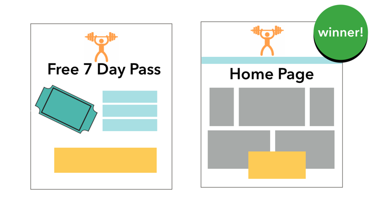
I used to manage paid search for a fitness center with multiple locations. Our paid search campaigns drove visitors to a dedicated landing page where they could sign up for a 7-day free pass.
The page checked all the boxes of standard landing page best practices:
- No external navigation or links.
- Simple form with high-contrast button.
- Brand recognition.
- Trust indicators and social proof.
- Compelling offer (free pass!).
- Strong page headline.
- Message match with ads and keywords.
Did the landing page drive conversions? Yes, it did. But here’s where it gets interesting.
Our client launched a site redesign, and they added the 7-day free pass as a pop-up offer across the site. So we ran an experiment.
We A/B tested the final URLs of our paid search traffic using both the dedicated offer page and the home page.
When visitors landed on the home page, they were twice as likely to sign up for the free trial offer.

Why Did the Home Page Outperform the Dedicated Landing Page?
Our prospects weren’t just looking to work out for a week. They were shopping for the right gym to join; one they would go to for months and years.
They needed to know about classes, schedules, hours, locations, childcare and other amenities. There’s no point in getting a free pass if you can’t use it, and they couldn’t tell from the landing page whether the fitness center would help them meet their fitness goals.
The laundry list of best practices failed to cover what visitors cared about the most. Meanwhile, the impact of having club and amenity information was so compelling that we switched all traffic to the home page (gasp!).
We saw our year-over-year conversion rates double for each of the next 12 months by driving visitors to the website rather than dedicated landing pages.
Driving traffic to the home page, year-over-year conversions were up 80 percent, with a 98 percent increase in conversion rate

Well-designed landing page experiences prioritize the audience over any checklist.
If your visitors can’t understand your offer, your process, your price, or how their lives will be better by taking action… they’ll be less likely to convert. It doesn’t matter how cool your hero image is, what color the button is or where the model’s gaze falls on the page.
Want your visitors to take action? Ditch the checklist and speak to what they care about.
How to Prioritize Your Audience for Better Conversion Rates
With so many marketers fixated solely on page software and elements, it’s extremely common to optimize for the page while ignoring the audience. But it’s not inevitable.
Fortunately, even checklist-loving marketers can get it right by following smart guidelines that go beyond button colors and navigation.
- Copy Hackers’ Joanna Wiebe has a “7 Sweeps” tutorial series that teaches marketers advanced techniques to connect with their audience.
- Nicholas Scalice of Landing Page School offers a suite of questions that every page should answer for better performance.
This process may not be as concise, binary, or easy as just stripping content from a page, but it’s what makes the difference.
As you build and evaluate your landing pages to meet the needs of your audience, your campaigns will improve, regardless of the specific page format of the final URL.
Remember, landing pages don’t convert; people convert. So give them the context and motivation they need to take action.
More Resources:
- How Targeted Do You Need to Make Your PPC Landing Pages?
- 8 Dos & Don’ts for Your PPC Landing Page
- 4 Common Goals of PPC Landing Pages for B2B Lead Gen Campaigns
Image Credits
In-Post Mockups: Created by author, February 2019
All screenshots taken by author, February 2019


