It’s been a busy week for the Facebook Ads platform.
The delayed date (originally intended for September) of the Apple iOS14 roll-out hit, causing all kind of trouble for media buyers.
In the midst of it, Facebook updated its Account Quality dashboard, which is tucked inside Business Manager. While the feature itself is not new, it appears Facebook is enhancing to integrate Page-side information along with an upgraded user interface.
Account Quality Sections
The dashboard contains four sections:
- Account Issues
- Account Status Overview
- Facebook Account
- Business Accounts
Most of the information has been available, so the overall update itself isn’t a huge reset. However, there is a convenience factor in having all disapproved ads in one place for easy review, particularly for media buyers who manage multiple Facebook Ad entities.
Account Issues Section
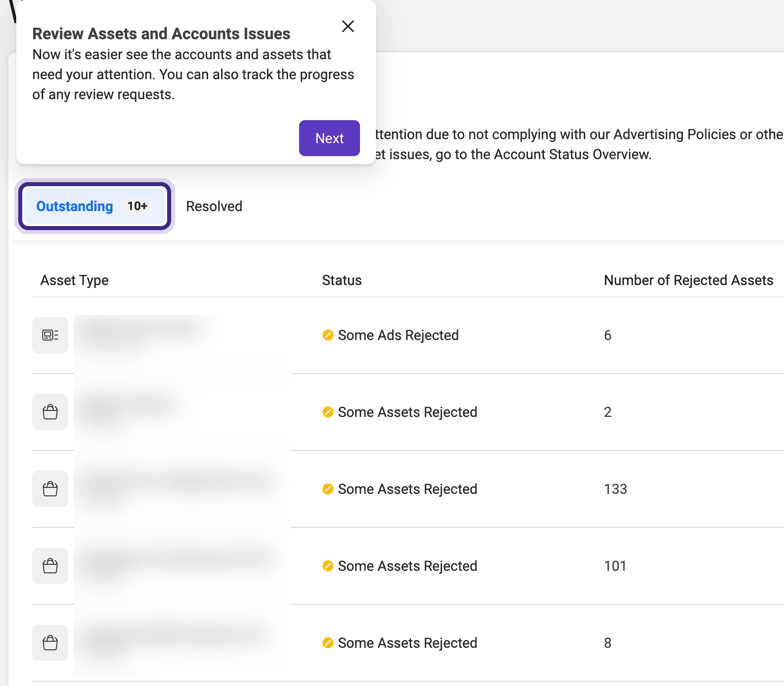
This section gives a birds’ eye view to the accounts and assets that may have issues to address. Indicators at the top will note the number of outstanding vs. resolved issues:

Clicking on an outstanding line item takes you to a detail screen noting the item’s Campaign location, number of ads affected, what policy it violates, and scheduled vs. review dates.

Facebook’s Support for Issues
Unfortunately, this convenience doesn’t fix one of the biggest complaints advertisers lament: support and transparent communication.
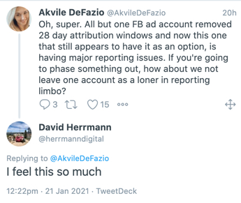
This juxtaposition is very relevant this week. Facebook rolled out the updates previously announced in preparation for Apple’s iOS14 roll-out. These changes included the sunsetting of 28-day attribution (both viewthrough and click-based), and limiting the number of conversion events tracked.
The changes began rolling out on Tuesday of this week, wreaking havoc on reporting dashboards.

Campaign-level insight into conversions and purchases seemed to vaporize overnight, and calculations were wrong or simply no longer there.
Twitter and Slack channels were flooded with frustrated media managers, who were suddenly flying blind on how to manage client’s spend.
Helpful tip:
If you are experiencing these issues, one way to fix them is to manually assign the attribution window at the Campaign level For example, here is one that used multiple attribution windows. There is no Purchase data, and notes there are multiple attributions:

Go to Columns, and choose “Compare Attribution.” Once you choose attribution length, your Campaign level data will populate for your selections:

The Path Forward
Updates like the Account Issues section would normally be a welcome step towards efficiency for higher-volume managers.
But, the timing made it mean very little. Many media managers would gladly forego those types of updates for consistent support, expectation management, and answers from their Facebook reps.
Sources say a fix for this attribution view problem is on the way, but it’s left many wondering whether the left hand is talking to the right. The optics of updating a UI to clarify account issues and disapprovals is in stark contrast to the fact Facebook Ad’s biggest issue often appears to be itself.


