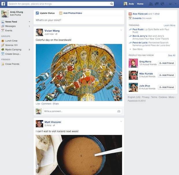
Facebook announced they have begun rolling out yet another new look to their News Feed, this time they are listening to their users and giving them more of what they like. The updated look is reminiscent of what the News Feed used to look like, with a few minor tweaks.
After experimenting with a radical new look to the News Feed, the feedback from people who tested it indicated that they liked the bigger photos, but overall found it more difficult to navigate.
Using that feedback, the updated design features the layout and navigation people prefer, with bigger photos and a new font. The new fonts being used are reported as being Helvetica for Macs and Arial for PCs
The mobile design will remain unchanged. In fact, the new desktop News Feed has been designed to look more like the mobile version. Here’s what it looks like:
The changes are purely cosmetic, it will not affect how content is surfaced or how stories are ranked in the News Feed. Nothing is different in terms of how ads are shown to users, requirements for creative specs and image aspect ratios for ads have not changed.
This is good news for marketers because we can continue to do everything the same way we have gotten used to. Maybe Facebook is beginning to realize that its users and advertisers don’t appreciate having drastic changes sprung on them.
The updated News Feed will be rolled out to all users in the coming weeks.


![AI Overviews: We Reverse-Engineered Them So You Don't Have To [+ What You Need To Do Next]](https://www.searchenginejournal.com/wp-content/uploads/2025/04/sidebar1x-455.png)