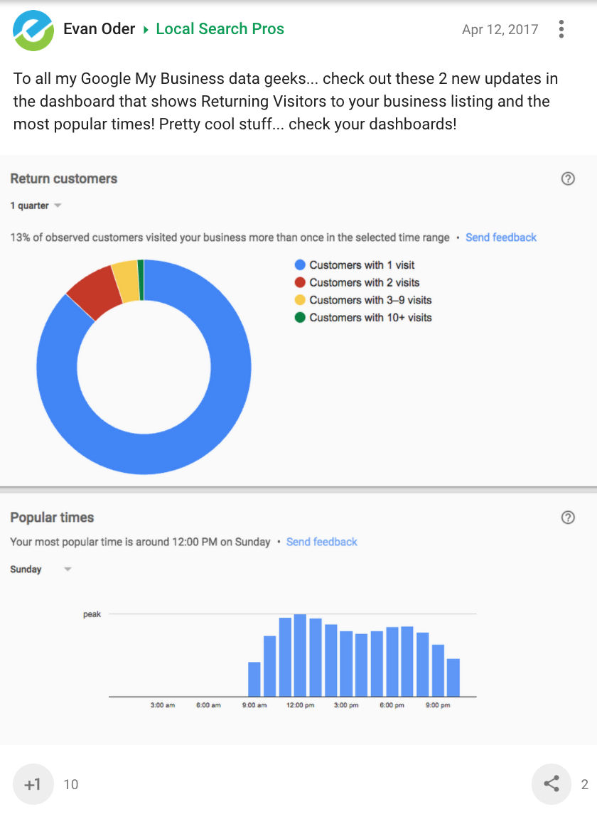
Two new reporting insights have been spotted in some users’ Google My Business dashboards. GMB is now reporting on the amount of returning customers to a business, and the most popular times of a business.
Evan Older of the Local Search Pros community on Google+ first shared this finding, which you can see below:

The ‘Popular times’ graph is very similar to the one which is displayed publicly in the knowledge graph for certain businesses. I can see it also being useful for business owners who need immediate access to the information through GMB.
The ‘Return customers’ circle graph is a completely new set of data which users have never had access to before. It shows the percentage of people that have visited a business more than once during a selected time period. Is your business thriving on repeat clientele, or do most customers only come in one or twice during a given time period?
Not everyone has access to these new insights yet, which is an indication that the update is either rolling out gradually or it is only going to be made available in specific areas.


![AI Overviews: We Reverse-Engineered Them So You Don't Have To [+ What You Need To Do Next]](https://www.searchenginejournal.com/wp-content/uploads/2025/04/sidebar1x-455.png)