Google Docs continues to be a pivotal service for the search giant. Their most recent updates include new chart types and more ways to use spreadsheet-generated charts in other elements of Google Docs.
Google’s New Charts
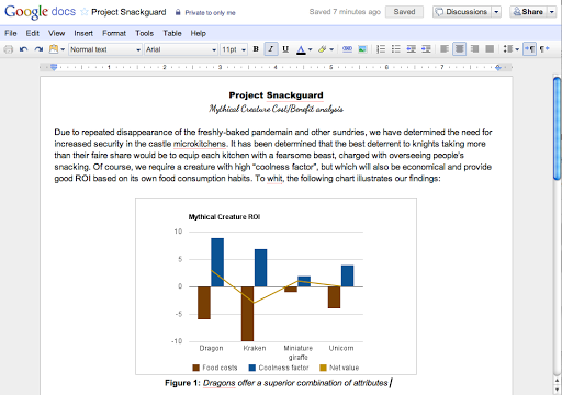
As outlined on the Google Docs Blog, charts generated in Google Spreadsheets can now be displayed in four new ways. Those ways are the candlestick chart, combo chart (which combines area lines, columns, and standard lines), GeoMap chart (where you can use a Google Maps–generated visual to show region-specific data), and TreeMap chart (which lets you show proportions in a block grid).
For most, though, the exciting change is the ability to copy charts directly into a Google document. To do so, follow these steps:
- Create a chart as normal.
- Click on the arrow next to the chart to access the chart actions menu.
- Select “Copy chart.”
- Go into the document where you want to paste the chart.
- Click on the “Web Clipboard” option from the Google Docs top navigation.
- Click on the name of the chart in this menu. This will paste the clipboard to your current cursor position.
- Resize , rename, adjust alignment of, and otherwise tweak the chart.
The end result looks like this:
Why Docs Matters
While Google fans may enjoy hearing news like this, it can be hard to see how it applies to the world of SEO, or even to search in general. The reality, though, is that Google’s battle with Microsoft is important on all fronts, and Docs is one of the most pivotal territories.
Microsoft has long owned the world of productivity, but Google’s ambitious efforts in the cloud have brought the first real wave of competition. If Google can secure productivity – especially in business and educational environments – they will win greater user loyalty for the brand in general. Microsoft, meanwhile, is integrating Bing with the majority of their services, and marketing their search through Office 365 is highly likely.
Whoever wins the productivity battle will make a big dent in the search war as well.


