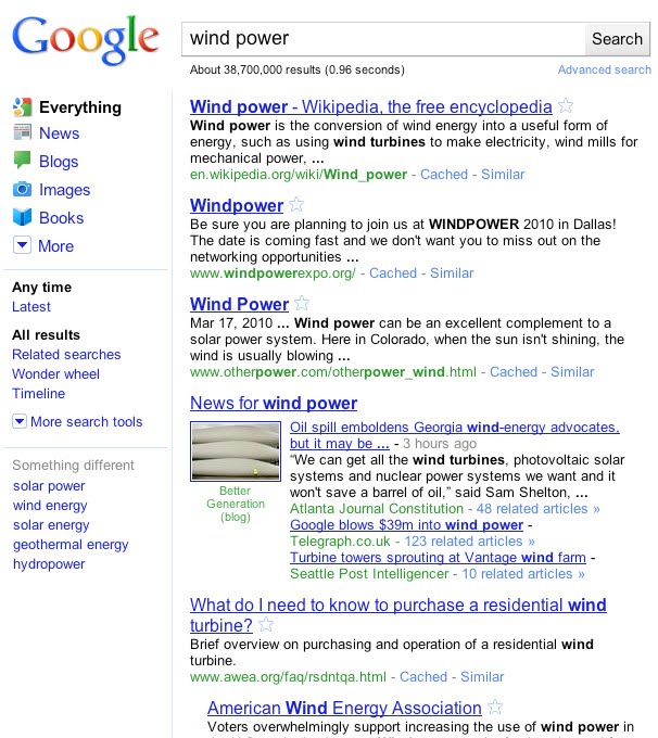
Google has given its main web product, web search a much needed redesign. And while this is a welcome development since it’s been quite awhile since Google has done this to its major service which happens to be the company’s bread and butter, the new look of the search results pages will kind of remind you of Bing though. It’s actually a simpler kind of Bing’s search results pages.

Anyway, putting aside its similarities to Bing’s search results pages, Google’s redesigned search results pages now features a contextually relevant, left-hand navigation which highlights Google’s search verticals including – news, blogs, images, books and more. The new side panel is powered by Google’s search technologies – Universal Search, Search Options Panel and Google Squared.
What’s good about the contents of the left-hand panel is that it is dynamic and changes depending on the type of your search. Through Universal Search technology, the items on the left-hand panel changes and suggests the most relevant genres of results for your query. And you can switch seamlessly to these different types of results. It could also suggest different views on how you want your search results to be displayed or even display the search results together with other related topics.
In addition to the said enhancements to the search results interface, Google has also tweaked the color palette as well as the Google logo – giving the search results pages a modern and still simple look and feel.
The redesigned Google search interface is being rolled out globally today, although I haven’t seen it when I tried visiting Google Search. Have you seen the changes already? How do you like the new design and navigation of the Google Search Results Pages?


![AI Overviews: We Reverse-Engineered Them So You Don't Have To [+ What You Need To Do Next]](https://www.searchenginejournal.com/wp-content/uploads/2025/04/sidebar1x-455.png)