Google has introduced a fresh look for mobile search results that more closely resembles the devices they’re being viewed on.
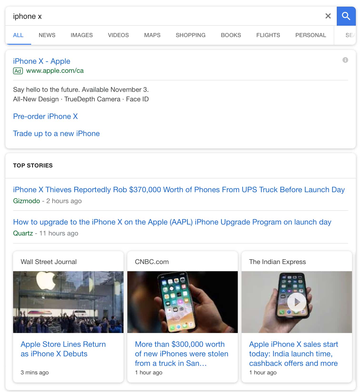
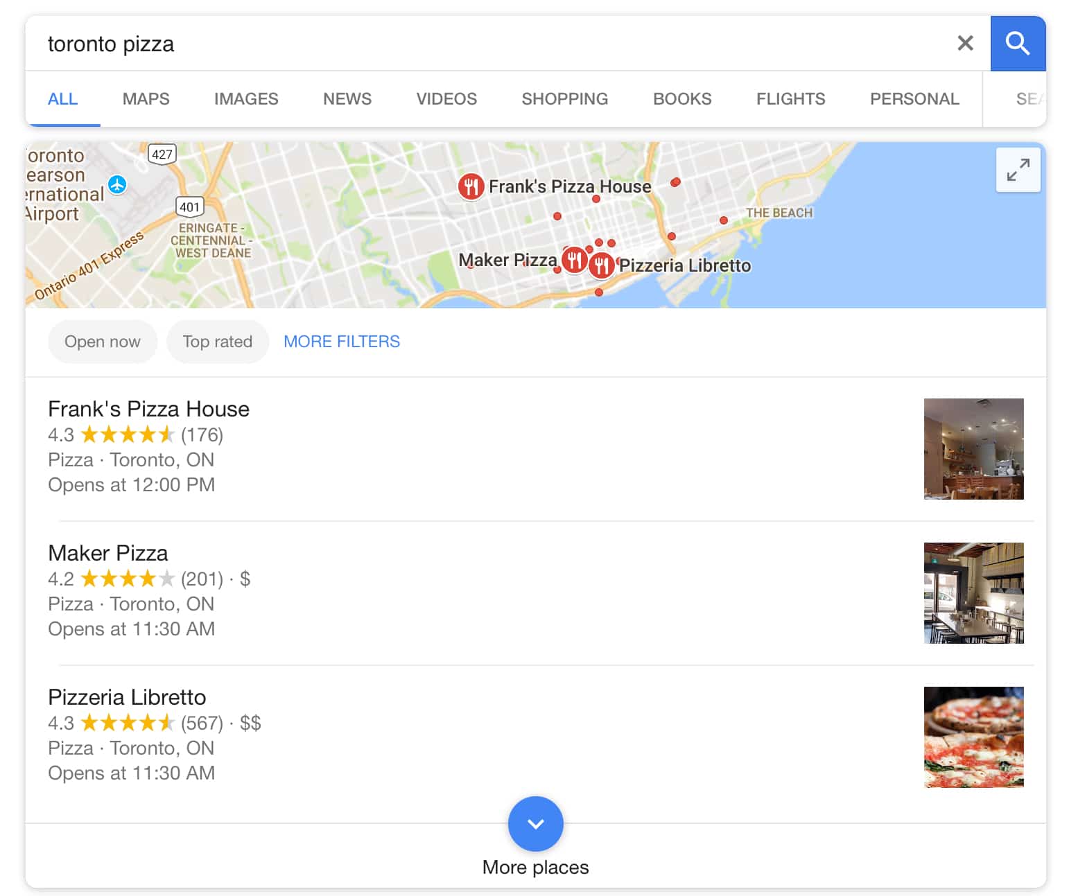
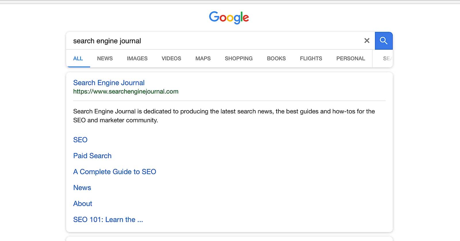
Looking at Google’s new design for mobile search, there is nary a sharp corner to be found. All search cards, and boxes within search cards, now have rounded corners.

The new rounded corner design is an appropriate fit for mobile search. All the latest smartphones with edge-to-edge displays have rounded corners, why not deliver a look that compliments today’s screens?
In addition to the rounded corners you may also notice that the blue links are brighter, which searchers may find more pleasing to the eye than the previous dark blue color.
If you search for a local business you’ll notice another color change. The review stars on business listings have been changed from orange to yellow.

Beyond a few aesthetic changes I didn’t notice any significant changes to how the search results themselves are rendered.
Pages still have the same number of ad units, local packs still have the same amount of listings, there’s still the same selection of related searches at the bottom.
Since this roll out just occurred, and there has been no official announcement from Google, it’s not known whether this is just a test or a permanent change.
For what it’s worth, the look of the Google app and desktop site has not changed. That could be an indication the company is not fully invested in the new design, but we’ll have to wait until we hear more.


![AI Overviews: We Reverse-Engineered Them So You Don't Have To [+ What You Need To Do Next]](https://www.searchenginejournal.com/wp-content/uploads/2025/04/sidebar1x-455.png)