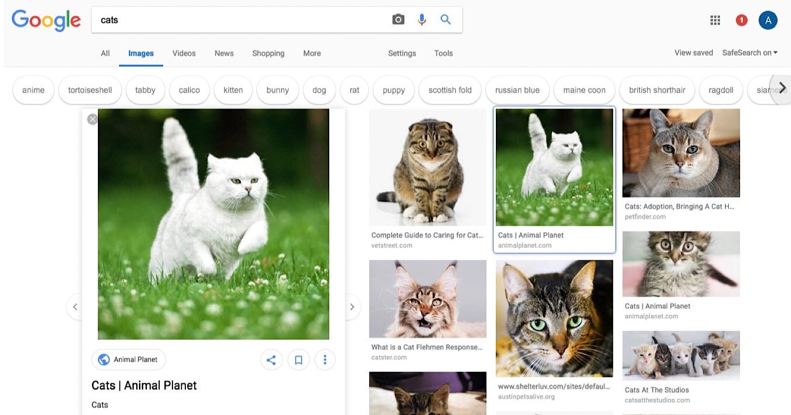
Google has been spotted testing a new design for image search results pages.
The new design features the now-familiar rounded corners — one of the most prominent changes in Google’s latest redesign of regular search results.
In addition, the way images are presented has been redone. The redesign includes an in-line photo viewer, which opens on the left-hand side of the SERPs.
OMG the Google Image search results page changed, like, drastically. For a brief moment I even thought I had pressed the wrong button somewhere. pic.twitter.com/k7wipCiZor
— UnderConsideration (@ucllc) July 19, 2018
Google’s new photo-viewer maintains its position on the side, making it possible to continue scrolling through search results while keeping the selected image in view.
With a white background, the new photo viewer is arguably more aesthetically pleasing as it’s designed to blend in with the rest of the page.
By comparison, the old photo viewer with the solid black background tends to stick out like a sore thumb.
You’ll also notice that the vibrantly colored image search suggestions have been changed to plain white. The suggestions are contained in bubble-shaped buttons, so there’s no more sharp edges there either.
All in all, the redesigned image search doesn’t add anything new to the user experience, nor does it take anything away.
The changes are purely cosmetic, perhaps in an effort to make image SERPs match the regular SERPs.
For the time being this new design is still in testing, so it’s likely that most users will continue to see the old image search design.


![[SEO, PPC & Attribution] Unlocking The Power Of Offline Marketing In A Digital World](https://www.searchenginejournal.com/wp-content/uploads/2025/03/sidebar1x-534.png)