Google’s John Mueller addresses a few technical aspects of mobile-first indexing that continue to confuse site owners.
Mueller says he occasionally gets questions about how to use rel-alternate and rel-canonical links on sites with separate mobile URLs.
This information may be known to you, but Mueller felt it’s important enough to create a whole Twitter thread about, so I will go over what he said in case it’s useful to you.
Mobile-First Indexing and Canonical URLs
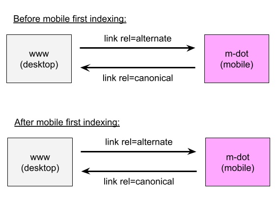
Mueller explains nothing has changed with mobile-first indexing as it relates to sites with separate mobile URLs using rel-canonical.
“Keep the same annotations. No changes needed,” he says in a tweet.
Mueller even created a diagram to show how nothing needs to change before and after mobile-first indexing.

He goes on to say what has been said from the beginning about mobile-first indexing, which is mobile versions of a site are indexed by default.
In the case of sites with separate mobile URLs, that means the m-dot version is used for indexing.
“The change with mobile first indexing is that we’ll use the mobile version (m-dot) as the version for indexing, instead of the www (desktop) version. For most sites, this change has already happened. If your site is already indexed with mobile, nothing will change.”
Google will use the mobile URL as canonical even if the rel-canonical points to desktop.
Again, there are no changes needed in order for Google to do this. It doesn’t matter which URL version is listed in the sitemap.
Where site owners can come in and assist Google is through setting up redirects by device type.
If a desktop user accesses the mobile version, they should be redirected to the desktop URL. If a mobile user accesses the desktop version, they should be redirected to the mobile version.
Here’s where things get more technical as Mueller brings hreflang into this discussion.
“If you use m-dot URLs + hreflang, the hreflang annotations should be by device type. Desktop hreflangs point to desktop URLs, mobile hreflangs point to mobile URLs. M-dot + hreflang is hard & confusing.”
Lastly, Mueller adds that sites with separate mobile URLs using hreflang are better off moving to a responsive setup with their next site upgrade.
Read the full discussion around this subject by viewing Mueller’s tweet thread below:
I occasionally get questions about this, so just to be clear: if you have separate mobile URLs (with rel-alternate / rel-canonical links), with mobile first indexing you *don't* need to change anything. Keep the same annotations. No changes needed. pic.twitter.com/nGPucxPXWn
— 🍌 John 🍌 (@JohnMu) January 18, 2021
The change with mobile first indexing is that we'll use the mobile version (m-dot) as the version for indexing, instead of the www (desktop) version. For most sites, this change has already happened. If your site is already indexed with mobile, nothing will change.
— 🍌 John 🍌 (@JohnMu) January 18, 2021
Technically, we'll use the mobile URL as canonical even if the rel-canonical points to desktop. That's fine. In the sitemap file, you can list either of these, or even both. We'll crawl, find the annotations, and do what's needed. There is no special mobile markup for sitemaps.
— 🍌 John 🍌 (@JohnMu) January 18, 2021
Ideally you'd also redirect users by device type: if a desktop user accesses the mobile version, redirect to the desktop URL. If a mobile user accesses the desktop version, redirect to the mobile version.
— 🍌 John 🍌 (@JohnMu) January 18, 2021
If you use m-dot URLs + hreflang, the hreflang annotations should be by device type. Desktop hreflangs point to desktop URLs, mobile hreflangs point to mobile URLs. M-dot + hreflang is hard & confusing. Another reason to move to a responsive setup with the next site revamp :-).
— 🍌 John 🍌 (@JohnMu) January 18, 2021


