Last week I started discussing huge navigation menus by asking what is a better way to order the navigation categories: alphabetically or by popularity. Today I am going to further discuss the topic of optimizing the huge navigation menus by sharing my finds as per the ways to organize, design and choose words to name the list items.
Despite the fact that people tend to focus on content first and then turn to other design elements, website navigation menus is extremely important for website usability:
- It navigates users to further pages;
- It helps users to quickly associate the site with a particular topic;
- It helps users to understand where they are in a website’s information architecture; etc.
Design of the navigation menus
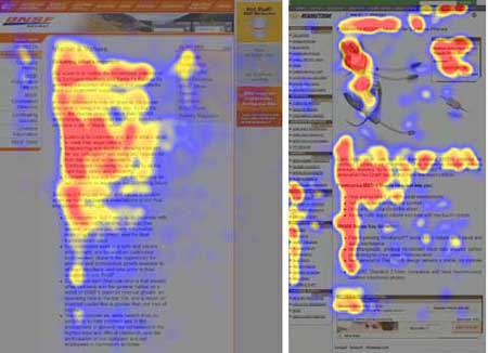
- Page layout: navigation menus should be placed in the left sidebar: according to UseIt.com eyetracking study, users’ main reading (or scanning) pattern looks like an F with a horizontal movement being the first scanning component. Left-justifies navigation menus increases “scannability” of the page, and enhances user’s experience as visitors are able to find the navigation menus really quickly and easily.
![]()
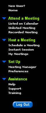
- Colors: Use color to represent hierarchy in the navigation menus:

Language choice for the navigation items
- Start each menu item with the one or two most important (in terms of the amount of information it carries) words. That said, avoid using generic terms like “information”, “list”, “advice” to start the navigation menus item.
- Avoid using the same words to start list items, because doing so makes them harder to scan.
- Use generally recognizable words to ensure the navigation menus will help everyone understand the site topic. “Speak the user’s language” has been a primary usability guideline for more than 20 years. Avoid made-up words in navigation menus, because users scan them for words they know.
Category
SEO


