Google recently published a 108 page eBook filled with proven advice for increasing sales. The insights are based on scientific A/B testing and includes citations to a wide range of research and articles. The information in this free book is a virtual gold mine.
The playbook is indexed by Google and freely available online. However it is unclear where the document is linked from. Which is why this article describes the document as Secret.
UX Playbook for Retail
A playbook is a book that contains all the plans and strategies that are to be used by a sports team or a business organization. What Google has published is indeed a playbook. It is filled with insights into how to improve conversions and sales.
The book addresses six areas for improvement:
- Home/Landing Page
- Menu & Navigation
- Search
- Category/Product
- Conversion
- Form Optimization
As an example of the depth the book offers, Google’s retail playbook offers eight insights for creating a powerful home page or landing page:
- Clear CTA above the fold
- Have descriptive CTAs
- Clear benefit-oriented value proposition above the fold
- Don’t use full page interstitials
- Remove automatic carousels
- Display top categories on homepage
- Use legible font sizes
- Use social proof
Some of the above may sound like common sense. But when you read the sections, you’ll see that the book links to articles and research that provides further insights into why something works. Thus, while the book is 108 pages long, the multiple links to further reading easily triples the amount of pages to be read to fully comprehend and master all of these tips for increasing sales to an online store.
Do Not Use Home Page Carousels
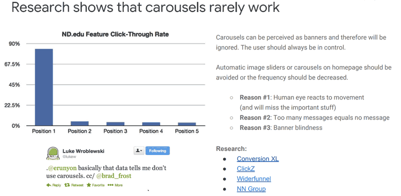
Among the useful insights is the one discouraging the use of home page carousels. Research has shown that the negative effects of a home page/landing page carousel far outweigh any perceived benefits. One of the articles that the book links to (Don’t Use Automatic Image Sliders or Carousels) says this:
“Jakob Nielsen (yes, the usability guru) confirms this in tests. They ran a usability study where they gave users the following task: “Does Siemens have any special deals on washing machines?”. The information was on the most prominent slide. The users could not see it – totally hit by banner blindness. Nielsen concludes the sliders are ignored.
Notre Dame university tested it too. Only the first slide got some action (1%!), other slides hardly got clicked on at all. 1% of clicks for something that takes up (more than) half the page?”

Use a Prominent Search Bar
Another example of the depth of useful information available is the section on the search bar. The book encourages eCommerce websites to use a prominent search bar. This conversion optimization tip may also be useful for affiliate websites. According to Google:
“…users that search are 200% more likely to convert on average…”
Google links to a Think with Google case study to show how making the search bar prominent improved conversion rates.
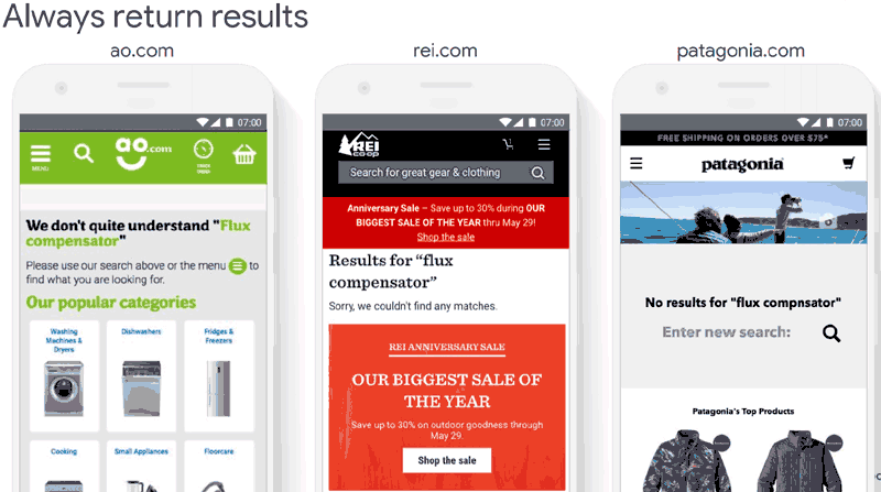
Some of the tips are easily overlooked user experience issues. For example, Google recommends that an eCommerce search function should never return zero results.
In the examples, the book shows how an eCommerce site returns a page of popular categories for a user to click through to find what they’re looking for. By showing the most popular categories, the retailer is increasing the odds of showing the right category to most of the site visitors.
Another example showed a retailer that used the zero search result page to show a banner advertising a sale.

Sneaky But Useful Tips
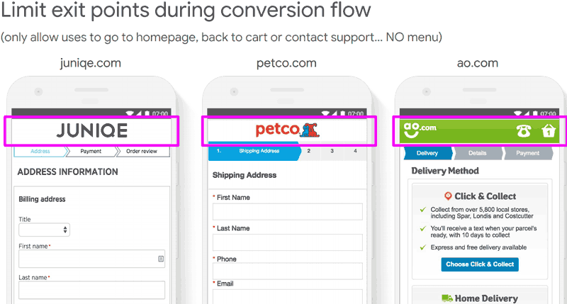
Some of the tips are somewhat sneaky but understandable. For example, never show a user a menu once they are on the path toward the checkout. Google recommends allowing users to return to the homepage, the shopping cart or to a support contact. Google is emphatic that the standard menu not be shown.

Download Google’s Retail UX Playbook
Google’s playbook is freely available online. You can download it here.
Images by Shutterstock, Modified by Author
Screenshots by Author, Modified by Author


