It’s been really positive to see how quickly Google Search Console has been changing since the launch of the new version.
However, with all of these developments, it’s important not to put too much focus on working with Search Console data in its native user interface.
To get the most out of Search Console, particularly Performance data, we need to:
- Extract parts of this rich data source.
- Visualize it in compelling dashboards that surface organic insights quickly so that we can tell persuasive stories to clients, management and other stakeholders.
I’m going to show you how to get more out of Search Console data by using it in combination with Google Data Studio.
By building custom Search Console dashboards you will be able to:
- Save a shed load of time by surfacing organic issues, fluctuations, and insights faster.
- Ditch your boring reports and share compelling visualizations that influence and persuade.
The Setup
Unless you’ve been hiding under a rock, you’ll have at least some awareness of Google Data Studio and what it’s about.
If you want to learn more about using Google Data Studio, there are some great guides out there so I won’t be delving into that here.
I do, however, want to start by taking you through a couple of options available for pulling Search Console data into Data Studio.
Native Connector
The most obvious way to get Search Console data in Data Studio is by using the native connector to create a data source.
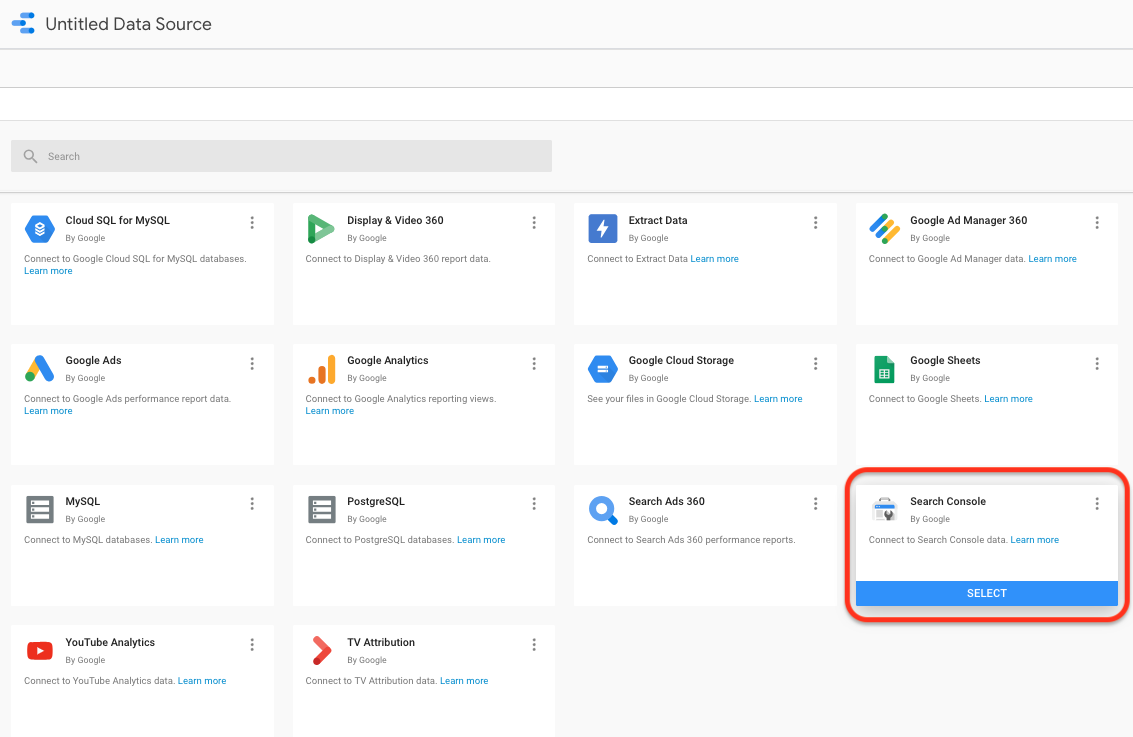
Using this connector is a quick and easy option for getting Search Console Performance insights into Data Studio.
The problem is that it is limited to Performance data alone and has a limited number of dimensions with which to dissect this data source.
Third-Party Tools
A better option is to access Search Console through a third party tool like Supermetrics.
Doing so will give you access to:
- Sitemap metrics and Performance data.
- A wide range of dimensions to help you slice and dice the data as required.
There are a number of different options and products available but I use Supermetrics for Google Sheets by:
- Running Search Console queries in Google Sheets using the Supermetrics add-on.
- Populating sheets with tables of Search Console data.
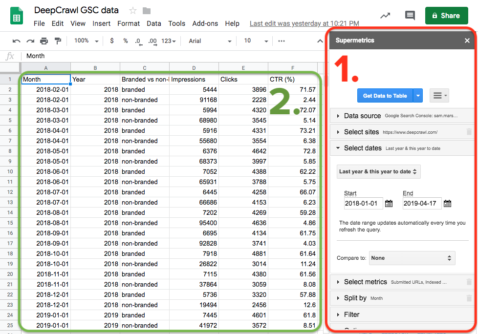
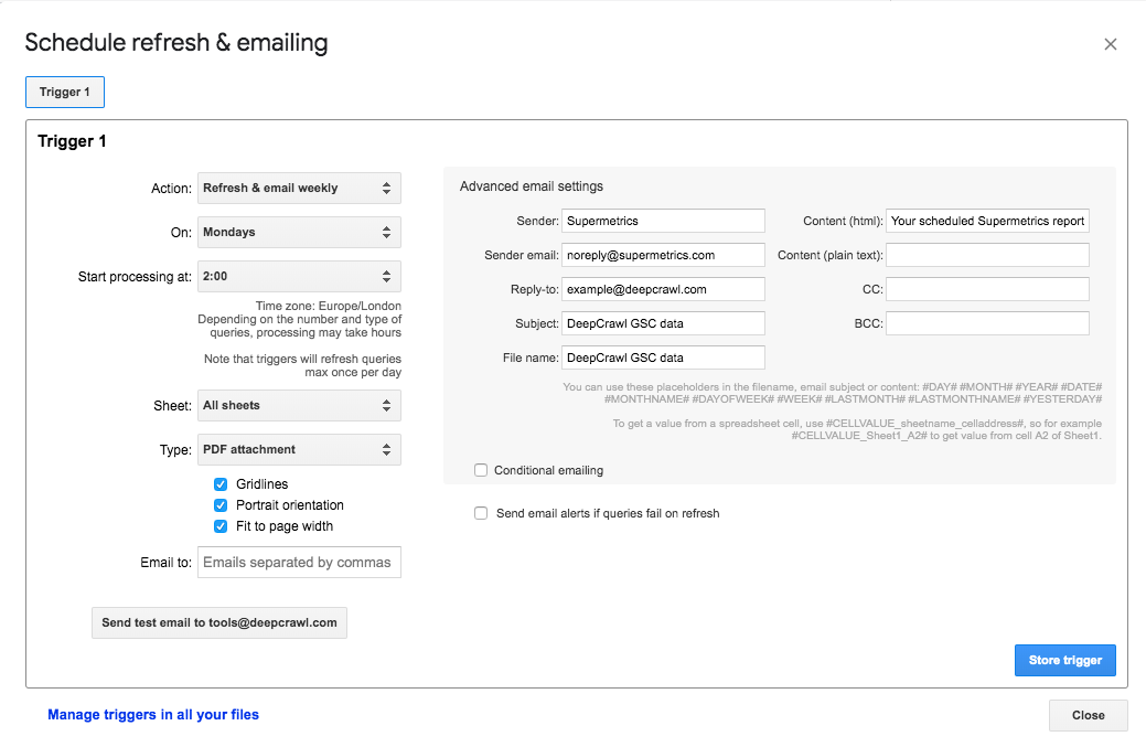
- Setting scheduled data refreshing using the Supermetrics add-on to keep sheets populated with up to date data.
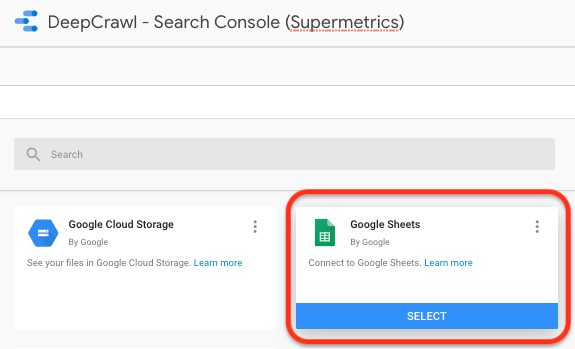
- Creating data sources in Data Studio using the Sheets connector.
- Visualizing the data in a variety of Data Studio dashboards.
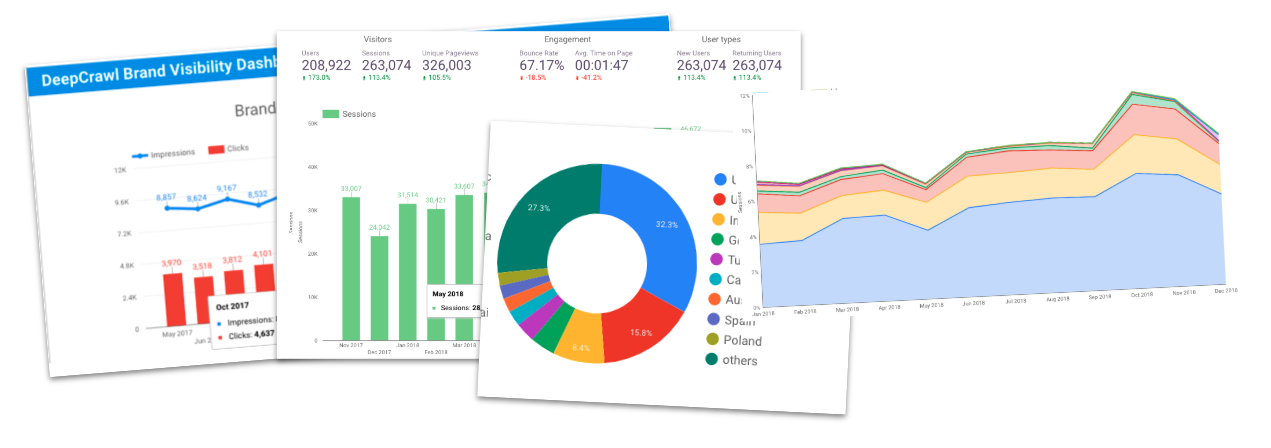
What Search Console Dashboards Can You Build in Data Studio?
With the flow of Search Console data into Data Studio in place, you can get down to the fun stuff: building pretty charts and graphs.
I use two main dashboards that serve different purposes and communicate different aspects of Search Console data.
I’ll spend the rest of the post taking you through them to give you inspiration for some visualizations that you can go off and create.
1. Top Level Trends Dashboard
The top-level organic trends dashboard provides a high-level overview of organic performance.
In addition to aiding SEOs and digital marketers, this could equally be shared with management, clients and other stakeholders who have a limited understanding of organic search but have an interest in its performance as a channel.
Let’s take a look at what this dashboard consists of.
Sitewide Trends
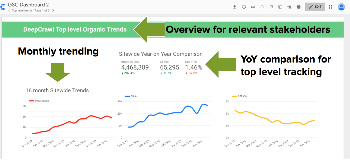
The dashboard kicks off with a sitewide year-on-year comparison scorecard to show how the overall site is performing in terms of impressions, clicks, and CTR compared to the previous year.
Below that, sitewide impressions, clicks, and CTR are trended on a monthly basis to clearly show the overall direction of organic performance.
In the case of the DeepCrawl site, we’ve seen strong and consistent growth in terms of the volume of impressions and clicks. Conversely, CTR has declined over this period, which warrants further investigation.
The key benefit of these graphs is that they remove the noise of the daily trending that you are locked into within Search Console itself, and you can instead visualize this information as clearly as possible.
Branded & Non-Branded Trends
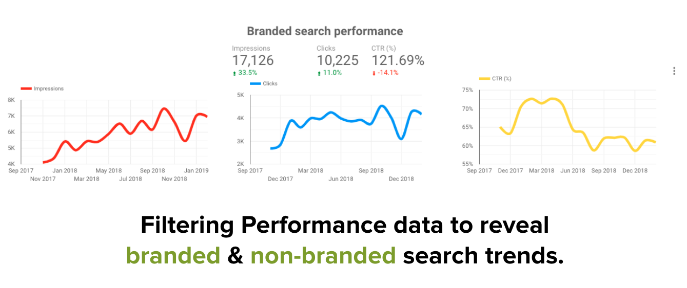
I’ve also included two sections using a similar format to the above to break out performance for branded and non-branded queries.
Splitting Performance data out in this way is possible as a dimension within Supermetrics, but if you are using the Data Studio connector you can create a filter where the query does/doesn’t include your brand name and its different variations.
Splitting out branded and non-branded performance is important because these could be telling different stories.
Non-branded search performance is more indicative of the effectiveness of SEO work, whereas branded search can speak more to the overall marketing efforts of a site and their success in growing brand visibility.
Directory Breakdown
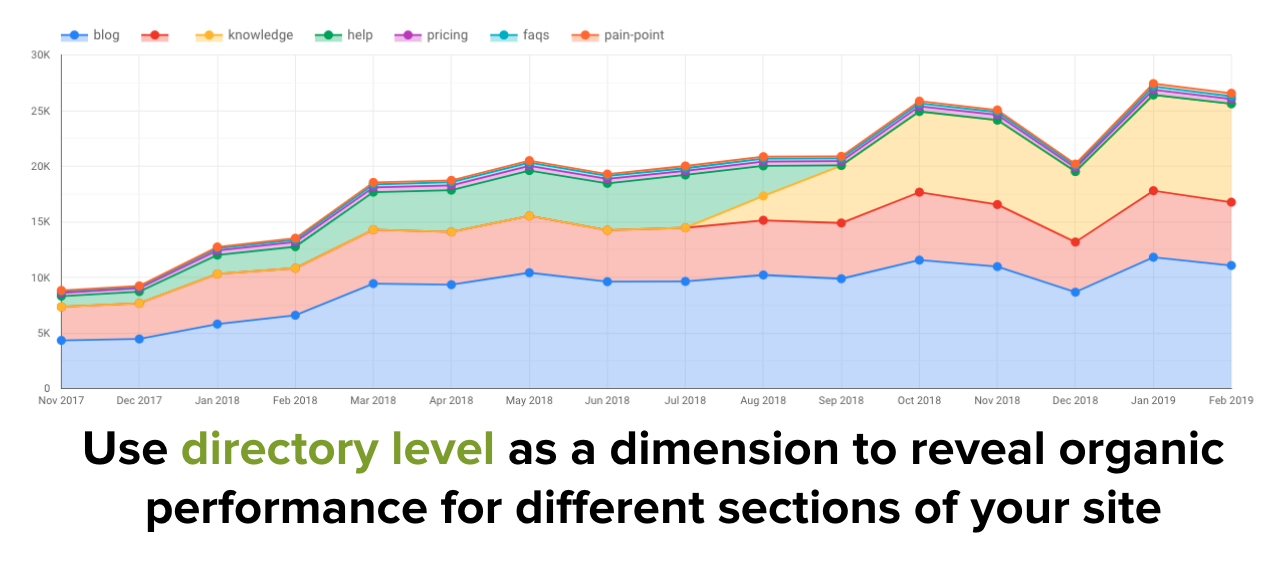
Another way of breaking out Performance data in a top-level way is by splitting out clicks and impressions by site sections and trending this on a monthly basis.
This data can easily be pulled using the directory level dimensions provided by default in Supermetrics.
When it’s set up it will show you how various sections on a site are contributing to the overall organic performance and how this has changed over time.
In the graph above you can see where we migrated over a section of our site where the green section turns to yellow.
You can see that the migration was a success because the new site section (in yellow) grew substantially compared to the performance of the old section (green) in the subsequent months (November 2018 onwards).
Long Tail vs. Short Tail Performance
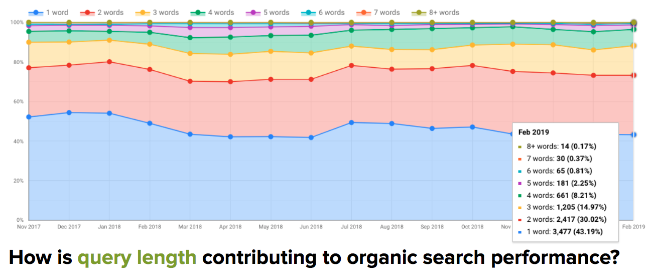
Using a similar style of graph to the directory breakdown, you can use query length as a dimension to gain an understanding of long and short tail performance.
This could be taken one step further, by bucketing together different query lengths to group short, mid and long tail queries.
Additionally, I’ve used the device and geographic dimensions to trend desktop vs. mobile performance and country-level performance in similar ways to the above.
2. Monthly Insights Dashboard
The second dashboard takes a more granular view, looking at Search Console Performance data on a monthly basis.
The Monthly Insights dashboard is useful for more regular check-ins to promptly detect changes and review performance.
Monthly Trends
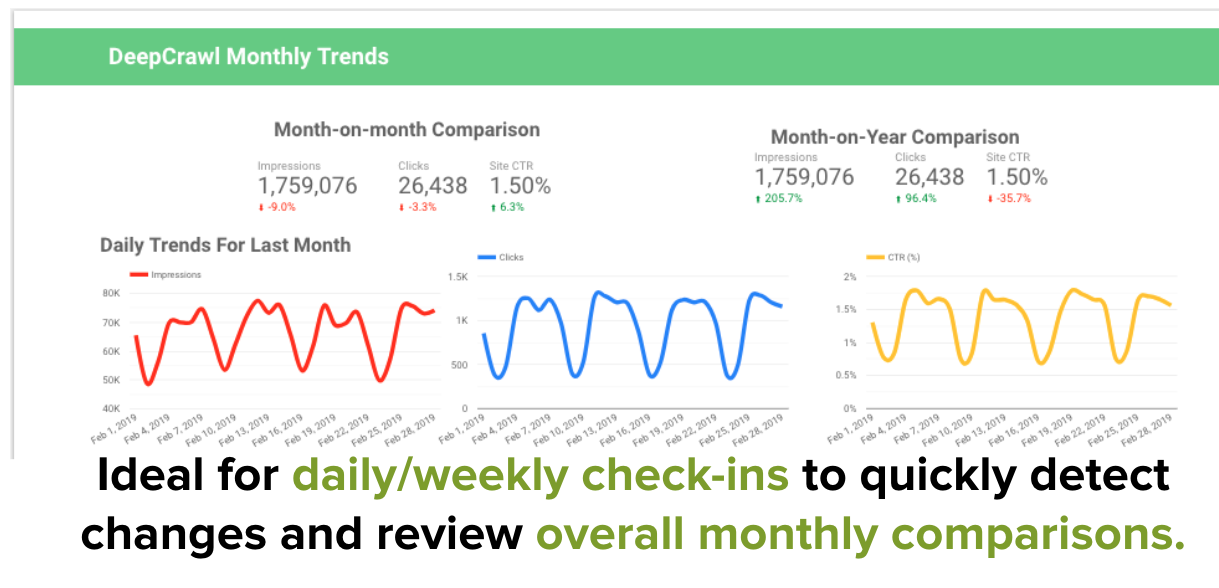
This dashboard features two comparison scorecards with month-on-month and year-on-year comparisons of impressions, clicks, and CTR.
Below the scorecards are three graphs showcasing performance data on a daily basis to identify more immediate fluctuations.
Device, Geographic & Search Type Trends
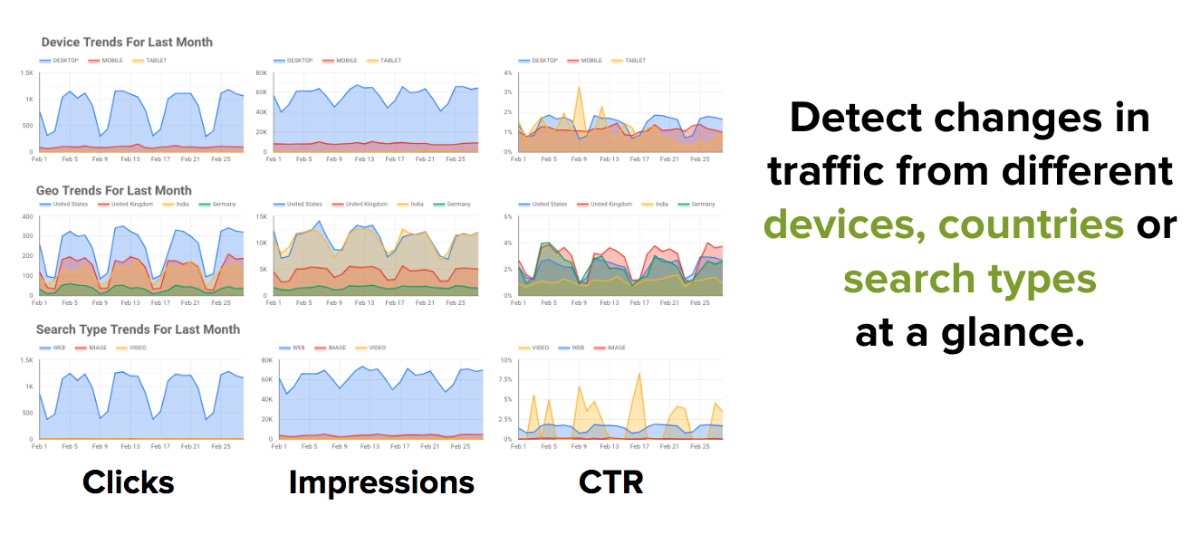
Below the sitewide metrics sit a series of graphs configured to detect changes in various types of organic traffic.
Impressions, clicks, and CTR are shown horizontally and device, country and search type breakdowns are shown vertically.
This is useful for flagging the source of fluctuations in organic traffic and forming the basis for further investigation.
Page & Query Performance
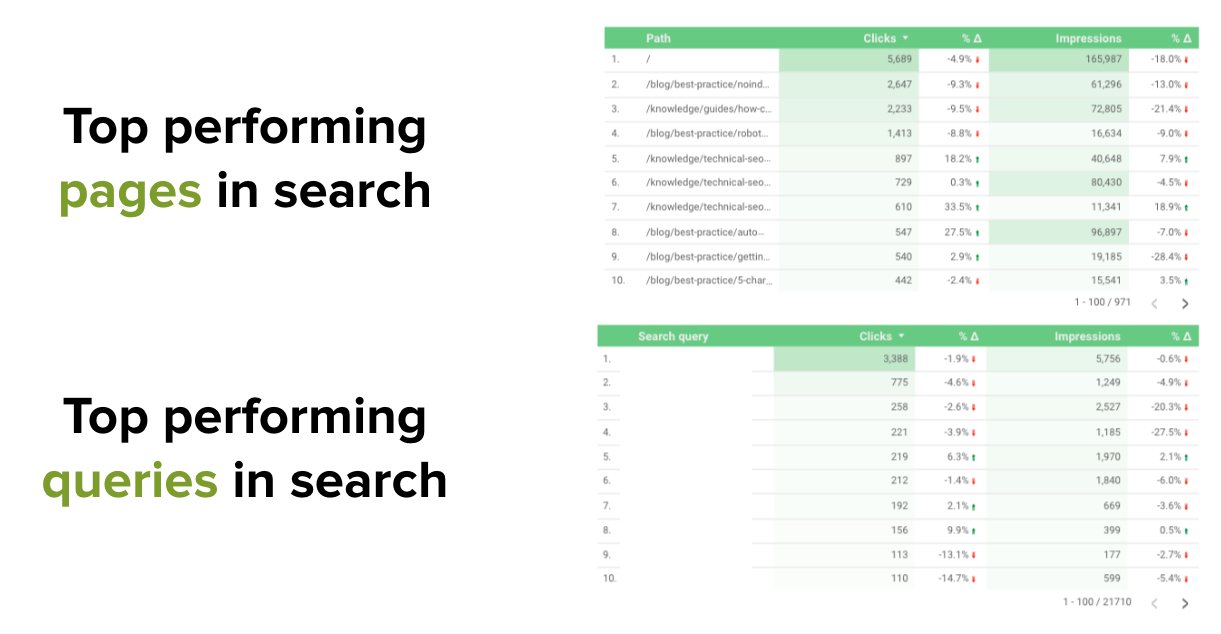
Following on from the device, geographic and search type trends are the top performing pages and queries for the last month, with a comparison to the previous month.
Of course, this is information that can be gained from the Search Console UI, but the benefit is that it saves you time as you don’t have to configure filters such as date ranges each time. The insights are there ready for you immediately.
Biggest Winners & Losers
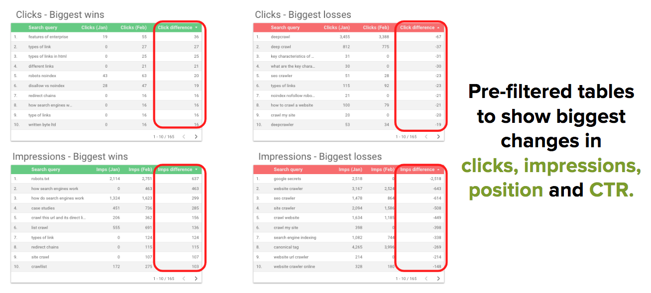
I’ve built some more pre-populated tables which show the biggest changes comparing last month to the previous month.
The biggest winners are queries that have seen the biggest increase in clicks, impressions, CTR and average position and the biggest losers are those that have seen the biggest decrease.
It is worth adding a filter to set a minimum number of impressions or clicks so that you’re displaying changes for queries that you care more about ranking for.
For example, who cares if you move up 50 positions for a query if your average position is 200?
These tables are something I would previously look for in Search Console itself, but it’s handy to have these pre-configured in a dashboard ready for me to review on a monthly basis.
Fraggle Performance
We’ve recently started optimizing our content to get fraggles in the SERPs.
While the name sounds like a rather unpleasant skin condition, fraggles are actually another name for the jump links in SERPs that deep link to specific sections of a page.
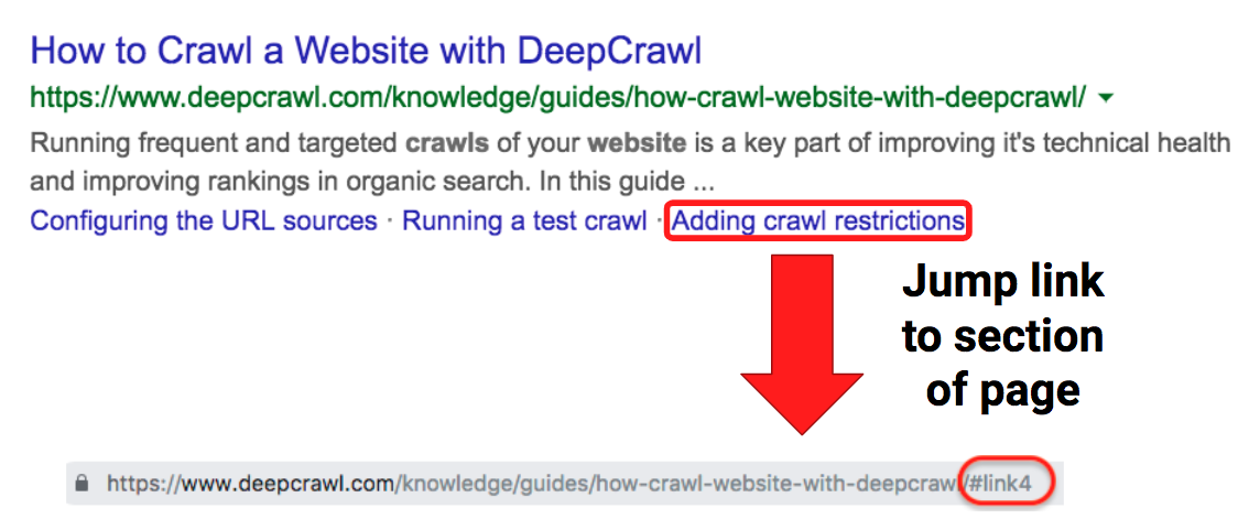 Getting fraggles for your site’s pages is pretty straightforward and they are particularly useful for sites with a lot of long-form content because they help get searchers to the information they want faster.
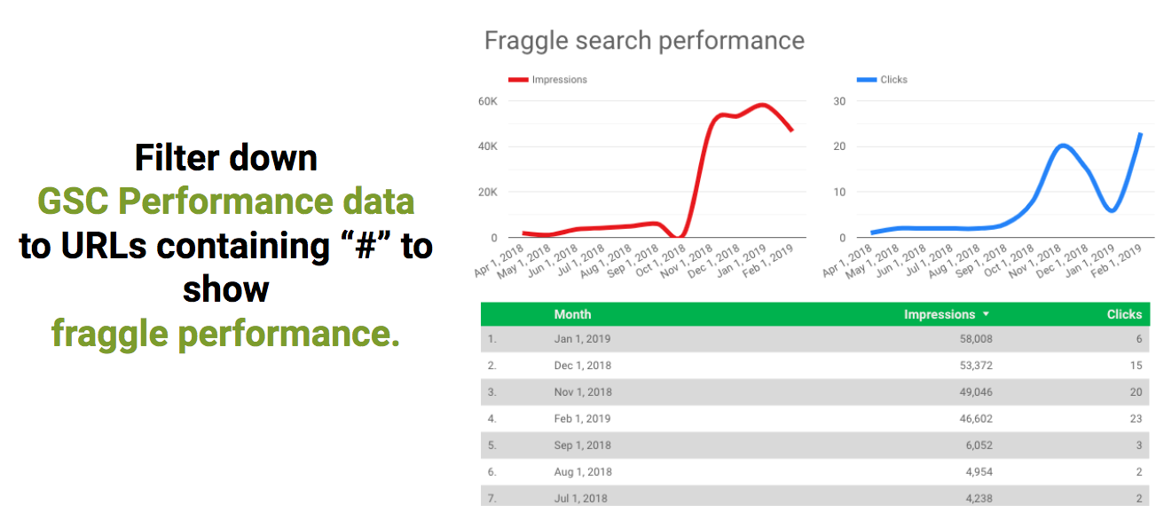
As fraggles are something we’re optimizing for, I decided to include this as part of the reporting in my Search Console dashboards.
I found that by filtering down URLs to those that contain a “#”, this surfaces the performance of fraggle impressions and clicks in search.
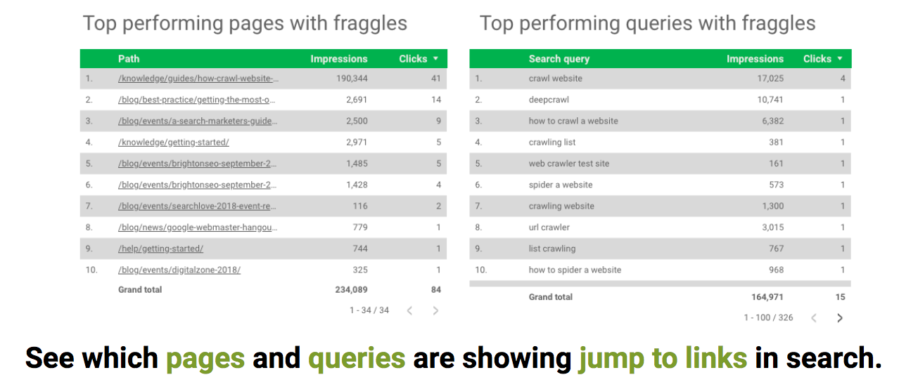
The above graphs and table show monthly tracking of fraggle performance in search and the tables below reveal which pages and queries we are receiving fraggles for.
Do Yourself a Favor…
Since I’ve been sharing my work on Data Studio, I’ve spoken to many people who are interested in learning about how they can build dashboards to streamline reporting, but don’t seem to have the time.
We’re all busy, I get it.
But it only takes a handful of hours to set up dashboards like the ones above and the costs are minimal (or free, depending on your setup).
Once you have these dashboards and automated processes in place, the hard work is done and you can reap the benefits in terms of time saved in the long run.
I hope this post has been useful in demonstrating how you can set up simple but effective organic search dashboards.
Google Data Studio is evolving rapidly, so I’d love to see you share your own dashboards and how you’re getting the most out of Search Console and other data sources.
Some Helpful Resources
- Get the Most Out of Search Console Using Google Data Studio – Griffin Roer
- Using Google Data Studio for a more actionable Google Search Console Performance Dashboard – Aleyda Solis
- Major Improvements in our Google Search Console Integration – Supermetrics
More Resources:
- Data Visualization: What It Is, Why It’s Important & How to Use It for SEO
- Top 5 Essential SEO Reporting Tools for Agencies
- The Top 5 Ways to Prove the Real Value of SEO
Image Credits
All screenshots taken by author, April 2019


![AI Overviews: We Reverse-Engineered Them So You Don't Have To [+ What You Need To Do Next]](https://www.searchenginejournal.com/wp-content/uploads/2025/04/sidebar1x-455.png)