If you’re developing a website or helping to manage one, you should be prepared for when things go wrong.
Links get broken, pages get moved, and users end up somewhere unexpected on your website.
This can cause a big disruption for people using your site, potentially leading them to leave your website to look for what they want elsewhere.
There’s also the possibility that it could impact your search ranking if people are landing on broken pages from inbound links.
That’s where the 404 page comes in – acting as a polite acknowledgment that things aren’t where they should be and nudging users back on track within your website.
There can be a lot of hidden value within a 404 page that does more than just state that something is missing, turning an error message into something purposeful and useful.
That’s why we’ve compiled a list of great examples that showcase the potential within a 404 page to add to a user experience rather than detract from it.
What Is A 404 Page?
A 404 page is a landing page that tells your website viewers the page they requested to view is unavailable or, in some cases, doesn’t exist.
So instead of showing that user a blank page, a 404 page is shown instead to explain what’s happened.
Ideally, users would never land on missing pages – but the reality is that old links can slip through the cracks or continue to exist on other sites, even for those with well-maintained websites.
This can potentially result in a poor user experience on your website, with those users possibly leaving your website to look for what they want elsewhere.
This can, in turn, have a negative impact on both your website traffic and ranking if not handled properly.
When Might Users Land On 404 Pages?
There are a range of reasons why a 404 page might be shown to a user:
- The server is down.
- A page moved and wasn’t redirected using a 301 redirect.
- The page never existed.
- The user typed in the URL wrong.
- The URL is broken.
These can all occur from a broken internal link within your website or when a user is redirected to a page on your site from elsewhere on the internet.
Because there are a wide variety of reasons a 404 page can be shown to a user, it’s best to have a strong 404 page that minimizes the possible negative effect it could have on them.
How Is A 404 Page A Brand Opportunity?
A 404 page is still a part of a user’s experience of your website and is fully within your control, despite the fact that their journey has taken a turn somewhere unknown.
That means the content of your 404 page can be designed however you see fit, forming a key part of your website just like any other page you need to design to represent your brand.
If users feel like their misstep on your site hasn’t been punished or ignored but rather is due to a foreseen issue, you can help retain their attention and keep them on-site.
By using a 404 page as another opportunity for website viewers to experience your brand’s personality, you can even bring them closer to your business and turn a potentially negative experience into a positive one.
What Makes A Great 404 Page?
The best 404 pages are those that feel authentic, giving a proper response to users that makes their unplanned step off of your sitemap feel considered.
Even better, the 404 page can offer alternative page options to take those users elsewhere within a website, which could help them find what they need.
Making full use of your brand’s tone of voice can turn the error message into something much more friendly and personable, which can offset the inconvenience of missing information.
It could even be delightful in unexpected ways, such as with interesting imagery or branded content that can feel like special Easter egg content within your website.
40 Of The Best 404 Page Examples
1. Marvel
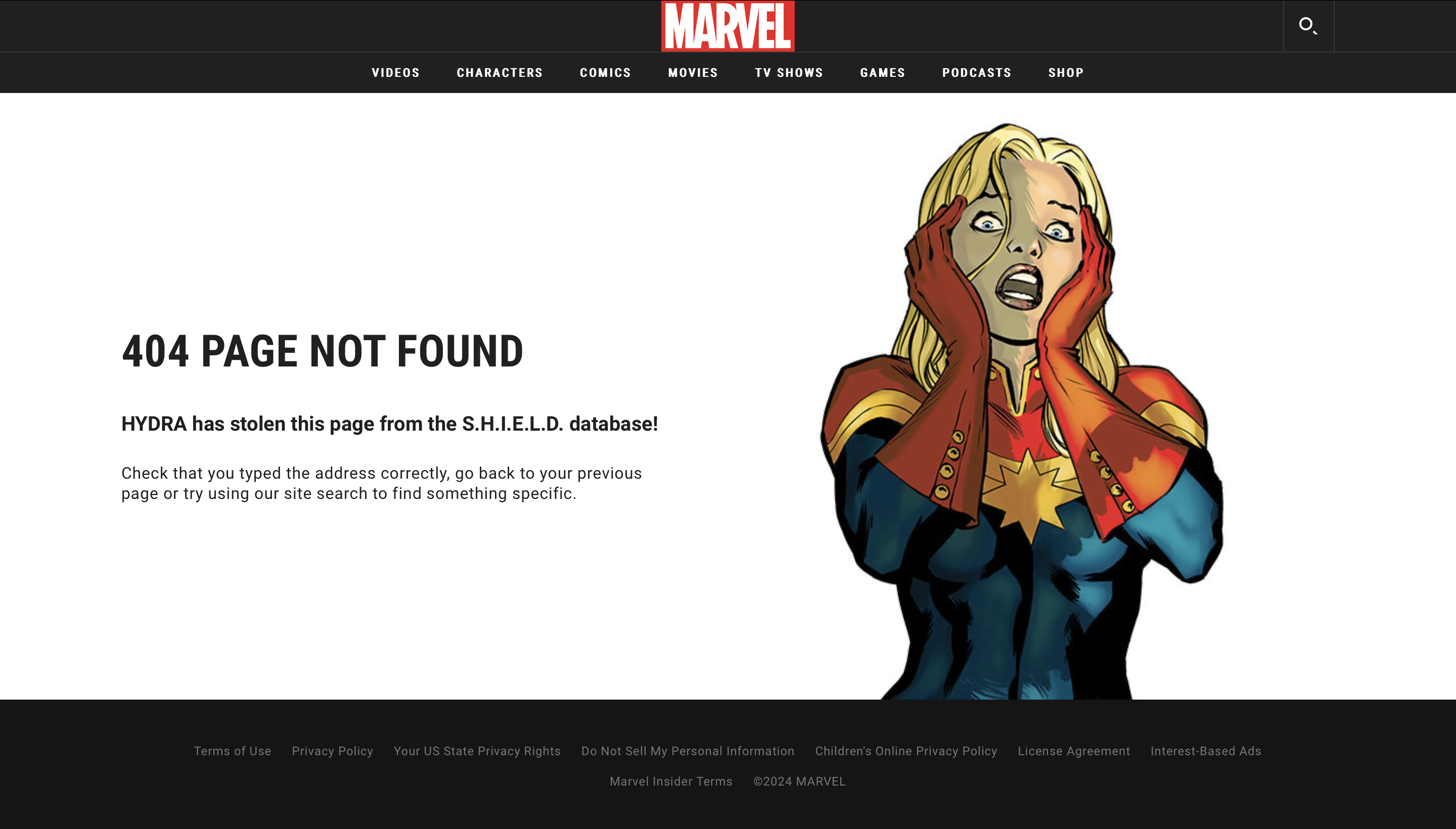
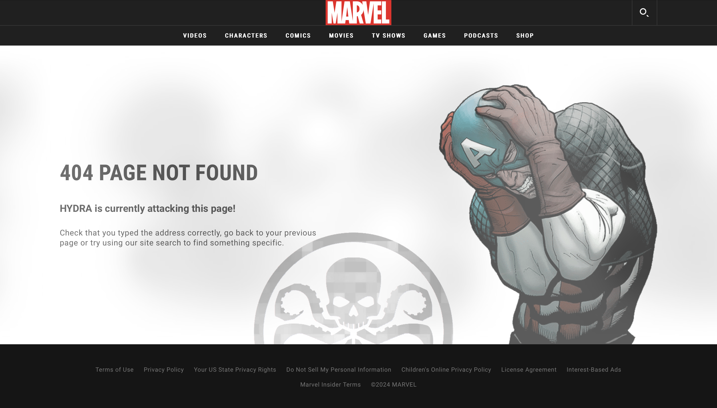
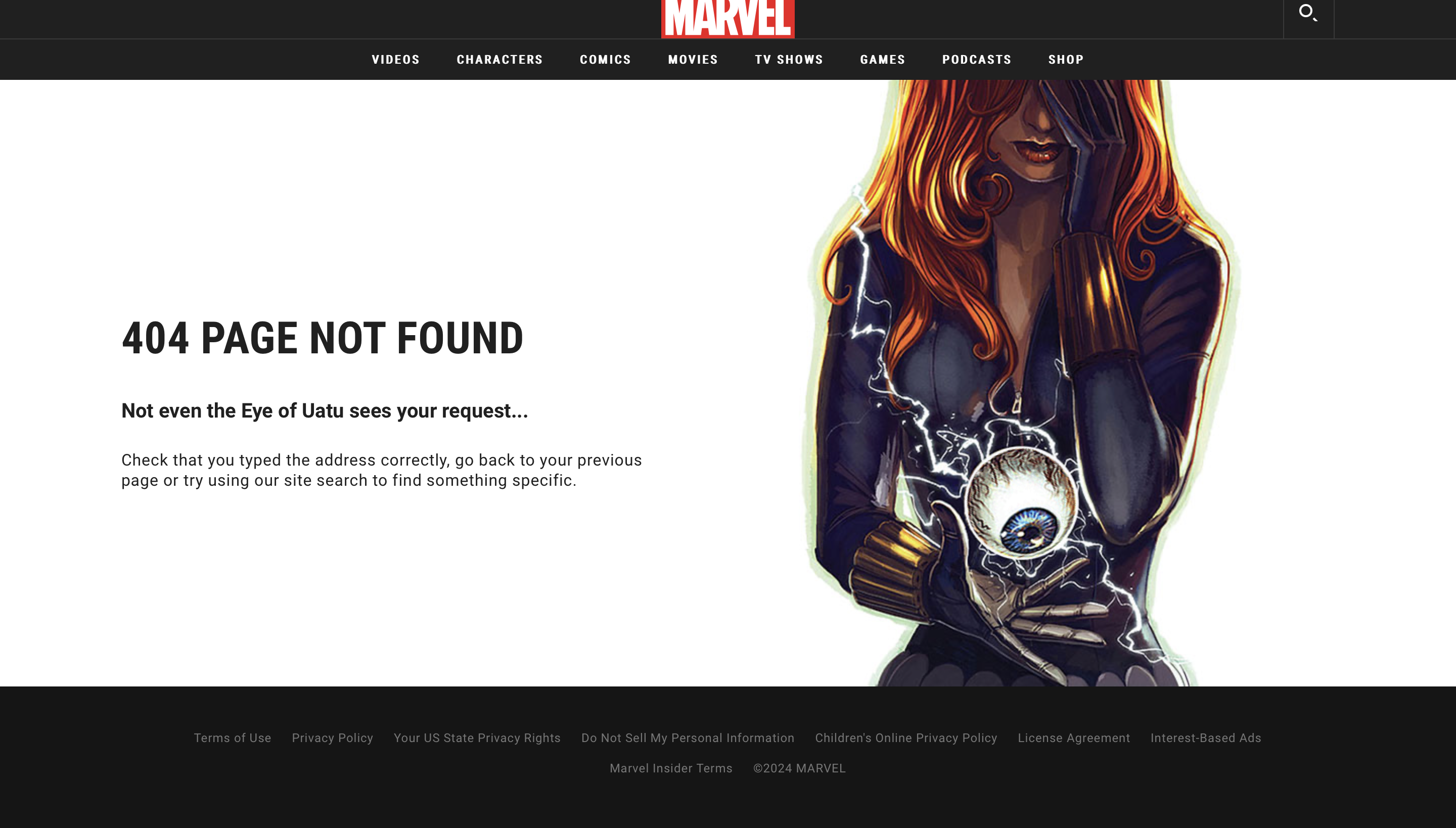 Screenshot from Marvel, February 2024
Marvel makes use of its extensive list of comic book characters and the popularity of the Marvel Cinematic Universe (MCU) to craft unique and entertaining 404 pages for its website.
The supporting line under the main 404 error message brings in a relevant character or plot line around items being lost, unavailable, or stolen away, which adds plenty of character to the page.
Coupled with a relevant image, it transforms a missing character bio or comic book listing into an error that feels less frustrating and more fun.
2. Ready to Go Survival
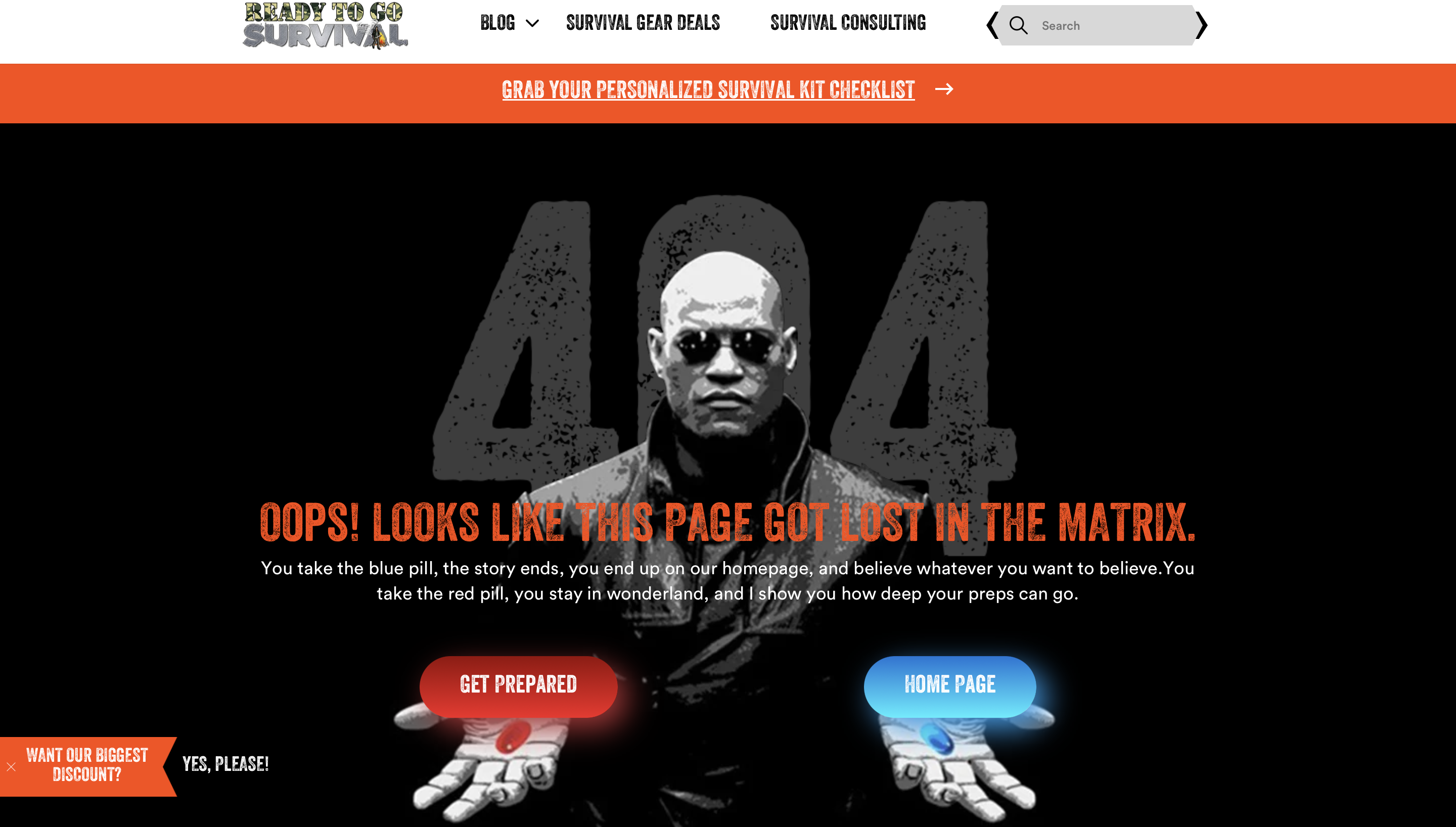 Screenshot from Ready to Go Survival, February 2024
Bringing in popular cultural references can be another way to make your 404 “Page Not Found” message more interesting, as this survival site has done with an iconic scene from The Matrix.
This references the choice offered by Morpheus within the film between a red pill or a blue pill, providing Neo with the answers he is seeking.
Ready to Go Survival plays with this choice, though, as both options link back to the homepage – so users can start their journey again and make new choices from there.
This reframes the error message as a choice, offering a way forward rather than being a dead-end page that could leave users stuck.
3. Kualo
 Screenshot from Kualo, February 2024
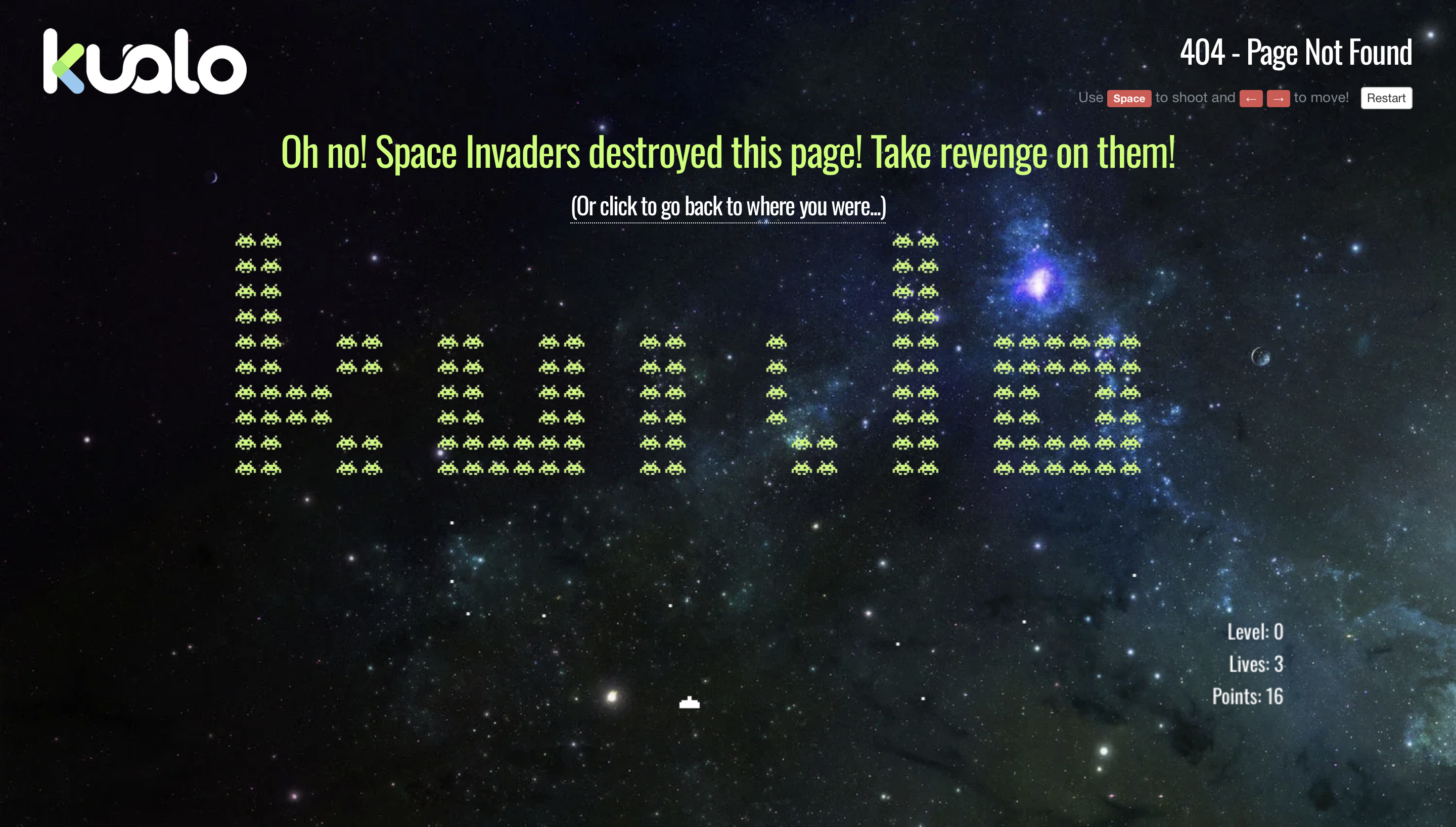
Long-time web hosting provider Kualo has turned its 404 error page into a chance for users to get stuck into a bit of interactive nostalgia.
Users who encounter a broken link are told that Space Invaders are the cause, and now’s your opportunity to take revenge.
While this might not provide users with the information they were looking for, by launching straight into a hands-on gaming experience, users are kept engaged with an unexpected moment of joy.
This creates more of a story around why website visitors are seeing a 404 message, which is more in keeping with the brand’s personality.
Plus, there’s still the option to go back and pick up their user journey where they left it after they’ve had their fun.
4. Steve Lambert
 Screenshot from Steve Lambert, February 2024
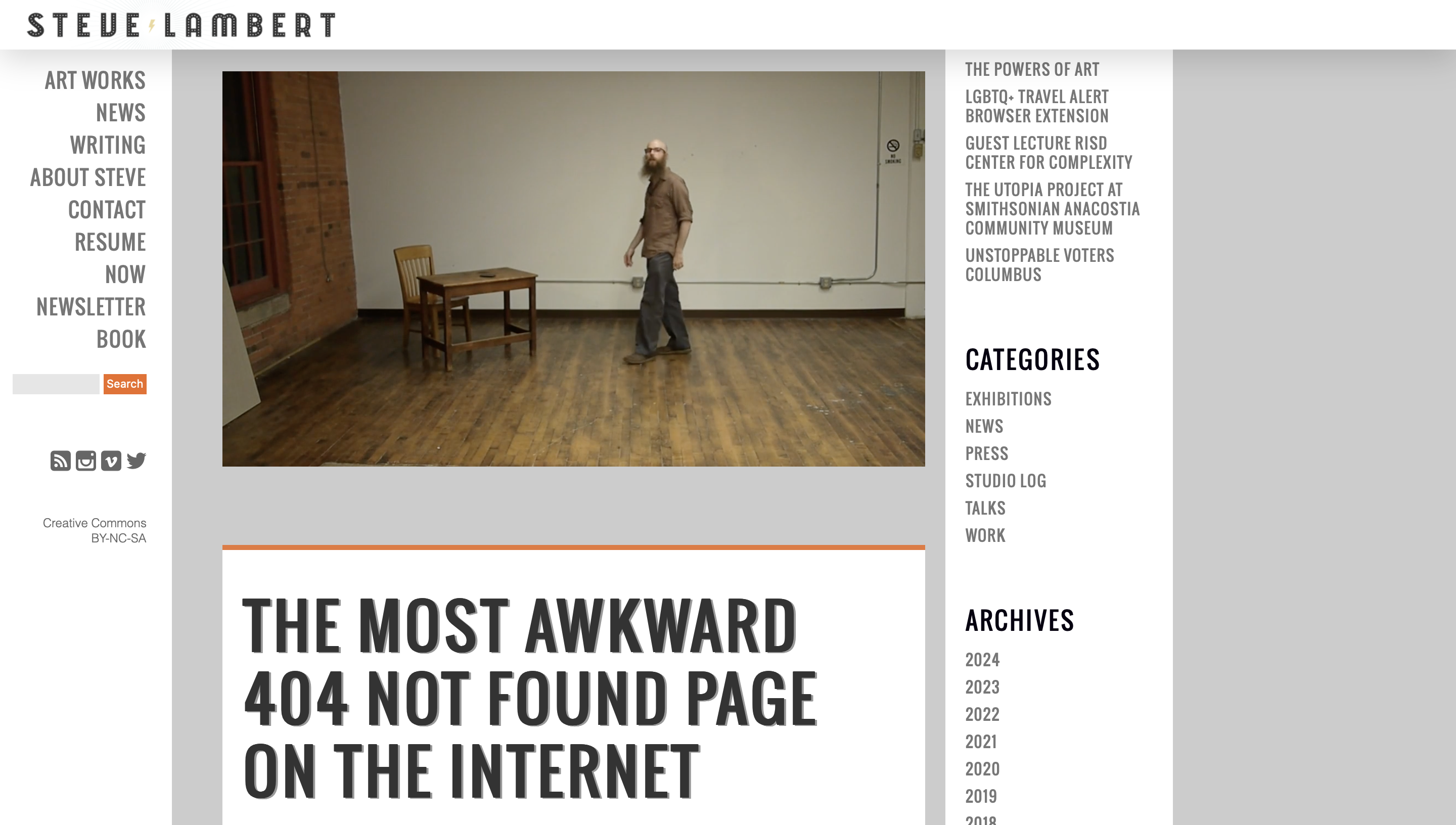
Given the unexpected nature of a 404 page, it’s a great opportunity to create a memorable moment on your website.
Steve Lambert has a unique approach to this on his personal website with his boldly titled “The Most Awkward 404 Not Found Page on the Internet,” in which he features a cringe-inducing video of himself making terrible jokes.
While this would be a usual feature for most websites, this suits Lambert’s brand of experimental art and helps to build his personal brand further.
By embodying his off-beat brand completely, even within his 404 page, his suggestions that the user made a mistake landing on his 404 page feel more tongue-in-cheek and part of the experience than an accusatory remark.
5. Mailchimp
 Screenshot from Mailchimp, February 2024
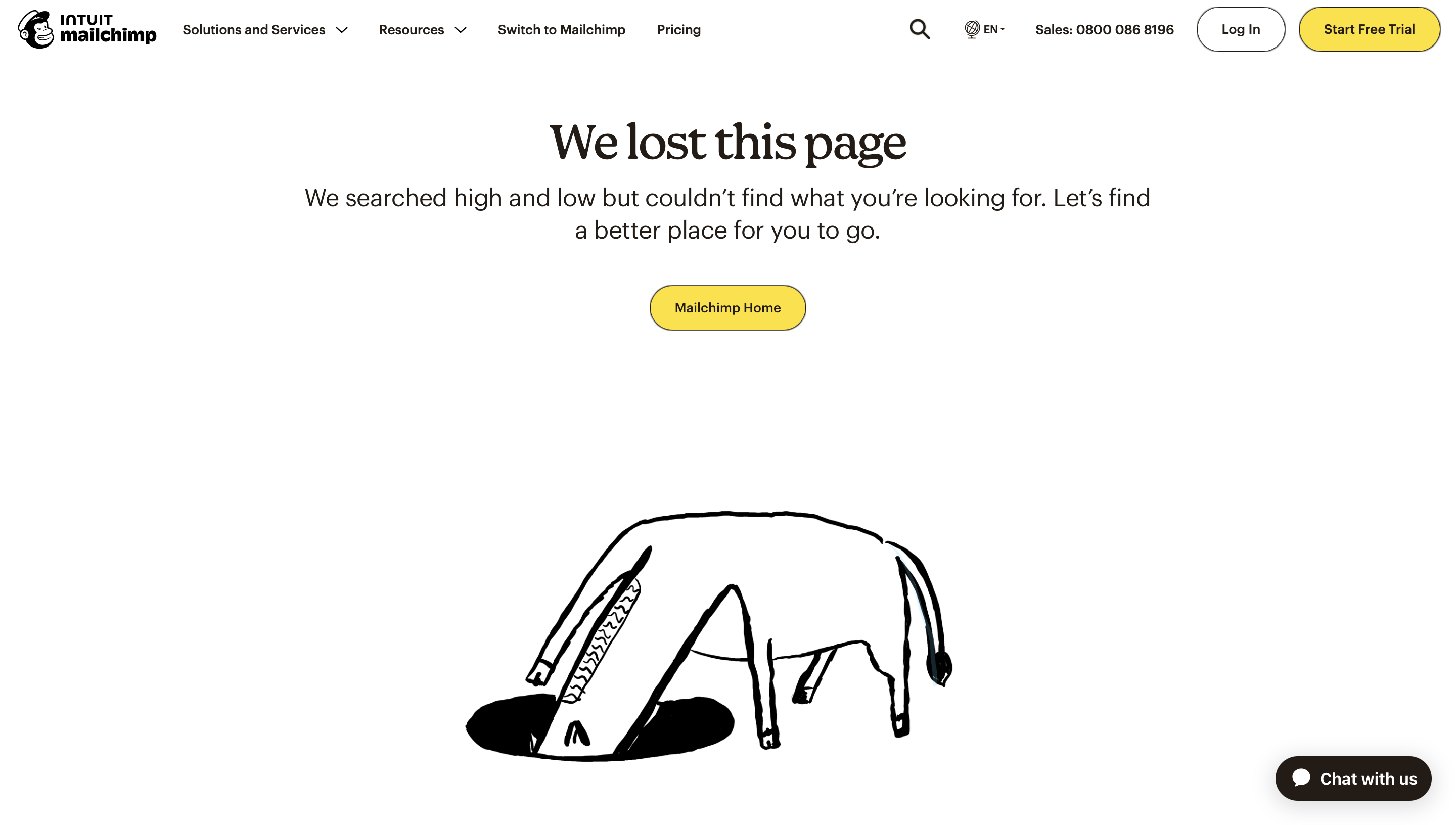
As an email marketing platform, Mailchimp’s focus is on automation and making life for marketing professionals easier.
So naturally, its 404 error page is on-brand and on-message to keep things simple. It takes accountability for the missing page and then suggests returning to the homepage to find a better place to go.
The hand-drawn artwork is what really sets the tone, though, with a confused cartoon donkey peering into a void – as if searching for the missing page – to support the page’s messaging.
The combination of the two captures Mailchimp’s signature use of playful graphics and coy humor to infuse simplicity with personality, which hopefully convinces users to hit the prominent “Mailchimp Home” button and continue their journey onwards.
6. Left Logic
 Screenshot from Left Logic, February 2024
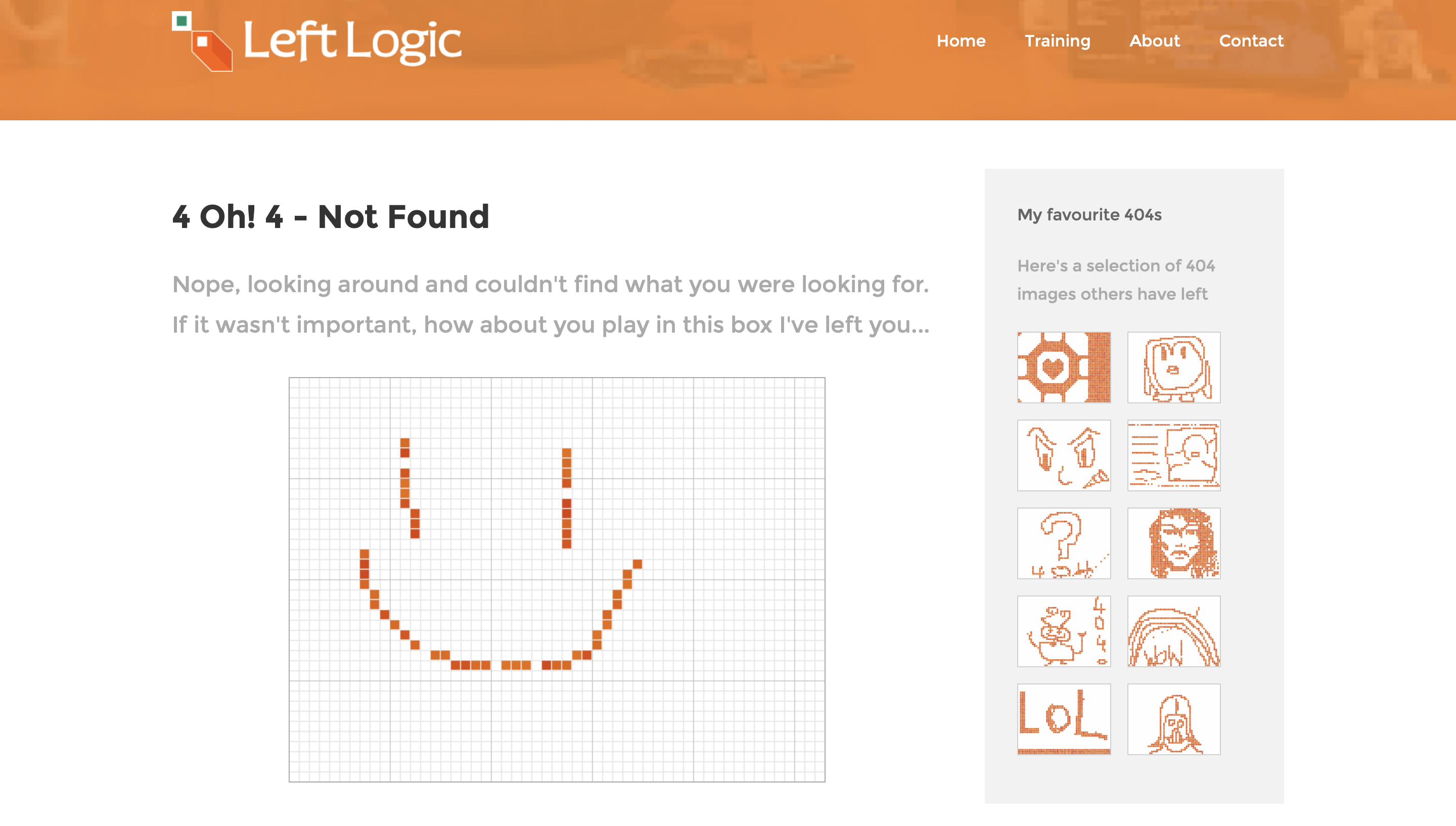
Designer Remy Sharp and the team at Left Logic push the creative boundaries of what’s possible using JavaScript, with their 404 page working in a way that engages the user a little differently.
Website visitors who end up navigating to the error page are treated to a blank pixel-art canvas where they can show a little creativity and draw their own masterpieces, with submissions from other users being shown on the right for inspiration.
This gallery of other user artwork is a covert way of showing that the user isn’t alone in their 404 journey, and subtly encourages engagement with the exercise before circling back to the site’s homepage.
7. Magnt
 Screenshot from Magnt, February 2024
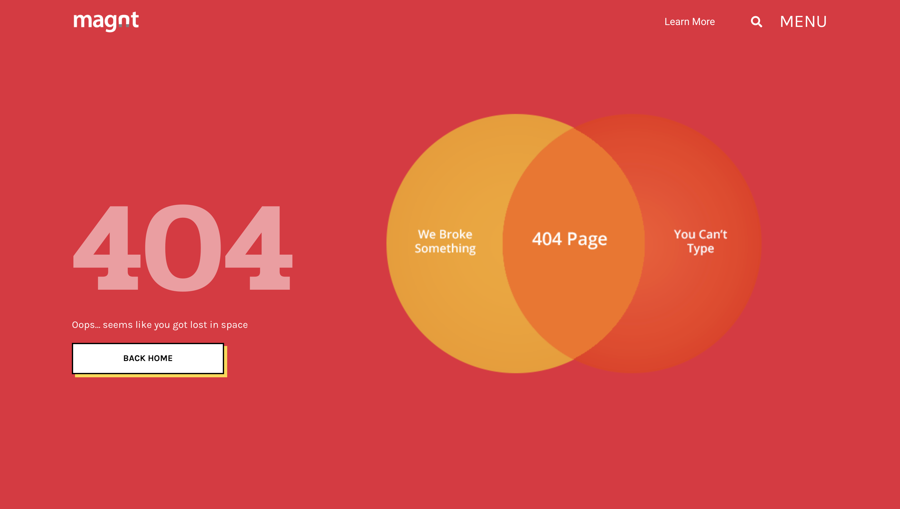
When you end up on Magnt’s 404 page, you’re treated to a little visual humor within some clean design.
Rather than simply stating the error, the brand has created a Venn diagram that covers the two main bases for why the user has ended up here – user error or a website issue.
Either way, both would result in landing on this bold 404 error message.
This light-hearted approach to a 404 page puts a more human spin on hitting a dead end, softening the frustration and laying out the accountability.
With the Back home button given prominence within the design, the page provides a quick bit of wit before encouraging users to circle back to the start of their journey.
8. Lego
 Screenshot from Lego, February 2024
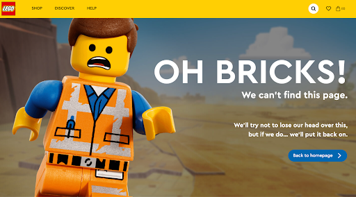
As one of the most creative household brands, Lego keeps it light with its 404 page, which plays with the mild shock of ending up somewhere unknown on its website.
The copy uses more family-friendly language with, “Oh bricks!” rather than other choice expletives and follows up with a tongue-in-cheek mention of popping their head back on after the shock of appearing on the 404 page.
The imagery of a slightly scared Lego man, Emmet, from the popular Lego movies, works alongside this to create empathy with the user’s experience and a mutual sense of surprise.
This puts both parties in a similar position, so when you’re gently encouraged to quickly move back to the safety of the homepage, users feel they’re assisting themselves and Emmet too.
9. Wendy’s
 Screenshot from Wendy’s, February 2024
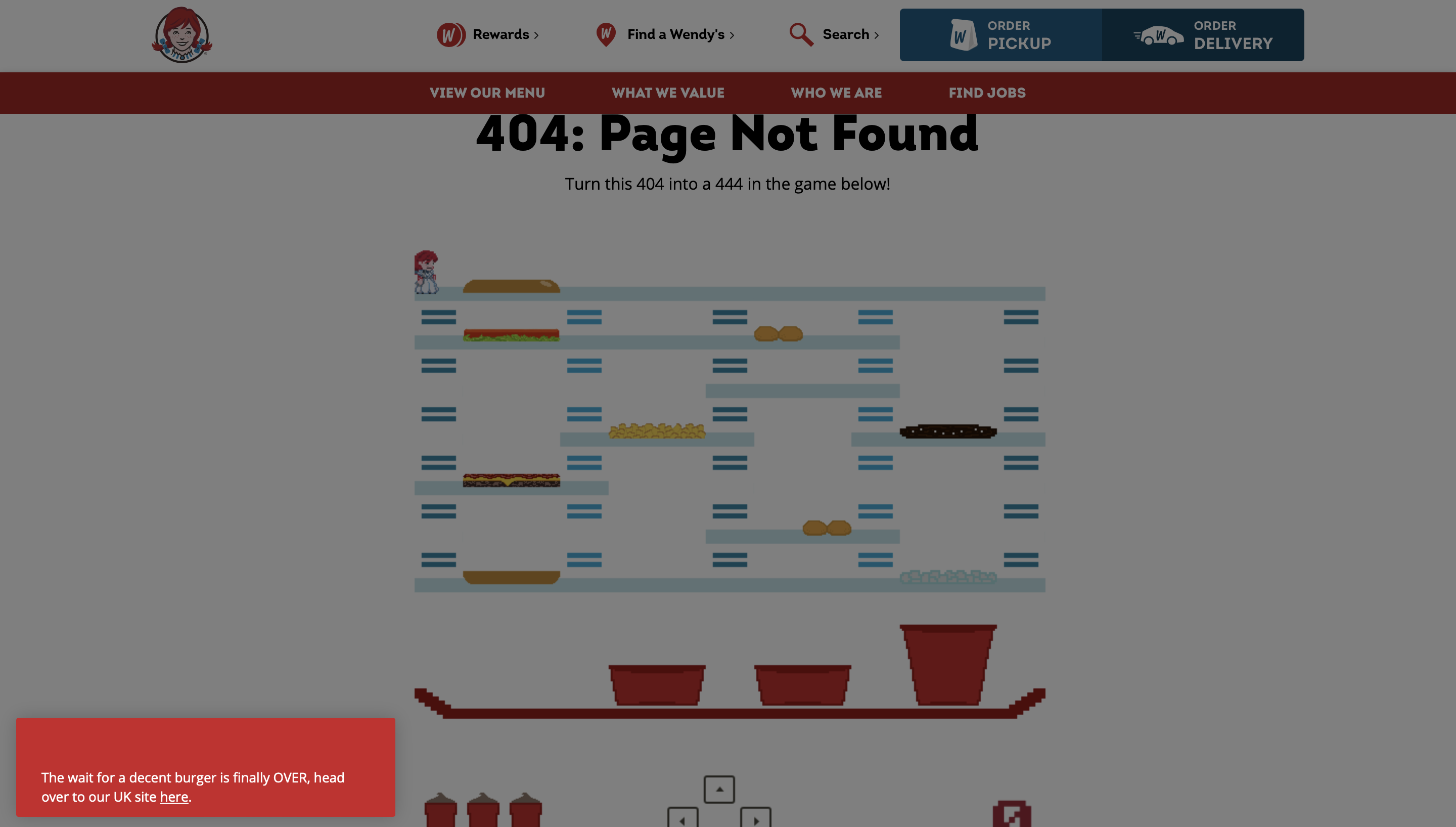
When people think of Wendy’s, their thoughts likely land on its signature burgers – the Baconator or Dave’s Double – and the brand’s red-haired mascot.
So, for Wendy’s 404 page, the company has whipped up a branded version of the old-school burger-stacking game “BurgerTime” featuring Wendy herself.
The page opens with a classic 404 message before inviting users to become players and dive into a quick bit of fun.
As players dodge hotdogs and drop fast food items onto the tray below, they might forget their frustrations as they’re charmed by the nostalgic gameplay before pressing start on their website journey once again.
10. 9GAG
 Screenshot from 9GAG, February 2024
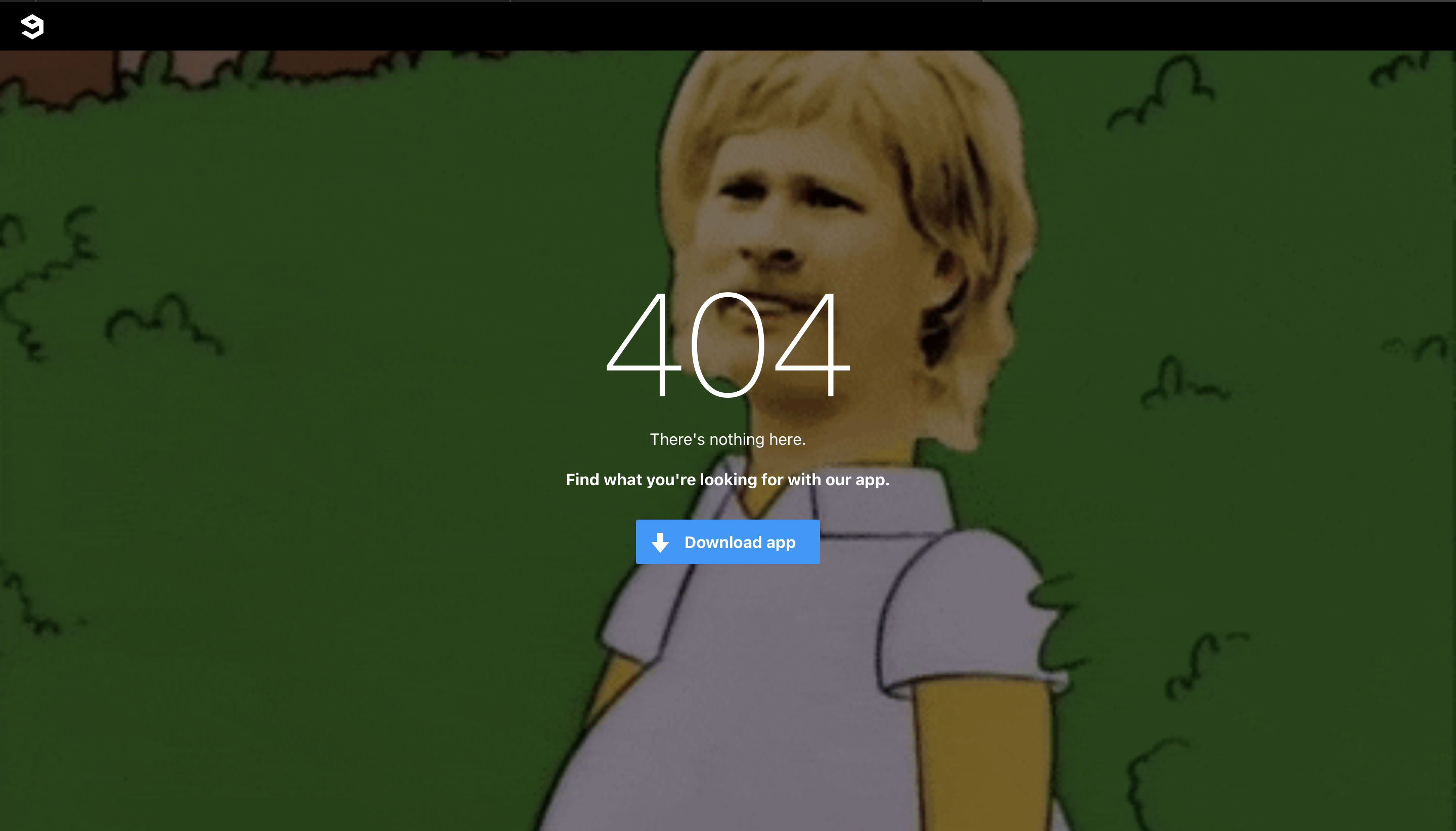
Internet humor hub 9GAG keeps its 404 page simple yet perfectly on brand.
While the copy is kept short and to the point, it’s the background imagery that’s the focus – using a twist on a classic Simpsons GIF to summarize the feeling of seeing a 404 error.
That empathy with the user is likely to get them giggling and falls right into 9GAG’s tone of voice sweet spot.
Memes act as a communicative shorthand that can turn frustration into fun through shared experience.
9GAG also uses this as an opportunity to nudge users towards its mobile experience instead, so you can scroll to your heart’s content.
11. OrangeCoat
 Screenshot from OrangeCoat, February 2024
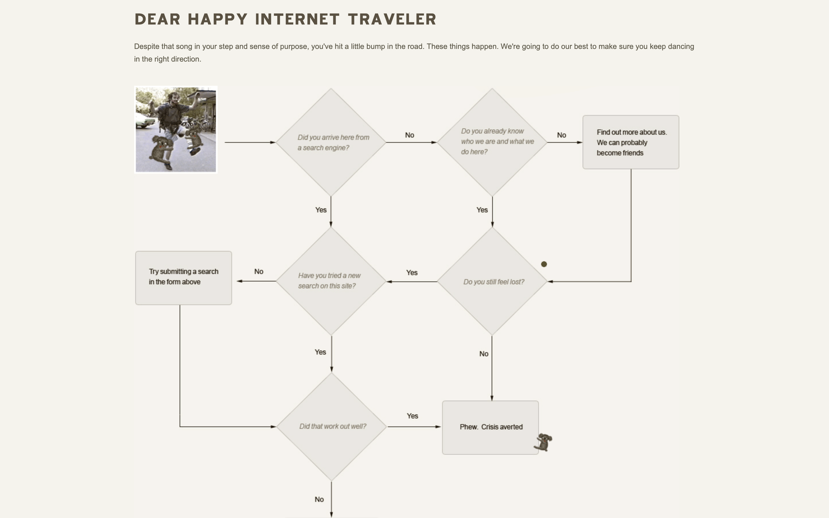
As a self-styled “gourmet web design” company, Orange Coat breaks the mold and serves up a flowchart for its 404 page to redirect a user’s journey.
Addressing the website viewer as a ‘happy internet traveler,’ Orange Coat invites them to answer a series of yes or no questions until they arrive at the right tip to get the user back on track.
Rather than simply offering a single option of returning to the homepage, Orange Coat sees the user more as an individual, offering a flowchart to guide them in the direction of the best fit for their needs.
This way, users are more likely to stay on the site to find what they want rather than clicking off and going elsewhere.
12. DashThis
 Screenshot from DashThis, February 2024
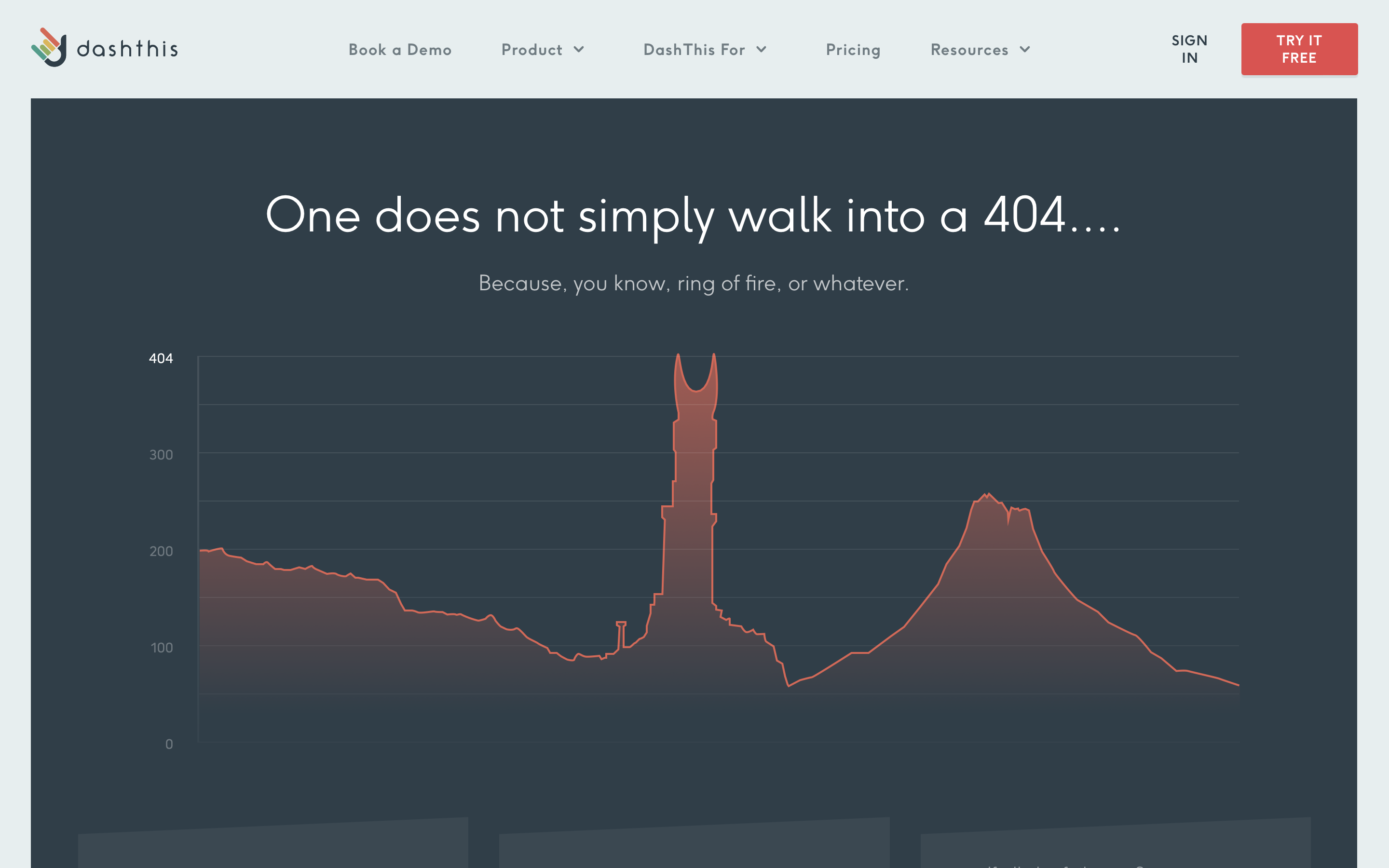
DashThis specializes in marketing reporting software, so it has catered its 404 page to the nerdier side of its audience with a classic Lord of the Rings reference disguised within data visualization.
While the chart recreates Mount Doom and the Eye of Sauron, the text features a play on words (404 = Mordor) to make this error page a little more light-hearted.
Even if this reference goes over a user’s head, there are three links right below to get them back on track – sending them to the homepage, help center, or for a chat with their support team.
This is a fantastic example of blending brand purpose with some irreverent fun and genuinely helpful signposting to assist a lost user.
13. Help Scout
 Screenshot from HelpScout, February 2024
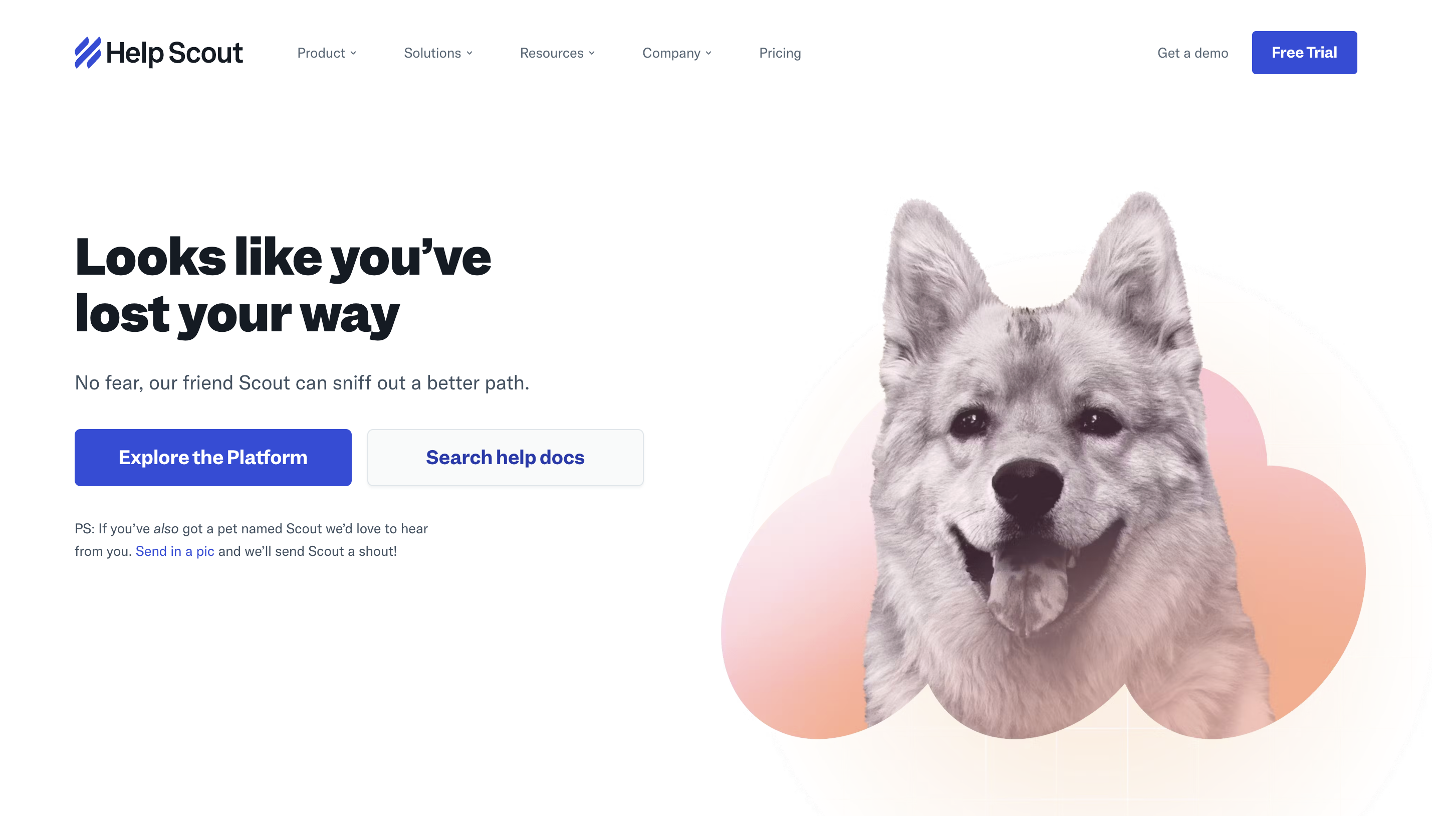
Help Scout is all about offering a simple, personal, and powerful platform to help with your marketing duties – and its 404 page is no exception.
It has personified its brand by bringing Scout, a rather adorable pup, to help you find another option within its site to help you while keeping the copy warm and encouraging.
With multiple options available to assist, from finding out more about its platform to the chat button still being clearly visible at the bottom, the brand also engages users by asking anyone with their own dog named Scout to submit a photo.
While niche, it’s something that makes the brand feel more authentic and human – a nice touch for a 404 page that could otherwise feel quite robotic.
14. World Association of Zoos and Aquariums (WAZA)
 Screenshot from WAZA, February 2024
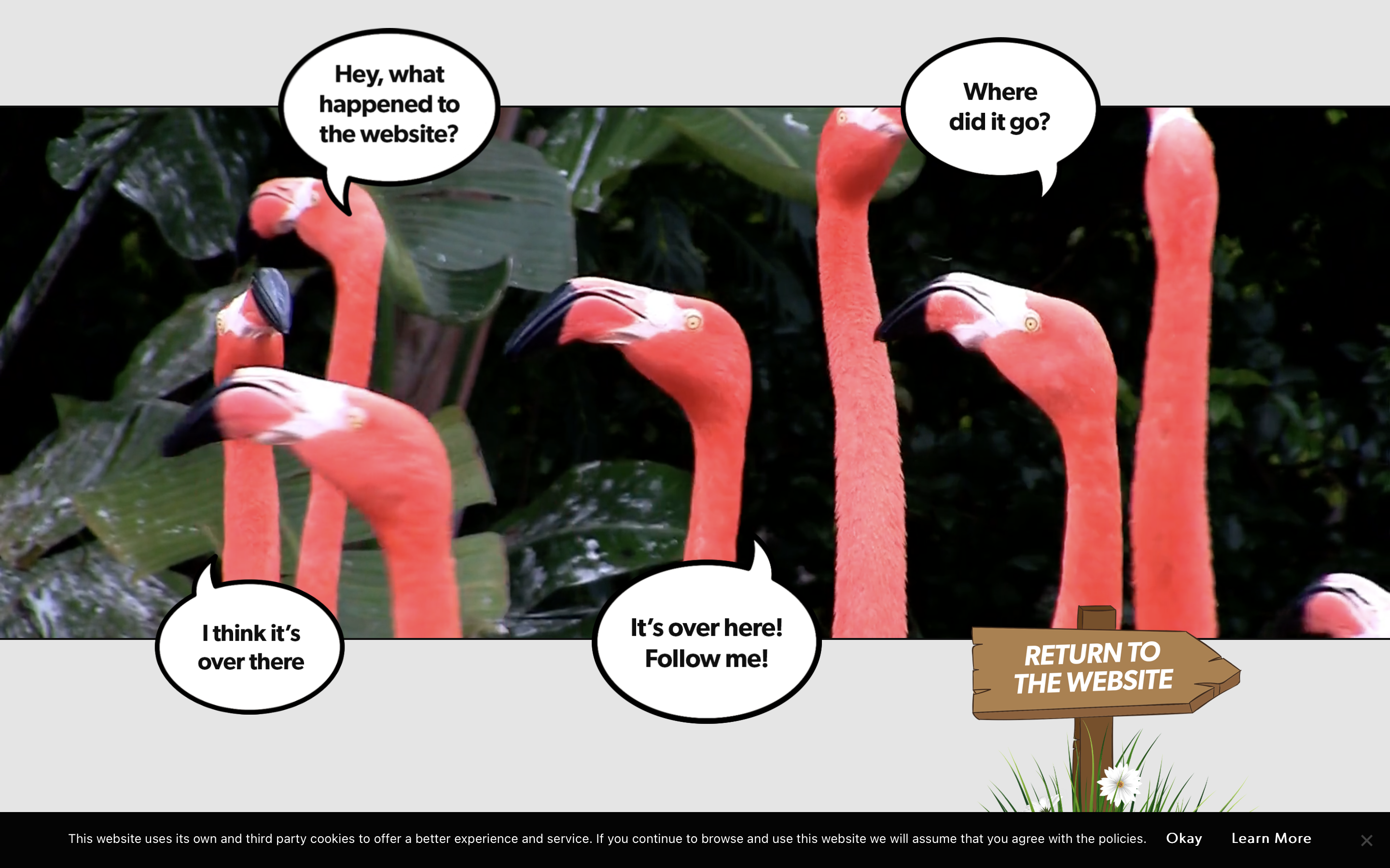
Sometimes, opting for a much more playful and personable approach to soften the landing on a 404 page.
WAZA ditched the usual error message and instead let its animals do the talking, with a flamboyance of flamingos squawking about the missing webpage.
This more novel approach aims to keep the user engaged by leveraging relevant video content before subtly getting them back on-site to continue their journey.
The speech bubbles surrounding the flamingos gradually lead you back to a link directing you back to the main website, giving the user a brief bit of brevity before they return to the homepage.
15. BluePath
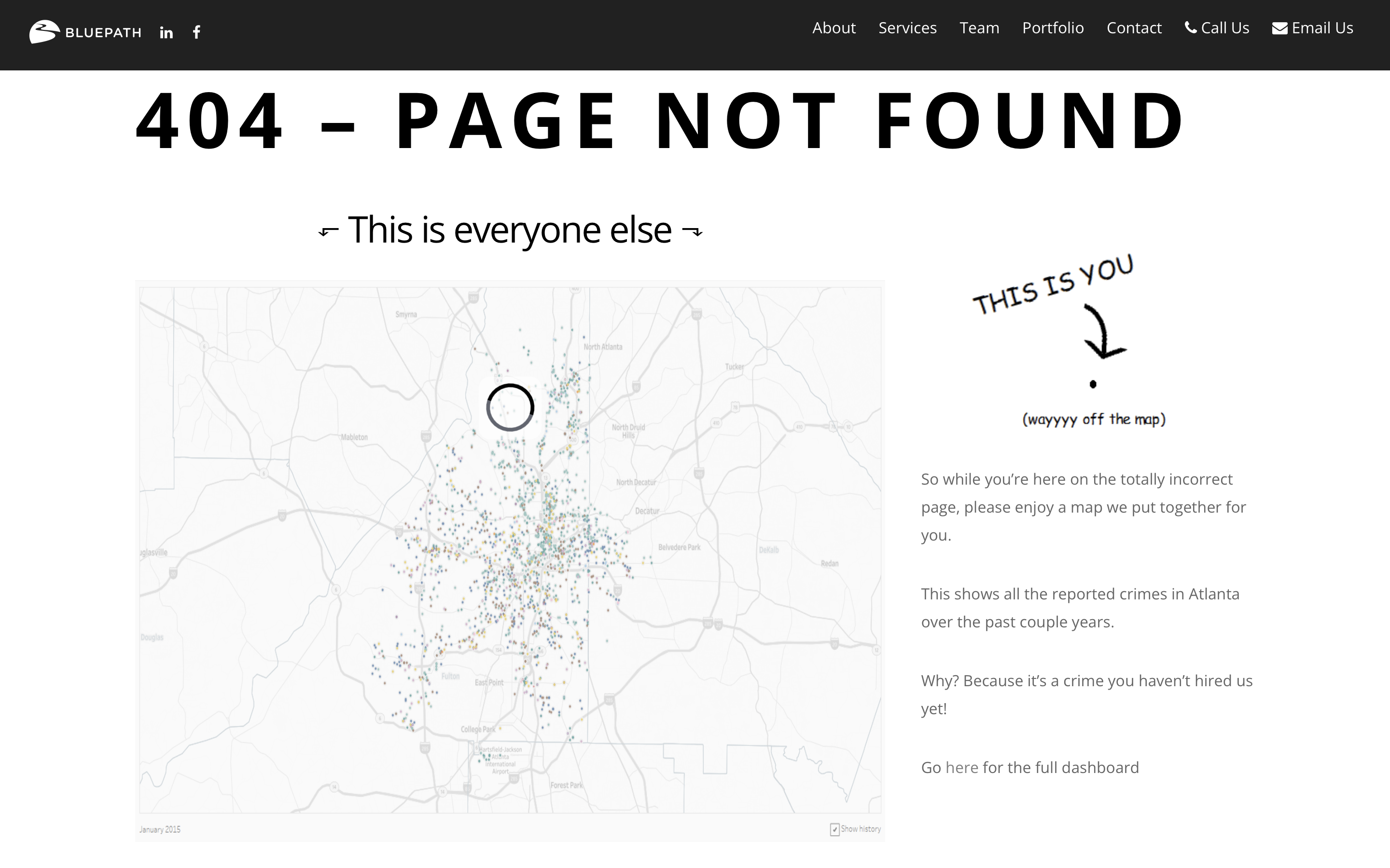 Screenshot from BluePath, February 2024
Data strategy and science might not be the easiest things to weave into a 404 page, but BluePath has integrated it seamlessly with a crafty call to action included.
The idea that a 404 page is the same as wandering off of the sitemap is played with, showing that you’re – in some ways – a little bit special to end up here by going off the beaten path.
Here, the brand showcases its data prowess with an interactive crime hotspot dashboard and leverage copy that’s a bit more risque with the pun – “because it’s a crime you haven’t hired us yet!”
This is a creative way of potentially securing leads through a wrong turn on its site and plays into the personality of BluePath’s brand.
16. Spotify
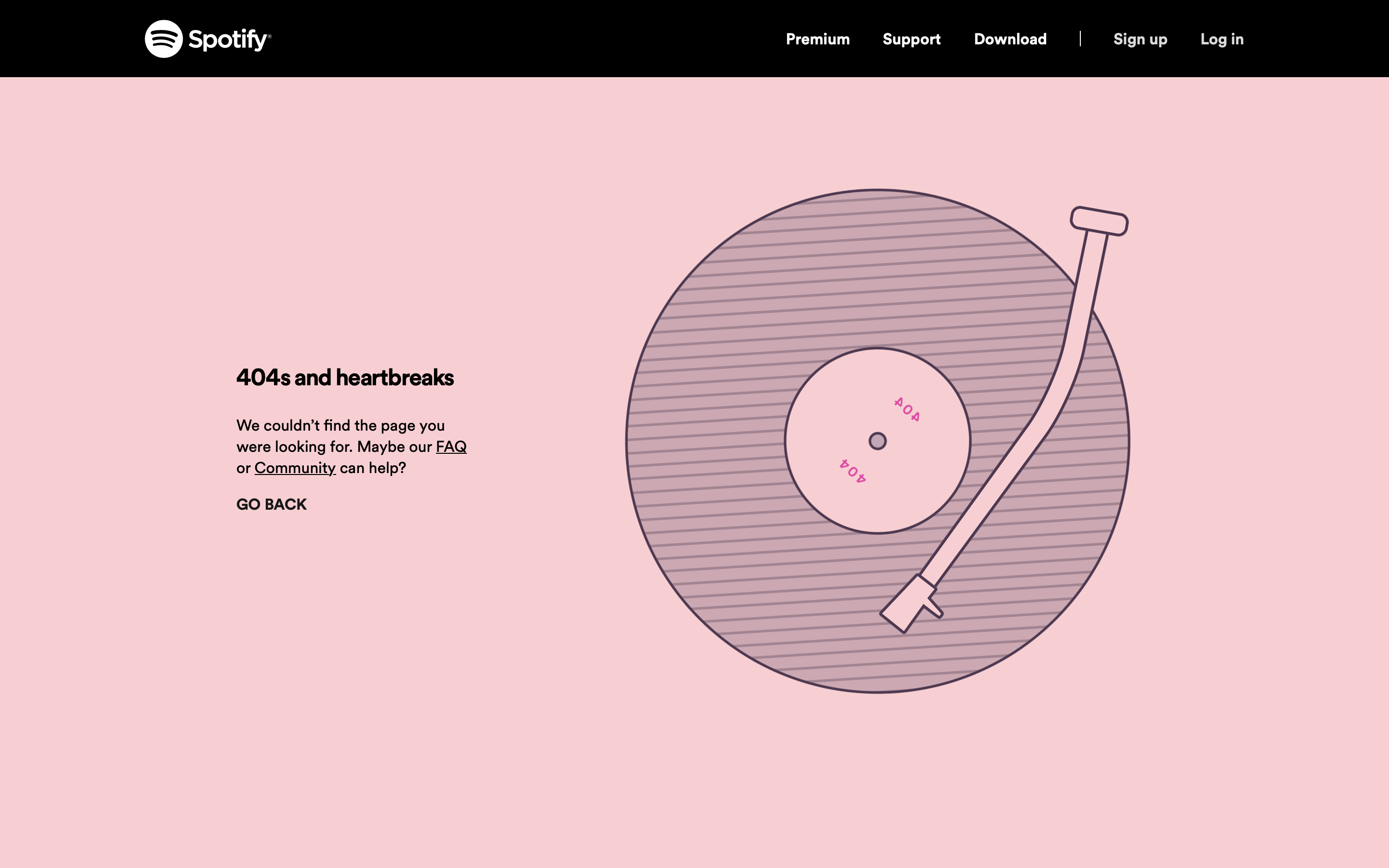 Screenshot from Spotify, February 2024
As one of the major players in the music streaming space, Spotify has a reputation to uphold with its 404 error page to keep it in line with the rest of its brand.
When a user’s track through the Spotify site has a record-scratch moment, they’re greeted by linework imagery of a turntable coming to a halt while the copy plays out an old-school Kayne reference – 808s & Heartbreak being his fourth album title.
The party doesn’t stop there, though, as Spotify signposts both its FAQs and Community pages as alternative spaces for users to find their groove again.
If neither of those suits the user, they’re also able to go back and replay the previous page they were on so they can pick a different link to follow instead.
17. Myriad
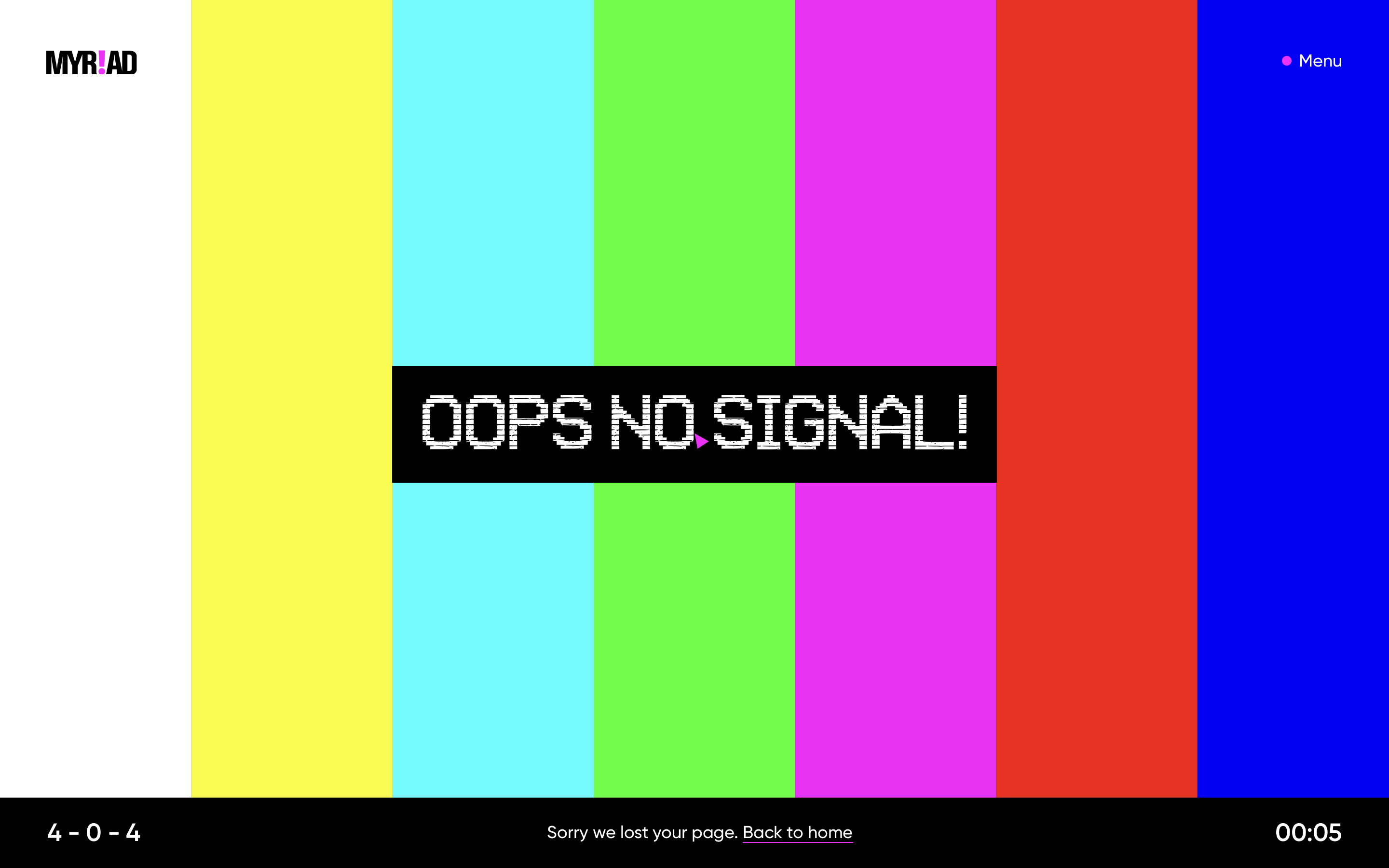 Screenshot from Myriad, February 2024
Myriad is a savvy video production agency operating out of North Carolina, with a 404 page that leans right into its analog roots.
When website visitors tune into a page that doesn’t exist, they’ll see a classic SMPTE color bar test pattern and ‘OOPS NO SIGNAL!’ blaring across the screen in an homage to CRT television era broadcasts.
This is a nod to the technical difficulties that sometimes struck in broadcasting, now repurposed for a more modern issue that’s completely on-brand for Myriad.
The 404 messaging is nicely integrated in a way that feels like part of the design, with a CTA at the bottom to return viewers to regular service on the homepage.
18. Fern
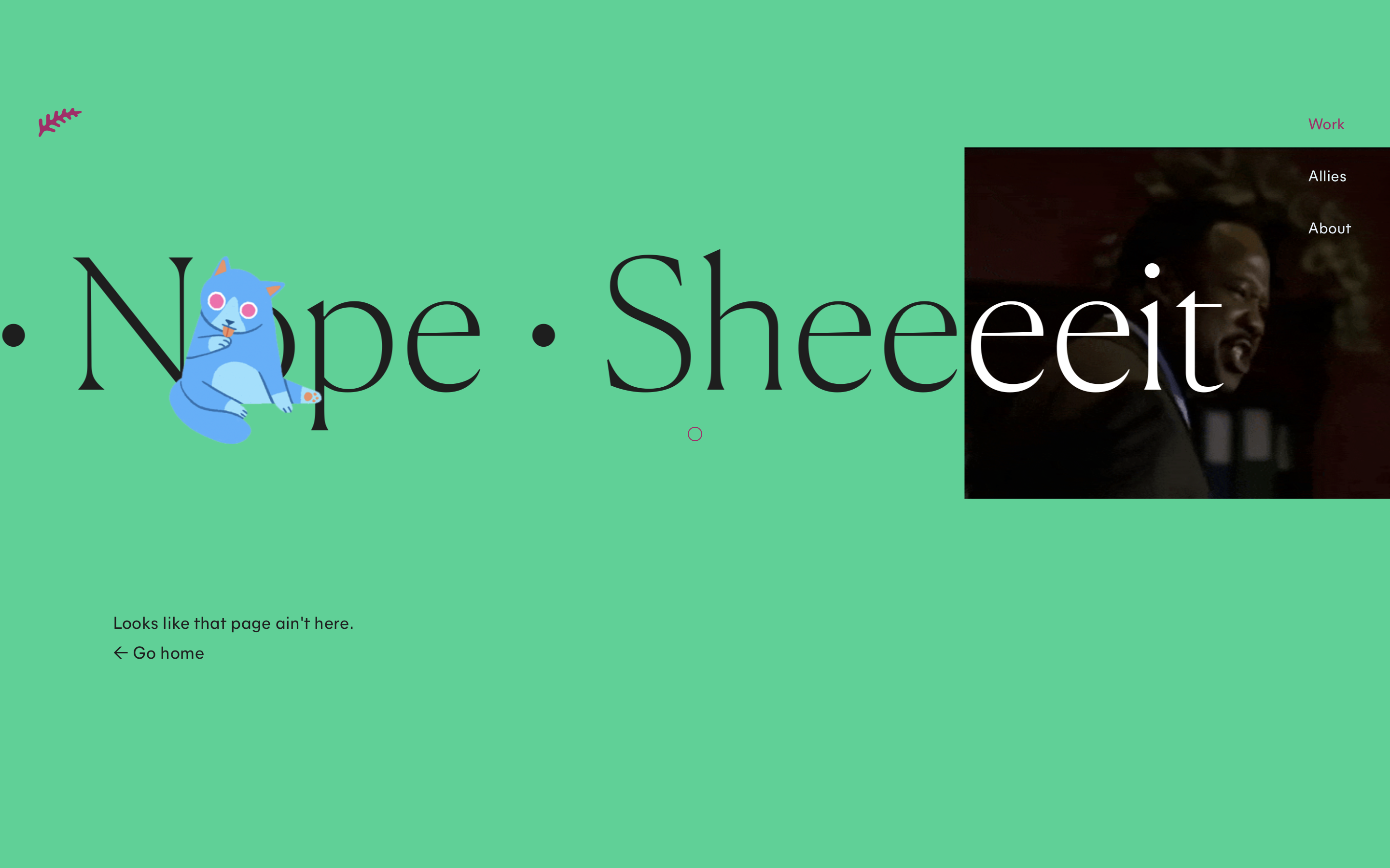 Screenshot from Fern, February 2024
Fern’s credentials as a design and animation studio mean that people likely expect exceptional experiences on their website, and its 404 page doesn’t fall short.
The scrolling text provides eye-catching movement, while illustrated visuals and a Clay Davis meme moment from The Wire help convey Fern’s playful brand voice and aesthetic.
As a 404 error is usually quite rare, this feels like a peek behind the curtain at Fern’s unfiltered creativity and tone of voice, picking out elements of fun from an undesirable experience.
Rounding this out are two quick lines of copy that quickly get people back onto the main site so they can discover my playful content just like this.
19. Disney
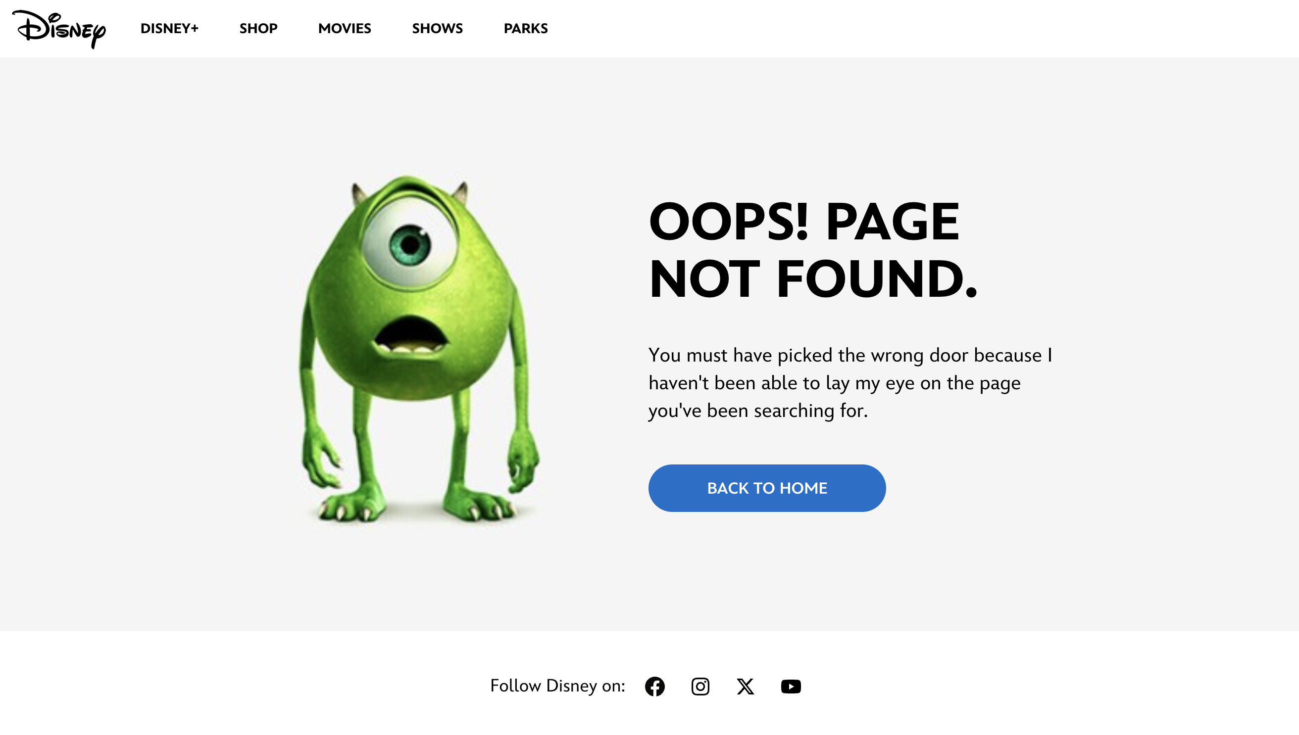 Screenshot from Disney, February 2024
One business with instantly recognizable characters is Disney, with its huge catalog of animated movies to draw upon to make its website feel more vibrant and interesting.
For its 404 page, Disney brings out Monsters Inc.’s main character, Mike, to create a bit of empathy and share in the user’s shock at discovering a missing page.
The copy is to the point and references a major plot point from the movie – the doors used for scaring – which is a nice treat for Disney fans who are in the know about this.
It then circles back to bring users back to the homepage so they can explore other elements and possibly meet other fan-favorite characters around the site.
20. Figma
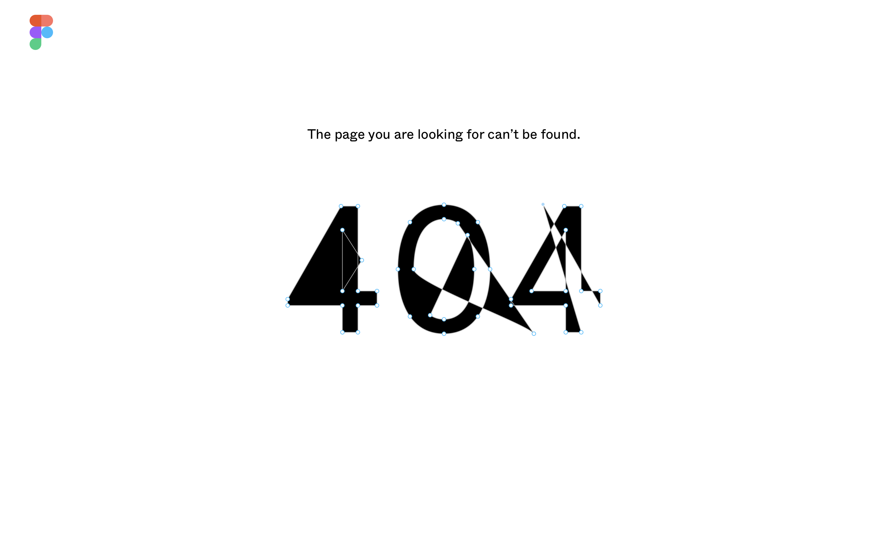 Screenshot from Figma, February 2024
At first glance, Figma’s 404 page looks deceptively plain – just black Helvetica text on a white background that succinctly conveys the error.
However, the small blue dots on the 404 numbering invite users to mess around with the shape of these numbers.
This subtle interactivity performs a few functions – it shows off the ease of Figma’s features, allows users to take out a bit of frustration by warping the numbers, and keeps the design clean. Hence, it’s clear that the colorful home button is the best option to pick.
21. Innocent Drinks
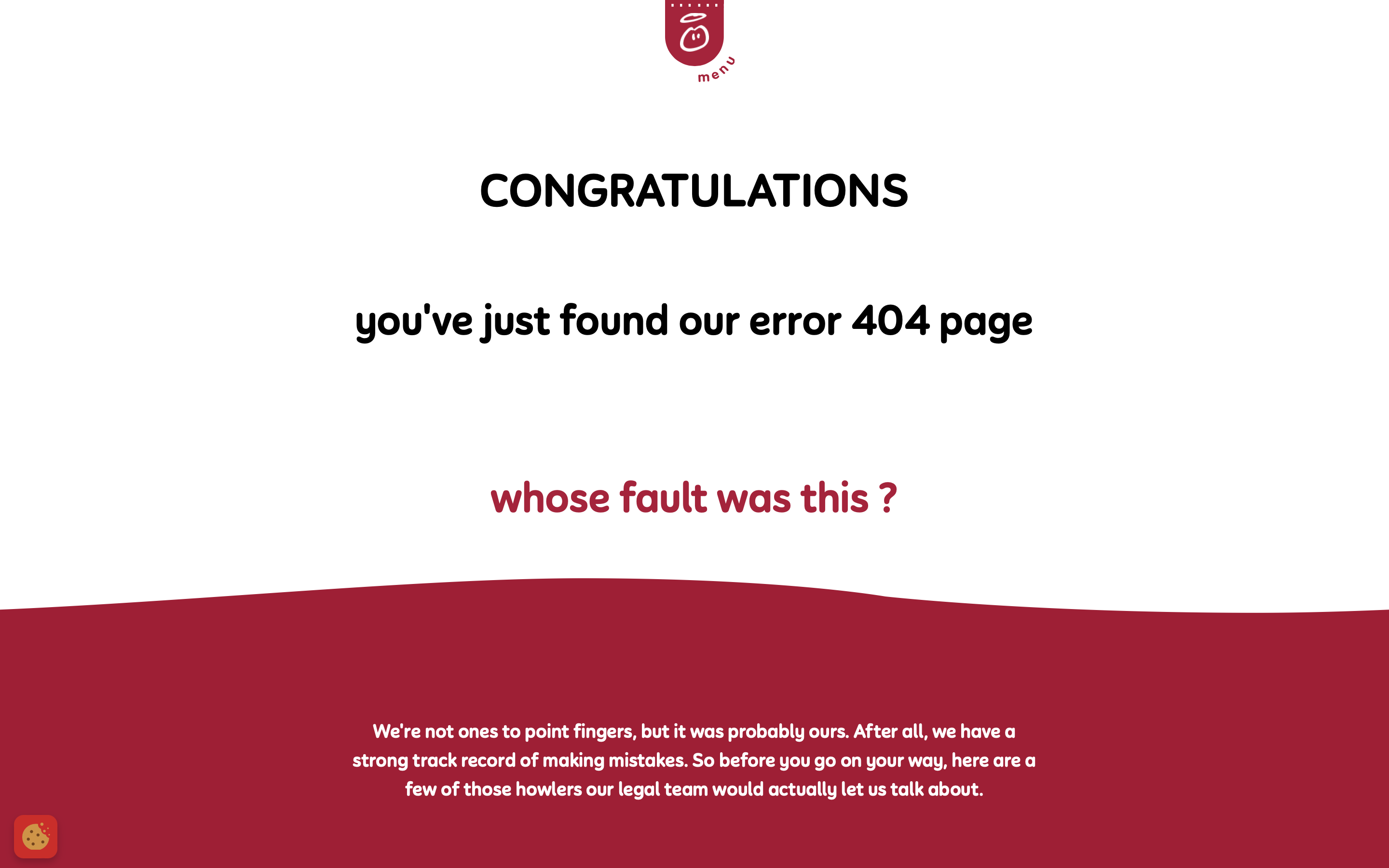
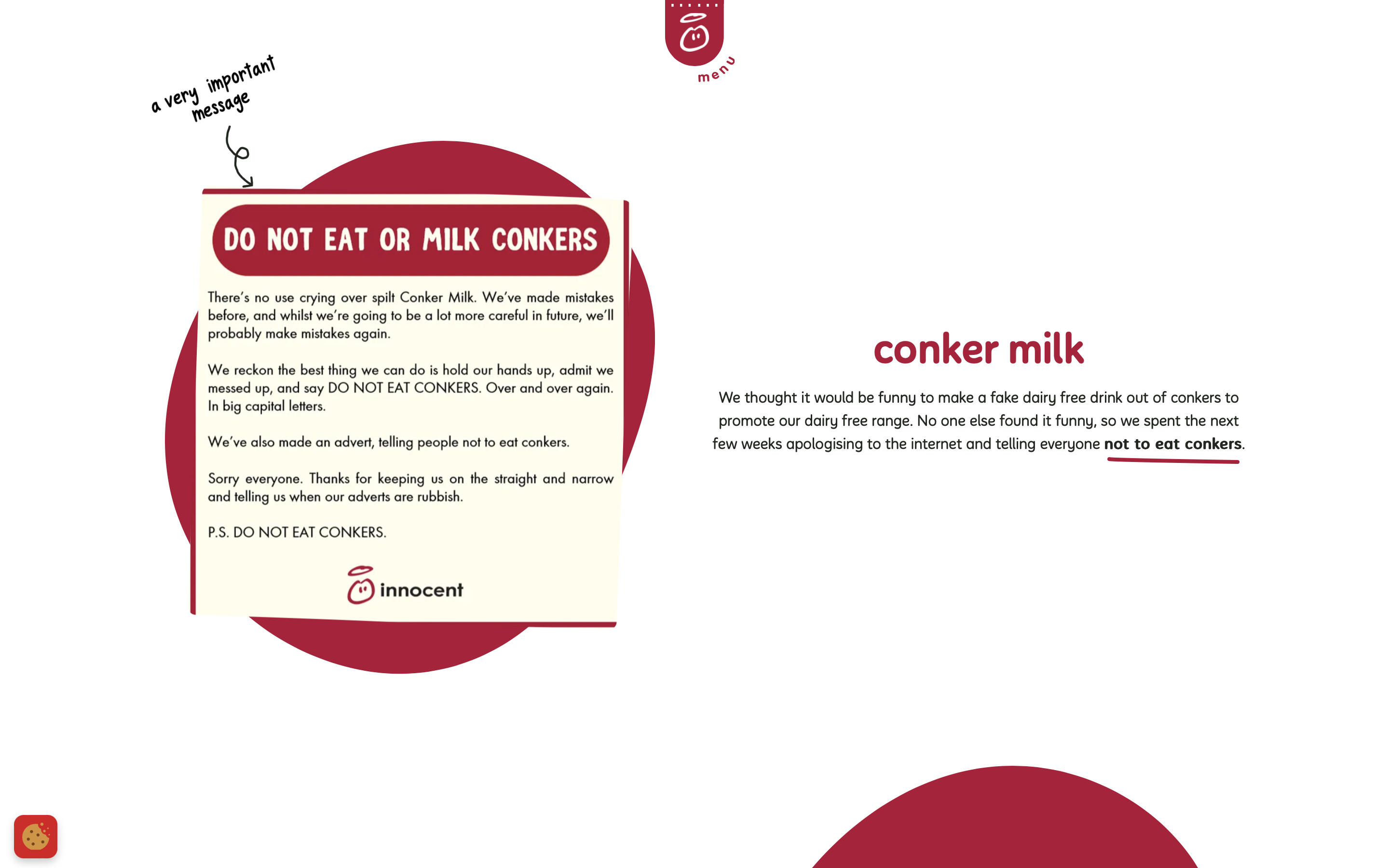
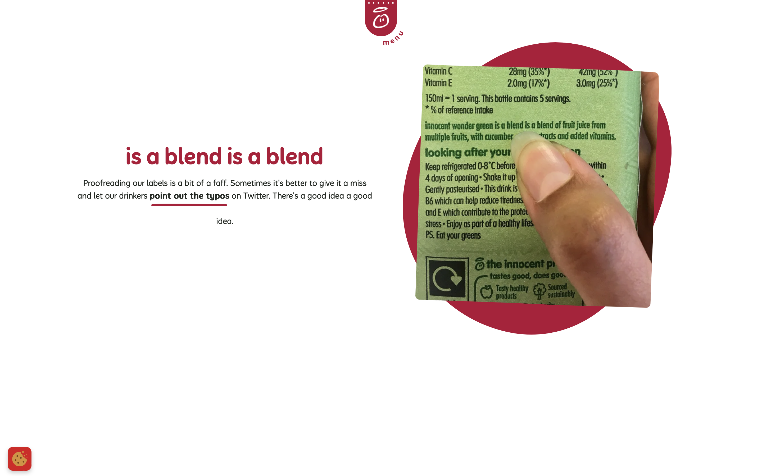 Screenshot from Innocent Drinks, February 2024
Everyone makes mistakes. It’s something we all have to own up to on occasion, and a 404 page feels like a good place to take accountability for your own.
That’s exactly what Innocent Drinks has done with its 404 page, providing a quick congratulations to the user for finding the page – and then taking responsibility for the error.
It then doubles down with some fun, light-hearted content that takes website viewers on a short tour of the brand’s previous missteps.
By doing this, it forms a bonding moment with the user and the 404 page no longer feels like a negative experience.
Plus, the bold red menu bar responsively follows the user’s scrolling down the page, ready to take them elsewhere on the site once they’ve finished enjoying Innocent’s previous little mistakes.
22. Gymbox
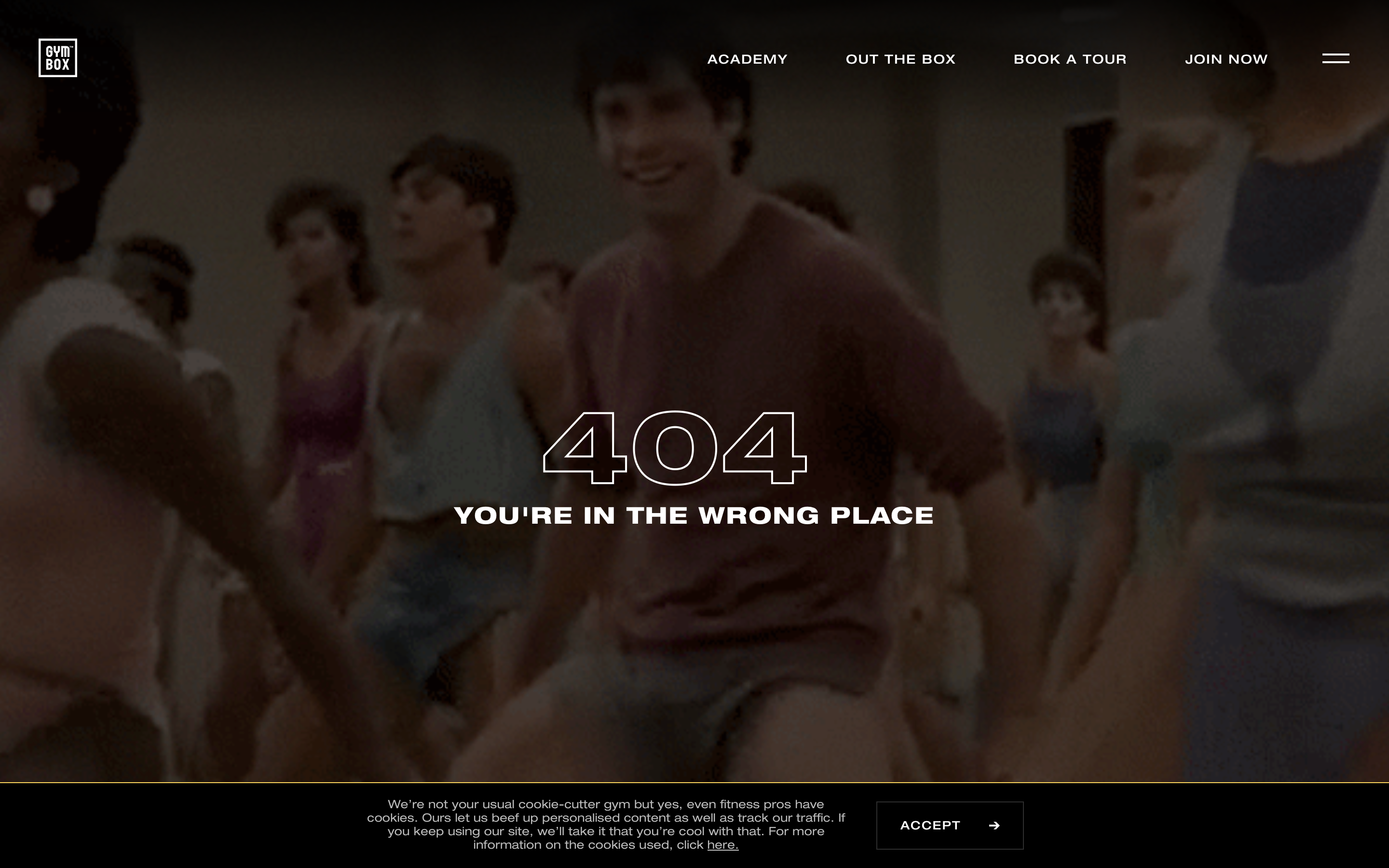 Screenshot from Gymbox, February 2024
Sometimes, you want to convey to users that the 404 page is definitely the wrong place and get them elsewhere fast.
Gymbox, a London-based gym chain, has taken this idea and run with it.
Its 404 error message goes a step further than others, informing users that they’re ‘in the wrong place,’ while a GIF of John Travolta from “Perfect” gyrating in a gym class of his own plays in the background.
This seems like an instrument for both shock comedy and mild discomfort, strategically redirecting users to anywhere else on the website with the navigation bar standing out clearly at the top of the page – away from the GIF content.
23. Jamba Juice
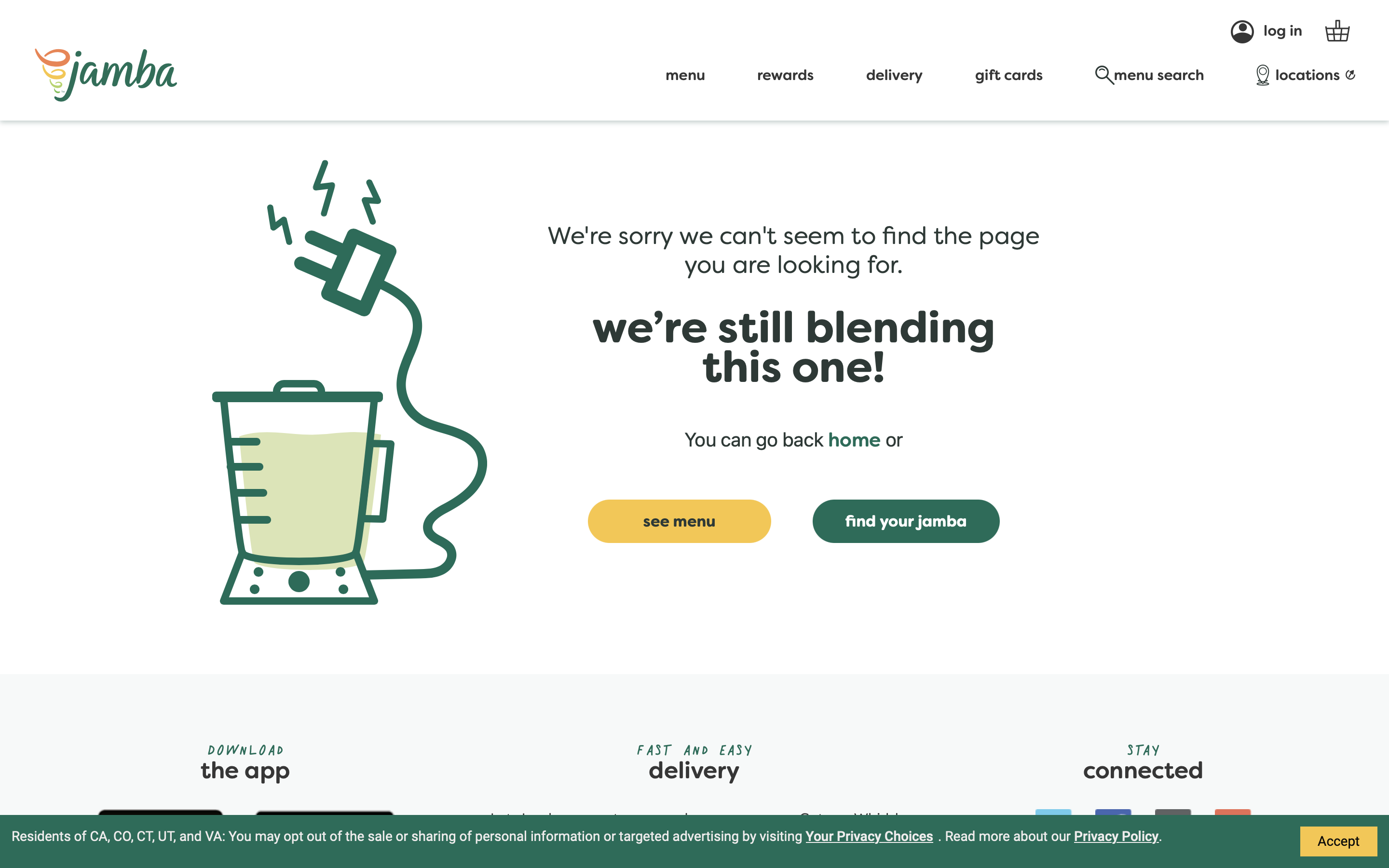 Screenshot from Jamba Juice, February 2024
Popular juice brand Jamba Juice has taken a best practice approach to its 404 page, keeping things to the point with just a splash of branding to make the page feel right at home on its website.
The middle message delivers the key information in a more Jamba-oriented way, while the copy above provides a more stative description of what it means, and the imagery to the side reinforces this point.
Underneath, Jamba has provided a blend of options that should cover the majority of user needs: a homepage link, menu option, and “find your Jamba,” so you can discover your closest Jamba location to grab your next juice fix.
While this page doesn’t do anything fancy or unexpected, it delivers on the key user experience to ensure the company has done everything it can to answer a user’s needs before they click away.
24. Kinsta
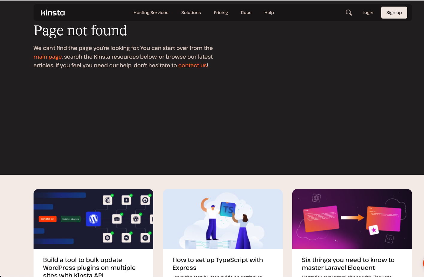 Screenshot from Kinsta, February 2024
Cloud-based WordPress hosting site Kinsta takes a function-over-form approach to its 404 page, prioritizing being useful over flashy visuals or novelty factors.
Website visitors who land here will be greeted by some practical copy that explains why they’ve ended up here and offers a few links to get them back to where they might want to be.
What’s even better is that below this message is a set of recently published resources that might be of interest to the user, giving them a range of jumping-off points for getting back into the website and finding valuable content elsewhere.
25. Carwow
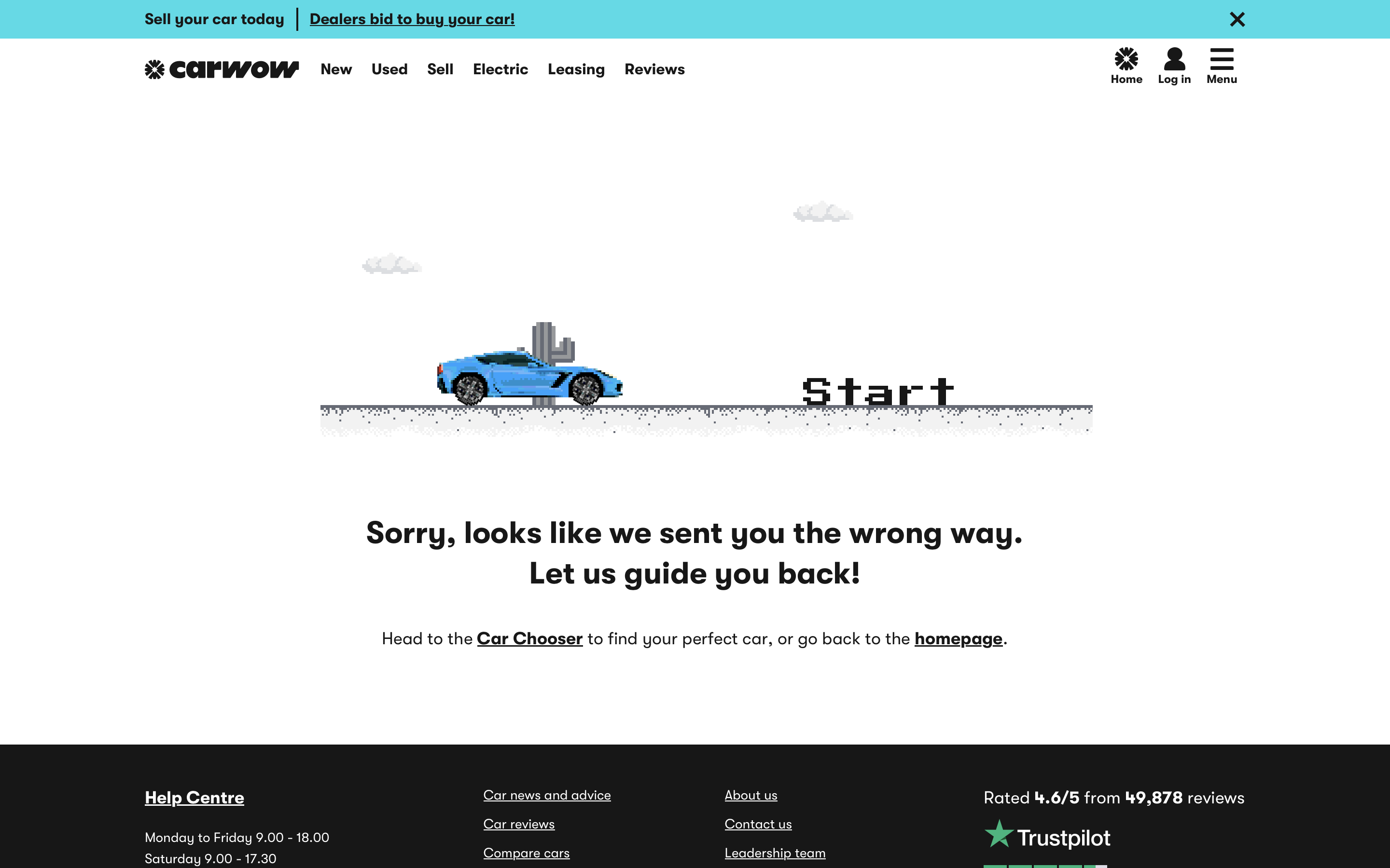 Screenshot from Carwow, February 2024
Creating an interactive 404 page can be tricky in terms of keeping it relevant to your product offering.
CarWow has managed to implement this flawlessly with an engaging and simple racing game with a ramping difficulty level.
When you (inevitably) crash and burn, the game actually directs you to find a new car in real life to replace your fictional one that’s just gone up in flames.
Plus, for those who aren’t particularly interested in setting a new high score, there’s some very clear text underneath with links both to the Car Chooser and the homepage to answer some clear user needs and get them back on their way through the website.
26. Wayside Studio
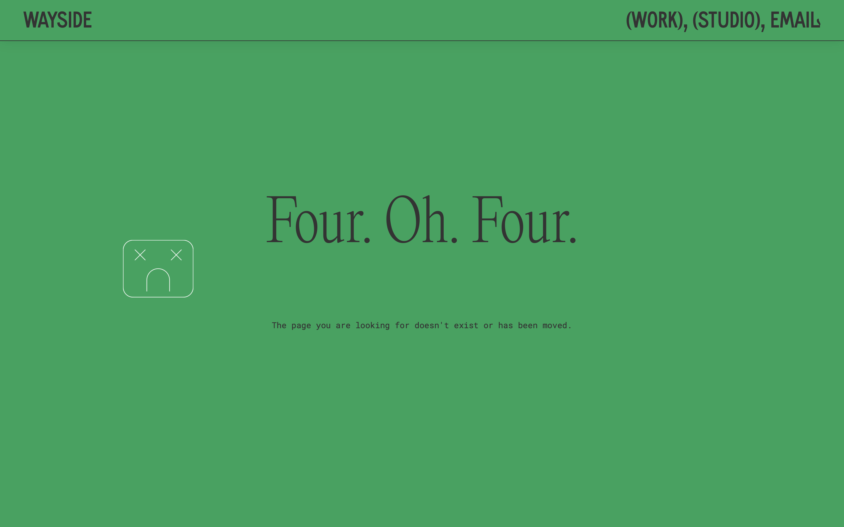 Screenshot from Wayside Studio, February 2024
Wayside is an innovative design and research practice that tries to do things a little differently to bolster the relationship between people and their communities.
The brand’s way of doing things is a bit outside of the norm, but not just for the sake of it – and the same goes for its 404 page.
Upon landing, its statement green coloring is on full display with clear error message text – but the big difference is your mouse cursor. A sad robot follows your movements around the page perfectly, indicating that this page is a dead end.
This reinforces the very clear error message on the screen, with the robot only leaving you alone when you return to the navigation bar to pick another option.
27. Pierre-Louis
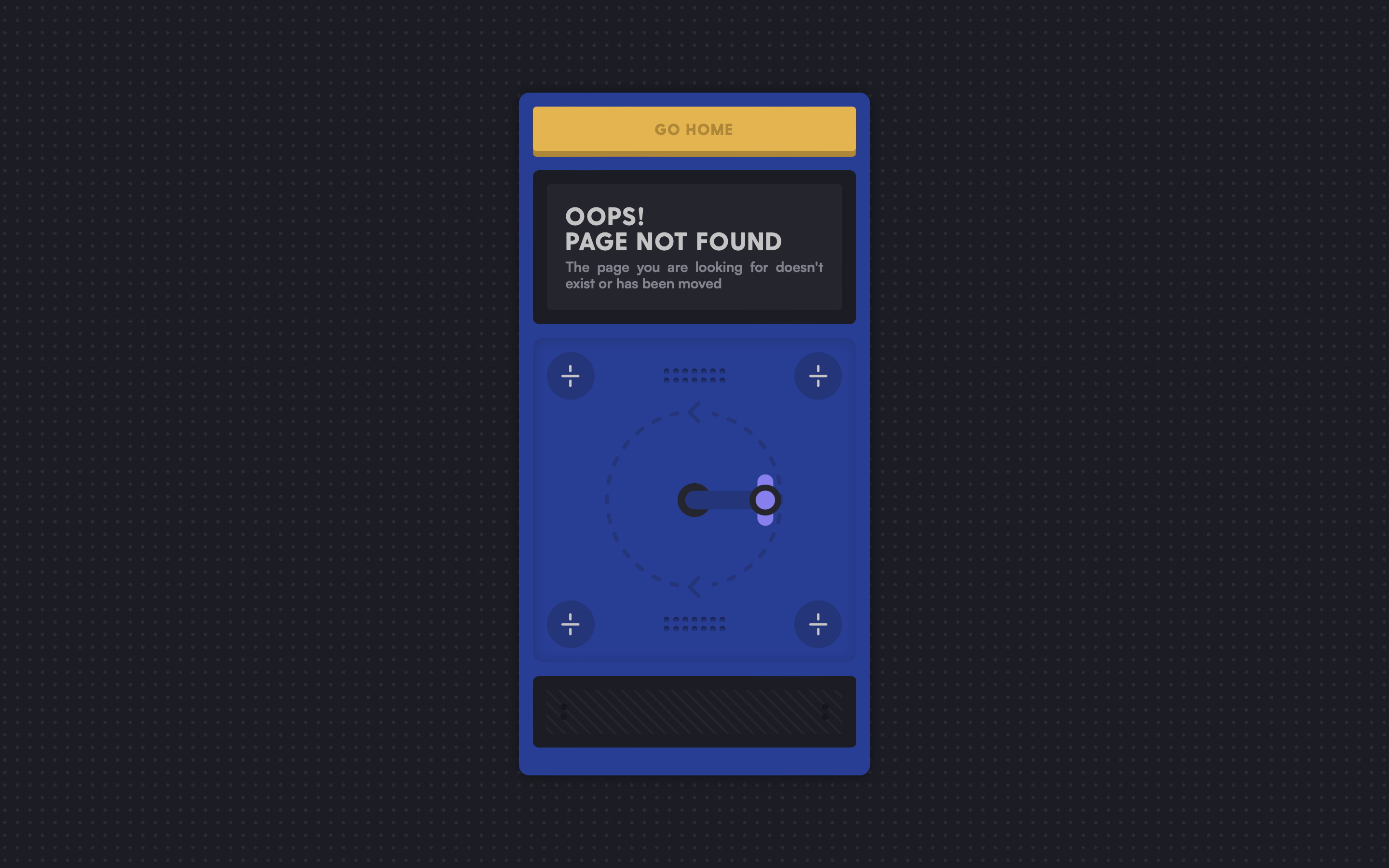 Screenshot from Pierre-Louis, February 2024
Pierre-Louis Labonne is a delightful creative freelancer with a website that really shows off his skills with a range of brilliantly designed digital gadgets and widgets.
His 404 page is no exception, with a digital machine that pops up to tell you, “Oops, the page you’re looking for is not found.” While this seems like a fairly standard message at first, the crank that sits underneath entices users to dig further.
Upon turning it, the text moves and is shifted by two puzzle pieces coming together to read “404.”
It’s a holistically branded package where even the error message is bespoke to Labonne, with a big and bold ‘Go Home’ button at the top so you can get back to familiar ground.
28. Red Bull
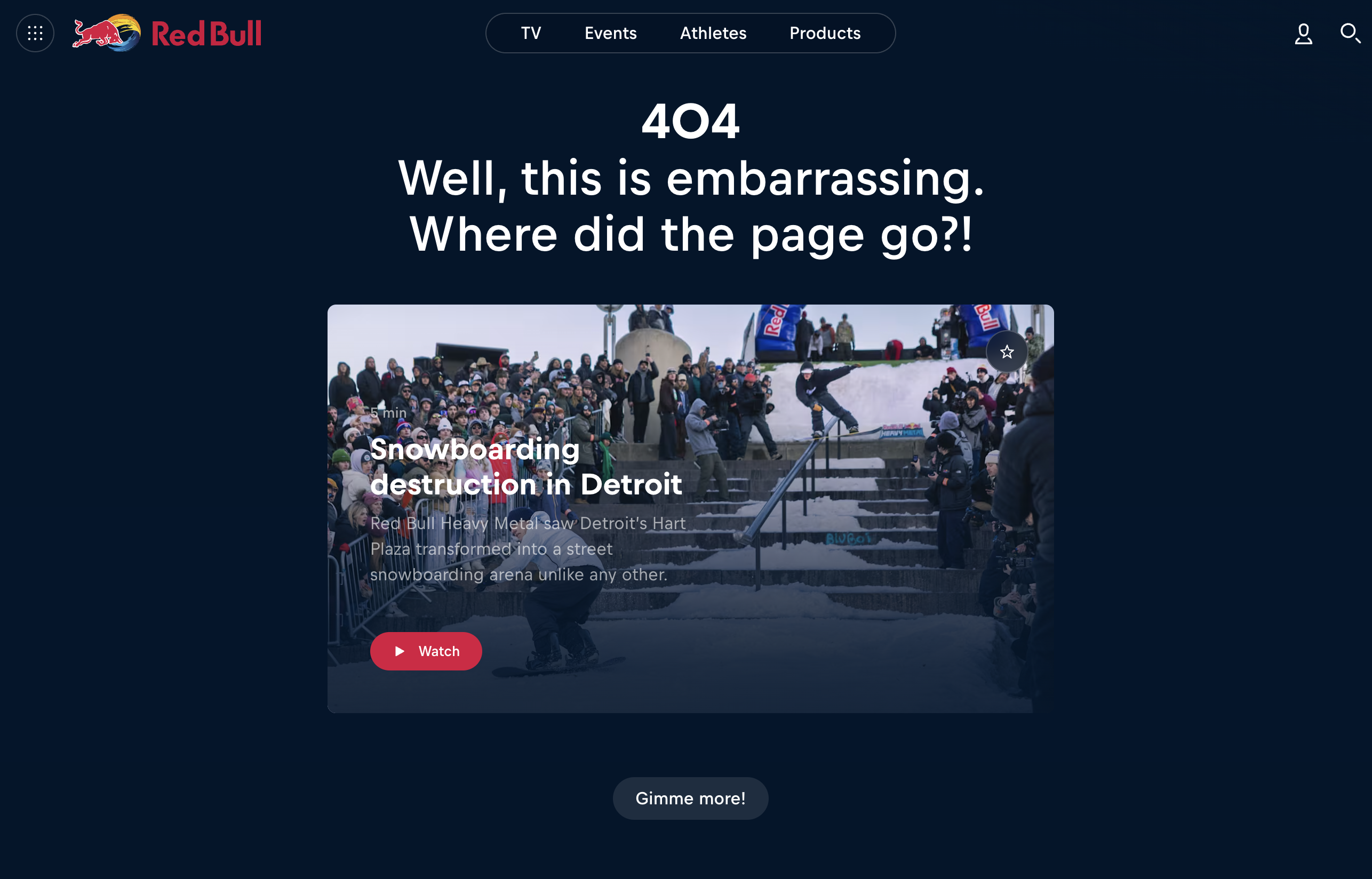 Screenshot from Red Bull, February 2024
High energy and visually stunning content make up Red Bull’s bread and butter when it comes to its brand.
From its advertising to its regular high-octane events, Red Bull’s website is never short of interesting elements to engage with. So, for its 404 page, Red Bull leverages this wealth of fascinating branded content and places it front and center.
This way, users who end up here are clearly informed that the page is missing while serving up a well-edited video of its most recent event to hold their attention.
If website visitors enjoy this video, they might be inclined to click the Gimme more! button below, which takes them through to Red Bull’s Discover page to restart their journey with renewed energy.
29. Tumblr
 Screenshot from Tumblr, February 2024
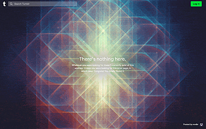
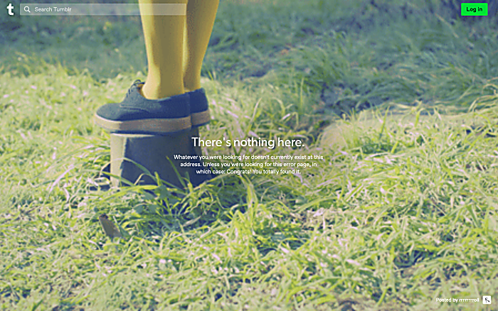
Tumblr has gone through many iterations over almost two decades on the internet, with its 404 page being a great example of how to keep people interested and serve their needs in a one-two punch.
If users manage to hit the 404 page, they’re treated to a randomly selected psychedelic background clip while the text provides a playful snippet of personality.
While informing website visitors that nothing exists here, it plays with convention to congratulate those searching for the error page.
What’s more is that after three to four seconds, the 404 page automatically redirects users to their trending page, so they can continue on their journey after a brief pause in the 404 void without needing to lift a finger.
30. Investors
 Screenshot from Investors, February 2024
There are lots of reasons a 404 page might appear for a user, but it can be tricky to explain or cover all the bases with one single page.
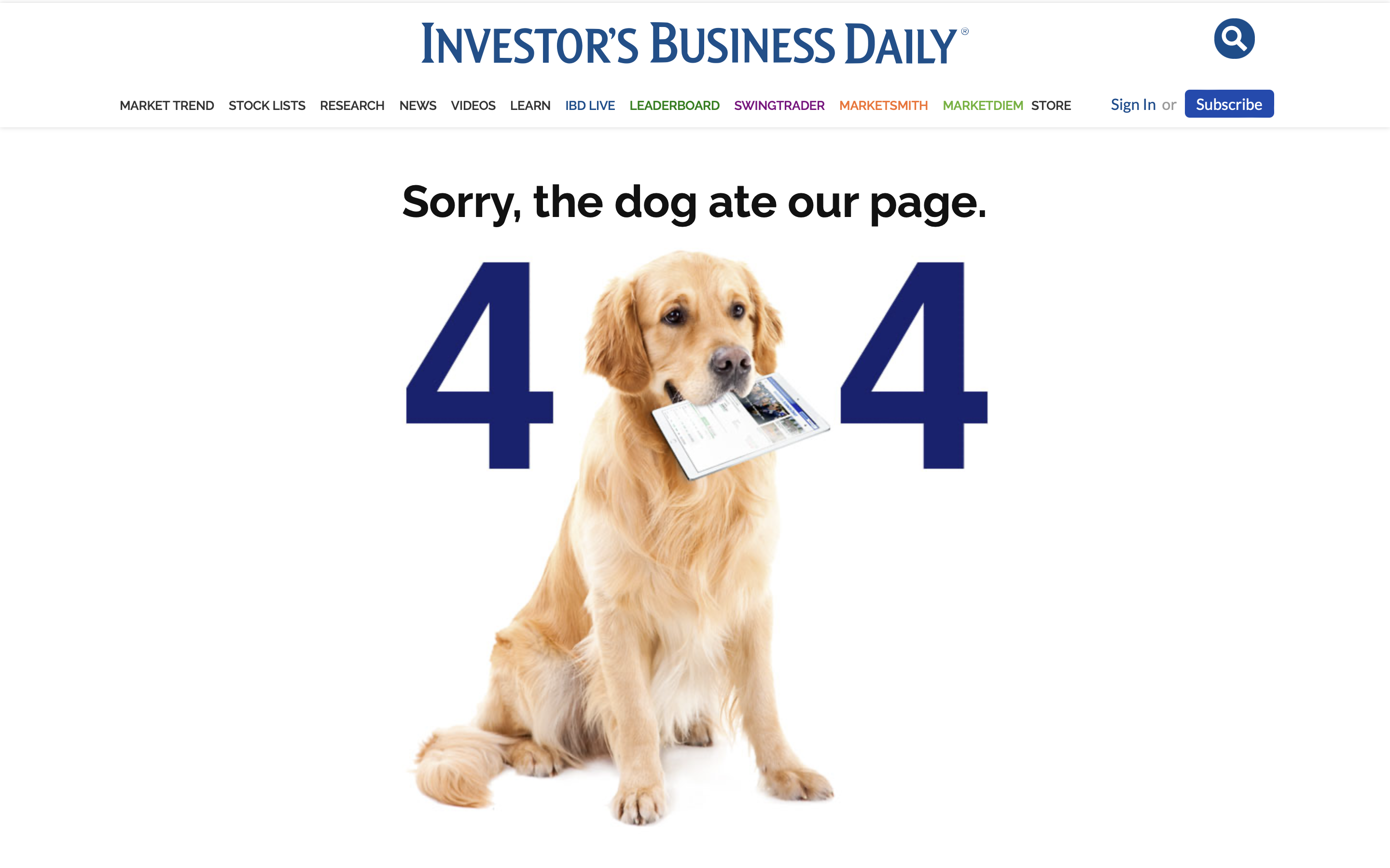
So, sometimes it’s easier to fall back on tried-and-true excuses – like the Investors classic, “The dog ate our page.”
It’s a very tongue-in-cheek approach with a suitably cute picture of a dog holding a page from the website, and it does encourage a level of forgiveness.
This touch of personality and wit makes a somewhat technical element of website management more straightforward by omitting the jargon of what caused the 404 and simply offering a silly excuse instead.
What helps tie this together is the search bar sitting underneath to help get website visitors back to where they might want to be with only a brief interruption.
31. Critical Danger
 Screenshot from Critical Danger, February 2024
As a non-profit that unites designers in order to support endangered wildlife charities, Critical Danger is very purpose-driven and relatively serious within its narrative.
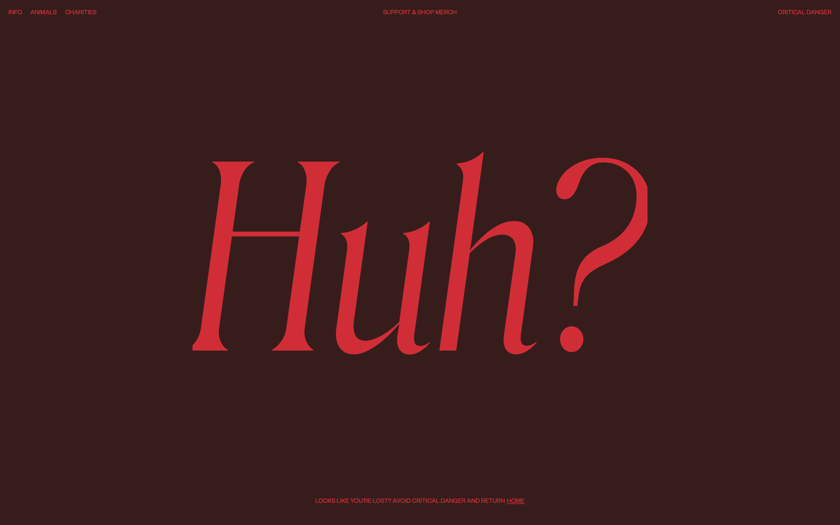
Because its core content comes with a more editorial and considered lens, its 404 page cuts through using just three letters – “Huh?”
The page retains the thematic red-on-red to still convey the sense of danger and urgency, but then immediately seeks to get people back to the top of the narrative using the text underneath or reorienting them with the links in the top left.
While not a clear 404 page at first glance, it performs its function elegantly and grabs a user’s attention with a no-nonsense approach.
32. Superlist
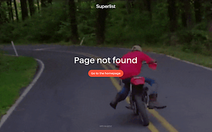
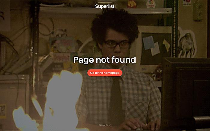
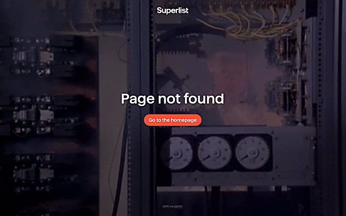 Screenshots from Superlist, February 2024
Superlist is another brand that makes full use of GIF content to convey the feelings associated with a 404 page.
Facilitated by an integration with Giphy, the page rotates through a preset list of GIFs – from Moss in The IT Crowd to a dirt bike rider hitting the dirt – to get across the feeling of things going a little bit wrong.
This keeps the content fresh while still setting limitations on what GIFs can appear on the page, just in case a user happens to land on the 404 page repeatedly.
By doing so, the page pokes fun at Superlist for having a problem and encourages users to see the lighter side.
And once a user has had their bite-sized bit of fun, they can hit the button in the center of their screens to return to the homepage and get their journey back in shape.
33. Wizarding World
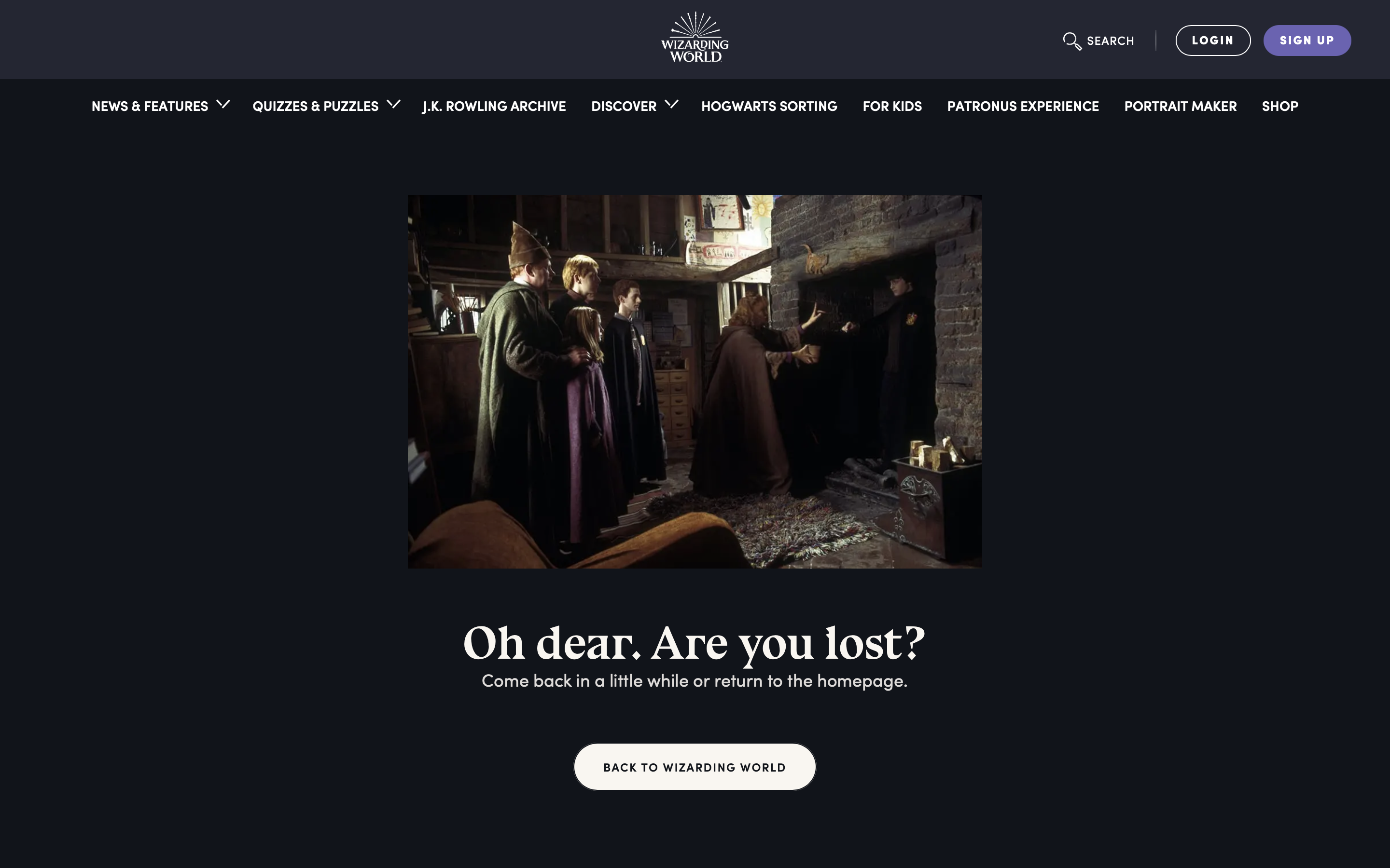 Screenshots from Wizarding World, February 2024
Chances are, if you’re searching through the Wizarding World website, you’re pretty familiar with Harry Potter and its iconic moments.
The site clearly knows its audience, as it conjures up a key moment from The Chamber of Secrets to mirror a blunder within its 404 page.
Harry mispronounces his destination while using Floo Powder – a substance used to teleport wizards and witches over long distances. So it makes sense that Wizarding World would use this moment when their users appear somewhere unexpected.
Channeling relatable moments like this from the source material can feel like an Easter egg for users, giving them a surprising moment of delight that brings them a little closer to the brand.
34. Thomas Bosc
 Screenshots from Thomas Bosc, February 2024
For a personal portfolio, it’s important to get across both your expertise and personality pretty quickly in order to make an impact.
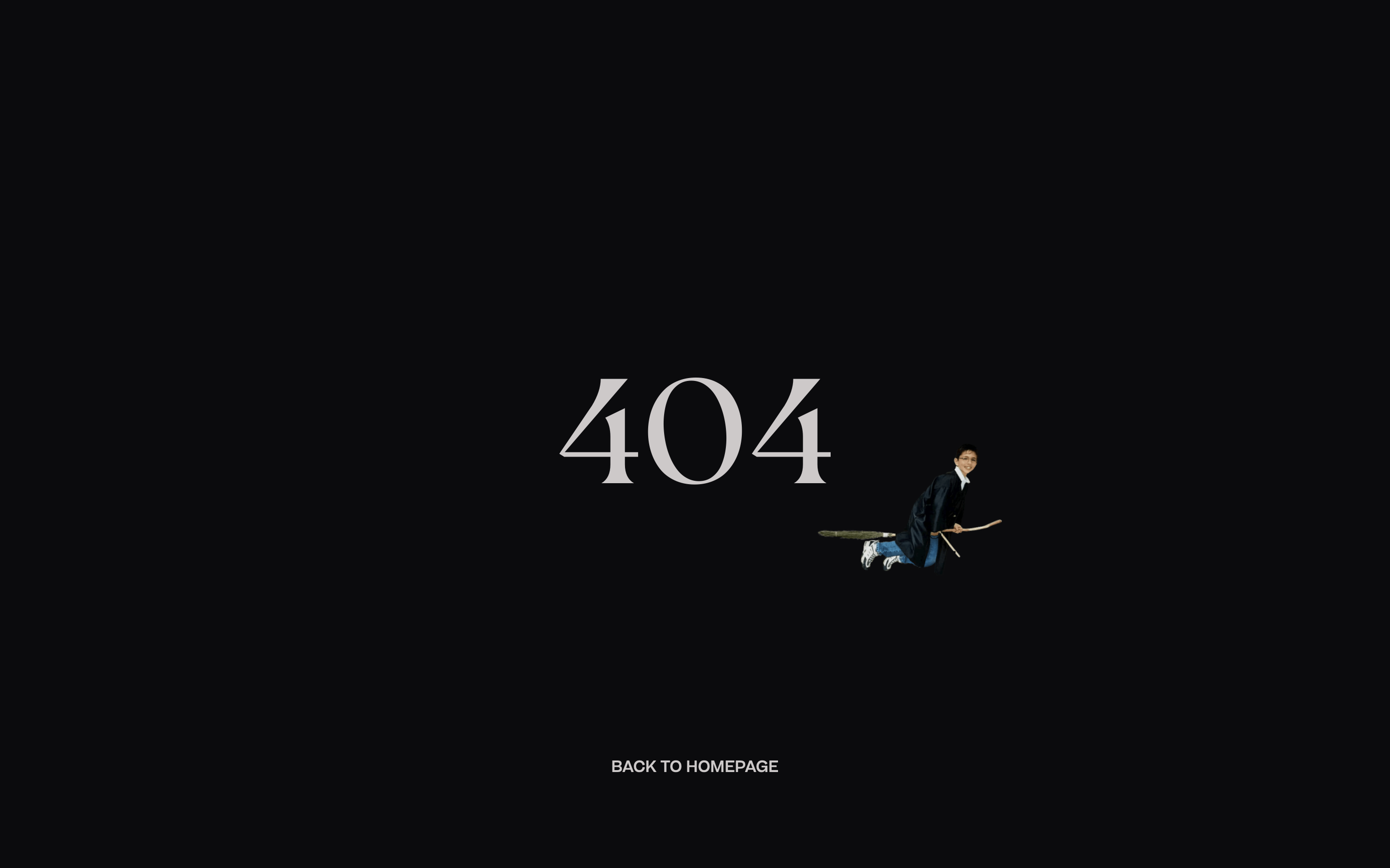
Thomas Bosc, a talented web developer, and designer, showcases both within his 404 error page, leading with a picture of his younger self in a magician outfit mysteriously sitting at the center of the page.
Because it’s the only interactive feature, you’re naturally drawn to click on it.
When you do, he takes to his broom and zooms off to attach to your cursor – leaving only a “404” message behind in his wake. It’s a little bit of magic that displays Thomas’ skills and mischief, which is bound to stand out from others within his industry.
35. Dribbble
 Screenshot from Dribble, February 2024
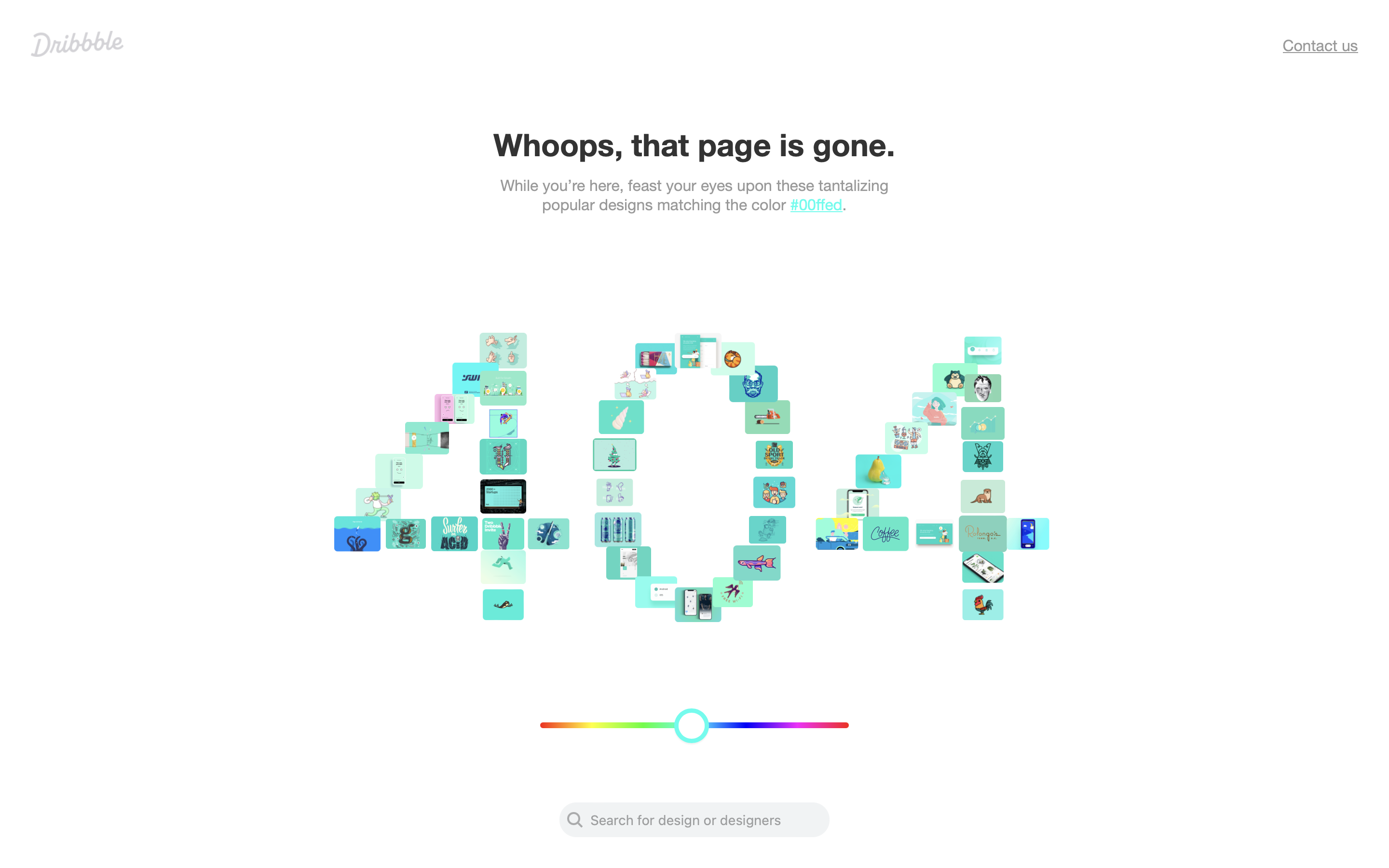
Being the hub for creative inspiration that it is, Dribble takes the opportunity presented by a 404 error and turns it into yet another way for a user to find the content they could be looking for.
When website visitors land here, they’re presented with the typical error message – along with a tool for finding further inspiration that matches a particular color hex code.
This works in a similar way to the color filter on their main inspiration page but with a more visual focus. Users can alter the 404 text color using the slider below, which then generates corresponding works that you can click on to learn more about.
So, in some ways, Dribbble’s 404 page is still a useful part of a user’s journey, even if they end up there by accident.
36. Ecosia
 Screenshot from Ecosia, February 2024
Ecosia is best known as an eco-friendly search engine, focusing its efforts on reversing deforestation and maintaining CO₂ negative operations.
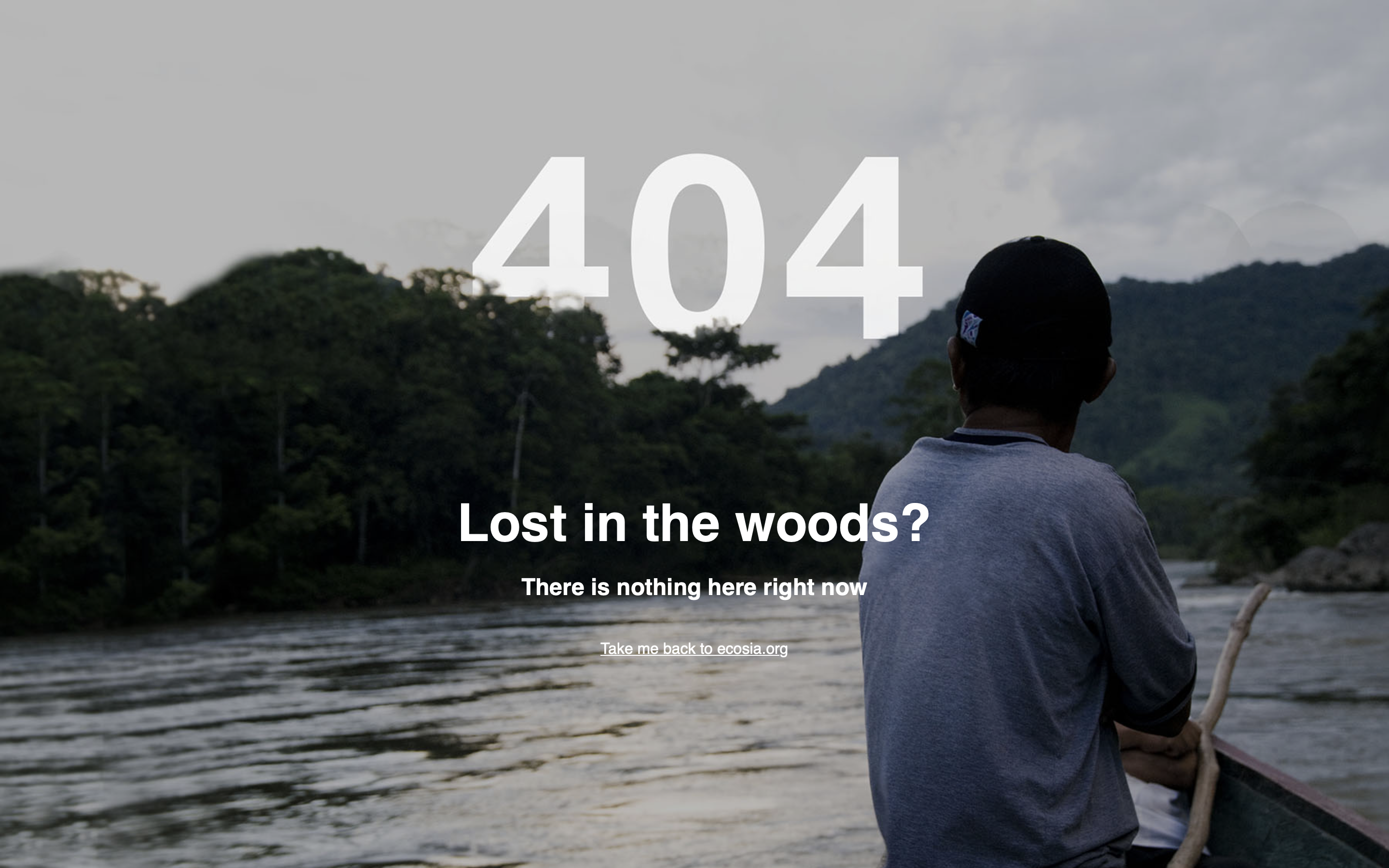
With such a commitment to the great outdoors and our planet, it makes sense that Ecosia’s 404 page would also focus on its tree-planting efforts.
If users manage to hit the 404 page, they’re treated to a rather beautiful shot of a rainforest overlooking a river with the message “Lost in the woods?” – playing with the brand’s purpose in a way that feels authentic to it.
This way, its 404 page ties back into Ecosia’s wider brand and feels more like a considered experience for anyone who finds themselves here.
37. Discord
 Screenshot from Discord, February 2024
Discord’s big focus is on community, bringing together friends and bigger groups online who play or talk together.
This sense of belonging and connection flows through the wider Discord website experience, with its 404 page being yet another charming example of putting your brand front and center.
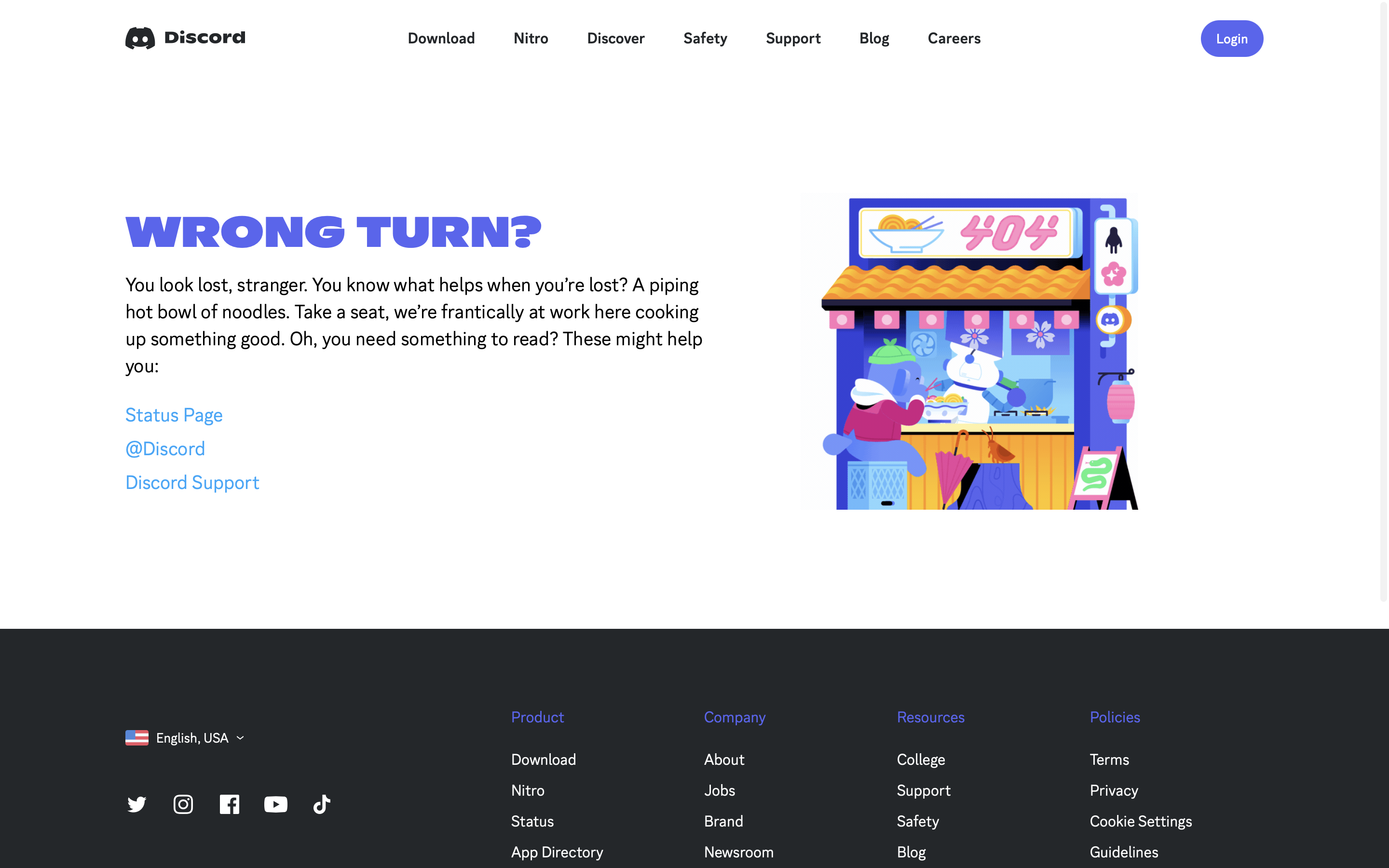
Discord’s 404 page is akin to discovering a secret food vendor abroad, with copy that’s reminiscent of this experience.
While warm and inviting, it leads you to some useful links disguised as “reading material” to enjoy while you slurp on a bowl of digital noodles.
This irreverent whimsy makes the error page feel like less of an error and more of a secret area that a user has discovered, which still serves to answer a user’s needs with signposted links.
38. Business Casual Copywriting
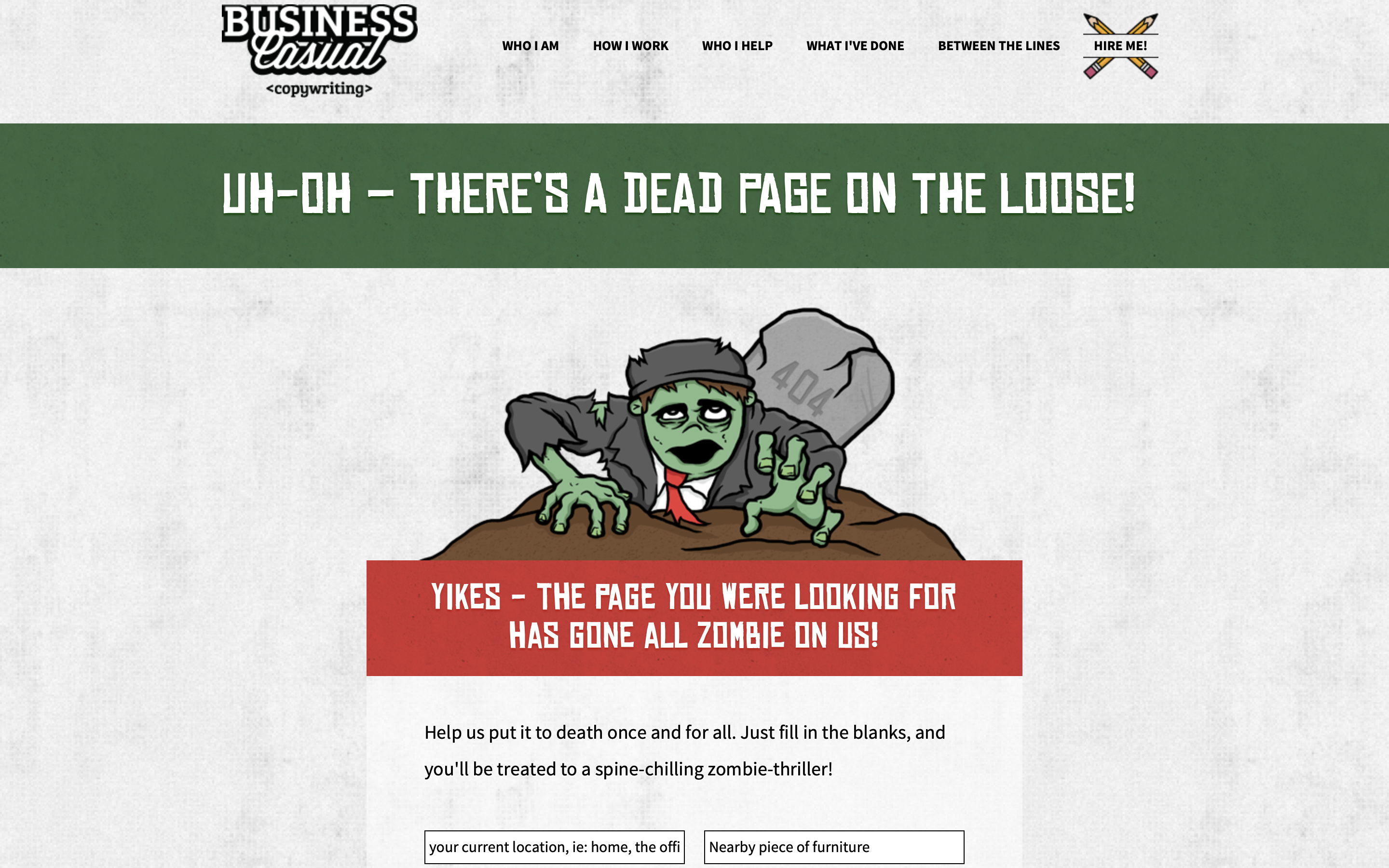 Screenshot from Business Casual Copywriting, February 2024
Calgary-based conversion copywriter Joel Klettke thinks words are boring – but copy can be great.
A writer with a clear, creative imagination, Joel has transformed his 404 page into something more like a madlibs-style adventure.
It even does away with the 404 code and simply refers to it as a dead page – hence the zombified styling of the content.
By filling in a few blank fields, users are treated to personalized content in the form of a zombie short story, which centers around the idea of 404 pages – with a twist of an ending to round it all off.
While the page itself may not explicitly nudge website visitors back to the homepage, it does showcase some of Joel’s talents and possibly encourage them to shuffle across to other areas of his website.
39. Gamespot
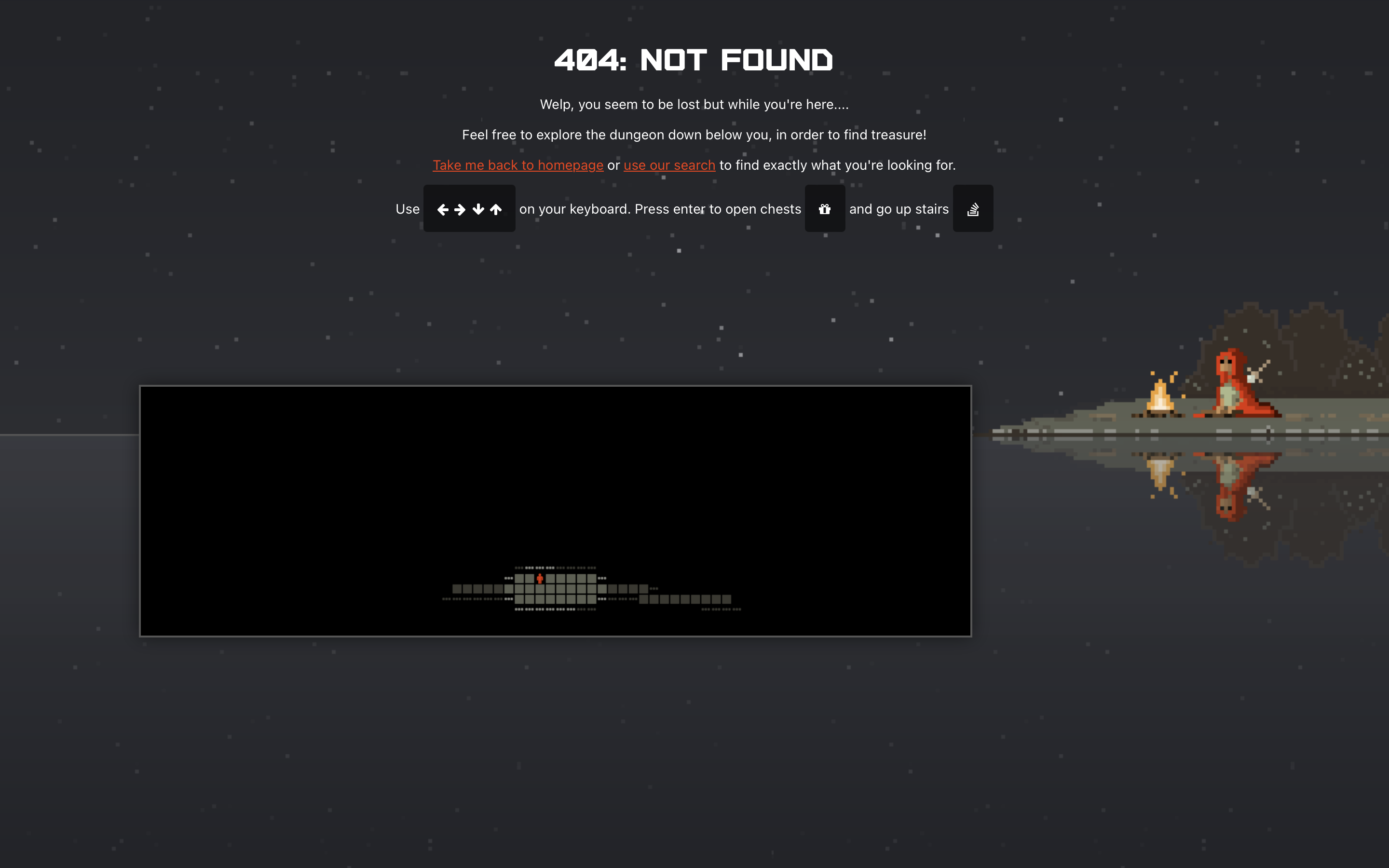 Screenshot from Gamespot, January 2024
Gamespot has been a hot topic for a number of years now after becoming a stock market sensation, and its 404 page is yet another reason to be talking about it.
As a gaming-centric business, it makes sense that its 404 error would be centered around a mini-game for users to dive into.
With a randomly generated dungeon, users become players exploring an endless dungeon filled with interesting treasures to uncover.
Once website visitors have grabbed their fill, the links to elsewhere on Gamestop’s website are clearly marked in red to help adventuring users find their way to what they were really searching for before stumbling across the 404 dungeon.
40. The-Artery
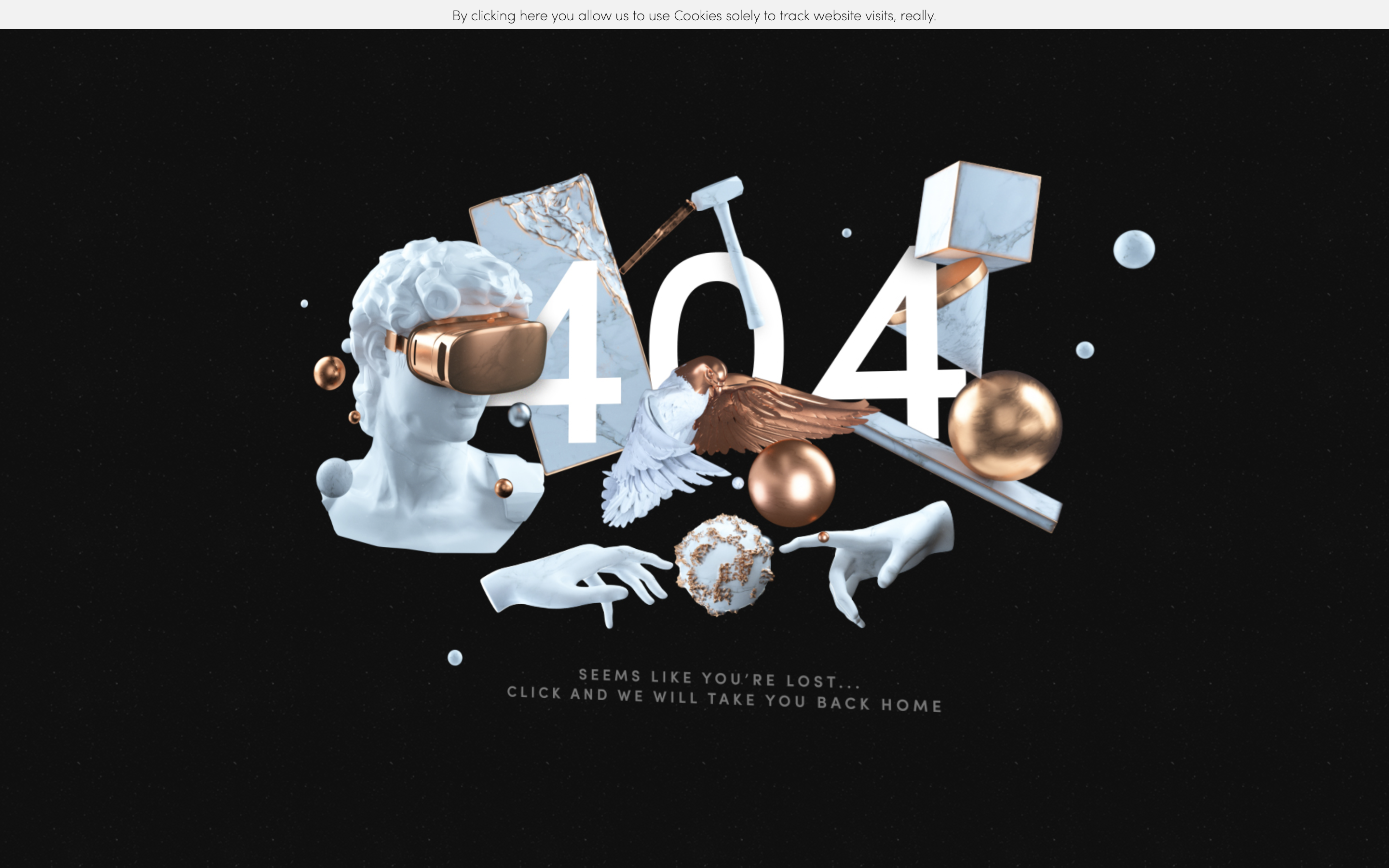 Screenshot from The-Artery, January 2024
The-Artery takes its creativity seriously, having produced some amazing visuals for brands as well as TV and film. Its website is full of stunning 2D and 3D designs, interweaving its expertise within every aspect of its site content without being too overt about it.
Within its 404 error page, various images from the core pages are pulled together to give users who’ve disappeared into the void a taste of The-Artery’s talents in the hopes of enticing them back to the homepage.
The copy even frames this almost as the act of a caring figure guiding a lost user back home to safety, so users are less inclined to panic and leave.
Summary
There’s more than one way to create a 404 page, and each one in this list performs a function that feels right for the brand.
Even better, each page feels like it has been considered as part of the wider user journey and crafted in ways that answer different user’s needs in order to keep them on-site.
You can also see common trends within elements across multiple 404 pages:
- Signposting clear links to other useful areas of the website.
- Using humor to entertain users in order to overcome momentary frustrations.
- Putting branded elements on the page so it feels like part of the core experience.
- Adding in interactive elements so users engage in novel ways.
- Keeping the copy warm and friendly so users don’t panic that they’ve misstepped.
- Adding in messaging that feels sympathetic to the user’s experience, like surprise.
By building your own 404 page around some of these key points, you can help to ensure users have a great experience on your website – even if they end up somewhere they’re not supposed to be.
More resources:
- 404 vs. Soft 404 Errors: What’s The Difference & How To Fix Both
- How To Create A Custom 404 Page In WordPress
- Advanced Technical SEO: A Complete Guide
Featured Image: tanahairstudio/Shutterstock



![[SEO, PPC & Attribution] Unlocking The Power Of Offline Marketing In A Digital World](https://www.searchenginejournal.com/wp-content/uploads/2025/03/sidebar1x-534.png)