To many web designers, user experience (UX) is the crux of every homepage, while SEO is an inconvenient ploy that uses cheap tricks and focuses strictly on numbers. Many believe the two ideas can’t work together, but that is simply not true.
Both SEO and UX are important elements for every site and should be embraced and combined by marketers to create a successful site. Every page needs striking headlines, copy, and pictures to interest their readers, but if you haven’t optimized the copy, page title, headline, and alt text to bring users to your site, your UX efforts are all for nothing. Likewise, if your site is well optimized but you don’t have quality content and appealing design then users won’t stick around to hear your message.
It is possible to create a compelling experience without stuffing the page full of keywords so the content isn’t readable – the key is to find a balance. Make the two work together by choosing quality over quantity. Here are a few keys that combine SEO and UX to create a site that really works.
Keys to a Good Landing Page
Having an attractive and user-friendly homepage is vital. It is the first opportunity you have to make a lasting impression on visitors and get them to engage with your site. Consider employing some of these tactics to create a successful homepage that converts viewers into users.
Create an experience: Captivate your viewer with sights and sounds, and use a strong call to action. This will give your message value and make it more likely to stick.
Make it easy to understand: People should immediately understand your mission when they see your landing page. Clearly explain your product, service, or mission, and incorporate primary keyword phrases to ensure your copy is optimized to bring organic traffic. This copy should obviously include your keywords, but you only need to mention them a couple times – it’s no longer effective to use an obnoxious amount of keyword repetitions.
Make it easy to scan: Craft a message that uses simple language, has a central theme, and can be read quickly. Avoid using large blocks of text that take too much time to process, and instead utilize bullets and bold headlines to get attention. This also means having proper semantic markup with an H1 tag (optimized of course) and subsequent H2 tags for each section that include variations of your keyword phrase.
Use a clear call to action: Guide your reader where you want them to focus. Use color, size, and space to your advantage, emphasizing where the viewer should look and what they should do. For example “Shop now” or “Download our Ebook”.
Optimize Your Page Title While you can do a great job creating an experience and making your landing page easy to understand, page titles are often overlooked by many who are focused strictly on UX.
5 Examples of Landing Pages That are Good for SEO & UX
Below are some landing pages that do a good job of creating a great user experience and optimizing for SEO. I’ve used these for inspiration in the past when making recommendations for clients and feel like the give good examples of how these two features can work together.
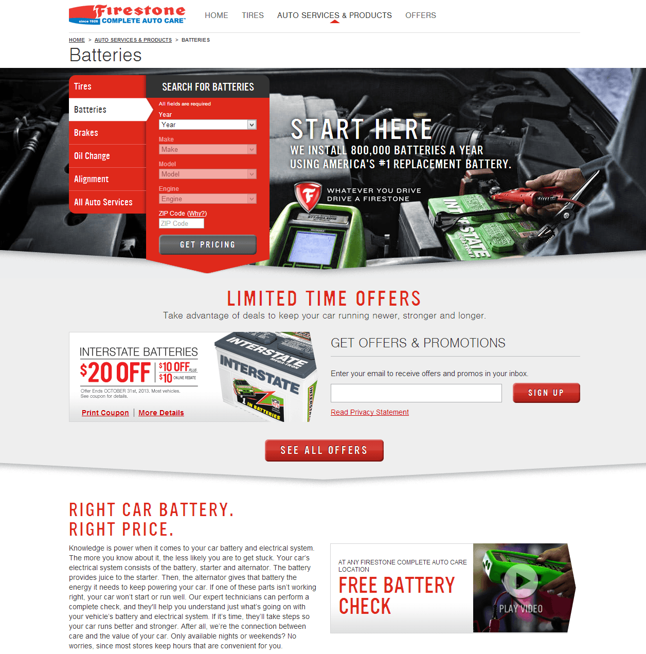
Firestone Complete Auto Care
I really like this landing page from Firestone Complete Auto Care as it is creates a good experience, giving the user exactly what they need at the top – the ability to find a battery for their vehicle and relevant product offers. They also do a good job of putting relevant copy on the page while also helping search engines create topical associations with the page.
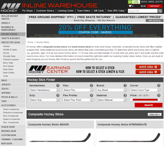
Inline Warehouse
This landing page from Inline Warehouse, while not as modern looking as the previous example, does a good job of finding the balance between putting copy on a page that is useful for users and search engines while still highlighting important elements of the page. In this case, it is the hockey stick finder app which still appears above the fold.
Subscribe for Daily Search Insights
AI, PPC, and digital marketing news distilled to fuel success. Join the other 75k marketers!
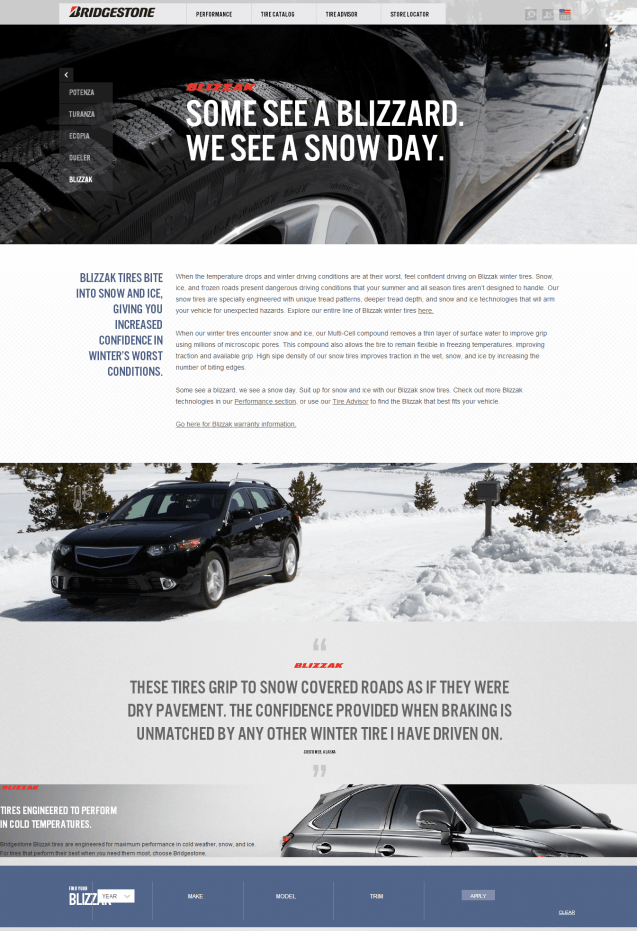
Bridgestone Tires
I really like how Bridgestone has incorporated copy into this parallax experience. Parallax sites are becoming increasingly popular due to their modern look and ability to create a great experience, but most parallax sites are very image and app heavy while excluding copy. This page does a great job of showing how you can do add a panel of copy into the experience.
Bravo Watch
This is a really good example for content sites – Bravo Watch adds content to their category pages, turning them from simple category pages used for browsing related articles to landing pages that are useful for users and search engines. I’d like to see a little more content on these pages – typically, I try to put 100 – 150 words of focused content on pages like this to help reinforce the topical theme. While some WP themes allow you to do this easily, many still do not. To help out webmasters with themes that don’t have this functionality, I’ve created a plugin for WordPress to help add content to your category pages.
Only Luxury Homes
While I wish the main headline on this landing page from Only Luxury Homes had more contrast to the image, I think this landing page does a great job of highlighting how copy can be integrated into parallax landing pages. It is worth noting that this page puts some of the text in an expandable div and there have been many debates on whether this tactic is considered a bad practice by Google. In a recent Webmaster Help Video this debate was put to rest. You should be pretty safe as long as your intent is not to deceive.
If you have examples of other landing pages that are great for UX and SEO, I’d love to see them – please share in the comments!


