We’ve long heard the importance of creating a mobile-friendly website for enhancing your user’s experience and improving your SEO efforts. Even so, we often think of mobile-friendliness in terms of ensuring your webpages appropriately resize when viewed on a mobile device.
Being mobile-friendly extends beyond just responsiveness across every device. It also applies to creating mobile-friendly content.
To provide an ideal experience for your customers, marketers should approach mobile-friendliness as a comprehensive endeavor – one in which the focus is on the overall experience your customers will have when visiting your website.
In order to help amplify your mobile content efforts, we’ve outlined our top tips for developing mobile-friendly content that engages and converts customers.
1. Craft Strong Introductions
Mobile phones are much smaller than their desktop counterpoints.
With less available real estate to convey your message, you must consider the initial information that will be presented to a mobile visitor.
In most instances, a mobile visitor will only see a few paragraphs at max before needing to scroll down for more information. This leaves your introduction of any webpage to convey your most compelling information to hook the reader and leave them wanting more.
Visitors spend 3 minutes or less on a website, on average.
Craft strong introductions that avoid unnecessary information and get to the point quickly. Share the most relevant information related to your topic first to add immediate value for your visitors.
2. Break Content Into Short Paragraphs
It can be difficult to grab a reader’s attention with lengthy paragraphs on a desktop. This becomes increasingly difficult on a mobile phone with a smaller screen.
Eliminate the need to scroll to consume more of your content by following Jon Ziomek’s 1-2-3-4-5 approach. Ziomek suggests your paragraphs contain one idea, expressed in two to three sentences taking up no more than four to five lines on the page.
Ziomek notes that at six lines your paragraph becomes more than an inch long, which is too thick for most readers. He also says this is especially true when developing mobile-friendly content.
The “Yahoo! Style Guide” suggests even shorter paragraphs, when possible. They state that two to three sentences are often enough, and to keep paragraphs to one or two ideas at most.
3. Consider How a User Consumes Content
The way users consume content on a desktop differs from a mobile device. Eye-tracking research shows that webpage visitors scan sites and phone screens in various patterns, all of which should be considered when developing your content.
These patterns include:
- Bypassing pattern: Skips the first words of the line when multiple lines of text start with the same word or words.
- Commitment pattern: Reads every word on the webpage, although research shows this isn’t a common pattern.
- Layer-cake pattern: Scans headings and subheadings and skips the normal text in between.
- Marking pattern: Focuses on one place as they scroll through the page. This is more common on mobile versus desktop.
- Spotted pattern: Skips big blocks of text and scans for something specific. This may mean looking for a link, call to action (CTA), image, or more.
4. Offer a Summary or Highlights
Mobile users’ attention is often limited. They prefer pertinent information to be displayed right away.
One method for accomplishing this is to offer a summary before the rest of your content. Your summary should highlight key takeaways from the content that is to come.
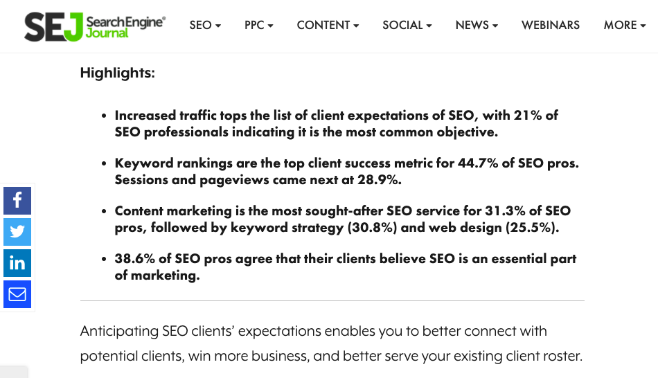
 Example of an article summary calling out highlights – SearchEngineJournal.com, September 2021
By writing a summary, you are not only providing information readers are seeking at the top of your webpage but also highlighting content that could get you links and social shares.
5. Eliminate Unnecessary Words
Whether writing content for desktop or mobile, it’s a best practice to keep your content simple and straightforward.
In fact, the Yoast SEO plugin leverages the Flesch Reading Ease formula to determine the readability of posts drafted in the WordPress platform. The Flesch Reading Ease formula measures the readability of a text.
To determine the text’s score, the formula looks at:
- The average length of your sentences (measured by the number of words).
- The average number of syllables per word.
This test can also be applied to creating mobile-friendly content.
To mirror a higher ranking on the Flesch Reading Ease test, ensure you take the following into consideration when drafting content:
- Shorten your sentences: Avoid sentences that are too lengthy, confusing, and difficult to process.
- Avoid using difficult words: Words with four or more syllables are considered difficult to comprehend.
- Remove unnecessary modifiers and determiners: Eliminate “filler” or “fluff” content.
- Don’t repeat yourself: Avoid redundancy — using similar words or phrases that describe the same concept.
- Don’t provide excess detail: Don’t over-explain or overcomplicate the message you’re trying to convey.
6. Add Images/Videos
Images or videos break up your text, making your content more easily digestible.
Add supporting images throughout your content when and where applicable. This not only adds separation between your text but adds a visual component.
Research shows visuals are processed up to 600 times faster than text, which means you can help your readers better understand your content through visuals as opposed to solely text.
Video can also bolster your content. In fact, 54% of consumers wanted to see more video content from a business they support.
Videos and images also give you more opportunities to show up in rich search results.
7. Use High Contrast Colors
To encourage readership, your content must be easy to read.
Your font size, for example, should be larger than 32 points to maintain readability on a mobile device. You can also use high contrast colors for aesthetics and accessibility of information.
Using highly contrasting colors, such as white text on a black background, will increase readability. Low contrast colors, such as yellow text on a white background, are difficult to read.
Insufficient contrast can especially pose problems for individuals with color blindness because they can’t distinguish between certain colors, like red and green. Low contrast sensitivity also becomes more common as people age.
Leveraging high contrast colors will help make your text become more effective for a wider range of readers.
 Screenshot from Nike.com, September 2021
8. Keep Your Title Short
Your title is the reader’s first introduction to the content that is to come. It also determines how the title of your webpage will appear in search.
A few years back, Google increased the maximum length of the mobile title tag to about 78 characters. Mobile titles can also appear on two lines.
Despite these two factors, search experts agree page titles should be short and concise, and should display on one line in mobile search results.
To accomplish this, keep titles short and sweet with no more than six words or about 70 characters. The shorter your title, the less your readers have to absorb and comprehend.
Additionally, you should feature your focus keyword at the start of your title to improve your search ranking and discoverability.
9. Strategically Place Your CTAs
When writing copy for on-the-go readers, keep in mind that you have limited opportunity to capture their attention. Mobile users expect to find the information they need quickly.
If you fail to provide them with the next action to take within a few seconds of browsing your site, you miss out on conversion opportunities.
Place your CTA front and center at the top of your website to better assist readers through your sales funnel.
The more visually distinct and explicit you make your CTA on your website, the more successful you’ll be at attaining your end goal.
This holds particularly true with mobile, where there’s less space to share your main objectives.
10. Preview Before You Click Publish
It’s a best practice to preview your content prior to publishing.
However, we often focus on how our content will appear on a desktop rather than our mobile devices.
While this adds an additional step in your editorial process, having an accurate preview of how your content appears on mobile prevents any errors prior to publishing.
View how your content will appear from your mobile reader’s perspective and identify opportunities to:
- Better break up your paragraphs.
- Add relevant subheadings.
- Identify areas where you may want to add supporting images.
- See where more whitespace should be added, etc.
A second check on mobile also further prevents your content from publishing with mistakes, which can lead your visitors to view your brand as less credible and authoritative.
Whether you’re building mobile-friendly content from scratch or revamping existing content, keep the aforementioned tips in mind to increase your potential for conversions and improve the customer journey.
High-quality content enables you to communicate your message, educate your customers, and persuade them to purchase your product and service rather than engaging with your competitors.
Stand out from the competitive landscape with strategic, well-executed content on every device.
More Resources:
- 10 Best Ways to Optimize Mobile Landing Pages
- The 10 Most Harmful Mobile SEO Mistakes
- Core Web Vitals: A Complete Guide
Featured image: SiuWing/Shutterstock


![[SEO, PPC & Attribution] Unlocking The Power Of Offline Marketing In A Digital World](https://www.searchenginejournal.com/wp-content/uploads/2025/03/sidebar1x-534.png)