

Images often make up the largest part of webpages.
They have their own tab on Google results and even their own algorithm. Appearing in image results should be part of a complete SEO strategy to reach users looking for images.
Your content should contain high-quality images either way, so why not optimize them too?
It’s like the search engines are giving away Oreos and milk for free. Don’t only take the Oreo – it’s way better dunked in milk.
This article will discuss each aspect of image SEO in detail and guide you on optimizing your images for better visibility in search engines.
How Search Engines Index And Understand Images
Search engines crawl webpages to discover images and extract data from images, such as metadata and file names.
Google considers factors – such as surrounding text, image file name, alt text, captions, and page content – to understand the context of images and uses image recognition technologies to understand the content of the images.
What Is Image SEO?
Image optimization is a set of techniques for increasing visibility in search engine results pages (SERPs) based on our knowledge of how search engines crawl, understand, and rank images.
This involves compressing images to reduce load times, using responsive images for different screen sizes, implementing lazy loading, adding relevant alt text for a better user experience, using descriptive file names, and implementing structured data for images.
With this background, let’s dig into each optimization tip below.
1. Choose The Right Image Format
There are dozens of image formats available, but Google search supports only these formats: JPEG, PNG, WebP, BMP, GIF, and SVG.
Let’s understand the differences between these formats and how they impact your website and SEO.
- PNG: Uses lossless compression, meaning no image data is lost. Thus, it produces better-quality images and supports transparency, but it comes with a larger file size and is ideal for printing.
- JPEG: Uses lossy compression and causes image quality degradation, but you can adjust the quality level to find a good balance.
- WebP: Developed by Google, it uses lossless or lossy and is more efficient than JPG (ranging from 25% to 80%), thus providing smaller file sizes at comparable quality levels. It is supported by all major browsers.
- GIF: Uses lossless compression but is limited to 256 colors, making it less suitable for high-quality images and more suitable for simple graphics and animations.
- SVG: This vector-based format is used for logos, icons, and other designs because it can be scaled to any size without increasing file size. This makes it ideal for responsive web design.
- BMP: Large and uncompressed image files that maintain very high quality. Due to its size, it is not typically used for websites, as it can significantly slow down page loading times.
For me, the best option is PNG, which can then be converted into WebP format for web deployment.
Regarding GIF conversion to WebP, note that old browsers, such as Safari 15.6 (macOS Catalina) and older, don’t support animated WebP formats.
Typically, only a few users utilize outdated browser versions, so you don’t need to worry about it.
As a general rule, when you use a certain technology, it is advisable to regularly monitor the percentage of your traffic’s devices that support it via Google Analytics.
How Compression Affects Image Quality And Load Times
To understand this, let’s use a sample image in BMP format and convert it into different formats.
Look at how file size and load time on the webpage change based on my experience.
 Sample image in PNG format
| Image Format | File Size | Load Time on 3G Connection | Load Time on Fast Connection (128 MB/sec) |
| BMP | 1900 KB | 17.22 sec. | 311 msec |
| PNG | 552 KB | 9.16 sec. | 156 msec |
| GIF | 265 KB | 5.89 sec. | 89 msec |
| JPG | 91.5 KB | 2.91 sec. | 47 msec |
| WebP | 41.2 KB | 1.77 sec. | 29 msec |
As a testing environment, we used a local Apache web server and included images on a sample HTML page.

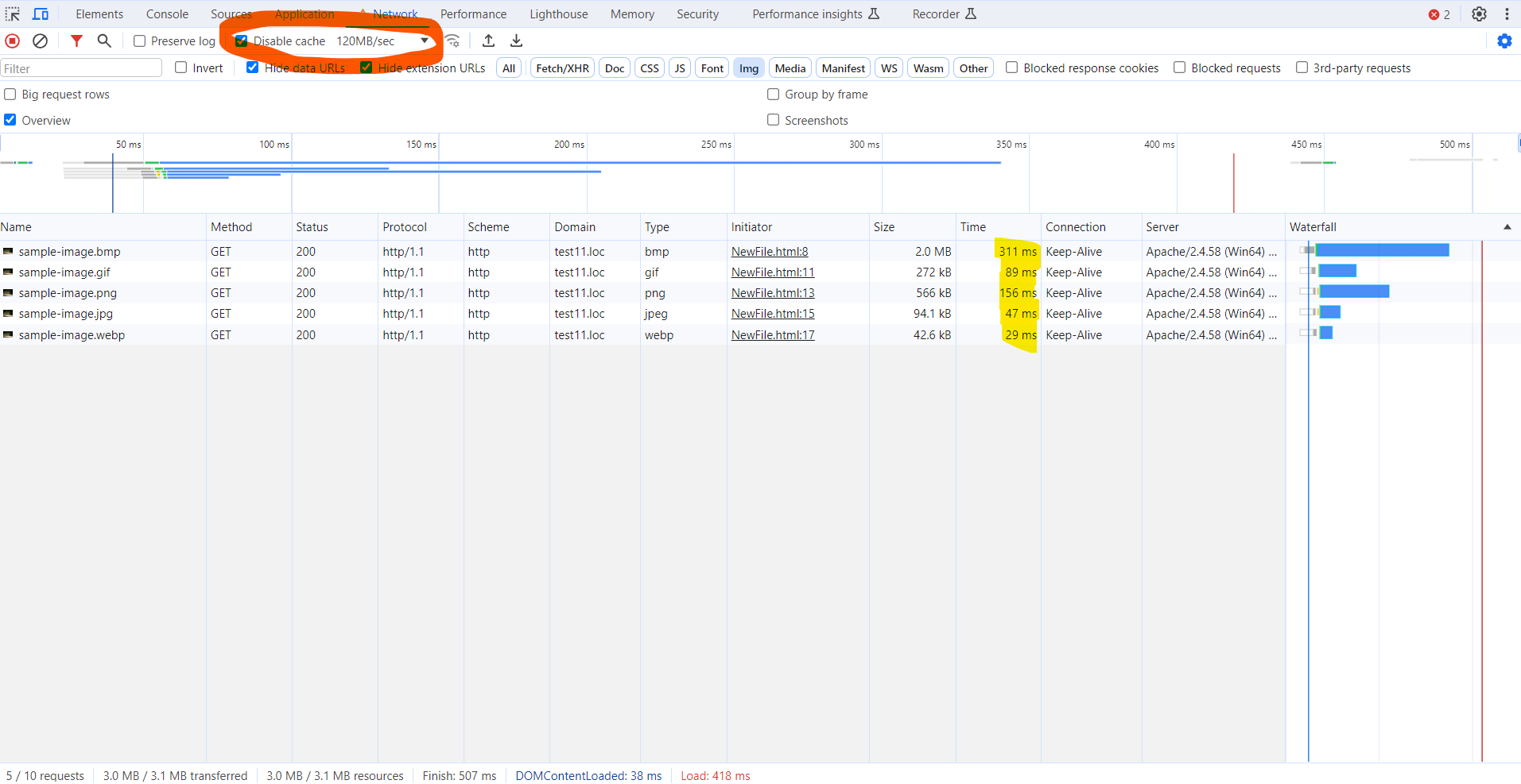
This illustrates how effective a WebP format is. It has the lowest file size and loads five times faster than PNG and almost twice as fast as JPG files.
That is why it is recommended to use WebP. If you have done that, it means you already made great progress in optimizing for the load. (There are cases when WebP image size can be higher than the original file. Learn more about it at Google’s FAQ page.)
However, changing the image format, a.k.a. applying a compression algorithm, may cause it to lose its quality and sharpness. This means that you should choose the appropriate format based on the nature of your website.
For example, if you have a photography website where retaining high-level details in images is key to user experience, it is advised to use PNG rather than JPG or WebP.
In that case, you can display WebP format thumbnails that link to the full-quality PNG images.
We have learned about the various image formats and their respective compression methods.
You might be wondering what different image compression tools, such as ShortPixel or TinyJPG, do.
Image compression services use advanced algorithms and strip out unnecessary metadata (like EXIF data and GPS tags) to reduce file sizes beyond the basic compression inherent in standard file formats.
These services apply enhanced lossy or lossless compression techniques, selectively removing data that is less noticeable to the human eye.
For example, when the sample image above is converted from JPG to WebP using ShortPixel lossy, it results in an 8.3 KB file, while TinyJPG generates a slightly different 8.7 KB file.
Below is a list of image compression services you may consider using:
However, be aware that compression using these tools may noticeably degrade the quality of images. For example, when done in screenshots containing text, it may distort the text on the image.
Therefore, it is always recommended that optimization types be checked and chosen carefully.
What About The AVIF Format?
AVIF is a new format that is supported across all major browsers, and Google Search recently started supporting it.
It offers an even higher level of compression using lossy compression.
The same image file, for example, is 11 KB in AVIF compared to 41 KB in WebP.
However, as you may notice from the comparison below, it degrades the quality of the image. This is evident in the flattening of irregularities that occur in an image when compressed using AVIF compression algorithms, as opposed to using WebP on the right.
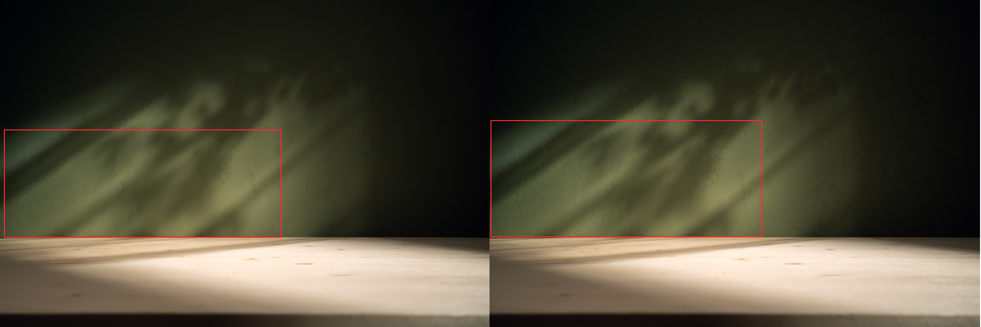 AVIF vs. WebP
However, if you are satisfied with AVIF quality and want to use it, you can do so by including it in the <picture> tag as the first <source>.
Browsers that still don’t support it will simply ignore it and proceed to the next format specified in the <picture> tag.
Here is a sample code:
<picture>
<!-- AVIF format will be processed if client (i.e. browser ) supports it as a first in list-->
<source type="image/avif"
srcset="image-300w.avif 300w, image-600w.avif 600w, image-1200w.avif 1200w"
sizes="(max-width: 600px) 300px, (max-width: 900px) 600px, 1200px"
>

<!-- WebP format will be processed if client doesn't support AVIF  -->
<source type="image/webp"
srcset="image-300w.webp 300w, image-600w.webp 600w, image-1200w.webp 1200w"
sizes="(max-width: 600px) 300px, (max-width: 900px) 600px, 1200px"
>

<!-- If WebP is also not supported, the browser will then fall back to the PNG format  -->
<source type="image/png"
srcset="image-300w.png 300w, image-600w.png 600w, image-1200w.png 1200w"
sizes="(max-width: 600px) 300px, (max-width: 900px) 600px, 1200px"
>

<!-- Lastly, if none of the advanced formats are compatible, the browser will default to displaying the JPEG image. -->
<img src="image-300w.jpg"
srcset="image-300w.jpg 300w, image-600w.jpg 600w, image-1200w.jpg 1200w"
sizes="(max-width: 600px) 300px, (max-width: 900px) 600px, 1200px"
alt="Description of the image">
</picture>
This progressive enhancement guarantees maximum compatibility across various browsers and devices.
We will cover the srcset and sizes attribute later in this article, explaining how to use them to optimize images for different devices and screen sizes, thus ensuring they load efficiently and are mobile-friendly.
2. Create Unique Images
Too many websites are cluttered with the same generic stock photos, so you want your photos to pop on your site and bring unique value to the users.
If you fill your website with stock imagery, you’ll look unoriginal because Google understands the content of the image. Since the same stock photo can be used on other websites, it will be treated as duplicate content.
Think about a corporate website, a consulting firm, or a business that prides itself on customer service. All these websites use virtually the same-looking stock image of a businessman smiling.
I’m sure you’ve seen one that looks like this:
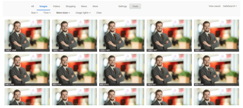 Screenshot by author, February 2024
While you may have your stock images perfectly optimized, it won’t have the same impact or potential SEO benefits as an original, high-quality image.
The more original pictures you have, the better the user experience will be and the better your odds of ranking on relevant searches.
Remember, large images are more likely to be featured in Google Discover.
Google recommends images be at least 1200 px wide and enabled by the max-image-preview:large setting in robots meta tag to ensure they are surfaced as large images in Google Discover.
<meta name='robots' content='index, follow, max-image-preview:large' />Here is an example of how that can help your images appear big:
 Screenshot from Google Discover with large and small thumbnails using the ‘max-image-preview:large’ setting, February 2024
However, here is a caveat. As you can see, thumbnails can also appear small even though webpages use the required setting.
Google doesn’t guarantee that it will always be surfacing big thumbnails.
The best you can do as an SEO is to include the required setting in robots meta tag and make sure images are at least 1200px in width:
 Screenshot by author, February 2024
3. Optimize Image File Names
When it comes to SEO, creating descriptive, keyword-rich (not stuffed) file names is absolutely crucial.
Image file names alert Google and other search engine crawlers as to the subject matter of the image.
Typically, file names that look like “IMG_722019” or something similar don’t help Google better understand the image.
Even though Google can now understand the content of the image, it doesn’t hurt to set meaningful file names and help Google understand images better.
Change the file name from the default to help the search engines understand your image and improve your SEO value.
Depending on how extensive your media library is, this involves some work, but changing the default image name is always a good idea.
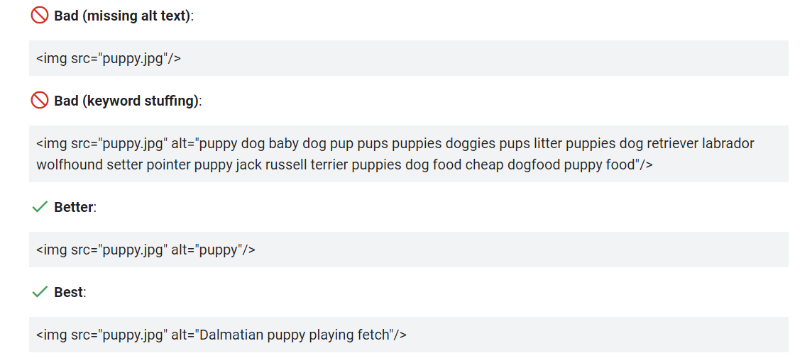
4. Write SEO-Friendly Alt Text
Alt tags are text alternatives to images when a browser can’t properly render them. Similar to the title, the alt attribute describes the contents of an image file.
When the image won’t load, you’ll get an image box with the alt tag present in the top left corner. Make sure the alt tags fit with the image and make the picture relevant.
Paying attention to alt tags also benefits the overall on-page SEO strategy.
You want to ensure all other optimization areas are in place, but if the image fails to load for any reason, users will see what the image is supposed to be.
Plus, adding appropriate alt tags to the images on your website can help your website achieve better rankings in the search engines by associating keywords with images, as alt text is a ranking factor.
It provides Google with useful information about the subject matter of the image. Google uses that information to help determine the best image to return for a user’s query.
Here is an example of bad and good alt text per Google’s official documentation.
 Screenshot from Google Search Central, February 2024
Additionally, alt text is required under the American Disabilities Act for individuals who are unable to view images themselves.
A descriptive alt text can alert users to exactly what is in the photo. For example, say you have a picture of chocolate on your website.
The alt text could read:
<img src=”chocolate-1.jpg” alt=”chocolate”/>However, a better alternative text that describes the image would read:
<img src=”chocolate-1.jpg” alt=”dark chocolate coffee flavored bar”/>For further SEO value, the alt text can act as the anchor text of an internal link when the image links to a different page on the site.
5. Optimize Your Page Title & Description
Google uses your page title and description as part of its image search algorithm.
All your basic on-page SEO factors, like metadata, header tags, copy on the page, structured data, etc., affect how Google ranks your images.
It’s like putting all your toppings on your burrito; it tastes way better with guacamole. So, make sure to add the guac to improve image rankings.
6. Define Your Dimensions
Image dimension attributes are important for preventing Cumulative Layout Shift (CLS) issues that can interfere with your Core Web Vitals optimization. This stops the page from jumping when it loads.
Making sure that you include width and height attributes for every image and video element is key.
This tells the browser how much space to allocate for the resource and prevents the annoying content shifting that lowers your CLS score.
Check out the short video demo below on how images without the width and height attributes set can cause a page to jump up and down.
7. Make Your Images Mobile-Friendly
As you may have noticed, we briefly touched upon the srcset and sizes attributes when discussing image formats.
In essence, these attributes enable responsive images, allowing them to scale according to the size of the user’s device or resolution and load at optimal size by saving precious bandwidth, particularly on slow network connections.
Now, let’s dive deeper into these attributes to understand how they function.
Let’s break down this sample code:
<picture>
<!-- WebP format for browsers that support it -->
<source type="image/webp"
srcset="image-300w.webp 300w,
image-600w.webp 600w,
image-1200w.webp 1200w"
sizes="(max-width: 600px) 300px,
(max-width: 900px) 600px,
1200px" >

<!-- Fallback JPEG format -->
<img src="image-300w.jpg"
srcset="image-300w.jpg 300w,
image-600w.jpg 600w,
image-1200w.jpg 1200w"
sizes="(max-width: 600px) 300px,
(max-width: 900px) 600px,
1200px"
alt="Description of the image">
</picture>
The srcset attribute is used within the <img> tag to specify different image files and their widths.
Each file is listed with a ‘w’ descriptor indicating the width of the image in pixels. This is necessary because browsers cannot identify image sizes until they are downloaded.
That is why you must specify the width to inform the browser about the width of each version. For example: srcset=”image-300w.jpg 300w, image-600w.jpg 600w”
The sizes attribute is used by the browser, along with the srcset attribute, to pick a resource. It specifies the intended display width of the image for different viewport sizes.
For viewports up to 600 px wide, it will choose a 300 px wide image; for viewports up to 900 px, a 600 px wide image; and for larger viewports, a 1200 px wide image.
Without this attribute, the browser defaults to using the viewport’s full width to select an image from the srcset.
You can also use the “x” descriptor, which tells the browser to choose the most suitable image size based on the device’s screen resolution (like 1x, 2x, or 3x for standard, retina, and super retina screens).
<picture>
<!-- WebP format -->
<source type="image/webp" srcset="image.webp 1x, image@2x.webp 2x, image@3x.webp 3x">
<!-- Fallback JPEG format -->
<img src="image.jpg" srcset="image.jpg 1x, image@2x.jpg 2x, image@3x.jpg 3x" alt="Description of the image">
</picture>
Additionally, you may use “x” descriptors for different screen resolutions (for example, retina displays) where the image size remains constant.
Meanwhile, “w” descriptors are suitable for fluid, responsive layouts where the image size varies based on the viewport size.
I can read your thoughts as you ponder how working with sizes and srcset attributes is quite challenging to automate, even if you know the layout of your webpages well.
Fortunately, Chrome recently started developing support for sizes="auto", which will instruct the browser to determine the size of the lazy-loaded images from the srcset attribute based on the HTML layout and CSS.
This means that the browser will consider downloading the appropriate image size according to how it would be displayed on the page, as dictated by your CSS rules, rather than assuming it takes up the whole viewport width.
Remember that this feature will work only on lazy-loaded images. This is because the layout is already rendered when lazy-loaded images start downloading, allowing the browser to accurately calculate the size they occupy on the webpage specified in CSS.
However, note that you always need to specify the width and height attributes of the largest size available.
By specifying image dimensions and utilizing CSS (width: 100%; height: auto;) to maintain the aspect ratio, the browser can accurately select and display the image from the srcset attribute when using the sizes="auto".
8. Lazy Loading And Preloading
Lazy loading is deferring the loading of images that are not visible in the user’s viewport (above the fold).
Instead of loading all images when the page loads, lazy loading downloads images only as they are about to come into view when users scroll.
This reduces initial load time, speeds up page performance, and can significantly improve LCP, especially on pages with many images.
Implementing lazy loading is as simple as adding loading="lazy" attribute in your <img> tag.
<img src="image.jpg" loading="lazy" srcset="image-300w.jpg 300w, image-600w.jpg 600w" alt="Description">But never lazy-load images above the fold, as this can negatively affect the First Contentful Paint (FCP) metric.
Instead, preload them or use the fetchpriority="high" attribute.
The advantage of preload over the “fetchpriority” attribute is that preload is supported by all browsers, while the latter isn’t supported by Firefox and Opera browsers.
Below are examples of preload and use of fetchpriority:
<img src="image.jpg" fetchpriority="high" srcset="image-300w.jpg 300w, image-600w.jpg 600w" alt="Description"><link rel="preload" as="image" href="image-600w.jpg" imagesrcset="image-300w.jpg 300w, image-600w.jpg 600w" imagesizes="(max-width: 600px) 300px, 600px">By using preload or fetchpriority, you instruct the browser to start loading the images as a priority, which is beneficial for improving Largest Contentful Paint (LCP).
9. Add Images To Your Sitemap
Whether adding your images to your sitemap or creating a new sitemap for images, you want images somewhere in your sitemaps.
Having your images in a sitemap greatly increases the chances of search engines crawling and indexing your images. Thus, results in more site traffic.
If you’re using WordPress, Yoast and RankMath offer a sitemap solution in their plugin.
If you don’t use WordPress, you may consider using software like Screaming Frog to generate a sitemap.
10. Add Structured Data
Adding structured data to your images can enhance your webpages by guiding Google and other search engines to deliver better visual results.
For example, you can include images of your products along with details like price, availability, and ratings in the product schema. This makes your products stand out in search results, attracting more attention from potential buyers.
Another use case involves adding an image schema in Article schema with multiple sizes to enhance the visibility of your articles in Google Discover and different devices in Google Search.
Google may select the best matching size when surfacing them.
Here is an example:
<script type="application/ld+json">
{
"@context": "http://schema.org",
"@type": "Article",
"headline": "Article Title",
"image": [
"https://example.com/photos/1x1/image.jpg",
"https://example.com/photos/4x3/image.jpg",
"https://example.com/photos/16x9/image.jpg"
],
"datePublished": "2024-01-10T08:00:00+08:00",
"dateModified": "2024-01-10T09:20:00+08:00",
"author": {
"@type": "Person",
"name": "Author Name"
},
...
}
</script>
11. Using CDN For Daster Image Delivery
Content Delivery Network or CDN is a set of servers spread worldwide that hosts your content and delivers it to the users from a server location nearest to them geographically.
However, delivery is not the only advantage of CDNs; they also offer transformation and optimization capabilities.
By passing parameters along with image URLs, you can request different image sizes or convert images to more efficient formats like WebP.
For instance, services like Cloudflare’s Polish can automatically optimize image formats by detecting the browser’s compatibility with WebP format. It can serve PNG and JPEG images in WebP format upon request.
For example, at Search Engine Journal, we use that technique to serve WebP format with our server’s built-in CDN.
Even though images have “.jpeg” or “.png” extensions, our CDN serves WebP if browsers support it.
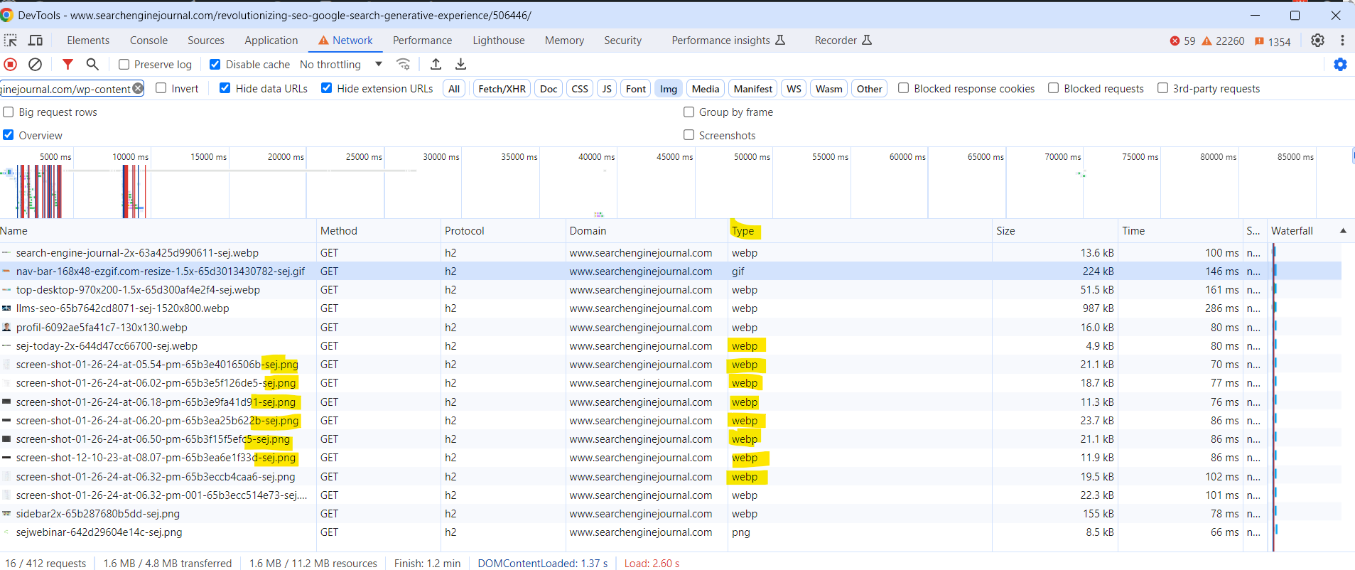 Serving PNGs as WebP (Screenshot from DevTools, February 2024)
When validating pages with PageSpeed Insights, it is advisable to ensure that you pass the audit “Serve images in next-gen formats.”
Below are a few of the most known CDN services you may consider using:
12. Beware Of Copyright
Regardless of the image files you choose to use, make sure there’s no copyright conflict.
The Postal Service is paying $3.5 million in an image copyright lawsuit, and Skechers was sued for $2.5 million.
If Getty, Shutterstock, DepositFiles, or some other stock photo provider owns an image you use – and you don’t have a license to use it – then you’re risking an expensive lawsuit.
Under the Digital Millennium Copyright Act (DMCA), you could be issued a notice if you have violated any copyright issues. If the owner of a piece of content sees their content on your website, they can issue a DMCA Takedown, which you must comply with.
Image Optimization Key Takeaways
So, before you begin uploading your image to your site, follow the image optimization rituals from above.
The most important thing is ensuring the image and alternative text are relevant to the page. Other key takeaways:
- Choose the right file format.
- Serve the right file size for faster page load speed.
- Make sure your on-page SEO elements (metadata, structured data, etc.) pair with your image.
- For crawlability, create an image sitemap or make sure your images are featured in your sitemap.
Optimizing images is no joke. With recent advances in search, especially when Google started prioritizing visuals in search results, your entire site will benefit from taking the steps above.
Happy optimizing!
Read More:
- 6 Image Optimization Tips From Google
- The Essential Guide To Using Images Legally Online
- Social Media Image Size Guide For All Platforms In 2024
- Page Speed As A Google Ranking Factor: What You Need To Know
Featured Image: Paulo Bobita/Search Engine Journal
