By and large, websites today depend on a different set of strategies to stay afloat than those ten years ago did.
When Google’s Gary Illyes announced on October 13th at Pubcon that Google would become a mobile-first index in the coming “months”, he changed the game for websites everywhere.
Although, this doesn’t come as a shock to us at SEJ. We’ve been aware of this since Gary shared that Google was working on a mobile-first index at SMX in 2015. And, our Executive Editor, Kelsey Jones, mentioned at the State of Search Conference that 75% of searches in 2017 will be mobile. So we’ve been preparing for this transition.
” 75% of search in 2017 will be mobile … “#StateofSearch #SEM #SEO @wonderwall7 pic.twitter.com/IqRvTM164I
— Rogue Marketing (@roguethink) November 14, 2016
Website owners have no choice but to adapt to this growing trend to maintain traffic and rankings.
A website optimized for mobile SEO is accountable to different sets of customers, search algorithms, and technical implementations. Mobile search is not only for the millennials and trendsetters, but also for the online and in-store shoppers, travelers, smartphone users, and the not-so-tech-savvy.
Just like the all-hands-on-deck approach in the early stage of website development, mobile SEO for websites often isn’t so much a nice-to-have as it is a necessity.
Among the mobile-indexed websites which can truly claim mobile SEO as a priority, one thing is certain: Every SEO tactic will now own a piece of that mobile-first index puzzle. Simply put, a website cannot achieve mobile-first index success without first attaining high levels of a responsive web design, optimized schema data, and fast load time among its internal SEO strategy.
In fact, some brands have started embracing these mobile-first constraints down to such a science that their mobile optimized websites rival their desktop first counterpart.
Take a look at Typeform:
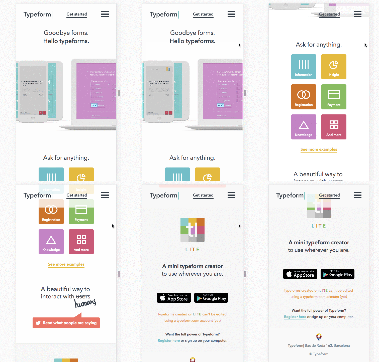
Or, Creative Babes:

So how do they do it? In part, by keeping strategy and processes simple for the dev team, the client, and everyone involved. Let’s take a look at a few strategies.
Why Is Google Going Mobile-first?
Before we take a deep dive into the best SEO tactics for a mobile-first index, imagine you’re searching for donuts on your smartphone. You find a local donut shop with a snippet in the mobile search results that talks about pumpkin donuts (when aren’t you craving pumpkin beer icing, cinnamon cayenne pumpkin seed brittle, and caramel on a donut? Like never!). However, when you click that link and open it up, there are no images, copy, or products related to pumpkin donuts. As someone who works on websites every day, this user experience is like having a donut without the icing 🍩. It just doesn’t work. And, frankly, I don’t like it.
Google is attempting to fix this issue by going mobile-first. If the content isn’t valuable enough to feature on your mobile site, then it probably isn’t valuable enough to have on your desktop site. And, with the increase in mobile searches every year, Google is simply adapting to its users.
I believe the mobile-first index will affect how Google will rank your site, determine your authority, and decide if your content is relevant based on what Google stated in their Webmaster Blog:
“Although our search index will continue to be a single index of websites and apps, our algorithms will eventually primarily use the mobile version of a site’s content to rank pages from that site, to understand structured data, and to show snippets from those pages in our results.”
Ryan Jones, Manager Search Strategy & Analytics at SapientNitro, goes more in-depth on what mobile-first indexing actually means for your site and what’s coming next. He states:
“When it comes to mobile first index, there are only about three buckets of scenarios: A website is either responsive, has a separate mobile site, or doesn’t have a mobile site at all.”
Will My Site Be Impacted by Mobile-first Index?
If your site falls into these two categories below, you will be impacted for the switch to a mobile-first index:
- Mobile serves different content than desktop. This does include mobile websites with a URL similar to this set-up: m.unicornsforsale.com.
- Mobile removes structured data from desktop.
If you have a responsive website, you’re golden.
Before I get rolling into the mobile-first index SEO strategies, pull up your website on your desktop browser to view in mobile. This will help you follow along without having to physically check your phone.
If you’re not sure how to view the mobile version of your website on your desktop, just go to your website and right-click to “Inspect.” Then, toggle between desktop and mobile in the upper left corner.

12 SEO Tips for a Mobile-first Index
1. Plug Your Website Pages Into Google’s Mobile-friendly Test
If you’re managing multiple client websites or you’re a small business owner, the first thing you need to do is check to see if your pages pass Google’s Mobile-Friendly Test.
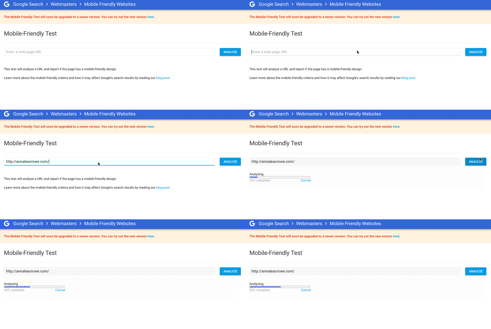 How to Test:
Start with your money pages (or key navigation pages) to plug in one by one. Yes, I know, this may sound time-consuming. But trust me, you don’t want to find out six months down the road that your highest selling category page or product page was not optimized for mobile or not indexed.
If you’re using a tool like DeepCrawl, you can manage your mobile pages much faster. First, take a peek into the “No Mobile Configuration” section. This will help guide what pages you need to focus on first.
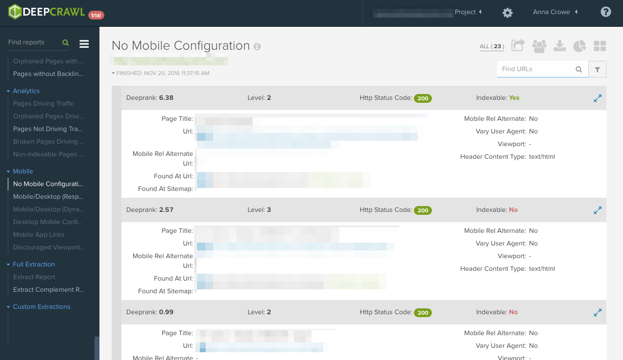 How to Fix:
If you do not have a mobile site, a responsive site, or AMP pages, I highly suggest you start an implementation strategy before Google entirely rolls out the mobile-first index. Although, Google has mentioned it will continue to index your desktop site as Google said in their blog post:
“If you only have a desktop site, we’ll continue to index your desktop site just fine, even if we’re using a mobile user agent to view your site.”
Mobile-first: with ONLY a desktop site you’ll still be in the results & be findable. Recall how mobilegeddon didn’t send anyone to oblivion?
— Gary Illyes ᕕ( ᐛ )ᕗ (@methode) November 6, 2016
If you’re starting with a blank slate, I will opt for a responsive website design. If you have a responsive website, you’re ready to go. The same content and design structure follows through from desktop to mobile.
Now, if you’re using a tool like DeepCrawl, I’d start by exporting the mobile pages that are not optimized for search into Google Sheets. Pages without mobile optimization will impact your performance in Google’s search engine.
2. Verify That Your Mobile Pages Are Being Indexed
I know this may seem like a no-brainer, but it’s easy to make simple mistakes like forgetting to index your mobile pages.
How to Test:
To check to make sure mobile is indexing your pages, go to Google on your smartphone and enter “site:mywebsite.com.” If nothing shows up, Googlebot may not be able to access your mobile pages.
How to Fix:
If Googlebot is not indexing your mobile pages and you’re using two separate websites for your desktop and mobile (meaning, unicornsforsale.com vs. m.unicornsforsale.com), I’d recommend creating a mobile sitemap. Why? Googlebot may not be indexing your mobile pages because you have separate mobile URLs compared to your desktop URLs. You’ll also want to tag your mobile pages with the rel=canonical and rel=alternate tags. Once completed, submit your mobile sitemap to Google Search Console and add your mobile sitemap to your robots.txt file.
Again, this is only needed if you have two separate URLs. As John Mueller was quoted last year stating:
“That SEO tool is wrong; you don’t need – and shouldn’t have! – a mobile sitemap if your site doesn’t have a feature-phone (WAP/WML, etc.) version. If your site is responsive and works well on smartphones, that’s enough for us (if you use one of the other methods, make sure to follow those instructions separately). Feel free to point them at this thread, if they need more information.”
If you don’t have separate URLs, be sure to double-check your robots.txt file to make sure you’re not blocking Googlebot. You should see something like this:
# Crawlers Setup
User-agent: *
3. Review Smartphone Errors in Google Search Console
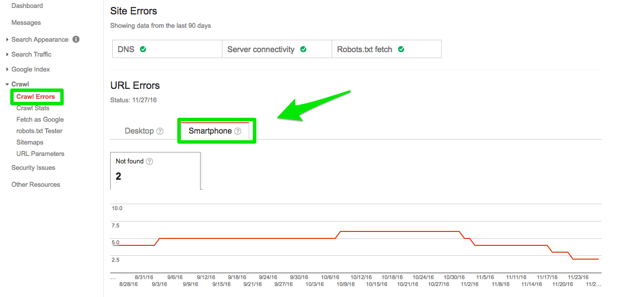
Next item on this is to examine your smartphone errors in Google Search Console. When you’re looking at these errors, you want to check to see what errors are popping up. These errors will help guide you in your strategy.
How to Test:
Go to Google Search Console > Crawl Errors > Smartphone Errors.
 How to Fix:
Depending on the errors listed, you can direct your next steps. For example, a common mistake I see is a faulty redirect. A faulty redirect happens when a desktop page is redirected to a smartphone page not relevant to the search query. You’ll want to have your server redirect smartphone users to the correct smartphone URL. If your desktop URL doesn’t have a matching smartphone URL, then create one.
Cleaning these smartphone errors up will allow Google to index your content better.
4. Update Mobile Content to Reflect Desktop Content
If you do have a separate mobile site or responsive site, you’re going to want to cross-check the content published on the desktop and mobile. Many mobile websites are much lighter in content to keep the page speed super fast. However, with the new mobile-first index, having different content on desktop and mobile can cause some major traffic and keyword loss down the line.
How to Test:
Again, this will be a manual process. I’ll typically work with a Project Manager who collaborates with the dev team. First, I’ll pull a list of my highest traffic pages in Google Analytics into a Google Sheet. Then, I’ll view each URL, one-by-one, on my desktop and smartphone.
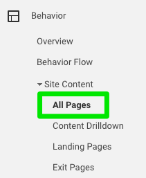
You’ll also want to do a scan on your code to find anything that may look like this:
<div class="mobileHide">
OR
#content-desktop {
display: inline;
}

#content-mobile {
display: none;
}
How to Fix:
If you discover a page with more content on the desktop than the mobile (or vice-versa), you’ll need to collaborate with the dev team and editorial team to redesign these pages. Before the redesign begins, I’d suggest having a content audit completed to determine what pages are getting traffic for keyword terms. You’ll want to know what you can and can’t remove from the desktop without losing traffic. And, you’ll need to decide what content is valuable enough to place on your mobile site.
You can use Google Search Console’s Fetch and Render to see what Google views. Just make sure to swap to the mobile user agent.

Once you’ve gone through this step, Google will show you two pages side-by-side. You want to ensure the Googlebot sees the same thing as your users.
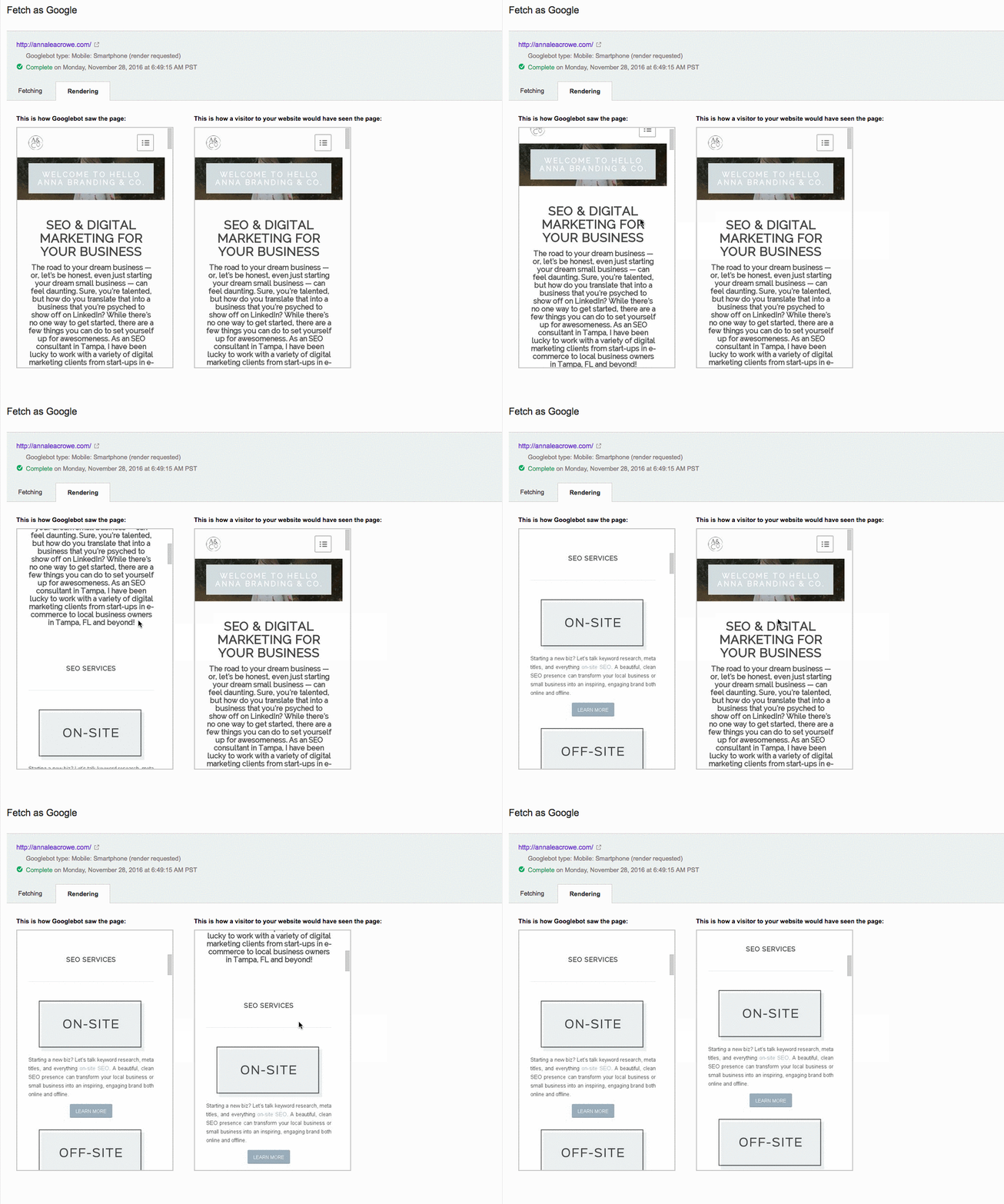
It’s important to note that Google will only rank content from your mobile site. If there is content listed on the desktop and not on mobile, you will lose rankings for those keyword terms.
Bonus Tip: Do not change your canonical links to mobile. Google uses canonical links as guides for users searching desktop or mobile.
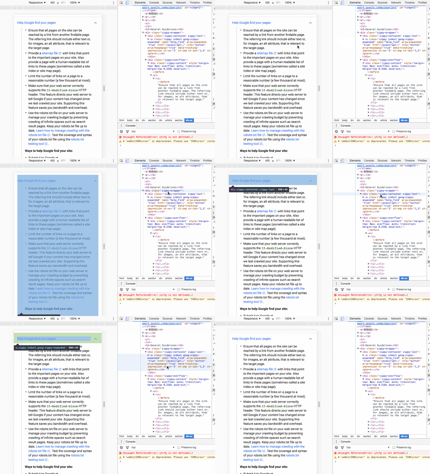
5. Remove Hidden Content in Your Tabs and Accordions
While content listed in tabs and accordions is not hidden and you should be okay for the mobile-first index, I would still double-check to make sure the content is visible to all users on desktop and mobile. It’s a common tactic of web designers or developers to hide content in mobile to make the design cleaner. Every SEO marketer should watch for hidden content.
Text that is not accessible to users is against Google’s guidelines, as Matt Cutts describes in this Webmaster video, and you could see a drop in traffic if you don’t update this before the mobile-first index rolls out.
How to Test:
To make sure you have implemented the tabs and accordions correctly, scan your website manually or with a tool like Screaming Frog for a code similar to this:
$('#hideAccordion').show();How to Fix:
To get this removed work with your web developer to make sure all the content in the accordion or tabs is shown. If the content is listed on the desktop, then it must appear on the mobile version.
Here’s a look at Google’s use of the accordion feature in Google Search Console Help:
6. Add Structured Data on Your Mobile Version Pages
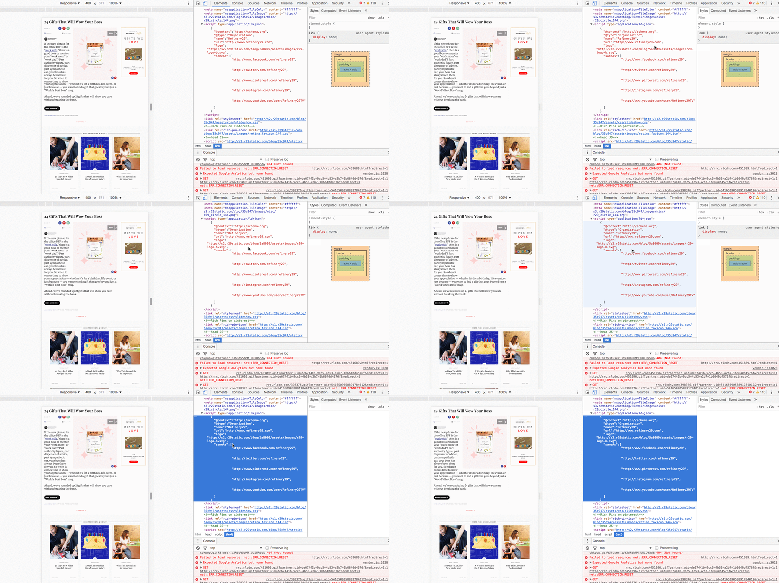
Many times when implementing structured data on a site, webmasters will skip adding them to the mobile site. With the new mobile-first index, if you want to keep your structured data, you’re going to need to add it to your mobile pages. Refinery29 continues their schema in place for mobile:
 How to Test:
If you have a responsive website, then your schema should be carried over with it. However, if you have a separate mobile site with different URLs, you’ll need to make sure you follow all the correct steps just as you would for the desktop.
How to Fix:
High-five! You think you have schema markup added to your mobile site, now double-check it with Google’s Structured Testing Tool. Be sure to “Inspect” it to make sure it’s coming through on mobile devices. And, if you’re using two different URLs you’ll need to update those in the schema. Just be careful not to drown your site in structured data. Google does recommend keeping your structured data slim. If you’re using a plugin for your structured data, double-check it in the testing tool to make sure the correct markup is being displayed.
For example, using the Refinery29 example from above, you’ll see that they have implemented schema correctly. This schema implementation will carry some pretty significant weight with the mobile-first index so I would make this a high priority item.
{

"@context": "http://schema.org",

"@type": "Article",

"mainEntityOfPage":{

"@type":"WebPage",

"@id":"http://www.refinery29.com/gifts-for-boss"

},

"headline": "24 Gifts That Will Wow Your Boss",

"image": {

"@type": "ImageObject",

"url": "http://s2.r29static.com//bin/entry/3b0/700x/1648146/image.png",

"height": 840,

"width": 700

},

"datePublished": "2016-11-28 10:30:00",

"dateModified": "2016-11-28 13:14:34",

"author": {

"@type": "Person",

"name": "Marshall Bright"

},

"publisher": {

"@type": "Organization",

"name": "Refinery29",

"logo": {

"@type": "ImageObject",

"url": "http://s1.r29static.com/blog/35c947/assets/images/logos/refinery29.png",

"width": 54,

"height": 54

}

},

"description": "If the new phrase for the office BFF is the "work wife," then is a good boss or mentor your "work mom" or "work dad"? Part authority figure, part dispenser of advice, part sympathetic ear, your boss has always been there for you. So when it comes time to show your appreciation — whether it's for"

}
7. If You Don’t Have Mobile Pages, Launch AMP Pages
If you just haven’t had the time to create mobile pages for your site, create an AMP version for your pages. Google will use the AMP version to index, even without a mobile friendly version.
However, if you’re using a mobile site similar to the m.unicornsforsale.com mentioned above, AMP is not your answer. If your m.mobile site has content (many web designers do this for an enhanced user experience) while your AMP page has the full content (same as your desktop), Google will rank your m.mobile site above your AMP page. Meaning, you don’t get any keyword love for your full content.
If you have a mobile version of a page with an AMP version, Google will index the desktop version. You don’t get bonus points for having both, but I like to think of it as a sense of security.
@rustybrick @maileohye @AlanBleiweiss but with the default amp setup desktop is picked. I dunno of any site that has only desktop+amp tho
— Gary Illyes ᕕ( ᐛ )ᕗ (@methode) November 16, 2016
How to Test:
If you think you’ve got AMP pages set up properly, just pop into a browser on your smartphone and search for a particular page on your site. You should see a gray lightning bolt next to the article if it’s an AMP page.
If you’d rather check it out on your desktop, check the view source for something similar to this:
rel="amphtml"
Here is an example from ABC News:
<link rel="amphtml" href="http://abcnews.go.com/amp/Politics/trump-threatens-reverse-obamas-cuba-policy-cuba-makes/story?id=43820479" />
Or, add the AMP Chrome extension. It will allow you to switch between AMP version and regular version:
 How to Fix:
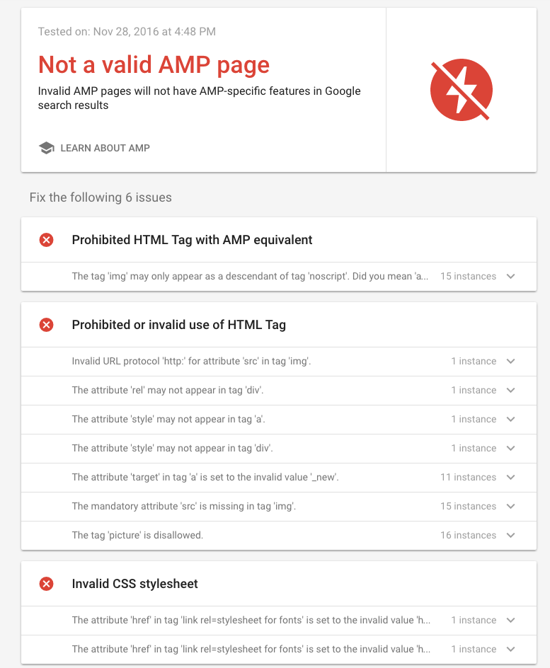
If you’re not sure if you implemented the AMP pages correctly, use the AMP testing tool. The AMP testing tool will give you suggestions on how to fix your AMP pages. This is what you might see:
8. Keep Your Desktop Optimized for Other Search Engines
While the majority of your traffic may be coming from Google, you don’t want to forget about your other traffic sources. Christi Olson from Bing told The SEM Post that Bing would not move to a “mobile first” index. Christi states:
“At Bing, we maintain a single index that is optimized for both mobile and desktop to ensure our users continue to receive the most relevant, fresh and consistent results no matter where they are.”
So, while you’re creating a mobile-first index strategy for Google, you need to maintain a desktop strategy for other search engines as well.
How to Test:
No testing needed for this one.
How To Fix:
Continue to establish a cohesive SEO strategy for the present and future.
9. Maintain Your Link Building Strategy
Gary Illyes didn’t share much intel on how links would be interpreted by mobile. He stated at Pubcon that links could pose a problem in the future because users typically do not link to the mobile web compared to desktop. While we may be in transition to a mobile-first index, building links to your desktop pages are still vital to your SEO success.
I believe Google will carry the weight of your links directed to your desktop over to the mobile-first indexing. However, this may be something you want to sprinkle in for the future.
How to Test:
No testing needed.
How to Fix:
You can still continue to build your link building strategy. But, you may want to start developing a mobile content strategy. Creating content that is more digestible on mobile will help increase page time, lower bounce rate, and all those other excellent analytics your clients want to see. For example, Sephora developed an app to help push in-store content. They understood the in-store intent of a consumer and paired it with mobile. Brilliant.
10. Verify Your Subdomains in Google Search Console
Let’s face it: Subdomains make every SEO marketer’s skin crawl. It’s a lot of work for little to no return. You can read about it here on Moz. But, if you are stuck with a subdomain like m.unicornsforsale.com or unicornsforsalemobilesite.com, you’ll want to verify it in Google Search Console.
If you have a responsive website, then you don’t need to verify in Google Search Console.
How to Test:
Head over to your Google Search Console account, click “Add Property” in the top right corner.

Then, add your subdomain.
 How to Fix:
Once you upload your subdomains to Google Search Console, you’ll get notifications from Google for your mobile site. If you’re blocking the Googlebot or if you have smartphone errors, manual actions, or any issues around your mobile site, Google will notify you.
Google treats these sub domains as two separate sites, so you’ll want to collect data on both sites.
11. Optimize On-Site SEO for Mobile
With the mobile-first index, you may want to rethink your on-site SEO strategy from title tags to H1 headers. For instance, title tags have different lengths on mobile when compared to desktop. Mobile has 78 characters whereas desktop gets about 71 characters, give or take a pixel. Remember, your goal is to create a positive user experience from Google to your website. Give the searchers something they want to click.
How to Test:
Let me break this down:
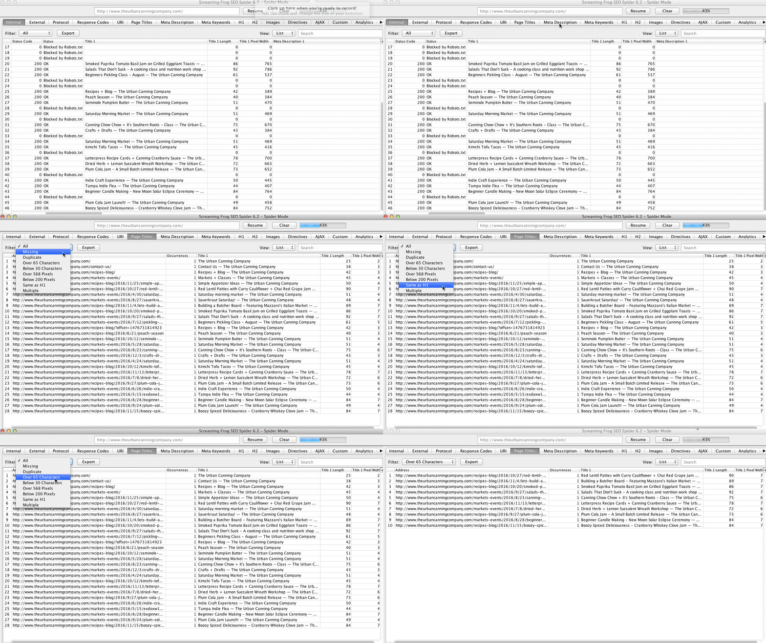
- Open up Screaming Frog and plug-in your URL.
- Scroll over and click “Page Titles” at the top.
- Filter results to “Over 65 Characters” and export your data.
 How to Fix:
With the exported data from Screaming Frog, I’d suggest rewriting your meta titles to be more mobile search friendly. I would repeat this step for your meta descriptions as well. For your H1 tags, you may want to consider reducing the size for a better mobile user experience. Here is a sample I’ve used in the past:
@media(max-width: 480px) {
  h1 {
    font-size: 10pt;
  }
}
Bonus Tip: Google also recommends checking your mobile site with their robots.txt testing tool, to ensure that you aren’t blocking Googlebot.
12. Keep Load Times Fast
From site design to not using Flash or pop-ups, developing a website for mobile with fast page speed can seem overwhelming. Web Performance Today shared a case study on the impact of page speed on mobile. They found that an additional 1000 milliseconds (converts to 1 second) of load time on your phone resulted in 9.4% decrease in page views, 9.3% increase in bounce rate, and 3.5% decrease in conversions.
How to Test:
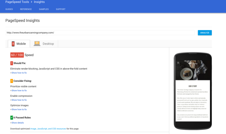
There are a ton of page speed tools you can use for free. I’d suggest PageSpeed Insights and Pingdom.
Just plug-in your website URL into the tool and review the results.
 How to Fix:
Depending on what comes back in your results, I’d suggest starting with the optimization that you can do without dev help. I typically start with optimizing images. Then, start to work with your dev team to reduce code, add browser caching, and reduce redirects. I list these out in a Google Sheet so we can collaborate as we go. Next, if you’re working with a web designer, see if there’s anything you can do to move more content above the fold.
Google has not clarified if page speed will be a determining factor to improve or reduce rankings. However, it wouldn’t surprise me if it did due to its current algorithm.
Plans for Mobile-First Index
The need for a friendly mobile experience isn’t exclusive to big brands. This will be a global rollout, and at one point or another, all websites will face the same constraints — content, AMP, dev time — to varying extremes. And, the same goes for users using PPC advertising. This mobile-first index could mean a change for AdWords.
The challenges for an SEO marketer are the same: making a case for a quality responsive website. What a headache it can be to juggle the many pieces to the mobile-first index for Google combined with the rotating need to optimize for other search engines. Or how difficult it is to redesign a mobile-friendly website without hidden content. While Google will still have a desktop index, it will not be as fresh as mobile. Maintaining a dedicated mobile site becomes vital now.
When there’s no dedicated mobile site, SEO becomes everyone’s job with this mobile-first index launching. Choosing the right path — AMP, responsive, separate URLs — are everyone’s priority.
What steps are you taking in your SEO strategy to adapt to the mobile-first index? Do you see any changes to your rankings? I’d love to hear from you in the comments!
Image Credits:
Featured Image: Deposit Photos / pproman
In-Post Photos: Taken by Anna Crowe. Taken November 2016.


![AI Overviews: We Reverse-Engineered Them So You Don't Have To [+ What You Need To Do Next]](https://www.searchenginejournal.com/wp-content/uploads/2025/04/sidebar1x-455.png)