Starting a business and selling your product is a daunting prospect in itself. But the intermediate steps of attracting customers and convincing them of your product’s worth can stop you in your tracks long before you get anywhere near the break-even point.
A much-quoted study by Forrester Research found that for every $92 spent on acquiring website traffic, a measly $1 is spent on optimizing it. (Page 9, Endnote 3)
This post assumes you fully understand the importance of optimizing every page of your website for conversion. While there are umpteen beginners’ guides and advanced blogs that spell out every little nuance in CRO for you, here are a few “Just Do This” kind of recommendations for you if your site – or idea, for that matter – only exists in a wire frame at present.
Start with a well-defined launch and marketing strategy, and put a system in place to continuously evaluate your cracks at lead generation and conversion.
Have a Clear Launch and Marketing Plan
A solid launch plan is not a ‘little thing’ by any stretch of imagination. But it’s startling to see the number of websites that are launched every day without a thought given to how they will be marketed or how they’ll attract visitors. Don’t be one of them.
Develop a brand personality – logo, color scheme, taglines, tone of voice, etc. – and using these, work on your brand positioning. Figure out who your target audience is and identify the media platforms best suited to reach out to them. Figure out how to promote your business on these platforms with laser precision.
If you are a cash strapped new business, you could try to build up inbound traffic by utilizing free or cheap marketing options before scaling up to bigger and more expensive platforms. You can choose to go in this order:
- Social Media
- Blog and Content Marketing
- SEO
- Email Marketing
If money is not an issue and you have managed to build up a good marketing budget, make full use of it. In this case, apart from the free options listed above, you could also use:
- Pay Per Click (PPC) Search & Display Ads & Retargeting
- Affiliate Marketing
- Sponsored Posts & Ads on Social Media
- Traditional Marketing like Television, Print or Outdoors
A great free option for e-commerce brands to get word of mouth publicity is through their core offering itself – the product and its packaging. Hotmail did this brilliantly years ago with its ‘Sign up for Hotmail’ link with every email sent out. Many social gaming apps request you to ‘Invite Friends’ to proceed to the next level or gain extra points. In the retail space, Johnny Cupcakes belongs in a league of its own for making their packaging so über-creative that they’ve barely ever done traditional marketing for the brand.
Set Up Web Analytics and Measure Obsessively
“If you don’t know where you’re going, you’ll end up somewhere else.”
– Yogi Berra
Set up your web analytics account – Google Analytics, Site Catalyst, Piwik – before you launch your website. Set up your conversion goals, tracking URLs, and other metrics in the analytics package to see the movement of your visitors on your site, their interactions with various site elements, micro conversions, and user profile information.
 Image source: Pixabay
Once the site is launched, keep monitoring your KPIs on a daily basis. Track goals that have been set up, your conversion funnel, e-commerce metrics like products sold, items added to cart, page views, and any others that are specifically relevant to your business. Tools like the new VWO can help you figure out which combination of website elements brings the best conversions.
These numbers are not just a measure of where your web presence is going; rather, they quantify how far you have succeeded. Identify the metrics you can improve upon and work on those to accelerate performance in specific areas.
Rev Up the Site Engines
OK, now that you have a marketing and measurement plan, let’s go ahead and see what things are critical to guide your hard-earned visitors towards purchase.
Experience, ‘must-do’ guidelines of web gurus, and good old common sense guide most of our digital adventures. From web design holy grails to conversion optimization rule books, every website owner worth his salt has likely read and digested multiple versions of these.
Sometimes, it helps to look beyond the rule books and explore what else can make the difference between a good website and a great website.
Here are a few conversion essentials that certainly deserve more attention than they are getting…
Inspire Action with Colors
White space holds such a sway on designers’ minds that many websites look famished, drained of all life, and stampeded (or flattened, if I may use a design-specific pun) by the herd mentality that is “white space worship.”
Don’t use white space in your website literally. Understand the principle of white space. Giving every element on your page ample breathing space and maintaining a single dominant color per page is the key to applying white space effectively. The space doesn’t even have to be white.
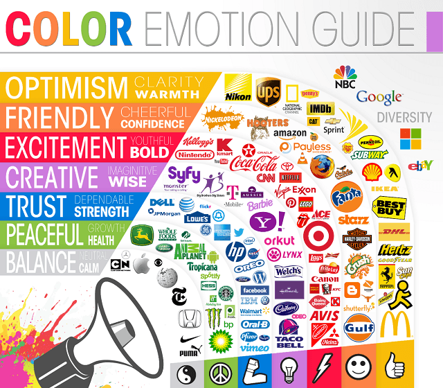
Pink and blue. Red and green. Most colors have a clear meaning in our heads.
Use colors designed to help you reach your goals. Do you run a fast food chain? Use colors that trigger appetite and food cravings. Think reds and yellows like McDonald’s or Burger King. Own a spa business? Pick calming colors for your website, something that soothes the eyes the minute you land on the home page. Blues and greens would be more up your alley.
 Image source: The Logo Company
Use contrasting colors to make key elements in your page stand out.
A red call to action button against a white and grey color scheme has a better chance of being noticed than against a pink and purple color scheme. A/B test the color options for CTA elements before you roll out the final version of your site.
Guide the Eye Towards the Star of Your Page
You cannot over-emphasize the value of stunning imagery on websites. But why have images just for the sake of making your site look pretty?
While having an attractive site is a bonus, use images to reinforce the main message your page is trying to convey. Numerous studies have been done on the ways human images can be used to direct users’ attention to the main message.
Here’s an example of a billboard (I know, but the rules are the same) that uses this principle to great effect.
 Image source: Daily Billboard Blog
Think like a photographer showing off his portfolio: let your images build up your message!
Harness the Irresistible Attractiveness of Microcopy
Here I refer to those little interactive bits of copy that truly reflect the personality of your site. An example could be little prompts that you can nudge users with while they’re filling up forms:
 Image source: Microcopy on Simple.com by Francis Storr via Flickr
Microcopy can be informative. It can be a signal a task is complete or there is an error. It can even be just a little bit of whimsy.
Reassure with Demo Videos and Expert Opinions
An online shopper is restricted in their shopping experience by the lack of touch and feel and reassurance from an on-floor salesperson for the product or service they are buying. This is most often overcome with the help of large, striking product images that can be magnified for a closer look.
But if a picture speaks a thousand words, it’s a no-brainer that a video does the job of a thousand pictures put together. Use product videos wherever possible to demonstrate the product being sold in detail.
This can be done for physical as well as virtual products. Many software sites use demo videos and embedded flows to walk potential customers through their product and help them get a taste of the real thing.
This tongue-in-cheek demo video by Zazzle is a great example of explaining the features and benefits of your product using a snappy, engaging video.
Blend Your Landing Page Content with Your Ad/Referrer Message
Many startups spend a significant chunk of their initial marketing budgets on PPC and online ads to reach a critical mass of traffic in an effort to gain an established audience of returning visitors to their sites.
This is definitely a great way to target consumers in a cost-effective way. But this cost effectiveness will only translate into profits if your landing page speaks the same language as the post or ad that pointed a visitor to it. Make sure the customer does not land on your site expecting something entirely different from what your ad promised.
A common mistake is to take customers to your home page that probably showcases all your various product and service offerings. This confuses a visitor and leads to a wasted lead.
To grow conversions, keep the copy on your ads short, catchy, and to the point. Then direct the user to a dedicated landing page that is designed to deliver on the message that led them there. With the widespread availability of tools such as GetResponse’s landing page creator and ready-to-use templates from Unbounce, this is no longer a big ask.
Parting Words
Websites are strange creatures, with a life of their own. The more we move from a big picture mindset and start paying attention to the little things, the easier it will be for us to get the pulse of our customers and to understand what really makes our websites tick.
If the devil is in the details, go wear out that spiky tailed fellow who lurks behind your website!
—
Featured image: Adaptation (under CC license) of image by Nils Mengedoht via Flickr


![[SEO, PPC & Attribution] Unlocking The Power Of Offline Marketing In A Digital World](https://www.searchenginejournal.com/wp-content/uploads/2025/03/sidebar1x-534.png)