SEO is multifaceted and each optimization factor is dependent on the others.
You can create first-class content that engages users and that is relevant to their search intent, but if your pages load slowly, your users will never get the chance to read this outstanding content you’re creating for your website.
Users are impatient and they will bounce if they have to wait for more than a few seconds.
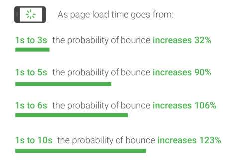
Can you blame them, though? Think about how frustrated you feel when you have to watch a loading wheel spinning, for what feels like an eternity.

This is the mindset we need to have when we approach any performance optimization work because the most meaningful improvements will happen when you approach things from a place of empathy for your users.
Understanding the Different Browsing Conditions of Users
Empathy for users is a great starting point, but we also need to support that with an understanding of how your users are accessing your website.
For example, what devices and browsers are they using to visit your website? What kind of internet connections are they browsing with?
These differences in browsing conditions can have a bigger impact on performance than you might expect.
This is demonstrated by the results from testing JavaScript processing times for the CNN homepage across different devices from WebPageTest.
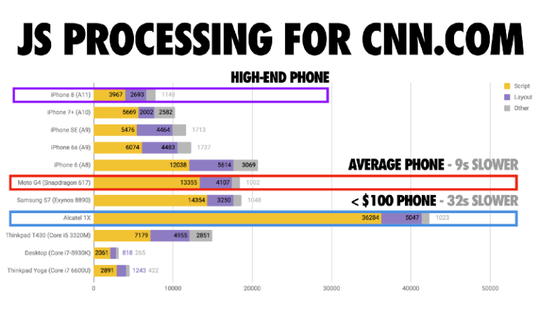
The iPhone 8, which is a higher-end device with a better CPU, loaded the CNN homepage in 4 seconds compared to the Moto G4 which loaded in 13 seconds.
However, the results were even more dramatic for the Alcatel 1X which loaded the same page in 36 seconds.

Performance isn’t a ‘one score fits all’ scenario. It can vary drastically depending on each user’s browsing conditions.
The Audience tab in Google Analytics is a great place to start digging around and doing some research into how your users are accessing your website.
For example, you can see the split of the most commonly used devices under Audience > Mobile > Devices.
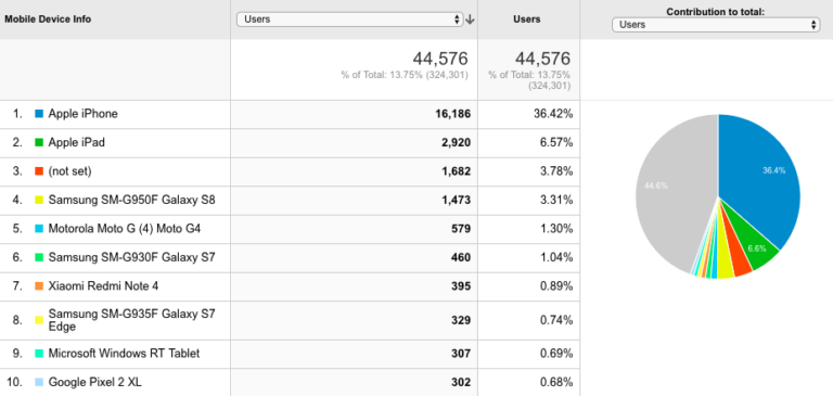
That’s just one report of many, so take a closer look in your analytics account to get a better understanding of your users and the factors that could be impacting their experience on your website.
User-Centric Performance Optimization Is the Future
Considering the varying nature of performance depending on the browsing conditions of each individual user, there’s a lot more that marketers can be doing to improve the way we speed up websites.
The future of site speed should be focused on tailoring performance around the user and their particular browsing environment.
Here are three areas that can be optimized to improve how users experience your website:
- The user’s device
- The user’s internet connection
- The user’s journey
1. Optimizing Performance Based on the User’s Device
The key to ensuring that every user has a positive, fast experience on your website is to implement a baseline level of performance that works for the most basic device you’re optimizing for.
Two web development strategies that work around this concept are:
- Progressive enhancement
- Graceful degradation
Progressive Enhancement
Progressive enhancement focuses on making the core content of a page accessible, and then progressively adds more technically advanced features on top of the capabilities of the user’s device or browser allow for.
For example, the website might provide clean, accessible content in the HTML first as a priority.
Then if it is detected that the user’s browsing conditions can handle more complex features, some additional CSS visual alterations can be layered on top, and perhaps some more advanced interactivity via JavaScript.
Graceful Degradation
Graceful degradation is basically the opposite of progressive enhancement.
The website will start with the full experience, but will then start falling back to a gradually less complex experience by switching off certain low-importance elements if the user’s device is unable to handle the more advanced features.
These web strategies can be really powerful because if your website loads quickly and performs well even on the most basic device, think about how much faster it will load on higher-end devices.
2. Optimizing Performance Based on the User’s Internet Connection
Internal connection is one of the most inconstant factors of a user’s browsing conditions, especially for those on mobile. As we use our devices on the move, internet connectivity is bound to fluctuate and drop off.
However, it is possible to optimize for different levels of internet connectivity to ensure that users will still have a good experience of your website on a 3G or 2G connection.
Network Information API
The Network Information API provides information on a user’s internet connection status, including the type and strength of their connection.
You can use the Network Information API to detect changes in the user’s internet connection, by using this code example:

You can also set instructions for what should happen if the internet connection changes, and how the content on a website should adopt.
As demonstrated at Google I/O 2018, if a user’s connection is 4G you can set a video to be loaded as this connection would be able to handle this rich experience.
However, if a user is browsing on a 2G or 3G connection you can set a static image to be loaded in place of the video so you’re not putting too much strain on the user’s already limited connection.

In this circumstance, the user doesn’t have the expectation of watching a video or animation and doesn’t know what they’re missing. The important thing is that they’re seeing content quickly.
This contributes to the user’s perception of speed as they’re getting a fast experience rather than having to wait a long time for a non-critical video to load.
3. Optimizing Performance Based on the User’s Journey
One way of prioritizing the most important resources to be loaded as quickly as possible is by the user’s journey.
When a user is on a particular page, where are they most likely to click next? Which links and resources will be needed for that next page in the user’s journey?
Again, this is another method of optimizing what is needed as a priority rather than optimizing every page that a user could potentially land on and every resource they could potentially need.
A fast, seamless journey between pages contributes a great deal to a user’s perception of speed.
Resource Hints
Leaving the browser to load every single resource all at once can be an inefficient process which adds more time for the user as they sit and wait for a page to load.
This is where resource hints can help. Resource hints are instructions that you can give to a browser to help it prioritize what is most important to be loaded first.
Preload
Preload specifies the highest priority resources that impact the current navigation that should be loaded first.
<link rel=”preload” as=”script” href=”example.js”>
Preconnect
Preconnect establishes connections with the server and other origins earlier. This process can take a long time for users with poor connectivity.
<link rel=”preconnect” href=”cdn.example.com”>
Prefetch
Prefetch specifies key links and resources that will be needed as part of the future navigation or for the next step in the user’s journey.
<link rel=”prefetch” href=”example.jpg”>
Guess.js
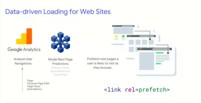
Guess.js takes resource hints to the next level by automating the process of prefetching important resources and prioritizing the ones that are most likely to be needed next in the user’s journey.
It works by using Google Analytics data to analyze how users navigate your website, using metrics like pageviews, previous page paths, and exits.
It then uses machine learning to model predictions for what the next page is most likely to be in a user’s journey from any given page.
It then prefetches the pages that a user is likely to visit in the next step of their journey through your site. This means that the next page will already have been loaded by the time the user goes to click on it, providing a fast, seamless navigational experience.
The optimization methods mentioned in this article will require developer work.
If you liked the look of any of them while reading through, then make sure you sit down with your development agency or engineering team to talk through what will be possible for your website from an implementation perspective.
In Conclusion
We need to stop assuming that everyone is accessing our websites in optimal conditions.
Each user will have their own unique browsing environment. This is why we need to work harder to tailor our performance optimization efforts around our users and the different variables that make up their browsing experience, such as their device and internet connection.
Doing this isn’t easy, however. It certainly isn’t something that an SEO or marketer should try to tackle by themselves.
We need to spend more time talking to developers and learning from them about the latest technologies and methods available for user-centric performance optimization.
More Resources:
- A Technical SEO Guide to Lighthouse Performance Metrics
- How to Take Your Website Beyond Fast
- Advanced Technical SEO: A Complete Guide
Image Credits
Featured Image: Unsplash
All screenshots taken by author, May 2019


