
![10 Top Converting Landing Pages That Boost Your ROI [With Examples]](https://www.searchenginejournal.com/wp-content/uploads/2025/03/featured-687.png)
This post was sponsored by Unbounce. The opinions expressed in this article are the sponsor’s own.
Want to increase sign-ups, sales, or demo requests from your landing page?
How can you ensure your landing page is optimized for conversions?
Landing pages can make or break your conversions.
A well-designed landing page doesn’t just look good; it also seamlessly guides visitors toward action, such as signing up, purchasing, or booking a demo.
A high-performing landing page should align with your goals:
- Capturing leads.
- Driving sales.
- Promoting an event.
The best landing page templates are designed with conversion in mind, featuring strategic layouts, persuasive copy, and clear calls to action.
So, let’s look at a few top-performing landing page examples to learn about why they work and how you should implement them.
1 & 2. FreshGoods & Radiant Yoga Studio: Great For A Clear & Compelling Unique Selling Point
The secret to beating the competition is positioning your brand so you’re the only one in your specific space.
How? By honing in on your Unique Value Proposition (UVP):
- What is the one reason to choose you, your products, or services?
- Where does your competition fall short?
- How do you make your UVP stand out?
FreshGoods Landing Page
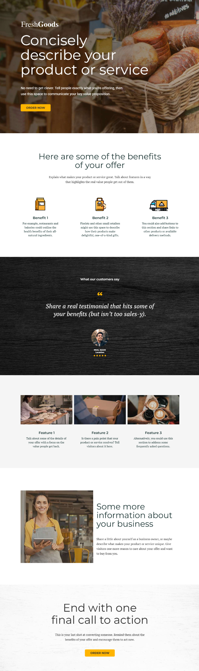 Image by Unbounce, 2025
Radiant Yoga Landing Page
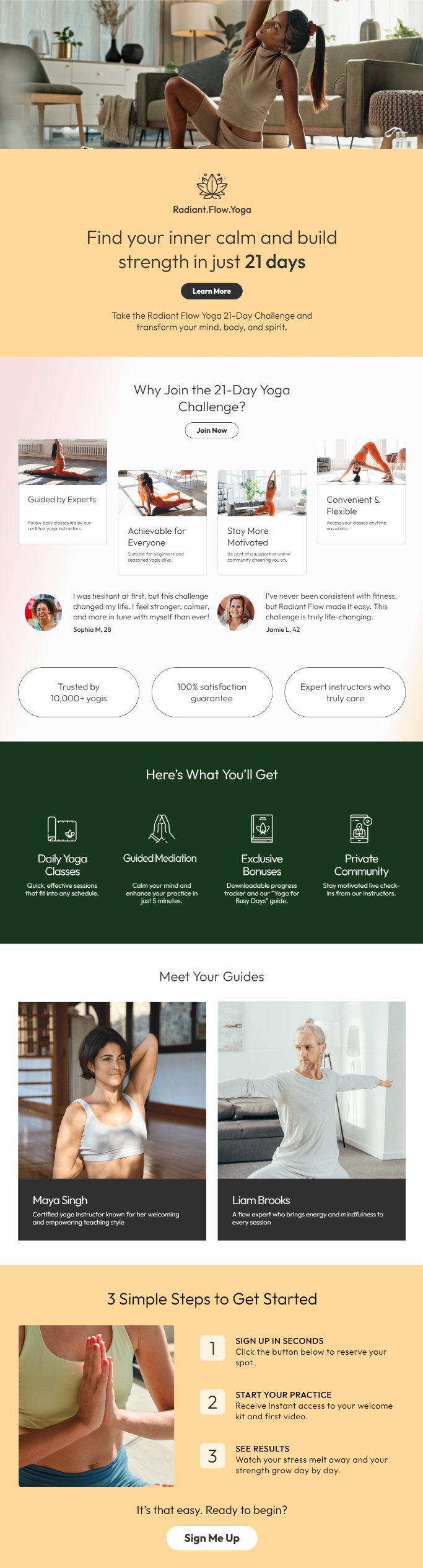 Image by Unbounce, 2025
Why They Work
These conversion-optimized landing page templates effectively highlight a USP throughout the design.
- A clear and bold headline that immediately communicates the core benefit.
- The supporting subheadline allows brands to reinforce the core USP message by expanding on the offer in a way that adds clarity without overwhelming visitors.
- The strategic use of whitespace and strong typography ensures that the USP remains the focal point, making it easy for visitors to grasp the value of the offer at a glance.
How To Recreate These Landing Pages
Step 1: Define Your Unique Selling Proposition
A strong USP makes visitors feel like they’ve found exactly what they need. Instead of blending in with competitors, it positions your brand as the only choice.
- Ask yourself: What is the one reason customers should choose you over others?
- Example: FreshGoods & Radiant Yoga Studio’s landing pages showcase a crystal-clear UVP in their messaging and design.
Step 2: Craft a Compelling Headline & Supporting Headline
Your headline is your first impression, so you have to make it count. The supporting headline expands on that core message.
- Best Practices:
- Be specific: Instead of “The Best Marketing Tool,” try “Turn Clicks into Customers with AI-Powered Marketing in Minutes.”
- Reinforce value: “No coding, no guesswork. Just smarter campaigns that drive real revenue.”
Step 3: Address Concerns with Reinforcing & Closing Statements
- A reinforcing statement builds trust (“Trusted by over 10,000 businesses…”).
- A closing statement eliminates hesitation (“Every second you wait is a sale you’re losing. Start your free trial now.”)
3 & 4. Vita Health & Orbit SaaS: Great For Hero Images & Visual Storytelling
Before visitors read a single word, visuals will capture their attention and convey meaning.
A strong hero image isn’t just decoration, it sets the tone, builds trust, and instantly reinforces your message. The right imagery makes your offer feel more tangible, relatable, and desirable.
Vita Health Landing Page
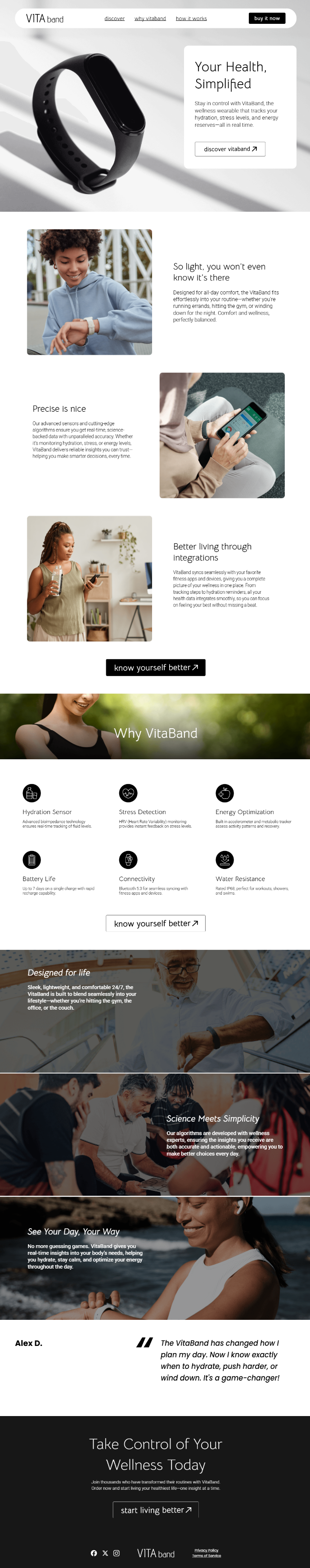 Image by Unbounce, 2025
Orbit Flow Landing Page
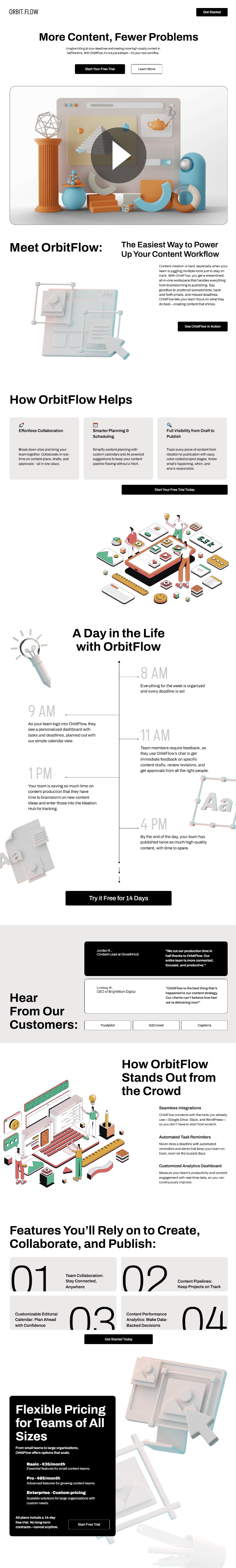 Image by Unbounce, 2025
Why They Work
A landing page’s imagery is a strategic tool that helps communicate your offer, build trust, and nudge visitors toward conversion. Choose visuals that don’t just look good but work hard to sell.
A well-chosen visual:
- Supports the UVP.
- Evokes an emotion that drives action
- Showcases the product, service, or outcome in action
- Makes the page feel polished, professional, and credible
In addition to the visual, the full landing page benefits from:
- Strong hero image placement
- An opportunity to reinforce the messaging conveyed with the hero image throughout the page
- White space highlights supporting visuals
- Visual hierarchy guides site visitors down the page to the parts that matter.
How To Recreate These Landing Pages
Step 1: Choose the Right Hero Image
Before visitors read a word, visuals capture attention. A great hero image should:
- Support the USP
- Evoke emotion & drive action
- Showcase the product, service, or outcome
Step 2: Guide the Visitor’s Eye
Strategic use of visuals can nudge visitors toward your CTA:
- Eye gaze: People follow where others are looking in an image.
- Angles & positioning: Lines or arrows subtly direct attention to the CTA.
- Contrast & color: Key elements should stand out.
Step 3: Reinforce Messaging with Supporting Imagery
Don’t rely on just one image. Use:
- Icons & illustrations
- Graphs & charts
- Customer photos & testimonials
- Short videos or GIFs
-
Bonus Tip:
Use A/B testing to find the ingredients for maximum impact.
The right image can make or break conversions, so test different options. Some images resonate better with your audience, drive more engagement, or feel more aligned with your brand.
Some elements to test include:
- People vs. product-focused visuals.
- Static images vs. motion (GIFs or videos).
- Close-ups vs. wider perspective shots.
- Different background colors or lighting.
5 & 6. Serene Vista & Digital Foundry: Great For Clearly Conveying Benefits
Visitors specifically care about what it does for them.
That’s why benefits should take center stage on a conversion-optimized landing page, not just a list of features.
Serene Vista
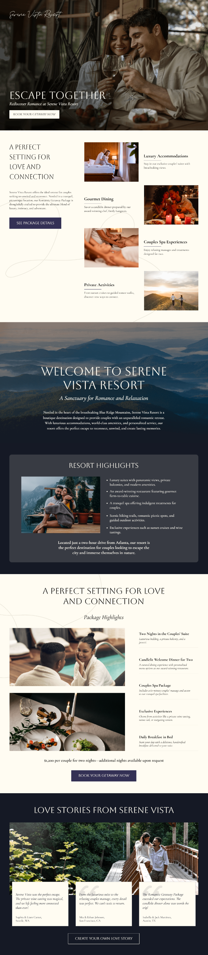 Image by Unbounce, 2025
The Digital Foundry Landing Page
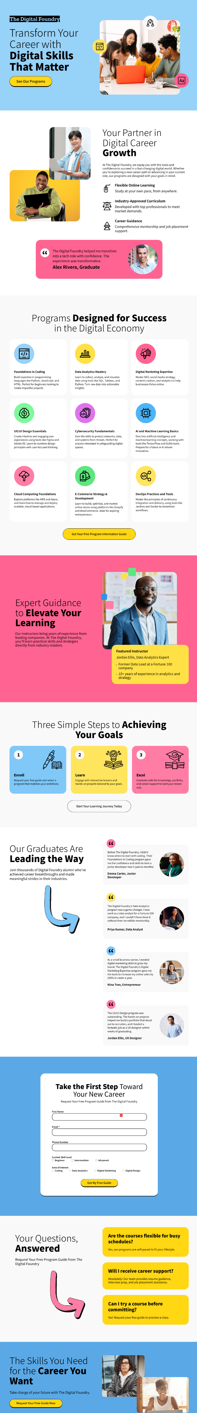 Image by Unbounce, 2025
Why They Work
- The benefits are concise and audience-focused
- Each feature section is well-spaced to garner attention
- Benefits are integrated well into the page structure with the subheadings and images to help visitors scan
How To Recreate These Landing Pages
Step 1: Translate Features into Benefits
- Feature: “AI-powered keyword research tool”
- Benefit: “Find high-converting keywords in seconds—no guesswork needed.”
Step 2: Address Pressing Concerns
- What pain points does your audience face?
- How does your product solve them better than competitors?
Step 3: Qualify Your Audience
- Use benefit-driven copy that attracts the right people:
- Example: “Perfect for fast-growing teams who need to scale without the chaos.”
7 & 8. Revive Aesthetics & Smile Dental: Great For Social Proof That Builds Trust
Not all social proof is created equal.
The best reinforces your UVP, addresses concerns, and speaks directly to your audience.
See what we mean here.
Revive Landing Page
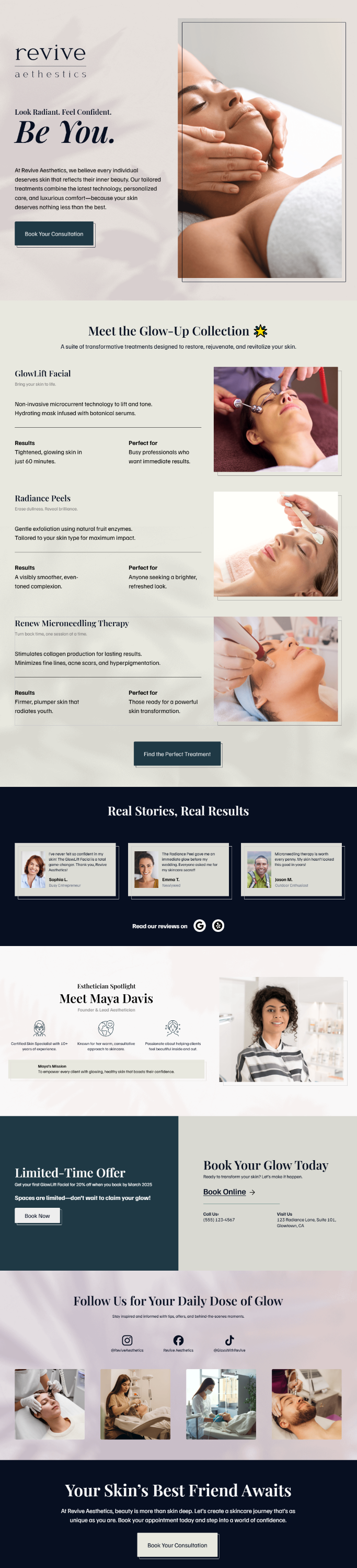 Image by Unbounce, 2025
Smile Kids Landing Page
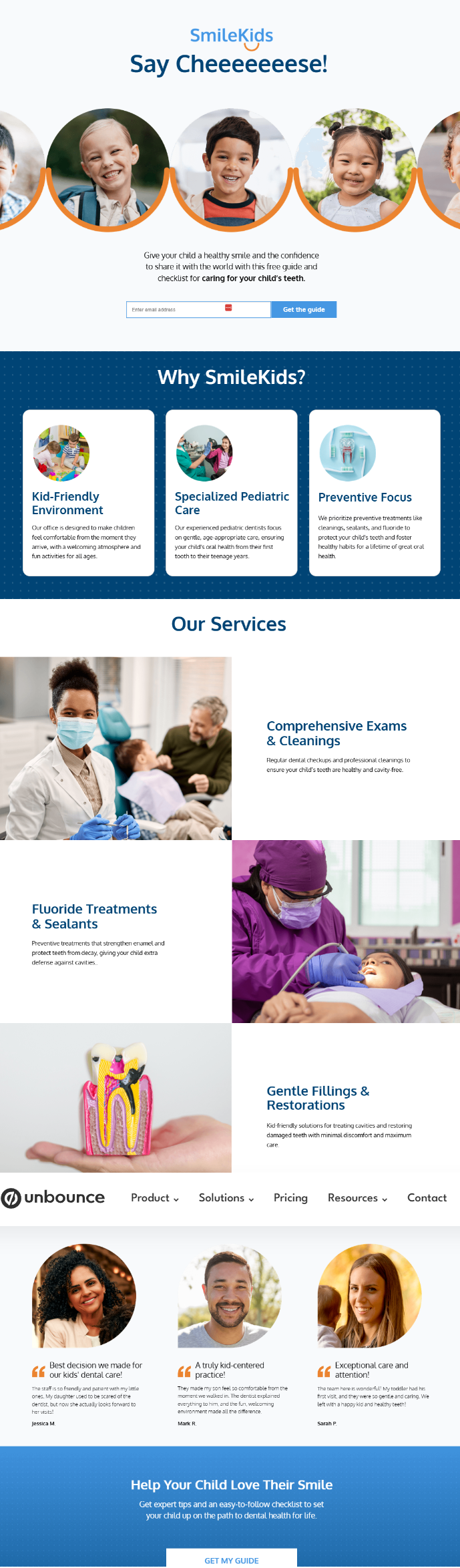 Image by Unbounce, 2025
Why These Landing Page Templates Work
- The headshots paired with the social proof enhance trustworthiness and make a connection with site visitors because they can see themselves in the experiences being described.
- The rounded shape and contrasting colors make the social proof stand out.
- Located near the point of conversion.
How To Create This Landing Page
Step 1: Choose the Right Type of Social Proof
- Customer testimonials & reviews
- Case studies & success stories
- Logos of recognizable brands
- Ratings & review scores
- Media mentions & awards
Step 2: Strategically Place Social Proof
- Near the CTA: Reinforces trust before action.
- Midway down the page: Nudges hesitant visitors.
- In the hero section: Puts endorsements front and center.
9 & 10. Livewell Lifestyle & Inner Handyman: Great For Turning Interest Into Conversions With Calls To Action
A landing page without a strong CTA is like a roadmap without a destination.
Your CTA is the single most important element that tells visitors what to do next.
And if it’s unclear, compelling, and easy to find, you’ll lose conversions.
A compelling CTA is a combination of copy, design, and placement that removes hesitation and drives action.
Livewell Landing Page
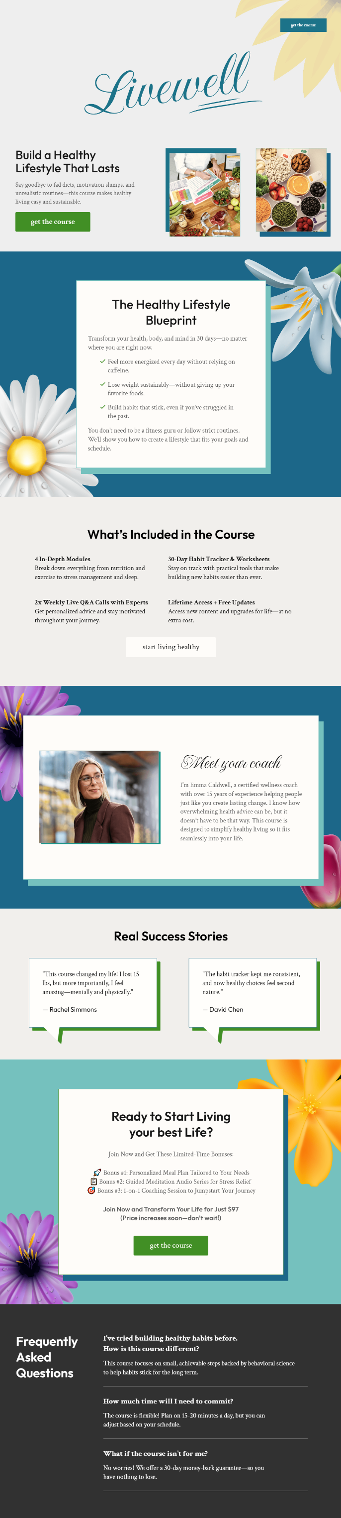 Image by Unbounce, 2025
Inner Handyman Landing Page
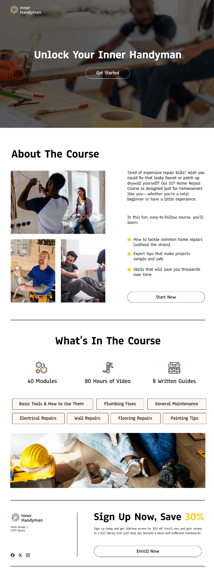 Image by Unbounce, 2025
Why They Work
- CTAs can be customized to stand out and get attention
- CTA sizing and positioning make them clear focal points despite having multiple elements on the page. It ensures you get the most conversion power in every pixel
- The CTA buttons are placed where it matters throughout the page, making sure the page attempts the conversion when and where it matters most
How To Recreate These Landing Pages
Step 1: Craft a Clear, Compelling CTA
A high-converting CTA should be:
- Action-oriented: “Start Growing Today” vs. “Submit”
- Benefit-driven: “Unlock Exclusive Access” vs. “Sign Up”
- Urgent (if appropriate): “Claim Your Spot Today”
Step 2: CTA Placement for Maximum Impact
- Above the fold: First CTA visible immediately.
- After key information: CTA follows value explanation.
- Near social proof or benefits: Reinforces trust.
- At the end of the page: Captures hesitant visitors.
Step 3: CTA Design That Stands Out
- Color contrast: The CTA should pop from the background.
- Size & positioning: Large enough to be noticeable but not overwhelming.
- Whitespace & directional cues: Ensures the CTA is the focal point.
Bonus Tip:
A/B test your CTAs for better conversions.
CTAs aren’t one-size-fits-all. Even small tweaks can make a huge impact on conversions, so A/B testing different variations is essential:
- Wording – Try “Get Started” vs. “Try It Free”
- Color – A bold button color vs. a softer, branded one
- Placement – Above the fold vs. midway down the page
- Size and shape – Larger buttons vs. compact ones
- Personalization – “Start My Free Trial” vs. “Start Your Free Trial”
Build High-Converting Landing Pages Faster
A great landing page isn’t just about design.
It’s about strategy.
Every element, from your USP and hero images to your social proof and CTAs, is critical in guiding visitors toward conversion. When these elements work together, your landing page drives action.
But building a high-converting landing page from scratch can be time-consuming and complex. That’s why using proven, conversion-optimized templates can give you a head start.
With Unbounce, you get access to 100+ professionally designed landing page templates built for maximum conversions. Whether capturing leads, promoting a product, or running a campaign, these templates help you launch faster, test smarter, and convert better—without needing a developer.
Ready to build an optimized landing page that converts?
Explore Unbounce’s best-performing templates and start optimizing today!
Image Credits
Featured Image: Image by Shutterstock. Used with permission.
