Infographics. Some SEOs and publishers love them; some hate them.
Whatever your personal perception is, there’s no denying the fact that they have been, for quite some time, an effective approach to earning high authority links from some of the world’s leading publishers.
The truth is, with a great concept, infographics make a journalist or blogger’s life easy. All they need to do is write a short introduction (in many cases, they’ll even ask that you, as the creator, to do it for them), use an embed code, and they’ve got a ready-to-go article.
Top-Tier Publishers Are Still Using Infographics (Just Not As Much)
For instance, even as recently as the past month, the Daily Mail has published a handful of infographics including this which looks at tourism complaints and this one which looks at driving laws across Europe. At the time of writing, the past 30 days showed another three published by the newspaper.
Run the same search for the Huffington Post (a search operator on Google of “site:huffingtonpost.com infographic”), filtering results by the past month, and there’s too many to count!
The reality is that infographics are still proving effective for many SEOs as a way of earning links; they’re just getting far less effective than they once were.
For many, infographics died a death sometime around 2012. Still, it is only during the past 12 months when many of the main publishers seem to have started to take a step away from this content format.
SEOs Are Still Guilty of Trying to Scale Anything & Everything
SEOs want to be able to scale things up, it’s what we’re known for. Infographics offered an easy way to scale link building in a way which attracted authoritative, editorial links.
The only reason infographics are losing their effectiveness is because they’re being overused. With the right concept (arguably the hardest part), a day or so of research time, and a graphic designer (this doesn’t even need to be in-house; there’s plenty of great designers on PeoplePerHour and Upwork who won’t break the bank), almost anyone can come up with an infographic which looks great. You can then send it out to a targeted list of journalists, bloggers, and publishers with the right approach to outreach.
In 2017, however, infographics have to be mind-blowingly brilliant to break through the noise and earn coverage. The bar is simply getting higher and there are less and less SEOs able to rise above this.
With that in mind, visual content is still a fantastic way to earn links.
Visuals are easy to share, make a great story and are loved by publishers; it’s just that us SEOs get lazy and over-use the same format.
Here are three forms of visual content (that aren’t infographics) which every link builder needs to be using.
1. Maps
While some may argue that maps are, in one way or another, infographics, it’s clear that publisher’s don’t think in this way. There’s recent evidence from a number of publishers that they’re an effective format at the moment.
Not a week goes by when UK newspaper, The Independent, doesn’t feature a map. This one, which was published last month, looks at countries that still haven’t legalized same-sex marriage.
Using this as an example, we see a simple but highly effective visual:
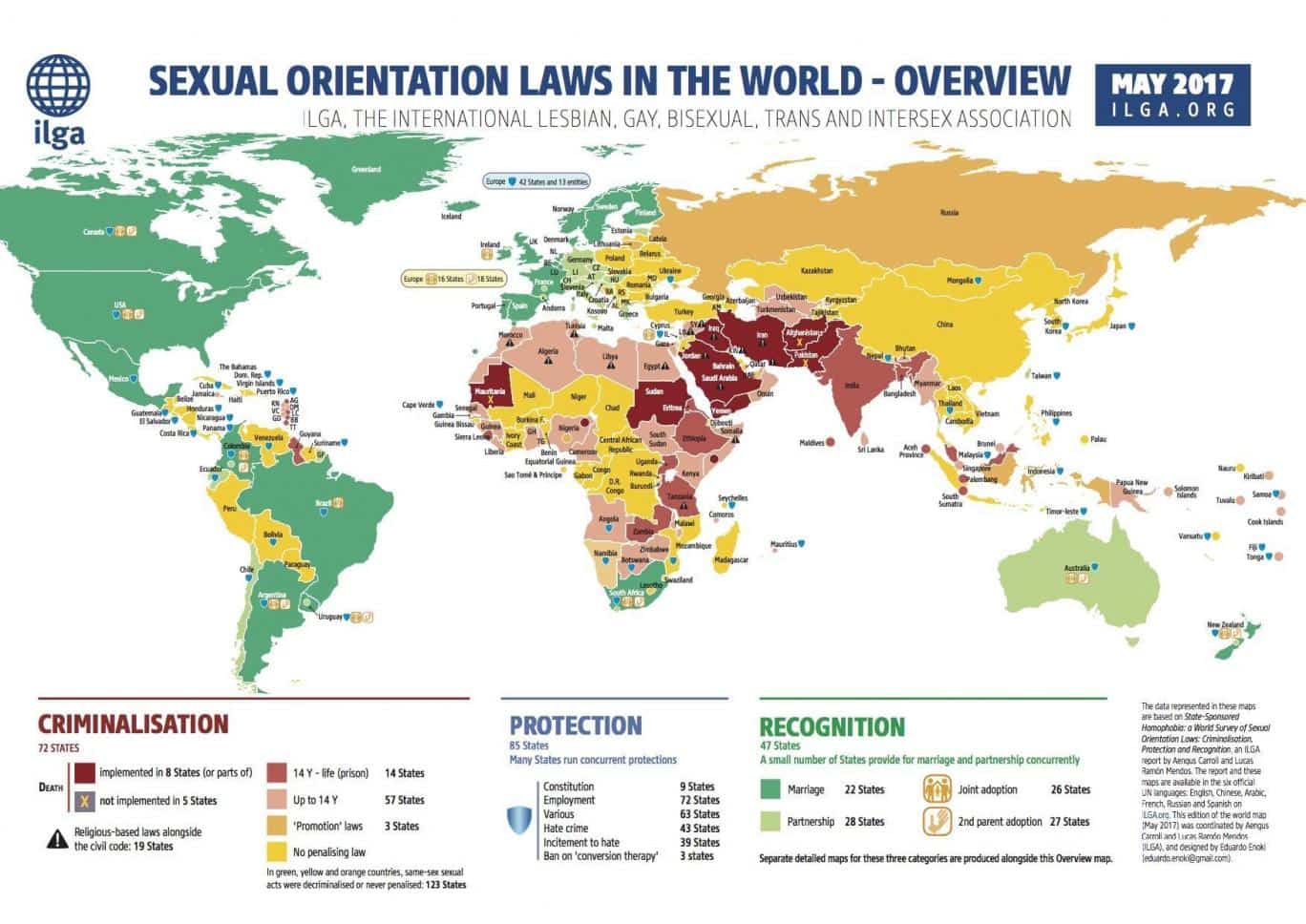
What makes this visual so effective and so attractive to publishers are these three main things:
- It covers a hot topic. One which a large number of people care about and have a strong opinion on. It isn’t controversial, but it definitely covers a talking point.
- It allows for easy comparison between countries, creating geographically relevant stories as well as the ability for readers to see how their own country stacks up against others.
- It contains an element of shock-factor. Did you know that in some countries, same-sex marriage is considered a crime for which the death sentence can be served? No, neither did most other people – making it really attractive for a publisher to share.
Maps are a great form of visual content for a couple of reasons:
- They’re usually fairly easy to produce cheaply (you don’t have to be the world’s best graphic designer to put something like this together).
- Publishers love to be able to compare one place against another.
Using public data is usually the best approach to creating a map, though it’s important to also put your own spin on this and look for fresh approaches.
The ILGA, which produced the example above, could have quite simply produced a two-tone map showing whether a country has legalized same-sex marriage. Instead, they took it up a notch and color-coded the map based on the penalties imposed by the state.
Here are two more fantastic examples of maps being used on link building campaigns. These illustrations show the diversity of what can be done with a little creative thinking:
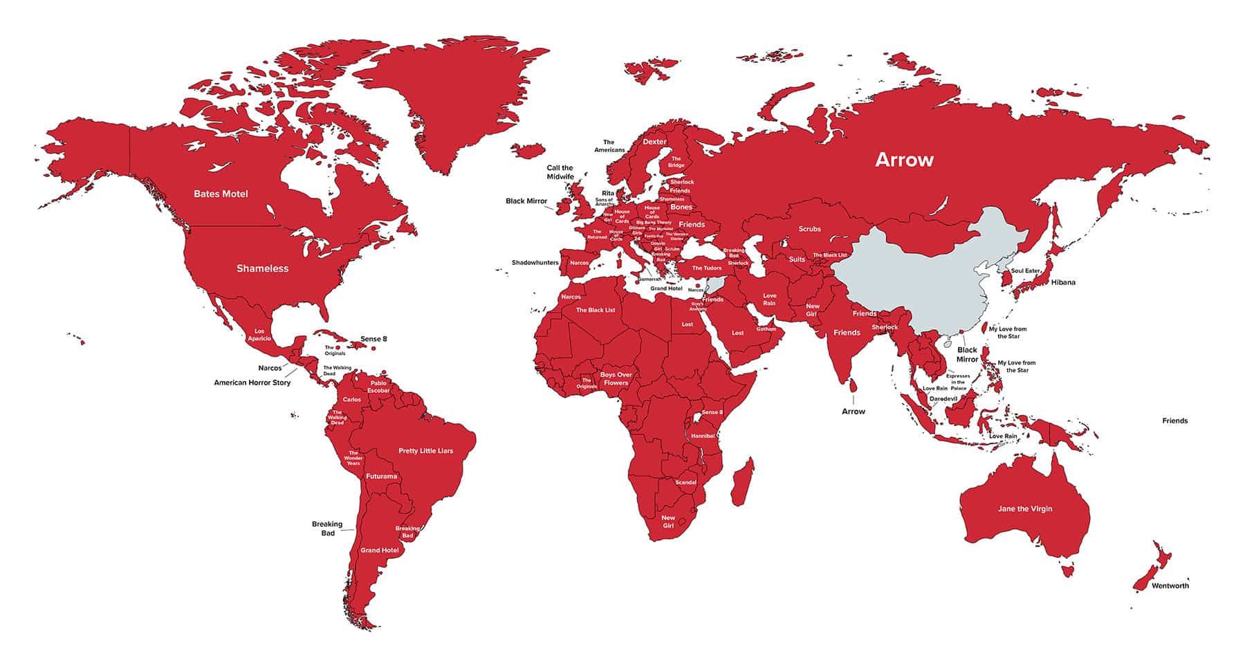 Netflix: What Is The World Watching?
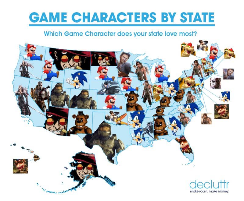 Which Game Character Does Your State Love Most?
2. 3D Mockups
One of the biggest issues with infographics is the fact that, more often than not, they’re boring. It doesn’t take the world’s best designer to put together an infographic which looks OK and, for that reason, they don’t really stand out from the crowd.
If you’re lucky enough to have access to the skills of a top-class graphic designer, why waste their talent on designing an infographic?
One form of content which has been seen to be used more and more in recent months is 3D mockups.
The effort and investment required to produce such content are far greater than an infographic but the results are also usually far greater.
When looking through examples, what becomes apparent is that the most effective 3D mockups are those which focus on something hypothetical. No one is interested in seeing a slightly different view or model of something which already exists, but both readers and publishers love to talk about and take a look at what something which doesn’t exist might look like.
As a content creator, the key here is looking at something which doesn’t exist and coming up with mockups of what it might look like. The only limits here are your imagination and the skills of your designer. You literally can’t get the foundations of the concept wrong!
Yes, it takes time to come up with a great idea, but here’s some inspiration from a couple of recently successful campaigns to get your thinking cap started:
 Five Apple Products Reimagined as Cars
 Your Favourite Superheroes Reimagined As Cars
3. Scrolling Interactive Visuals
While the above two visuals typically only require some thorough research and a great graphic designer, if you’ve also got the luxury of a developer on hand (typically those working within an agency or in-house at a larger organization), you can get some fantastic results through the creation and promotion of scrolling interactive visuals.
What we’re talking about here is something impressive that steps outside of the box and depicts stats in a way which is both relatable and shocking.
Successful pieces of content which have adopted this format, to use as inspiration, include Cewe Photoworld’s If You Printed All The Instagram Pics Uploaded in a Year… and Concert Hotel’s The Capacity of an iPod Visualized as Vinyl.
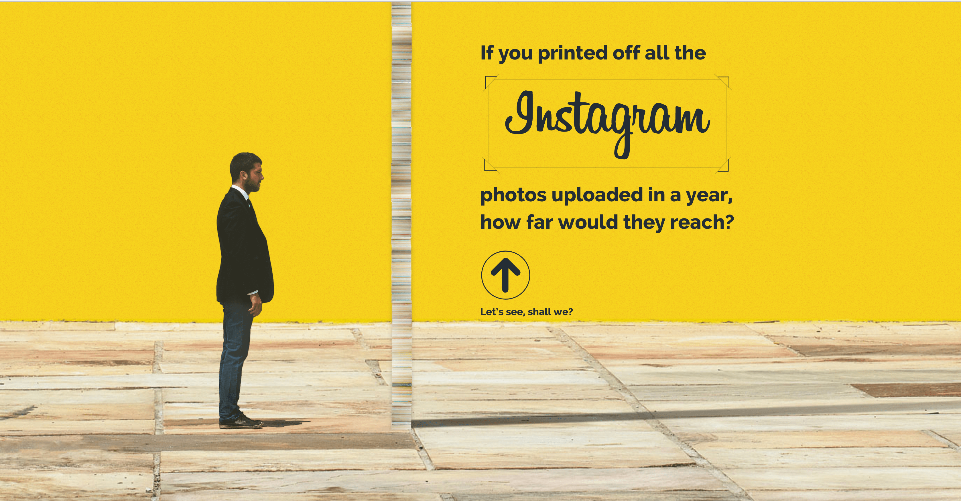
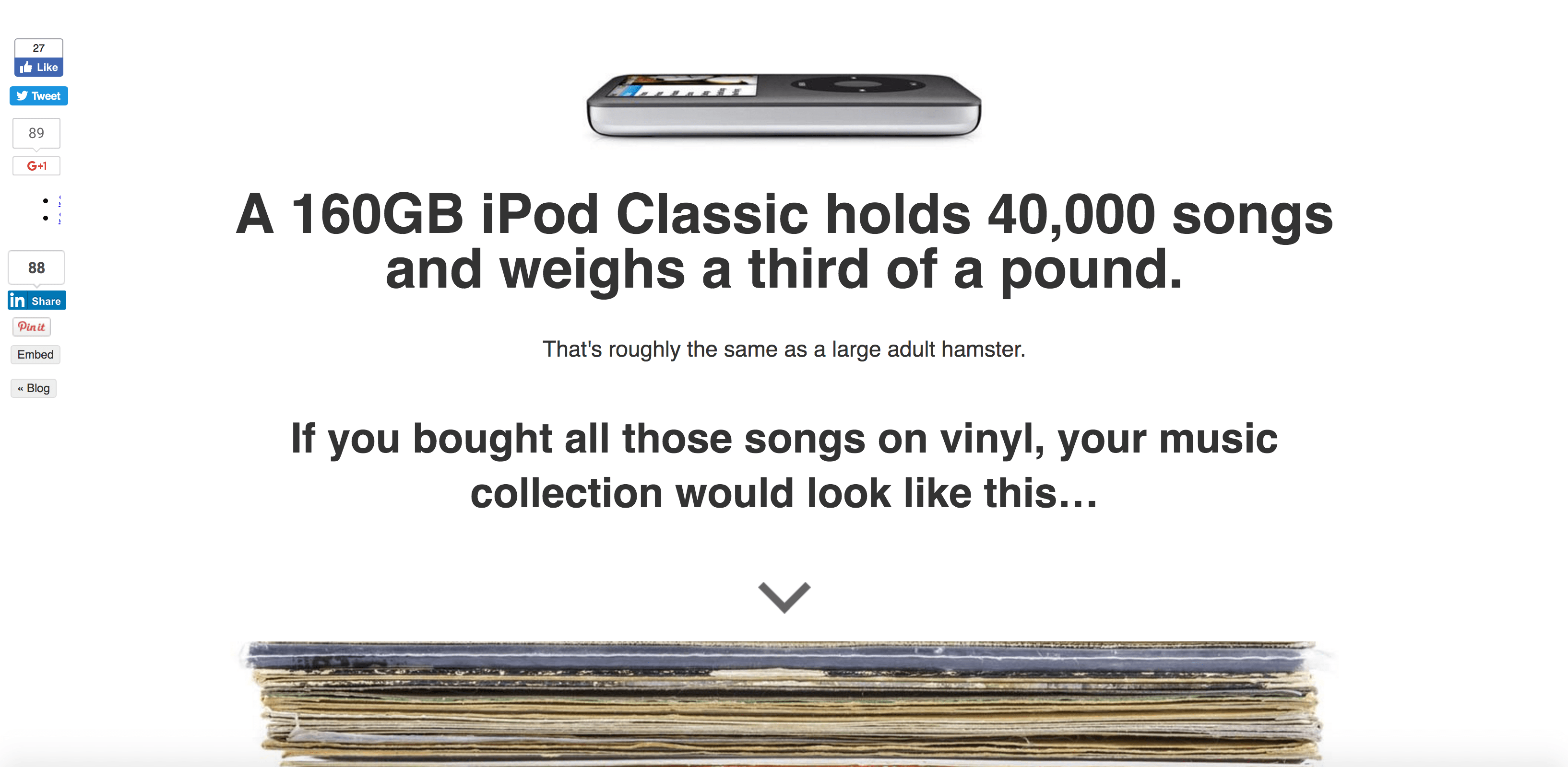
There are still few brands creating such content. It’s typically only larger businesses and agencies who have the resources to pull something like this together.
However, that doesn’t mean such content is completely out of the question for smaller outfits, especially when you break down the format and realize that, in many ways, it’s fairly simplistic. The key to the success of the content formats is the concept.
It takes a great idea coupled together creative execution to work, but the actual development and design nature aren’t overly complex and nothing which even a junior team couldn’t deliver in even a relatively short timeframe.
While these two examples are fairly similar in format, it’s the underlying message; one being that, as users, we share an awful lot of photos on Instagram and the other being that technology is a great space saver!
It’s these key media hooks which make this form of content so appealing to journalists and the main reason why these two examples earned 503 and 840 links.


We’re talking about serious volumes of links earned here. Those which really do move the needle on search engine ranking positions, especially when you see that many of these are from domains such as Mashable, Huffington Post, and Business Insider.
If you compare the time and budget resources needed to create content such as this, it’ll often come in at many more times that of designing and developing a simple infographic, nonetheless, the results speak for themselves.
The trick here is coming up with a great concept; nothing short of the best will do. Then again, that’s what sets great marketers apart from the rest–those with the ability to spot and develop an idea for a piece of content which is almost guaranteed success.
Risks vs. Rewards
When it comes to creating visual content as a link building approach, we can’t ignore how impactful infographics have been in recent years. They’re easy to execute and many of us have got great results from even a mediocre concept. However, times are changing.
As what happened with the guest blogging of old, we SEOs have tried to scale and have continued to output low-quality content which simply isn’t appealing to publishers anymore. The format of an infographic has become boring, overused, and dated.
What hasn’t changed is that publishers are still hungry for content which is easy to share. Usually, it comes in the form of visual content.
Think outside the box and try something new. There are some great ideas above but what else you can come up with is limited only by your ideas, your imagination, and the skills of your designer and developer.
Image Credits
In-Post Image 1: ILGA
In-Post Image 2: High Speed Internet
In-Post Image 3: Click Mechanic
In-Post Image 4: VW Motor Parts
Screenshots taken by James Brockbank, July 2017.


