After Yahoo! showed me their new site for the holiday season, I was pretty much underwhelmed. How could Yahoo! Shopping not introduce something incredibly bold for the holidays? And unfortunately I couldn’t even properly articulate my disappointment. I know Chris and Matt (and Haley) wanted to strangle me that afternoon…
What I want to do in this post is shed more light on what I like and don’t like about Yahoo! Shopping.
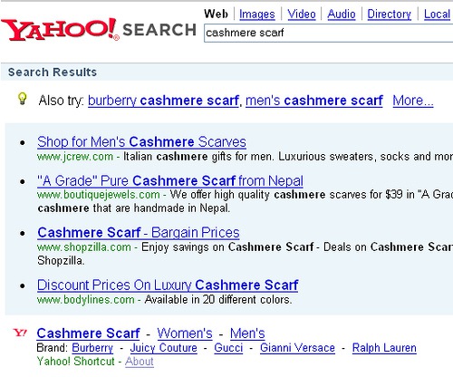
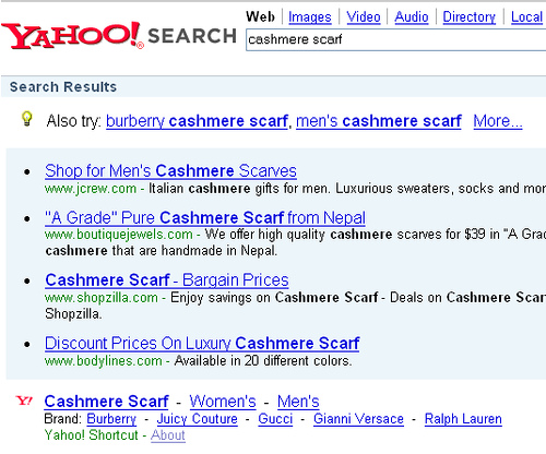
-The greatest potential for Yahoo! Shopping is the ability to leverage Yahoo! Search. And right now, the company is not taking advantage of this incredible opportunity as much as it could. I’m sure Yahoo! Product Search Shortcuts are being triggered on a hell of a lot of searches, but there are sooooo many more keywords to target. I’d highly recommend that Yahoo! Shopping just look at every top to ‘Wow Gift’ listed on its site and make sure that Shortcuts are being triggered (hint: look at the clothing section…it’s as if you skipped right to video games). Also, make sure that you’re targeting both singluar and plural forms of the words. A search for cashmere scarf triggered a Shortcut, but cashmere scarfs did not. Gold cuff bracelet triggers a shortcut, but Gold cuff bracelets does not.
I love the idea of the ‘cheap’ Shortcut (Cheap Shoes, cheap dresses, cheap jeans, cheap computers, cheap bags, etc.), but these search terms don’t get that much traffic (at least according to inventory.overture.com). Make sure to target holiday terms…’Christmas Gift’, ‘Hannukah Present’, or ‘gift for girlfriend’ (which goes to an old Gift Finder page) and tons of brand name products (assuming it’s allowed).
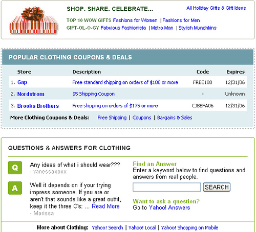
-I like that Yahoo! Shopping is bringing in the blog (contextually!), Yahoo! Answers (what an amazing success story!), coupons/deals, reviews, guides, etc., but I don’t like how the site has integrated these resources. You’re either integrating them way too much or not enough. These were just clumped together:
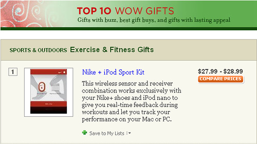
And this Top 10 Wow Gifts for Sports & Outdoors module just has a compare prices button next to a picture and description.
If you click through, you see coupons, ratings, reviews, and Answers. These incredible resources could be integrated better into the top level page (at least have reviews). Yahoo! Tech (awesome sight powered by Yahoo! Web Services) brought in ‘read reviews’ and ’see more MP3 players’. I understand that you don’t want to bombard the user with too many options, but if you say content and community are 2 of your main focus areas, then make use of your assets.
This main Home & Garden page has popular products, refinement options, graphical ads, a pick list from Target (not sure if it’s sponsored), more graphical advertising (from Target), a tiny bit of editorial from MightyGoods about Denyse Schmidt Quilts (that should totally link to more great editorial content, not just to a product list), a holiday gift module, popular coupons & deals module, a Yahoo Answers module, and YSM sponsored links. WHOA! I love a lot of the modules and content, but it’s overwhelming.
One integration that I really liked was the Buzz: Top actor searches into your movies category, but again, the user has to scroll and scroll some more to see the coupons module or Answers module.
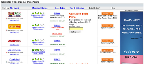
-Don’t distract the user on the compare prices page with annoying advertising. I don’t know what you were thinking in putting 125×600 skyscrapers in the price comparison listings. Yes, PPC listings from YSM and graphical advertising above or below listings is now standard, but what are you doing putting a Sony Brivia LCD TV ad right next to my price comparison listings for the Apple iPod Nano 2GB Silver? I understand that you’re making some good money off of graphical advertising, but if your goal is to help the user “find the right product at the right price”, then you have some explaining to do.
-You talked a lot about relevance and comprehensiveness during our conversation and that a lot of improvements were made behind the scenes. But I’m still confused on how a search for ‘movies’ brings up Chinese Erotic Movies (1997) and Too Hot for Hell above some mainstream blockbusters (a search for ‘dvd’ happens to bring up what I’d consider more relevant resutls). Or how Fight Club is the #2 movie in the comedy section. Excited to pop that one in right after Mrs. Doubtfire for some good laughs!
And what’s up with a search for TMX Elmo. I’d expect a little more normalization. I know this is REALLY hard when you’re crawling and working with data feeds, but the results are a mess (normalized/not-normalized), you’re listing the same Y! Auctions multiple times, and a number of the eBay auctions were expired.
Although I have to say your filtering options for clothing is really impressive.
-If you’re focusing on the user experience, the ‘next’ button (to see the next 10 listings) should be at the bottom of a list, not after 5 sponsored listings.
-You need to sprinkle a little Holiday Cheer throughout the regular search results and browse pages. You have a solid gifts section, now let people know about it (the little modules aren’t prominent enough).
-I personally don’t think people interact that much with buying guides, but since you highlighted them as part of the redesign, why are they burried at the bottom of the page for searches? I searched for PDA, laptop, and digital camera and found the Yahoo! and Consumer Reports buying guides at the bottom left hand side of the results. If someone searches for Blackberry 8700c or lenovo t43, that’s fine, but for those general terms, I would suggest removing the 4 YSM sponsored listings (or at least cutting the number of listings) and putting in links to the buying guides.
So I’m being a pain in the ass at this point, and I know it. At the end of the day, I was expecting more…you’re Yahoo!. Even if I didn’t get the web 2.0 experience (a sleeker layout and design), I’d at least expect some visible improvement to the search listings. Thank you for getting rid of the banner ad and the category buttons (smart), but what’s up with the 4 sponsored results at the top of the page and 5 sponsored results at the bottom of the page (before the ‘next’ button)? I chided Shopping.com for pushing their shopping comparison engine listings below the fold….and while the first listing for Yahoo! Shopping results is above the fold, there’s still room for improvement. I know Yahoo! has to show growth in its sponsored listings business, but I hate to see Yahoo! Product Submit and Yahoo! Shopping as ugly step-children.
So you’re going to come back to me and show 30+% growth for Yahoo! Shopping. You’re going to tell me that people are saving products to their lists. You’re going to come back to me and say that I’m contradicting myself – I want more integration AND less integration. You’re going to say that I missed 27 amazing things that are happening with Yahoo! Shopping.
I’ll say that it’s great that you’re in line with industry estimates, but why didn’t you knock the socks off everyone else? I’ll ask if people interacted with their lists (right now users are sent to another page as opposed to always having their list present). I’ll admit that I am contradicting myself (and I’m not a UI expert), but shouldn’t there be a much more consistent theme of ease of use throughout the site. I’ll say I didn’t miss the amazing things – I love the coupons and deals, the blog integration, and the Answers integration – but the overall presentation of these parts is weak. And that’s what’s frustrating me.

