YouTube is giving creators a new set of tools that make it easy to compare the performance of multiple videos over a period of time.
The new comparison tools, available in the Analytics section of YouTube Studio, are designed to help creators analyze video performance to determine what’s working on their channel and what’s not working.
Data is presented in the form of dot plots. Creators can plot the performance of up to 100 videos across the same timeframe.
This article covers how to access the data and how it can be used to guide the creation of future videos.
How to Access YouTube’s Video Comparison Tools
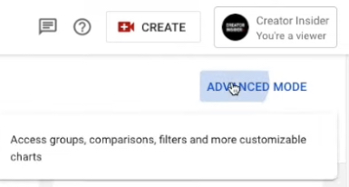
To find YouTube’s new video comparison tools, first go to channel analytics and click on advanced mode in the top right corner.
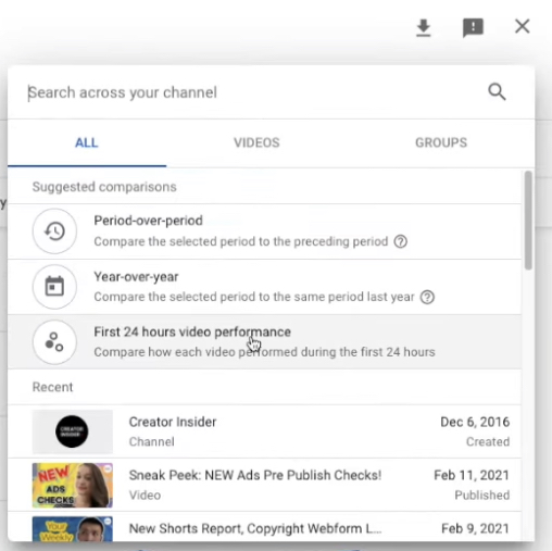
On the next screen, in the top right corner, click on compare to, and select first 24 hours video performance.
Once you’re in the report you will have more options to customize it.
On the left side you can choose between whichever publish dates you’d like to select. This will plot all videos published within that timeframe.
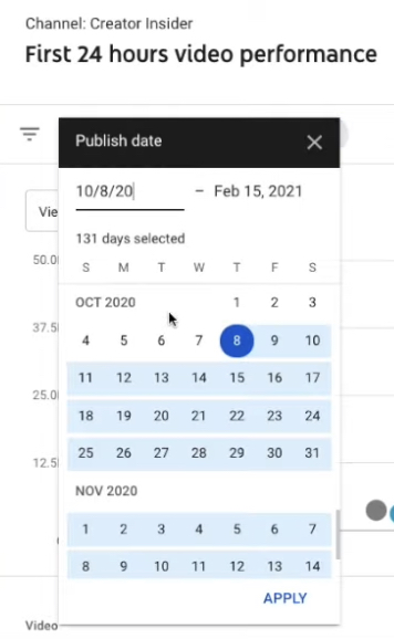
Note that this feature is available for videos published in 2019 onwards. Up to 100 videos can be compared at one time.
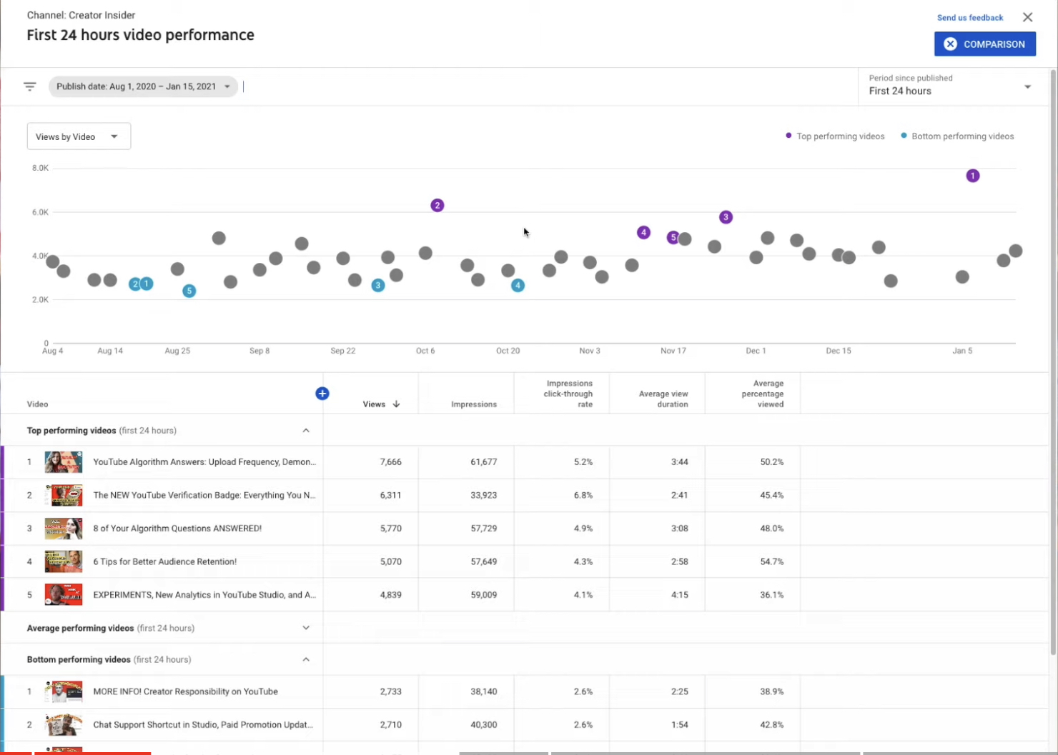
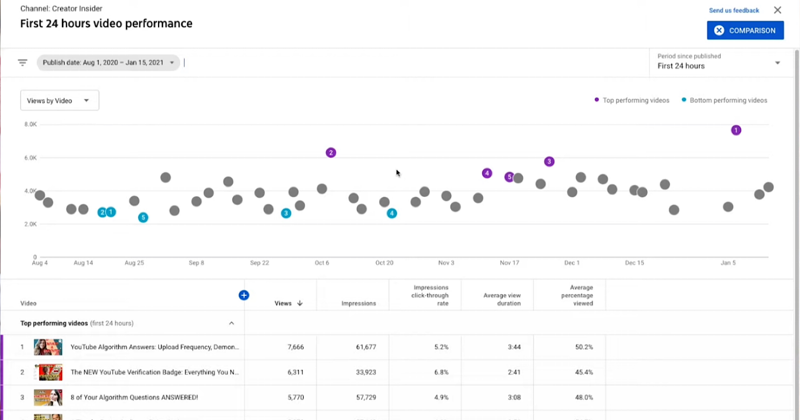
After selecting a timeframe of publishing dates you will see a screen like the one below:
Next you can select period since published. From the drop down menu in the top right corner you can select:
- First 24 hours
- First 7 days
- First 28 days
This feature allows you to make fair comparisons between videos. Each dot represents a video’s performance over the same timeframe. In this example all viewership data is from the first 7 days since each video was published. You can hover over each dot to see which video it represents.
On the left side of this screen there’s another drop down menu where you can choose which metric you want to compare each video against. You can choose:
- Views
- Impressions
- Click through rate
- Average percentage viewed
- Average view duration
- Watch time (hours)
- Likes
- Dislikes
Below the dot plot you will see a chart with videos separated into three categories: top performing videos, bottom performing videos, and average performing videos.
Top and bottom refers to the highest and lowest performing videos according to the metric you’ve chosen to compare.
Within the table you can see at a glance how many views and impressions each video has received in a given timeframe.
Dot plots are ideal if you want to compare many videos against each other. If you want to compare two videos you can utilize YouTube’s new ‘first 24 hours’ time range.
How to Use YouTube’s Video Comparison Data
This new report can help with identifying content trends on your channel over time. Look for common themes among top and bottom performing videos.
In this example you can see several of the the top performing videos mention “algorithm” in the title. That indicates there’s a demand for videos on that topic.

When looking at the bottom performing videos you can see trend where two of the titles begin with “more on” and “more info” in all caps.
That could be a sign to adopt a different strategy when writing video titles.
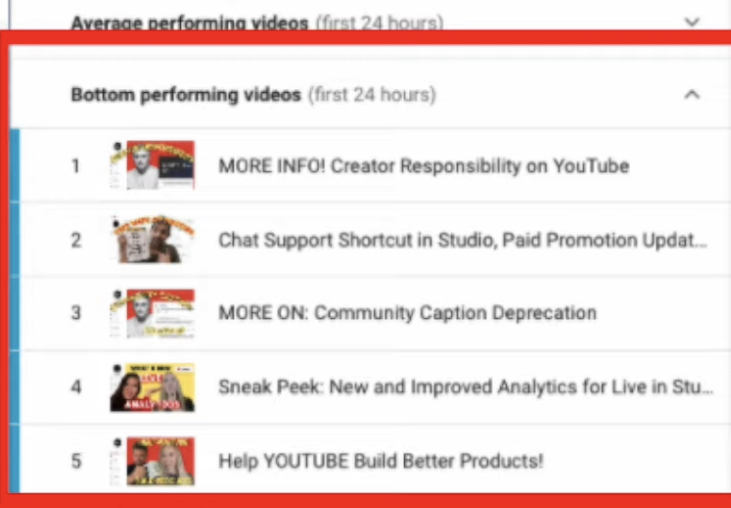
Another theme among the bottom performing videos is a similar thumbnail style which is more text heavy than the thumbnails of the top performing videos.
When comparing data ask yourself these questions: What can I make more of? What can I improve on?
For more on this new report see the video below:



![AI Overviews: We Reverse-Engineered Them So You Don't Have To [+ What You Need To Do Next]](https://www.searchenginejournal.com/wp-content/uploads/2025/04/sidebar1x-455.png)